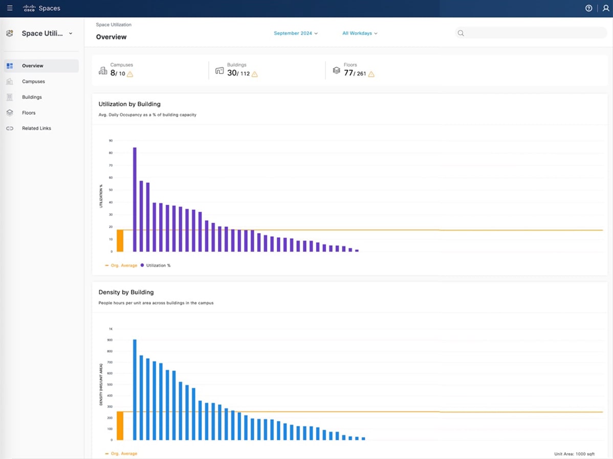
The Overview window is divided into two parts. The upper part has icons that present a quick view into the number of Campuses, Buildings, and Floors in your network and a count of these spaces that have rich maps integrated.
In the lower part, you can see the graphical trends for utilization (% average daily occupancy), density (people hours per
unit area), and room utilization (% time during work hours) for buildings. In these graphs, click on the network bar to navigate
to the detailed network view.
The app also supports the reporting of occupancy data from various sources such as collaboration devices, portal beams and
PIR sensors (such as Thingsee and Moko).
To view the data for different time periods, change the selection in the month and days dropdown menus on the top of the Overview window.
You can use the search box to look up locations as per the defined Location Hierarchy.
UI updates
These enhancements improve user navigation and provide a more intuitive interface.
-
Dynamic Page Title: The page title and filters now update automatically based on your selected view. You can quickly identify the specific building
or floor and see which filter is applied.
-
Location drop-down: The Location Selection drop-down list is now strategically repositioned to the right-hand side of the window. This filter is now available in both
building and floor views, enabling you to switch between locations more efficiently.
Heat Maps
The Space Utilization App now introduces Heat Maps, offering a new method to visualize historical occupancy trends and the utilization of physical spaces. The heatmap is displayed
directly on top of the 3D Digital Map, allowing you to gain a spatial understanding of occupancy density and utilization patterns
in an immersive manner.
Key Highlights
-
Heat Map Visualization: A visual, color-coded representation of historical occupancy density at the floor level, displayed over the 3D Digital Map
and helps to understand which areas of a floor have been most or least utilized over time.
-
Multi-Dimensional Analysis: View heat maps for each day of the month, day of the week, or hour of the day to identify trends and analyze occupancy patterns
and utilization trends across different time periods.
The benefits include:
-
Identify historically underutilized and high-traffic zones.
-
Make informed decisions about space reallocation or redesign.
-
Complement traditional chart views with intuitive, map-based visualizations using the 3D Digital Map.
-
Gain spatial insights to optimize workspace allocation and enhance the visitor experience.
Interactive Map
The Space Utilization App features Interactive Maps, which provide fast and intuitive geographic visualization of locations such as campuses, buildings, and floors on a global
map. This feature displays occupancy and utilization metrics with dynamic markers and color-coded clusters. This enables you
to gain quick insights at multiple levels.
Key Highlights
-
Seamlessly switch between global, campus, building, and floor-level perspectives with dynamic clustering.
-
Color-coded Markers representing key metrics such as people count, time spent, and percentage utilization.
-
Smart Map Controls, zooming, and informative panels that facilitate rapid exploration of your spaces.
 Feedback