View and Manage Events

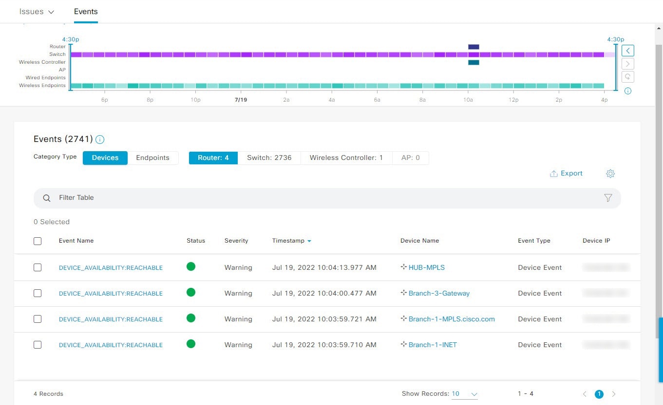
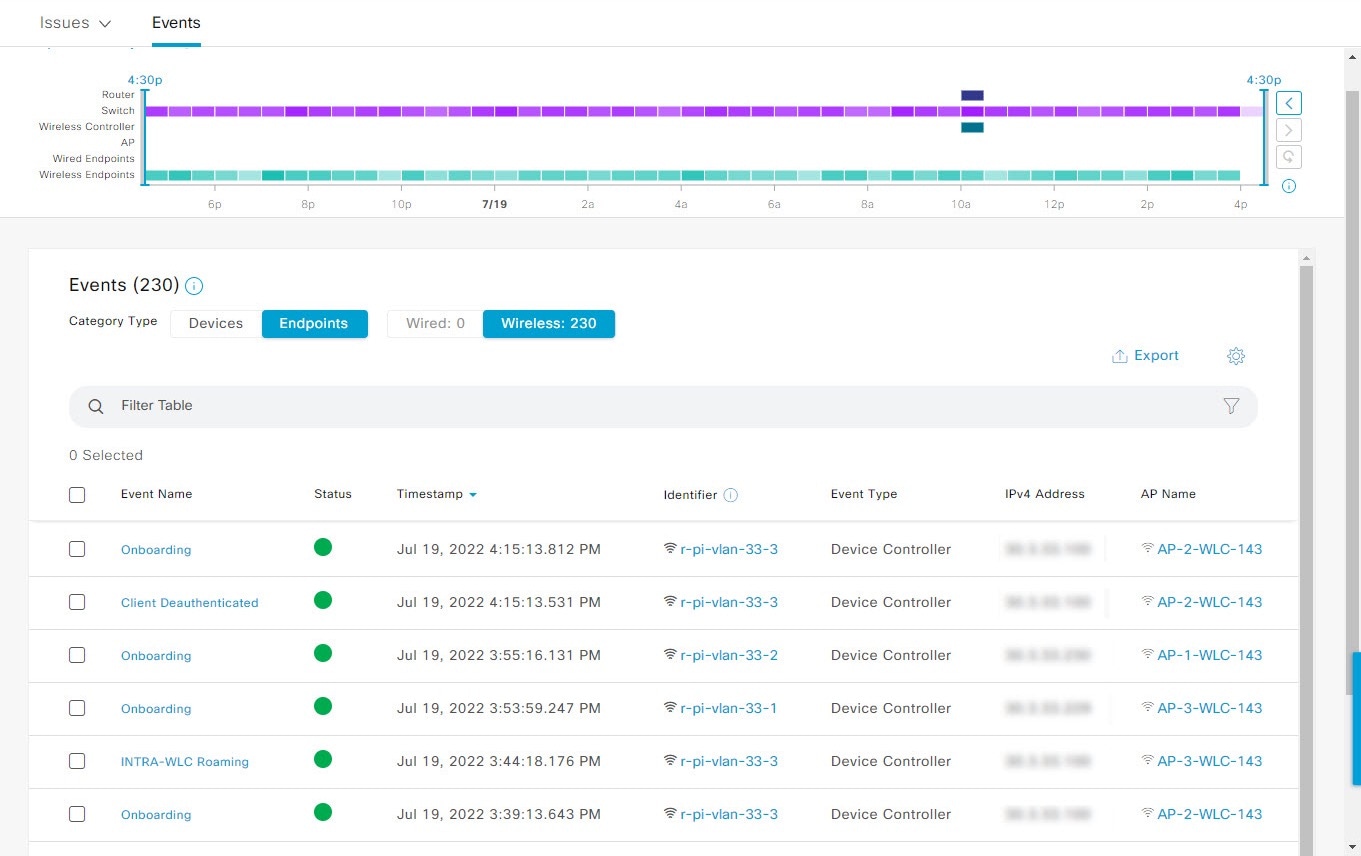
Events Dashboard Overview

The Events dashboard provides a contextual view of events for devices (routers, switches, wireless controllers, APs) and endpoints (wired and wireless). Instead of having to search for events triggered by devices that are connected to other devices involved in an event, Assurance provides these details for you.

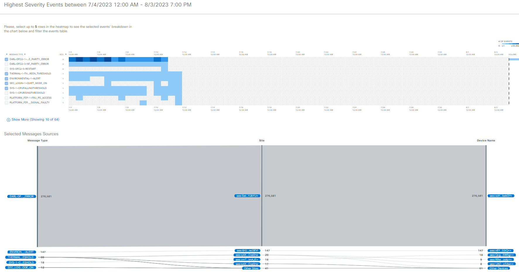
By default, the Events dashboard displays a timeline chart and a list view.

The timeline chart provides a color representation of the number of events by device type that occurred over a period of time.

The list view displays a table of events. Up to 10,000 events can be displayed, even if more events have been logged. You can export up to 5000 events to a CSV file. However, if there are more than 5000 events, the export capability is disabled.

From the list view, you can click an event to view its details, including events triggered by connected devices. You can configure the event time period in 15-minute increments, up to one hour (+/- 15 minutes, +/- 30 minutes, +/- 45 minutes, +/- 1 hour).

When you select more than one event, you can view multiple cards with event details. When you have multiple event cards displayed, you can minimize, maximize, and close cards. For example, to view the connected device events table for an event, maximize the event card. To return to the multiple card view, minimize the card.

View device events

Use this procedure to view events generated by routers, switches, wireless controllers, and APs.

Procedure


Step 1

From the main menu, choose Assurance > Dashboards > Issues and Events.

The Events dashboard opens with Device selected as the Category Type by default.

Figure 1. Device Events dashboard
Device Events dashboard
Item Description

  • Click in the top menu bar to select the site, building, or floor from the Site hierarchy.

  • Click next to the location icon and select Site Details to view the event counts for each site.

  • Select Hierarchical Site View or Building View from the drop-down list. Based on what you select, the table is refreshed.

  • From the Go to sites column, click for a site or building to display events for only that location.

Time Range setting

Allows you to display information on the window based on the time range you select. The default is 24 Hours. Do these steps:

  1. From the 24 Hours drop-down list, select a time range: 3 hours, 24 hours, or 7 days.

  2. Specify the Start Date and time, and the End Date and time.

  3. Click Apply.

    This sets the range of the timeline.

Timeline Slider

Allows you to specify a more granular time range. Click and drag the timeline boundary lines to specify the time range.

The colors represent the device type:

  • : Router
  • : Switch
  • : Wireless controller
  • : AP

The intensity of the color indicates its significance, whether more or fewer events have occurred for that device. For example, a lighter shade of blue indicates fewer router events than a deeper shade of blue.

Total Events

The total number of events for all device types for a specific time range.

Step 2

Under Events, for the Category Type, click the Router, Switch, Wireless Controller, or AP tab to display a list of events for that device type in the table.

Events table
Item Description

Event Name

Name of the event.

Click the event name to open a slide-in pane with details about the event.

Status

Status of the device.

The color represents the severity of the event.

: Error.

: Warning.

: Info.

: No data available.

Severity

Severity of the event: Critical and above (Emergency and Alert) and less severe than Critical level (Error, Warning, Notice, and Info).

Timestamp

Date and time when the event occurred.

Device Name

Name of the device that was impacted by the event.

Click the device name to open the Device 360 window.

Event Type

Category of the event: Syslog, Trap, Event, or AP Event.

Device IP

IP address of the device.

Step 3

To view multiple events, check the check box next to each event you want to view and click Show Selected Events.

The Multiple Events slide-in pane opens with each event displayed in a separate card.

From inside a card, you can do these tasks:

  • Minimize, maximize, and close a card.

  • Display more details by clicking the down arrow.

  • Click hyperlinks to launch the respective device 360 window.

When a card is maximized, any connected device events appear.

Step 4

From the Multiple Events slide-in pane, click the list view icon to display a compilation of all the subevents sequentially in a list.

To return to the card view, click the card view icon .


View endpoint events

Use this procedure to view events generated by wired and wireless endpoints.

Procedure


Step 1

From the main menu, choose Assurance > Dashboards > Issues and Events.

Step 2

Click the Events tab.

The Events dashboard opens.

Step 3

For the Category Type, click the Endpoints tab.

Figure 2. Endpoint Events dashboard
Device Events dashboard
Item Description

  • Click in the top menu bar to select the site, building, or floor from the Site hierarchy.

  • Click next to the location icon and select Site Details to view the event counts for each site.

  • Select Hierarchical Site View or Building View from the drop-down list. Based on what you select, the table is refreshed.

  • From the Go to sites column, click for a site or building to display events for only that location.

Time Range setting

Allows you to display information on the window based on the time range you select. The default is 24 Hours. Do these steps:

  1. From the 24 Hours drop-down list, select a time range: 3 hours, 24 hours, or 7 days.

  2. Specify the Start Date and time, and the End Date and time.

  3. Click Apply.

    This sets the range of the timeline.

Timeline Slider

Allows you to specify a more granular time range. Click and drag the timeline boundary lines to specify the time range.

The colors represent the endpoint type:

  • : Wired
  • : Wireless

The intensity of the color indicates its significance, whether more or fewer events have occurred for that device. For example, a lighter shade of purple indicates fewer endpoint events than a deeper shade of purple.

Total Events

The total number of events for all endpoint types for a specific time range.

Step 4

Click the Wired or Wireless tab to display a list of events for that endpoint type in the table.

Events table
Item Description

Event Name

Name of the event.

Click the event name to open a slide-in pane with more details.

Status (Wired Endpoints Only)

The color represents the severity of the event.

: Error.

: Warning.

: Info.

: No data available.

Severity (Wired Endpoints Only)

Severity of the event. Severity can be critical and above (Emergency and Alert) and less severe (Error, Warning, Notice, and Info).

Timestamp

Date and time when the event occurred.

Identifier

Identifier of the endpoint. It can be either user ID, hostname, IP Address, or MAC address, depending on the availability in that order.

Click the identifier to open a slide-in pane with more details.

Event Type

Category of the event: Syslog, Trap, Event, or AP Event.

IPv4 Address

IPv4 address of the device that is connected to the endpoint.

AP Name (Wireless Endpoints Only)

Name of the AP that is connected to the wireless endpoint.

Click the AP name to open the AP Device 360 window.

Switch (Wired Endpoints Only)

Name of the switch that is connected to the wired endpoint.

Click the switch name to open the Device 360 window.

MAC Address

MAC address of the device that is connected to the endpoint.

Port (Wired Endpoints Only)

Switch port that is connected to the wired endpoint.

VLAN ID (Wired Endpoints Only)

VLAN ID of the switch port that is connected to the wired endpoint.

Switch IP Address (Wired Endpoints Only)

IP address of the switch connected to the wired endpoint.

AP MAC (Wireless Endpoints Only)

MAC address of the AP that is connected to the wireless endpoint.

SSID (Wireless Endpoints Only)

SSID that the wireless endpoint is using.

UserID (Wireless Endpoints Only)

User ID of the wireless endpoint.

Wireless Controller Name (Wireless Endpoints Only)

Name of the wireless controller that is connected to the wireless endpoint.

Band (Wireless Endpoints Only)

Radio band that the wireless endpoint is using.

DHCP Server (Wireless Endpoints Only)

DHCP server that the wireless endpoint is using.

Step 5

Click the event name to view more information about that event in a slide-in pane.

The slide-in pane displays basic information (such as the identifier and severity), hyperlinked data, and connected device events details.

In the Connected Device Events dashlet, you can view a maximum of 10,000 connected device events in the table by clicking Show Events. In this dashlet, you can either filter or export the event data.

  • From the +_15 mins drop-down list in the top-right corner of the dashlet, select a timeframe to view all the events that occurred within that timeframe.

  • Click a device tab, such as Switch or AP, to view the events connected to that device.

  • Click Export in the top-right corner of the table to export up to 5,000 events from the table as a CSV file.

  • Click the gear icon in the top-right corner of the table to customize the table settings.

  • Use the table search bar to filter the table for specific data.

Step 6

To view multiple events, check the check box next to each event that you want to view and click Show Selected Events.

The Multiple Events slide-in pane displays each event in a separate card in the default card view.

In the Multiple Events slide-in pane, you can change views using the view switcher ().

From inside a card, you can

  • Minimize, maximize, and close a card;

  • Display more details by clicking the down arrow; and

  • Click any hyperlinked data.

When a card is maximized, any connected device events are displayed.


View Event Analytics—Preview dashboard

The Events Analytics - Preview dashboard provides a visualization of syslog messages and different types of network events to identify trends and correlate events across different data sources.

Use this procedure to view analytics and insights represented as heatmaps, which display the count of syslog messages and reachability transitions of wired and wireless network events.

Procedure


Step 1

From the main menu, choose Assurance > Dashboards > Issues and Events.

Step 2

Click the Event Analytics - Preview tab. The Event Analytics dashboard opens with wired events.

Figure 3. Event Analytics - Preview dashboard
On the Event Analytics - Preview dashboard, the Wired Events tab is selected and the heatmap of syslog messages is displayed.
Event Analytics - Preview Dashboard
Item Description

Click this icon in the top menu bar to select the site, building, or floor in the Site hierarchy from the Select a location slide-in pane.

Time Range setting

Allows you to display information on the window based on the time range you select. To set the range of the timeline:

  1. From the 24 Hours drop-down list, select a time range: 24 hours (the default), 7 days, 14 days, 30 days, or 60 days.

  2. Specify the Start Date and time, and the End Date and time.

  3. Click Apply.

Step 3

Click Wired Events to view the heatmaps that displays the count of syslog messages and reachability transitions from the wired devices. The heatmaps include a breakdown of message severity data with a granularity of 15 minutes for up to a 24-hour time period. At 7 days, the granularity is 4 hours. At 14 and 30 days, the granularity is 12 hours. At 60 days, the granularity is 24 hours.

Syslog Messages:

  • Use the time slider on the top of the heatmap to set the specific time period in the syslog messages heatmaps. View the total number of events and the count of high, medium, and low message severities.

  • To view insights and analytics data syslog messages, click Show Analytics. A series of cards with different visualizations displays the counts of syslog messages or devices, with an order that is based on different analytics criteria. Syslog messages support these analytics:

    • Highest severity events: Highest severity events that occurred in the selected period sorted by severity.

    • Rare events: Least frequent events that occurred in the selected period sorted by occurrence.

    • High volume events: Most frequent events that occurred in the selected period sorted by occurrence.

    • Message volume increase: Events with the highest increase in volume within the selected period sorted by variation.

    • Message volume decrease: Events with the highest decease in volume within the selected period sorted by variation.

    • New events: Events that started occurring at the end of the selected period sorted by occurrence.

    • Most active devices: Devices that generated the highest volume of events in the selected period sorted by volume.

    Figure 4. Analytics for syslog messages
    Under Show Analytics, the high severity event, rare event, and high volume event details are displayed.
  • Click View Details to view the detailed heatmap with a time series of event counts for each event type. You can select up to five syslog message types in the heatmap to filter the Sankey chart to show the distribution of the selected event type and to learn about the specific sites and device-generated events.
    Figure 5. Syslog Events heatmaps with Sankey chart
    On the High Severity Events window, five syslog message types are selected in the heatmap and the results are displayed in the Sankey chart.
  • You can select the message type, site, or device in the Sankey chart to filter the events table below the chart. Up to 10,000 events can be displayed in the events table. To create a user-defined issue, click messages in the events table and click Confirm.

Reachability Transitions:

  • Use the time slider on the top of the heatmap to set the specific time period to view the total number of events, unreachable events, reachable events, and ping-reachable events.

  • To view insights and analytics data for each reachability transition (top status transitions, top devices by events) from wired devices in a separate card, click Show Analytics.

  • Click View Details to view the detailed heatmap with a time series of event counts for each event type. You can select up to five events in the heatmap to filter the Sankey chart to show the distribution of the selected event type and to learn about the specific sites and device-generated events.

  • You can the select the from event, to event, site, or device in the Sankey chart to filter the events table to show the reachability transitions for each event. Up to 10,000 events can be displayed in the events table.

Step 4

Click Wireless Events to view the heatmaps that display the count of syslog messages and reachability transitions from the wireless devices. The heatmaps include a breakdown of message severity data with a granularity of 15 minutes.

Syslog Messages:

  • Use the time slider on the top of the heatmap to set the specific time period in the syslog messages heatmaps. View the total number of events and the count of high, medium, and low message severities.

  • To view insights and analytics data for each syslog message displayed in a separate card, click Show Analytics. The analytics cards are displayed for the available syslog messages with the severity and event type.

  • Click View Details to view the detailed heatmap with a time series of event counts for each event type. You can select up to five syslog message types in the heatmap to filter the Sankey chart to show the distribution of the selected event type and to learn about the specific sites and device-generated events.

  • You can the select the message type, site, or device in the Sankey chart to filter the events table to show the syslog messages. Up to 10,000 events can be displayed in the events table.

Reachability Transitions:

  • Use the time slider on the top of the heatmap to set the specific time period to view the total number of events, unreachable events, reachable events, and ping-reachable events.

  • To view insights and analytics data for each reachability transition (top status transitions, top devices by events) from wireless devices displayed in a separate card, click Show Analytics.

  • Click View Details to view the detailed heatmap with a time series of event counts for each event type. You can select up to five events in the heatmap to filter the Sankey chart to show the distribution of the selected event type and to learn about the specific sites and device-generated events.

  • You can the select the from event, to event, site, or device in the Sankey chart to filter the events table to show the reachability transitions for each event. Up to 10,000 events can be displayed in the events table.