- Introduction
- Requirements
- Set up Secure Email Threat Defense
- Configuration Settings
- Messages
- Downloads
- Insights
- High Impact Personnel List
- Manage Users
- User Settings
- Administration Settings
- Message Rules
- Cisco XDR
- API
- Cisco Security Cloud App for Splunk
- Deactivate Secure Email Threat Defense
- Frequently Asked Questions (FAQ)
Insights
Trends
The Trends page shows graphical information about your email data. View Trends by selecting Insights > Trends.
■![]() Use the calendar control to show data for a specific Day, Week, or Month.
Use the calendar control to show data for a specific Day, Week, or Month.
■![]() Click data of interest in the graphs to be taken to the data details on the Messages page.
Click data of interest in the graphs to be taken to the data details on the Messages page.
■![]() Click legend items to be taken to the relevant data on the Messages page. For example, click Incoming to see all Incoming messages that are currently showing on the chart.
Click legend items to be taken to the relevant data on the Messages page. For example, click Incoming to see all Incoming messages that are currently showing on the chart.
■![]() Download your trend data by clicking the download
Download your trend data by clicking the download  button. The results are exported as a CSV file that includes:
–![]() an hourly roll-up of the past 90 days of data if you are viewing the last 24 hours or a specific day
an hourly roll-up of the past 90 days of data if you are viewing the last 24 hours or a specific day
–![]() 24-hour roll-ups of the past 90 days of data if you are viewing the last 30 days
24-hour roll-ups of the past 90 days of data if you are viewing the last 30 days
■![]() Print your Trends charts or save as PDF by clicking the print
Print your Trends charts or save as PDF by clicking the print  button.
About Timezones
Each bar on a Day chart shows the data for one hour. These charts are based in your bowser’s local timezone.
Each bar on a Week or Month chart shows the data for one 24-hour day. The day is based on UTC 00:00 through 11:59 p.m. and then converted to your browser’s local time.
For example, if you are in Pacific Daylight Time (PDT) UTC−07:00, a bar on a Month chart would show from July 20 5:00 p.m. through July 21 4:59 p.m. Pacific.
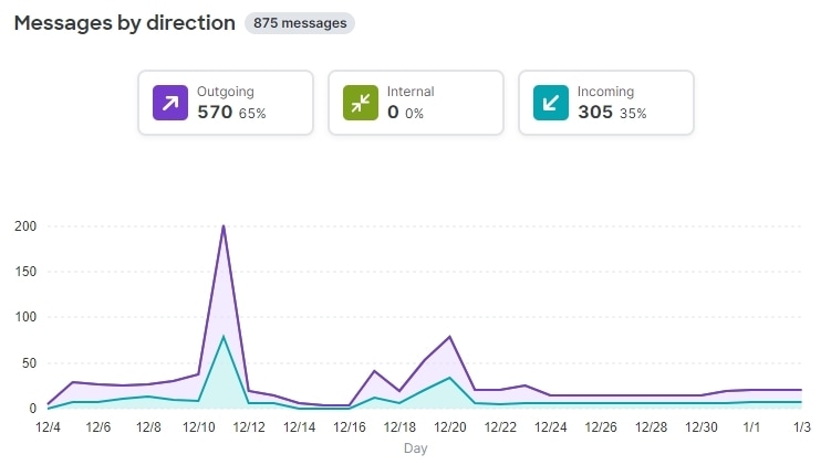
Messages by Direction
The Messages by Direction graph shows your total email traffic. Mail is divided into the following categories:
■![]() Outgoing : mail sent to recipients outside of your O365 tenant
Outgoing : mail sent to recipients outside of your O365 tenant
■![]() Internal : mail sent within your O365 tenant
Internal : mail sent within your O365 tenant
■![]() Incoming : mail received from outside your O365 tenant
Incoming : mail received from outside your O365 tenant
The legend shows the number of messages in each category.
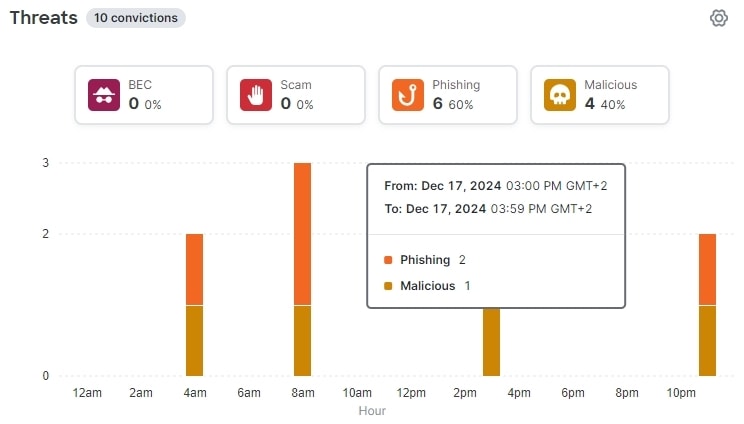
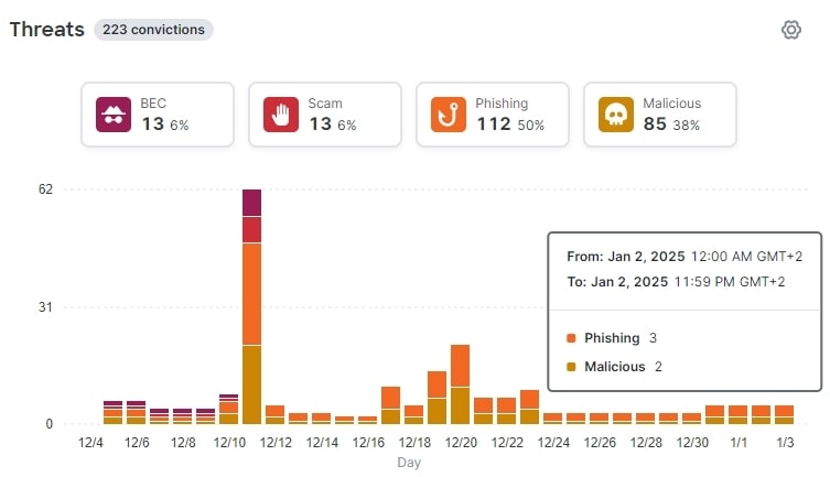
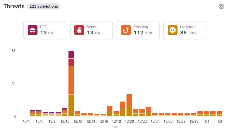
Threats
The Threats graph shows a snapshots of messages that were determined to be threats. This includes BEC, Scam, Phishing, and Malicious. The legend shows the number of messages in each category. Click the data to be taken to the Messages page.
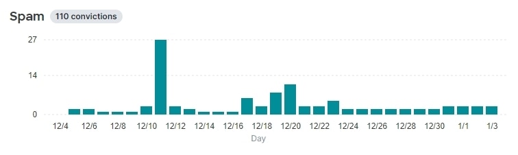
Spam
The Spam graph shows a snapshot of messages that were determined to be Spam. The legend shows the total number of messages determined to be Spam.
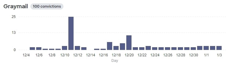
Graymail
The Graymail graph shows a snapshot of messages that were determined to be Graymail. The legend shows the total number of messages determined to be Graymail.
Impact Report
The Impact Report shows the benefits Secure Email Threat Defense provided over the last 30 days. Select Insights > Impact Report to see the report. Click data of interest in the report to be taken to the data details on the Messages page.
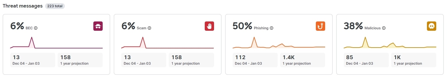
■![]() Threat messages caught by Secure Email Threat Defense in the selected 30 day period, and a 1-year projection of this data. The 1-year projection is calculated as the daily average multiplied by 365.
Threat messages caught by Secure Email Threat Defense in the selected 30 day period, and a 1-year projection of this data. The 1-year projection is calculated as the daily average multiplied by 365.
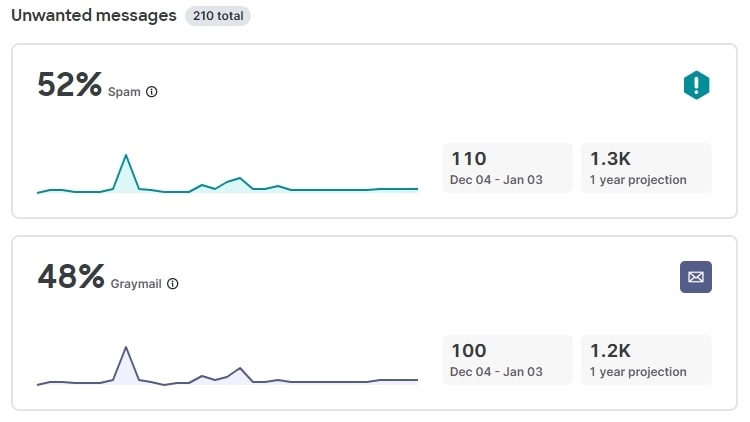
■![]() Unwanted Messages. This chart shows Spam and Graymail in the selected 30 day period, and a 1-year projection of this data. The 1-year projection is calculated as the daily average multiplied by 365.
Unwanted Messages. This chart shows Spam and Graymail in the selected 30 day period, and a 1-year projection of this data. The 1-year projection is calculated as the daily average multiplied by 365.
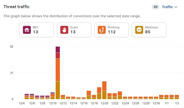
■![]() Threat Traffic. This chart shows convictions over the selected 30 day period. You can filter this chart by direction.
Threat Traffic. This chart shows convictions over the selected 30 day period. You can filter this chart by direction.
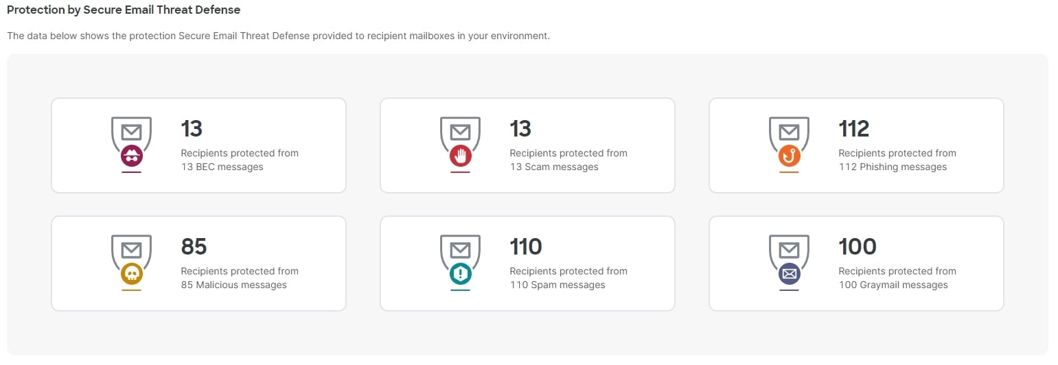
■![]() Protection by Secure Email Threat Defense. This chart shows the protection Secure Email Threat Defense provided to recipient mailboxes in your environment.
Protection by Secure Email Threat Defense. This chart shows the protection Secure Email Threat Defense provided to recipient mailboxes in your environment.
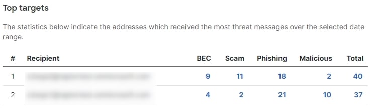
■![]() Top Targets. This chart shows the top ten internal targets of threat messages over the selected 30 day period.
Top Targets. This chart shows the top ten internal targets of threat messages over the selected 30 day period.
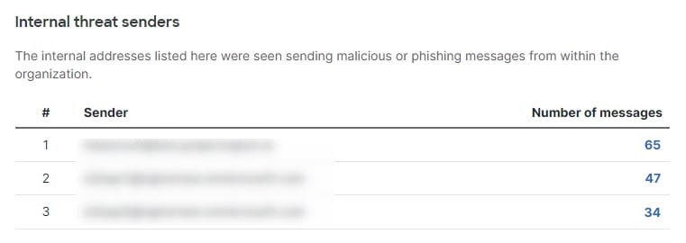
■![]() Internal Threat Senders. This chart shows the top ten internal senders of threat messages.
Internal Threat Senders. This chart shows the top ten internal senders of threat messages.
 Feedback