Network Visualization Overview
Cisco Crosswork Change Automation and Health Insights provides a graphical, topological map view of devices and the links between them so that you can visualize your network. The network topology can be displayed on a logical map or a geographical map, where the devices and links are shown in their geographic context. From the map, you can drill down to get detailed information about devices and links in order to troubleshoot problems. You can also filter the devices shown on the map using tags (see Filter Network Devices by Tags), and you can customize the map to show just the information you want, and save these custom maps for later recall.
To open the topology map view, choose from the left navigation bar in the Cisco Crosswork Change Automation and Health Insights main window.
 Note |
If you encounter topology issues, such as topology components not rendering as expected or component data not displaying on the map, Cisco recommends the following:
|
| Item | Description | |
|---|---|---|
|
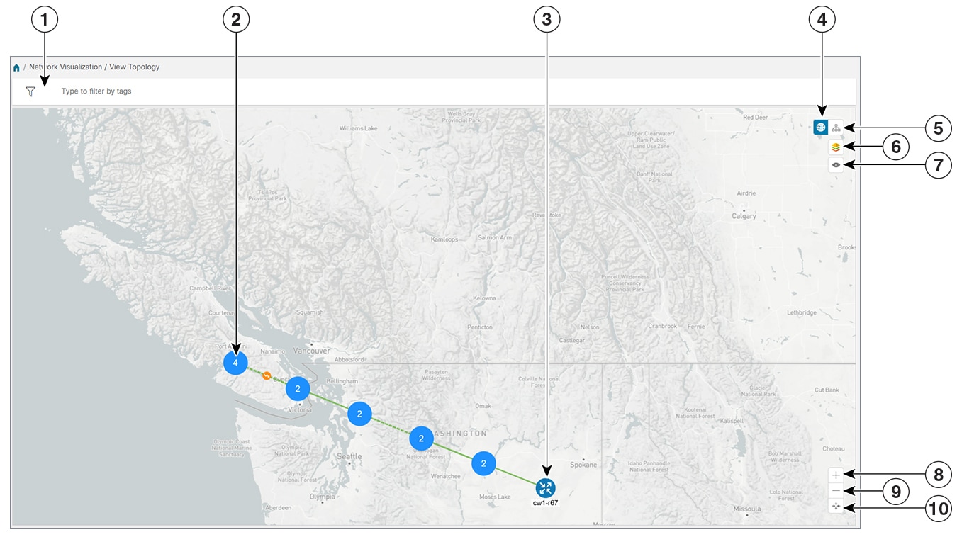
1 |
Filter by Tags: If tags have been assigned to devices, you can filter the map to show only devices with specific tags. For help with this task, see Filter Network Devices by Tags |
|
|
2 |
Device Cluster: If devices are in close physical proximity, the geographical map shows them as a cluster, represented by a solid blue circle with a number in the center, indicating the number of devices in the cluster. Displaying devices in this manner helps prevent overlap and clutter on the map. In this example, there are two devices in the cluster. To see the individual devices in the cluster, zoom in on the cluster or click on the cluster icon. If all the devices in the cluster are in the same location or extremely close to one another, you will be prompted to show the cluster devices in the logical map. See Identify the Members of a Cluster. Links: A solid line indicates a single link between two devices. If there is more than one link between two devices, or between a device and a cluster of devices, the line is shown dashed instead. A dashed line indicates an aggregated link that represents more than one link. |
|
|
3 |
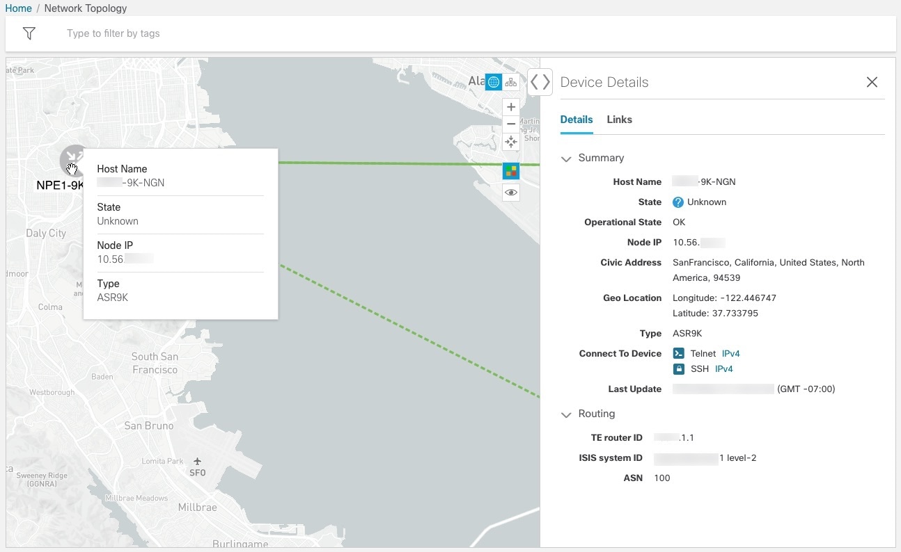
Single Device: The device icon represents the type of device (router, switch, and so on). A blue icon means the device is reachable; a gray icon means the device is not reachable. Hover the mouse cursor over the device icon to see device details. |
|
|
4 |
Geographical Map: Click this icon to toggle from the logical map to the geographical map. The geographical map shows single devices, device clusters, and the links between them, superimposed on a map of the world. The location of a device on the map reflects the device's GPS coordinates (longitude and latitude) as defined in the Device Management application. |
|
|
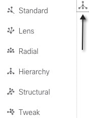
5 |
Logical Map: Click this icon to toggle from the geographical map to the logical map. The logical map shows devices and their links, positioned according to an automatic layout algorithm, ignoring their geographical location. You can change the layout algorithm; see Change the Layout of a Logical Map. The logical map displays up to 1000 devices and never displays devices in clusters. |
|
|
6 |
Display Preferences: Lets you view display settings for devices and link color. For example, you can toggle link color based on state or bandwidth utilization for the mapped links. For more information, see Show Bandwidth Utilization for Links on the Map. |
|
|
7 |
Custom Views: Lets you create a named custom view using the settings and layout for your current map, or display a custom view you have created previously. See Create Custom Map Views. |
|
|
8 |
Zoom In: Click the + icon to zoom in on a specific area. |
|
|
9 |
Zoom Out: Click the - icon to zoom out. |
|
|
10 |
Zoom Fit: Lets you automatically scale the map to fit your zoom area. |
|


 Feedback