The documentation set for this product strives to use bias-free language. For the purposes of this documentation set, bias-free is defined as language that does not imply discrimination based on age, disability, gender, racial identity, ethnic identity, sexual orientation, socioeconomic status, and intersectionality. Exceptions may be present in the documentation due to language that is hardcoded in the user interfaces of the product software, language used based on RFP documentation, or language that is used by a referenced third-party product. Learn more about how Cisco is using Inclusive Language.
Access: WAE Live > Analytics, click New Report, and choose Report Type: Ad hoc
Access: WAE Live > Explore, choose objects, and click Run Report
Ad hoc reports offer a flexible means of customizing reports to meet specific requirements, making them useful for a variety
of use cases. For example, you can average the sum of traffic exiting grouped nodes, or determine how many times an LSP left
its shortest TE path.
The basic ad hoc report creates a table of data in which each table value is the result of the time aggregation operation
applied to the property over the entire report time range. Each row is an object. Each column is defined by a combination
of properties and time aggregations (both of which are selected in the Data Columns fields).
This section contains the following topics:
Time Aggregation Options
Time aggregation operations vary, depending on the selected object:
Change Count—Number of times the value changed. For example, if you choose Shortest TE Path for LSPs, you can report on the
number of times it changed during the last year.
Count—Number of times the data was collected during the specified time period. For example, if you collected traffic information
once an hour for 24 hours, and the Count was 20, you would know there was a problem during 4 hours.
P99, P98, P95, P90, P85, Maximum, Minimum, Average—Time aggregation computations based on these values.
Last—Last value in the specified time interval.
Percentage Growth—Computation of the percentage of growth.
To configure reports for a specific network, choose it from the Network menu (top left). If there is only one network configured,
the word “default” appears.
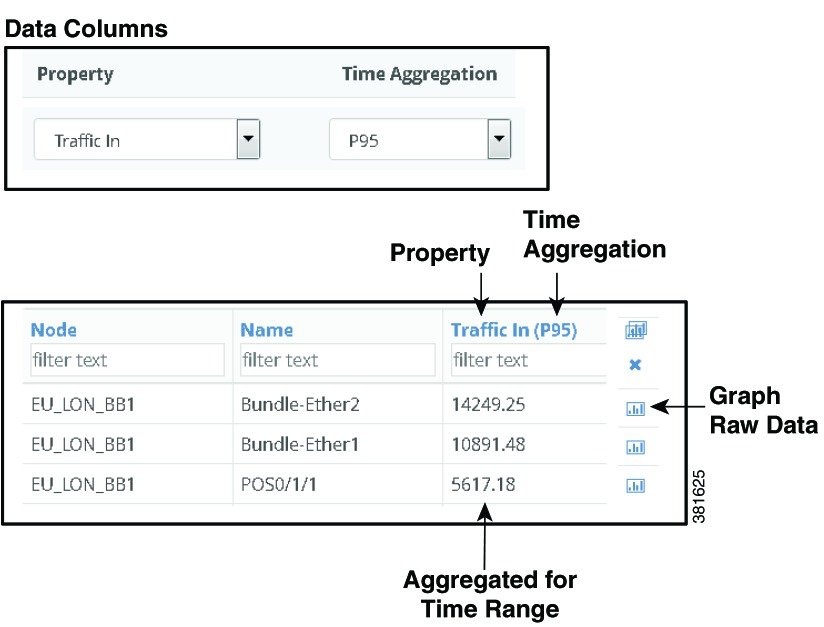
Example: Example Ad Hoc Report shows the output for aggregating P95 Traffic In for interfaces connected to the EU_LON_BB1 node. Interface Bundle-Ether2
(row 1) has 14,249.25 Mb of P95 traffic for the last three months.
Figure 1. Example Ad Hoc Report
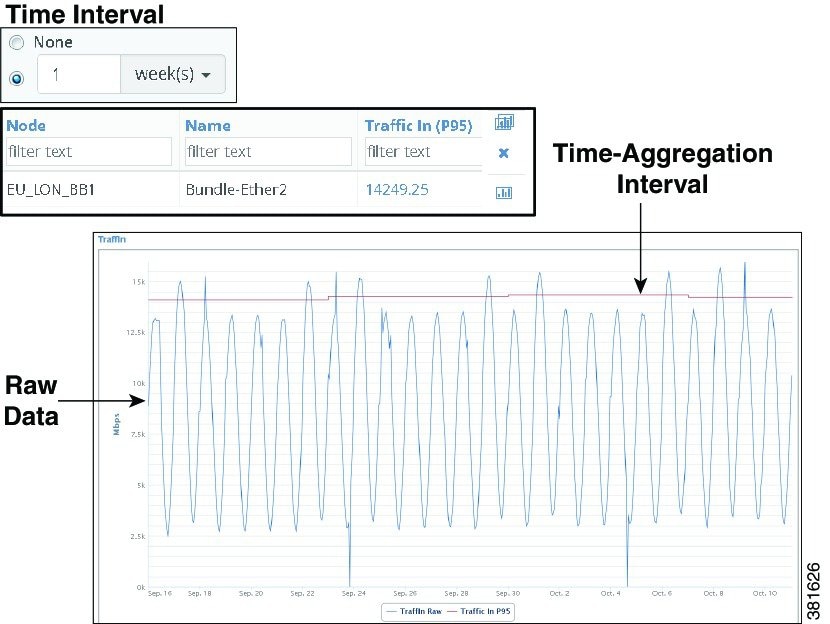
Aggregating by Time Intervals
Each combination of property and time aggregation value can be aggregated by time intervals ranging from hours to years. This
broadens the possibilities for how you view the data. For example, you can report on the average number of dropped packets
for the last six months (Time Range), and aggregate those averages on a weekly basis (Time Interval). Sorting the Dropped
Packets Out column would then show the most problematic interfaces. Another example would be to create yearly reports on a
quarterly basis.
These intervals are viewable as graphs. You can graph the time-aggregation value by clicking the aggregation value, or you
can graph both the raw data and the time-aggregation interval by clicking the graph icon.
Example: Example Ad Hoc Report with Graphed Time Aggregations Intervals extends the report created in Example Ad Hoc Report. Here, each property and time aggregation is further aggregated into a one-week time interval. The difference is that the
graph now shows the P95 aggregation applied to one-week increments across three months. By looking at these increments you
can see that while the raw data fluctuations, the traffic is very steady on a per-week basis.
Figure 2. Example Ad Hoc Report with Graphed Time Aggregations Intervals
Graphing Percentage Growth
Ad hoc reports let you determine and graph the percentage of growth for any high-frequency property over a specified time
range. The resulting data is based on time aggregations of the raw traffic data (for example, average traffic per day). The
report tables provide additional information, such as the number of aggregated objects on which the trending is computed.
They also list the percentage at which the traffic is growing or shrinking.
One potential use for the percentage growth time aggregation would be to identify how fast your traffic is growing so you
can plan for increasing capacity in the future, or whether it is declining, which could be an indication of a diminishing
market or service.
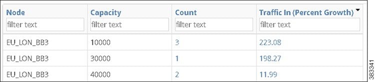
Example: Example Ad Hoc Report of Percent Growth shows the output of an ad hoc report that was grouped by node and then by capacity. The time range was 6 months, and the
growth computation was based on the daily maximum traffic. Sorting on Traffic In (Percent Growth) shows that the EU_LON_BB3
node with 10,000 Mbps capacity had the largest percentage growth in the last 6 months at 223.08 percent.
Data Columns—Apply the time aggregated operation to the associated property. The selected property and time aggregation combination
defines the output columns for the report. Defining each Data Column is a two-step process.
- Add or delete properties, as needed.
– To add a property, click the Plus icon.
– To delete a property, click the Trash Can icon.
For each selected property, identify how you want the data time aggregated for the report time range. See Time Aggregation Options. If you specify Percent Growth, you must further identify how you want this growth calculated. See Percent Growth Options.
Time Aggregation Options
Time aggregation operations vary, depending on the selected object as follows.
Change Count—Number of times the value changed.
Count—Number of times the data was collected during the specified time period.
P99, P98, P95, P90, P85, Maximum, Minimum, Average—Time aggregation computations based on these values.
Last—Last value in the specified time interval.
Percentage Growth—Computation of the percentage of growth.
Percent Growth Options
WAE Live first calculates the trend at which the property value is moving (its direction and frequency), and then uses this
trend to determine the percentage of growth. Set the following parameters to determine how this percentage is calculated.
Interval— The aggregation basis for the percentage: P99, P98, P95, P90, P85, Maximum, Average, or Minimum.
Per—The aggregation interval that is applied to the raw data before calculating the percentage of growth. This interval must
be less than the report time range.
Trending Algorithm—Algorithm used to compute the percentage of growth. Both the calculation and the graph differ, depending
on which option you choose. Following is a list of how these graphs are commonly used.
Exponential—Commonly used when data values increase or decrease at a constantly increasing rate.
Linear—Commonly used with linear data that often shows a steady rate of increase or decrease.
Logarithmic—Commonly used when data changes by increasing or decreasing quickly and then stabilizing and leveling.
Power—Commonly used with data measurements that increase at a specific rate.
Optional Tabs
Group By—Aggregate the report results by groups. The Overall option aggregates the results for all objects. For information,
see Configuring and Running Reports.
In the output, you can expand the group to see its objects by clicking the number in the Count column.
Time Interval—Apply the time aggregation operations defined in the Data Columns by time intervals. For more information,
see Aggregating by Time Intervals.
Example: If you choose Traffic as an LSP property in the Data Columns section and P95 as the Time Aggregation operation,
and if you choose 1 week as the Time Interval, the resulting graph shows P95 traffic aggregated on a weekly basis (one data
point per week, which is the P95 value of Traffic over that week).
Example: Ad Hoc Data Aggregation
If one plan file is generated per hour, then each day is comprised of 24 raw data points. If you run an ad hoc report for
maximum LSP traffic for the last 12 weeks, and if you use weekly intervals, the resulting report first aggregates the maximum
LSP traffic for those 12 weeks per object (provided those objects are not grouped). The number of raw data points included
in this aggregation would be 169,344 (84 days * 24 raw data points per day). These aggregated values appear in the table columns.
Additionally, the intervals would be aggregated per week for a total of 168 raw data points per each of the 12 weeks (168
= 7 days * 24 raw data points per day). These intervals are viewable as graphs. For information on how raw data is collected,
see Understanding Objects, Properties, and Data.
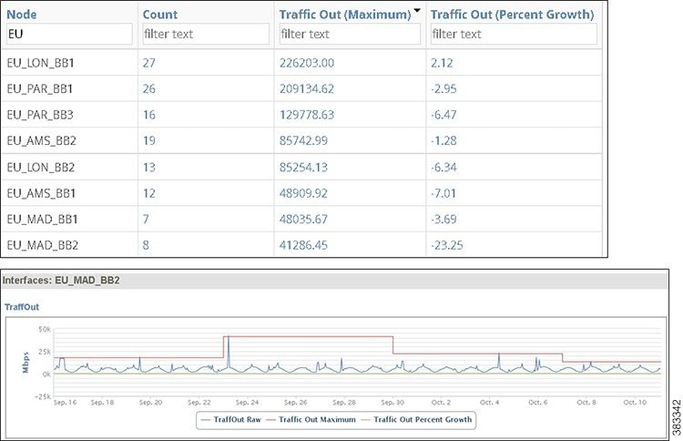
Example Ad Hoc Report
Example Ad Hoc Report shows an example ad hoc report generated to determine the aggregated weekly maximum outgoing traffic per node over the past
year. It also includes a calculation for the percentage of growth The totals in the resulting report are for three months,
and the graphs show the traffic aggregated in weekly increments. Clicking the number in the Count column shows the names of
the interfaces.
The table is filtered by EU nodes and sorted on the Traffic Out (Maximum) column to show which European nodes have the highest
outbound traffic using the given aggregation. For the European nodes with the highest traffic, the table also shows that these
nodes have little fluctuation in their growth, but that all but one has decreasing traffic. The node showing the greatest
percentage of loss is EU_MAD_BB2 at -23.25 percent loss over the last three months. Yet, you can also determine that while
it is showing a percentage growth loss over time, the node has traffic spikes.
Report Configuration
Parameters
Report Type
Ad Hoc
Object
Interfaces
Filter
Node
Time Range
Last three months
Group By
Node
Time Interval
1 week
Data columns
Traffic Out, Maximum
Traffic Out, Percentage Growth based on a maximum interval of 1 day using a linear trend
 Feedback