Release 6.3: Cisco Vision Director Data Integration Guide
Bias-Free Language
The documentation set for this product strives to use bias-free language. For the purposes of this documentation set, bias-free is defined as language that does not imply discrimination based on age, disability, gender, racial identity, ethnic identity, sexual orientation, socioeconomic status, and intersectionality. Exceptions may be present in the documentation due to language that is hardcoded in the user interfaces of the product software, language used based on RFP documentation, or language that is used by a referenced third-party product. Learn more about how Cisco is using Inclusive Language.
- Updated:
- August 5, 2020
Chapter: Designing the Layout of Content Using the Widgets Tool
- Prerequisites for Using the Widgets Tool
- Restrictions for Using the Widgets Tool
- Information About Using the Widgets Tool
- How to Design the Layout of External Content for Display
- Basic Widget Configuration Example
- Menu Board Widget Using DMB Themes Configuration Example
- Create the Menu Theme in the DMB Application
- Create the Data Source for the Menu Theme Widget
- Select the Input Fields to be Mapped to the Menu Board Widget
- Define the Mapping Expressions
- Enable the Data Source
- Create the Menu Board Widget
- Configure the Background Graphic Component for the Menu Board Widget
- Configure the List Components for Each Set of Mapped Data
- Configure the Text Area Components for the Group Headings
- Add the Data Pull Component
- TextToScreen Widget with Merged Generic Data Sources Configuration Example
- Tabular Widget Using List Components for a Transit Schedule Configuration Example
- Custom Welcome Messages Configuration Example
- Table Key/Value Pairs
- Design Message Content and Upload Graphics
- Define Customized Content by Location
- Add Tables for Data Integration
- Configure the System Data Source
- Enable the System Data Source
- Create the Message Widget
- Configure the Background Graphic Component for the Message
- Configure the Custom Text Component for the Message
- Bind the System Data Source to the Text Component
- Add the Data Pull Component and Bind the System Data Source
- Save the Widget
Designing the Layout of Content Using the Widgets Tool
This module describes how to design the layout for display of the data that you have integrated and mapped for output in Cisco Vision Director using the External Content Integration feature. This layout is required to create a content object referred to as a widget, that you can then publish with the standard features of Cisco Vision Director using playlists and scripts for eventual display on TVs.
This module includes the following topics:
■ Prerequisites for Using the Widgets Tool
■Restrictions for Using the Widgets Tool
■Information About Using the Widgets Tool
■How to Design the Layout of External Content for Display
■Menu Board Widget Using DMB Themes Configuration Example
Prerequisites for Using the Widgets Tool
Before you design the layout of external content, be sure that the following requirements are met:
■You have configured the external data sources and mapped the statistics to output fields in the External Content Integration feature.
■The data from the external source is being properly ingested by Cisco Vision Director.
■You have added any graphics that you want to add to the layout by importing them into Cisco Vision Director using Library > Import.
Restrictions for Using the Widgets Tool
Before you design the layout of external content using the Widgets tool, consider the following restrictions:
■The Widgets layout tool can only be used for data sources that have been integrated into Cisco Vision Director using the External Content Integration feature.
■Cisco Vision Director only supports widgets that are created internally using the Widgets tool.
■Up to16 different sessions can be supported in the Widgets tool on a single computer.
■The maximum graphic size supported is 1920x1080, which is also the maximum size of the area supported in the Widgets layout tool.
Note : If you attempt to use a larger graphic in the Widgets tool, it might not be displayed.
■The PicToScreen component has the following restrictions:
–A maximum of 5 images can be rotated using the PicToScreen component. Therefore, up to the first 5 images received from the data feed can be displayed. A new set of images can be retrieved at the next polling interval.
–Selecting Input Statistics and Mapping to Output Fields for Display.
–The TextToScreen component supports binding of text data fields from a source feed. Therefore, the data source must be defined with a title, description, or other text data field for output display.
■The maximum font size is not limited.
For information about installing fonts, see the “Using the Software Manager to Upgrade Cisco Vision Director Software, Language Packs, and Fonts” module in the Cisco Vision Director Software Installation and Upgrade Guide.
■Fonts with style, or weight, or both are currently supported in the Widgets tool.
■The following functions are not supported in the Widgets tool:
–Deleting a group of multi-selected components
■In Cisco Vision Director Release, no widget component—or its contents—should ever extend beyond the canvas region. If even a single component or its contents falls outside the canvas region, then all components of the widget might not display correctly, and all components of the widget could disappear from the screen.
For example, Figure 1 shows an example where a Pic2Screen component bounding box is within the canvas boundary, but the content itself extends beyond that boundary. This will cause problems with the entire widget display.
Figure 1 Widget Component Extending Beyond Canvas Problem
■If you re-import table data in the Table Lookup feature for use in an existing widget, you must redo the data binding in the widget tool.
Caution : If you upload a file that uses a table name of an existing table already imported to Cisco Vision Director, then that table data is replaced. Moreover, if you wanted to change the values used in the same TSV file for use in an existing widget, then you must re-bind your data source in the widget. To avoid this requirement, you can manually edit the table data from within the Cisco Vision Director UI.
Information About Using the Widgets Tool
This section includes the following topics:
■User Interface Characteristics
Components
The Widgets tool includes image-based and text-based components, and a tabular list component. There is also a special Data Pull component for certain environments where a change in the way data is retrieved and processed by Cisco Vision Director is needed.
New components are added to the widget area simply by dragging the object type and dropping it onto the canvas or by double-clicking the component.
The Widgets tool includes the following components:
Standalone Text and Graphic Components
Two component types are intended for data with standalone text or graphics:
The Widgets tool uses the Graphic component to support the addition of standalone images. Each time a graphic component is added to a widget, it is added in numerical order as a Layer on the canvas.
Data Feed Components
Cisco Vision Director Release 3.1 introduced two new component types to support generic data sources and feeds, whose content is either image-based or text-based.
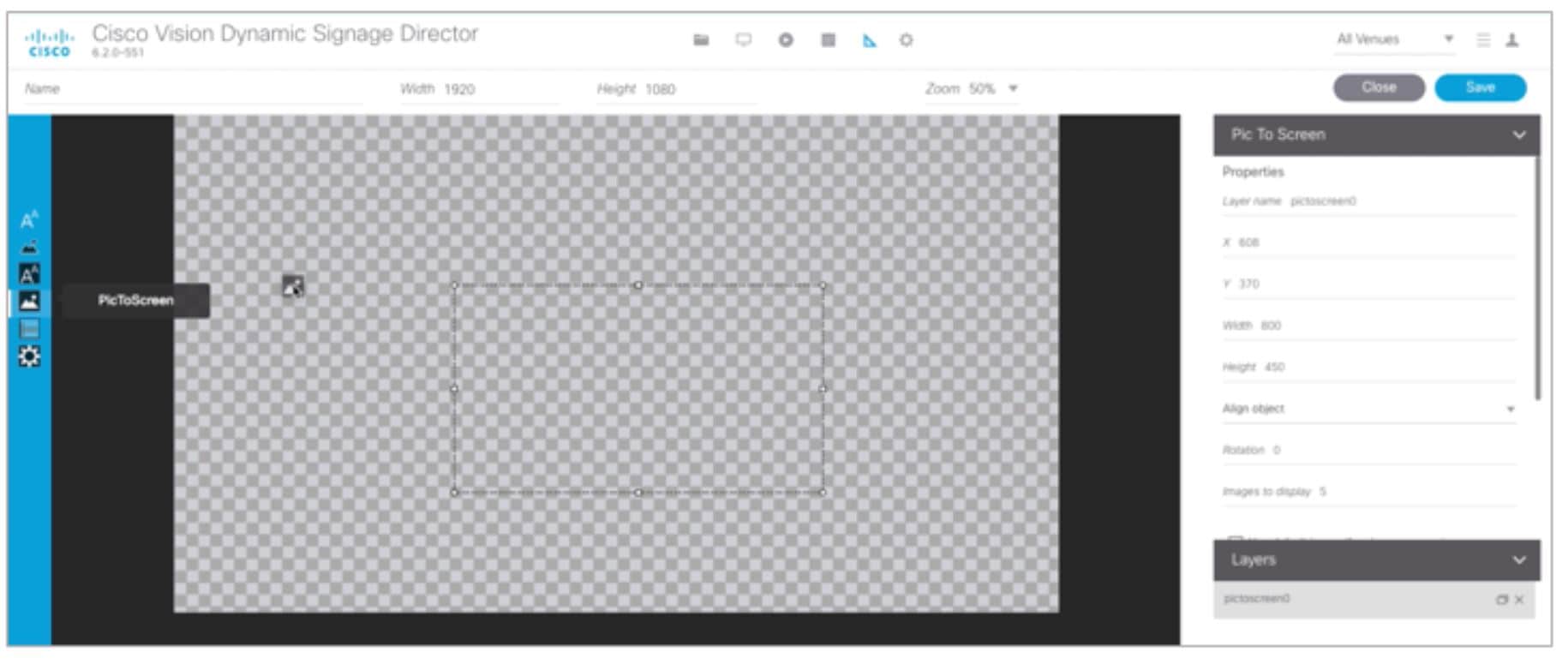
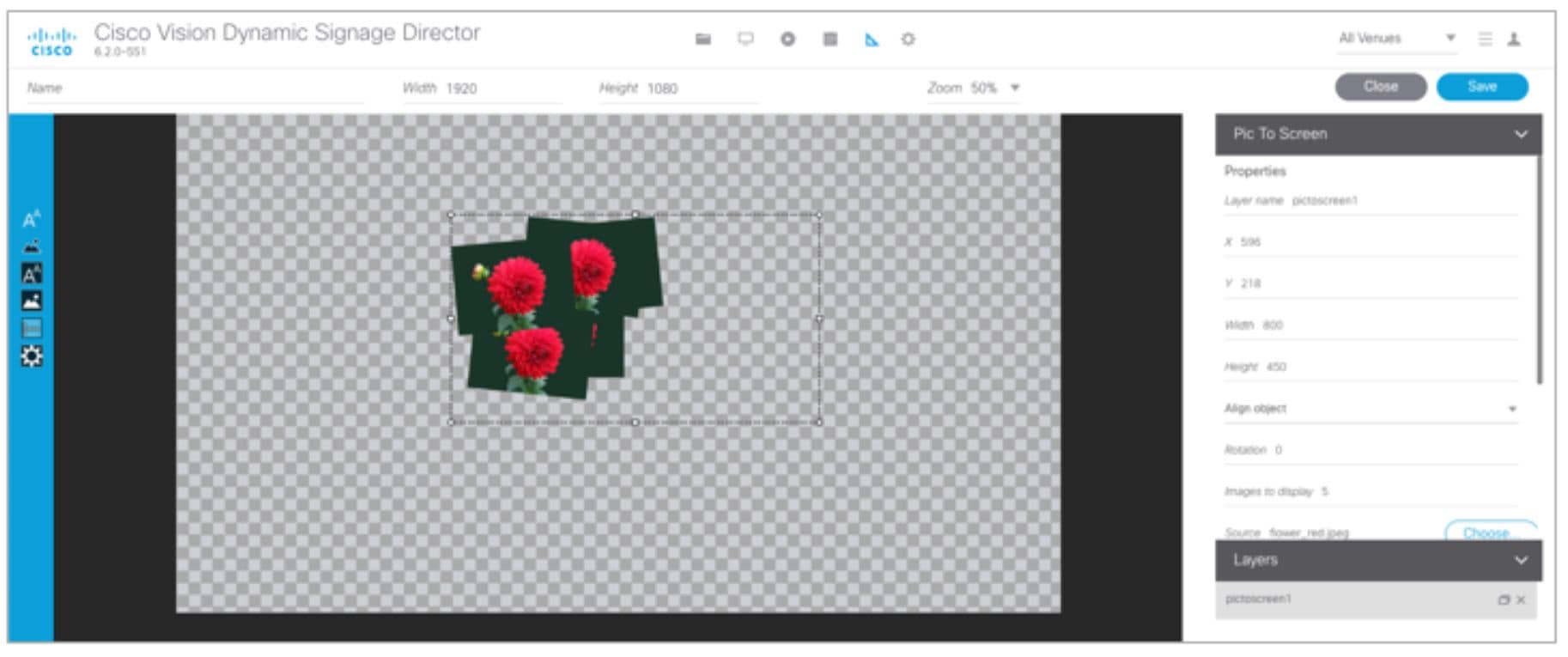
P2S (PicToScreen)
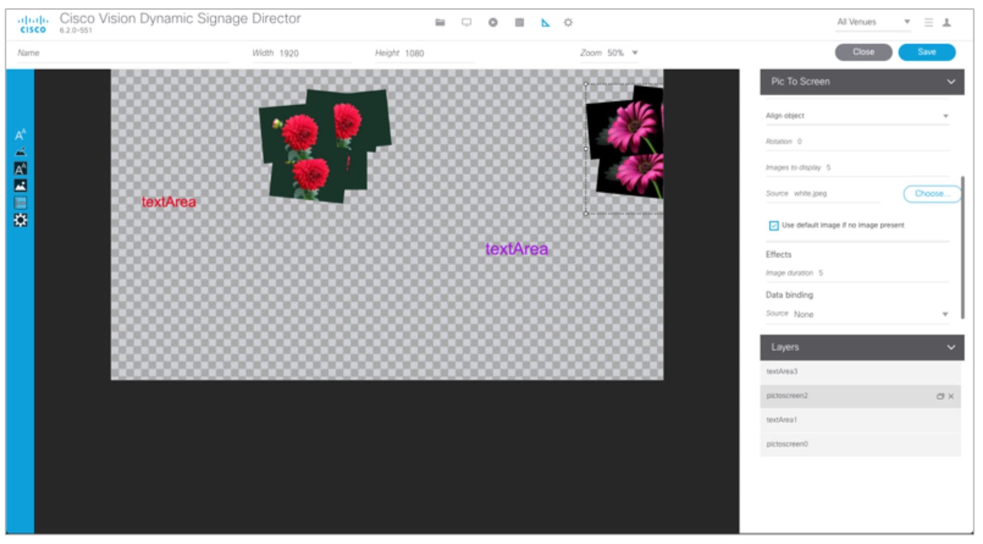
The PicToScreen component supports only image data fields from the data source, and can display up to 5 images from a data feed. The images appear in a fixed overlapping cascade that rotates through the available images from the feed (Figure 2).
Note : The cascading layout of the images cannot be changed. However, you can alter the position and orientation of the top graphic within the Widgets tool.
Figure 2 Example of PicToScreen Widget Display of 5 Maximum Images

Default Images and Display Behavior
Cisco Vision Director has default images that are used as placeholders for any images that cannot be found or when the number of images received does not equal the number defined in the “Images to Display” property of the PicToScreen component (up to 5).
If Cisco Vision Director must insert default images when enough images are not received from the data feed, then only the good images from the data feed are rotated through the cascading presentation. The default images will remain at the back of the stack in the presentation.
The default image is called DefaultImg.jpg and is found in the content library. You can change the default image by uploading your own image into the content library and change the “ContentName” property in the P2S component.
Image Orientation
You can change the position and rotation of the top graphic in the PicToScreen component. However, you cannot control the position or rotation of individual mages within the stack.
T2S (TextToScreen)
The TextToScreen component can support any number of messages from the data feed.
Figure 3 shows an example of a fixed background graphic component, with a TextToScreen component overlay in Figure 4.
Figure 3 Example of TextToScreen Widget Background Graphic

Figure 4 Example of TextToScreen Widget Display

List Component
Cisco Vision Director Release 3.2 introduces the List component, whose content is either image-based or text-based.
The List component can be used to create tables by grouping individual list components side-by-side either vertically or horizontally. The default format for the List component is a horizontal row of two cells. By changing the orientation to a vertical layout, the component becomes a single column of cells.
You can change the number of items in the list by changing the number in the Cells property and each list can be rendered as text or images in the List Render option, among other properties.
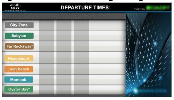
Figure 5 shows an example of a widget created for a transit schedule.
Figure 5 Example of Schedule Widget Using List Components
In this example, there is a Graphic component with a background image at the first layer of the widget (Figure 6). Notice that the route names are built into the fixed graphic on the left side, based on knowledge of the XML content in the data source for the widget, so that the data bound in the adjacent List components correlates.
Figure 6 Example of Schedule Widget Background Graphic
The remainder of the schedule widget uses five single-column list components each containing seven cells/items in a vertical orientation (Figure 7). These lists display dynamic content from a single data source through both field mapping and configuration of the expression editor.
For more information about using List components in a widget, see Configuration Examples.
Figure 7 Example of Schedule Widget Using List Components
Data Pull Component
The Data Pull component is a special component that is only needed in a widget for data sources with the following characteristics:
■Widget data source content is larger than 16 KB.
■The data source content does not require more immediate synchronization across large numbers (100-200) of media players (such as for menu board data).
The Data Pull component changes how the data source is processed to the media player. When using data pull, the media player pulls data source content from Cisco Vision Director. This overcomes the usual 16 KB packet size limitation if multicast is used to push the data source to the media player instead.
Also, in widgets without a data pull component, only specific output fields from the data source are sent using multicast. Widgets with a data pull component pull all output fields in the data source.
Layers
Similar to standard graphics editing applications, each time a Text Area or Graphic component is added to a widget, it is labeled in numerical order (by type) as a Layer on the canvas. Unless reordered, the first component added is at the bottom of the components added to the canvas, and the last component added is the topmost layer. In the user interface, the Layers box also lists the layers in stacking order with the topmost layer at the top of the list. In general, a background image should be at the bottom of the list.
You can reorder the layers by dragging and dropping them into a different order in the Layers box of the Widget tool.
The first graphic component added to the widget is identified as “graphic 1,” and the first text area is labeled “text area 1.” Components are numbered sequentially as they are added. Therefore, if you delete a component, that component number is not replaced.
Properties and Effects
The Properties panel allows you to set the characteristics of a component including explicitly setting its size, location, and rotation on the canvas. Depending on the component type, some additional Properties and Effects are available:
■Data Pull Component Properties
■List Component Properties and Effects
■Standalone Text Area Component Properties
■Standalone Graphic Component Properties
Data Pull Component Properties
Table 1 describes the property options available for the Data Pull component. You can configure the media players to pull data one time, or you can set an interval of time to repeat pulling data source content from Cisco Vision Director.
Note : Although there are dimensional properties for the Data Pull component in the widget, they really do not need to be set.
List Component Properties and Effects
Table 2 describes the property options that can be applied to List components.
TIP : Due to the number of the Properties and Effects options for the List component, you might need to use the resize handle at the top of the panel and/or the scroll bar to see all options.
Table 3 describes the effects that can be applied to List components.
Standalone Text Area Component Properties
In addition to setting the size, location, and rotation on the canvas for Text Area components, you also can specify the character string for the component, and select a font size and color.
Table 4 describes the property options that can be applied to standalone Text Area components.
Standalone Graphic Component Properties
In addition to setting the size, location, and rotation on the canvas for Graphic components, you can import an image and also specify that it retain the dimensions of the original image.
Table 5 describes the property options that can be applied to standalone Graphic components. No effects are supported for Graphic components.
PicToScreen Component Properties and Effects
Table 6 describes the property options and Table 7 describes the effects that can be applied to PicToScreen components.
Length of time (in seconds) to display the current set of images. |
TextToScreen Component Properties and Effects
Table 8 describes the property options and Table 9 describes the effects that can be applied to TextToScreen components.
|
|
|
|
|
|
|
|
Data Binding and Preview
After you have mapped the output fields for an external data source, you can bind that data to either type of component in a widget and see a preview of that live content feed. If you re-import table data to the system for use in an existing widget, you need to repeat your data binding for the widget.
Note : Live data is polled for preview every 15 seconds in the Widgets tool (including for the Data Pull component). There can be a slight delay before you see an update of the content within a component. This polling interval is for preview only and is not the same polling interval used in the data source configuration.
Only certain data fields are supported for the PicToScreen and TextToScreen components. For more information, see Restrictions for Using the Widgets Tool.
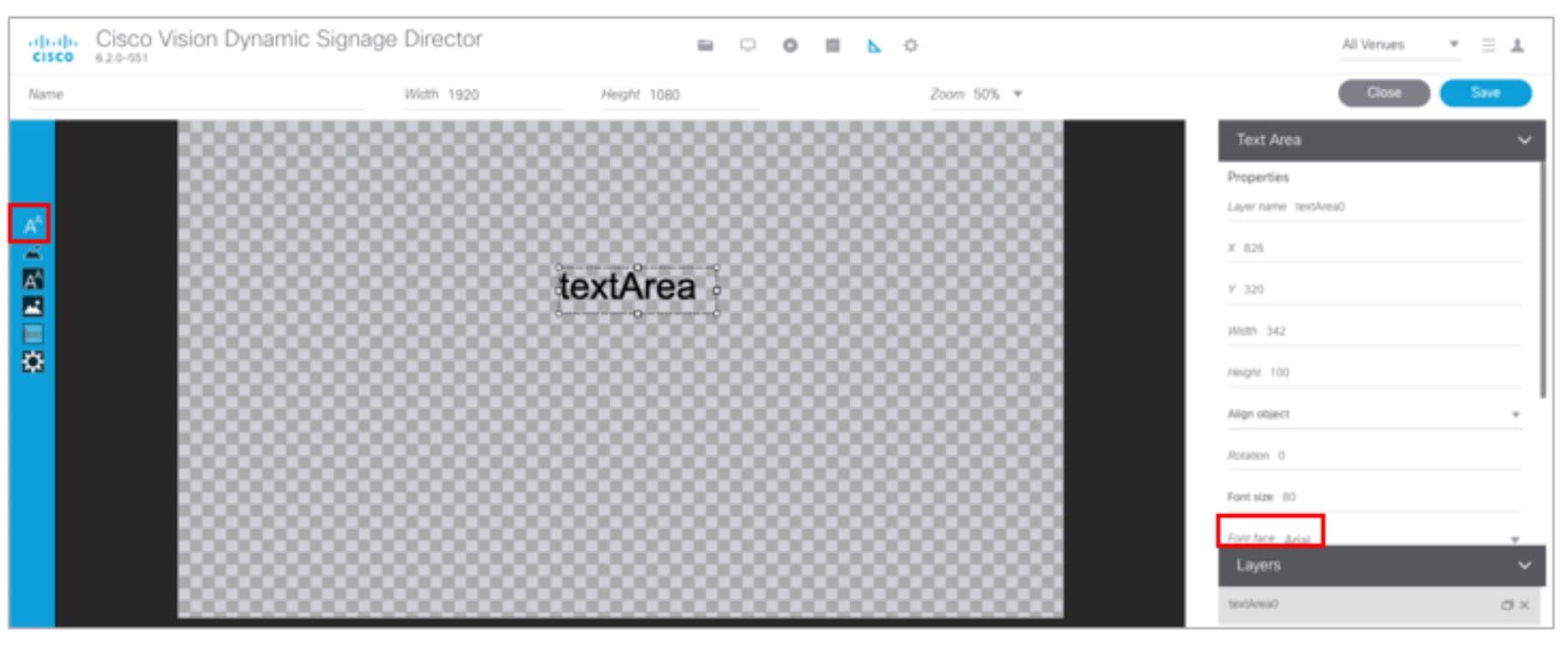
User Interface Characteristics
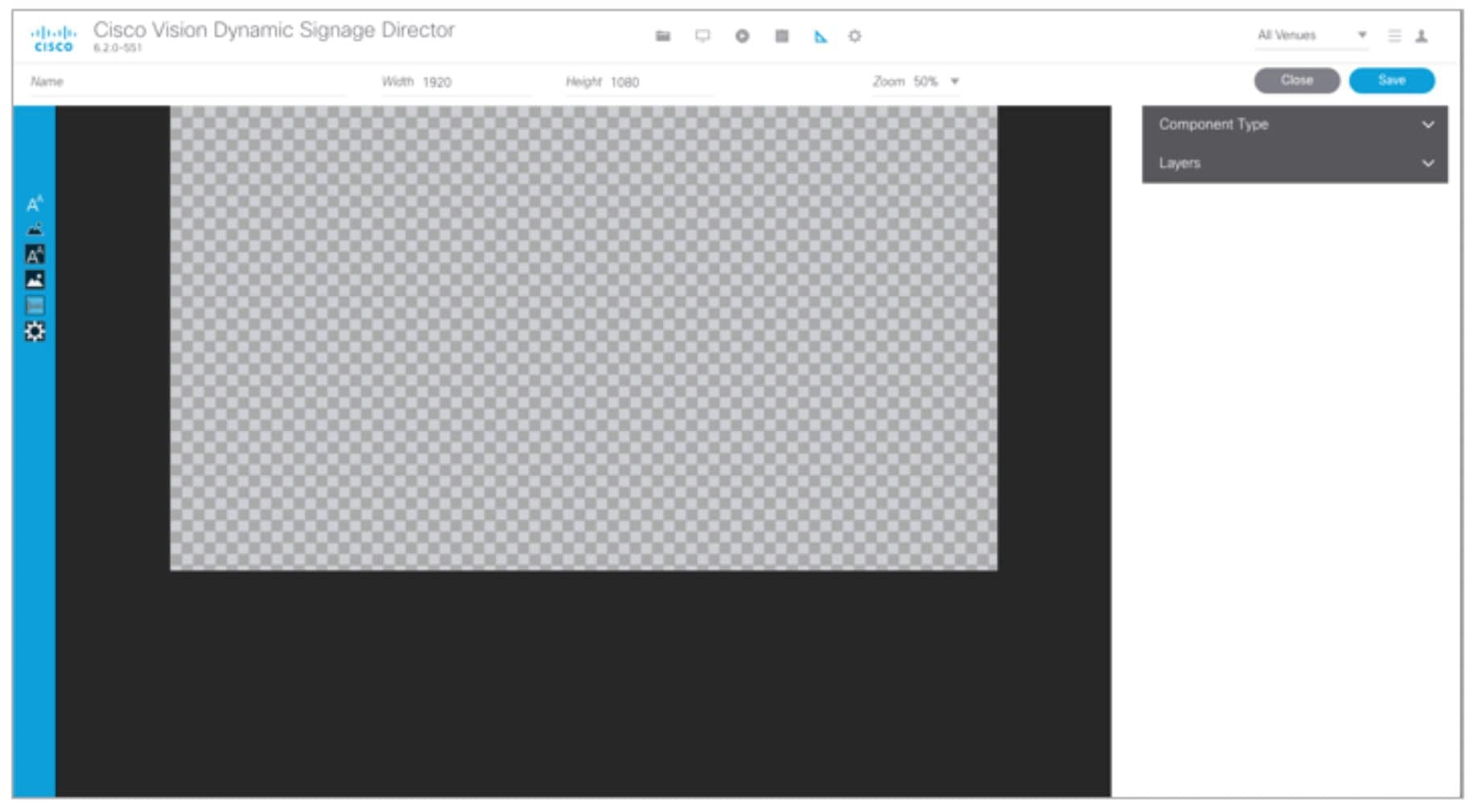
Figure 8 shows the areas of the user interface for a new widget.
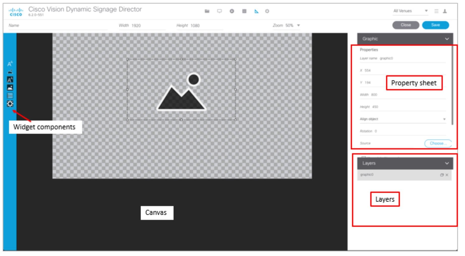
The Widgets tool interface supports some of the following functions and characteristics:
■Widget Name, Size, and Zoom options along the top
■Widget Tool Bar with six tools on the left panel
■Property Sheet that includes: X, Y, Width, Height, Align, (Figure 9) Rotation, Font, Cell parameters, and Grid parameters (Figure 10)
■Layer Sheet that includes: Layers, Menu, and Venue parameters
■Multi-selection of components using standard Control key sequences to move components as a group.
■Showing or hiding the bounding box of a component
■“Zoom-to-fit” function by double-clicking the zoom knob
■Change the widget dimensions by double-clicking the widget size in the upper right of the screen
Figure 9 Widget Property Sheet Parameters (in 3 views)
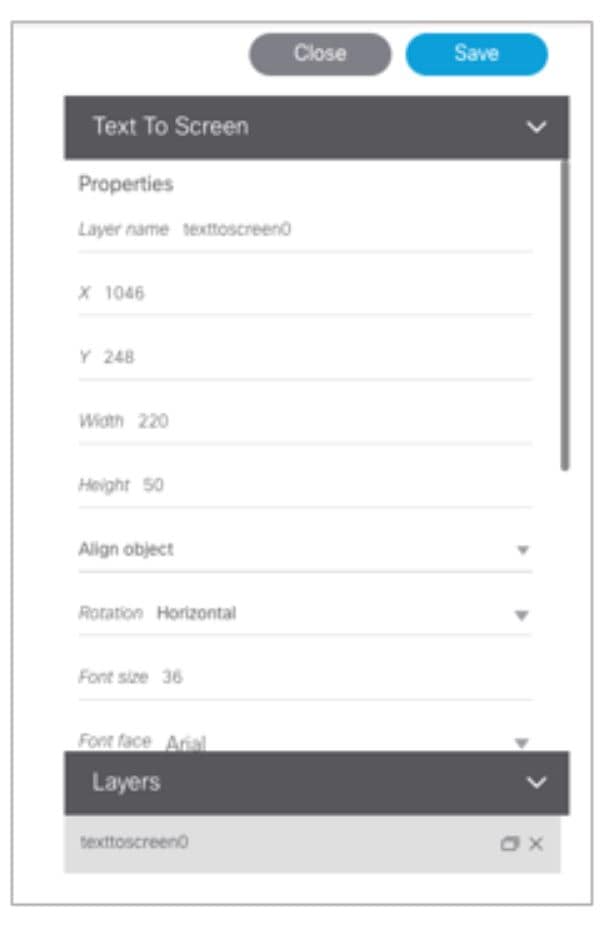
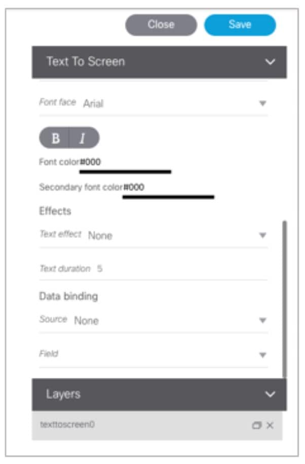
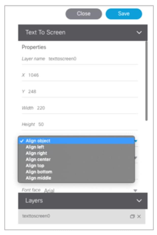
Figure 10 Widget Property Sheet-2 (in 2 views)
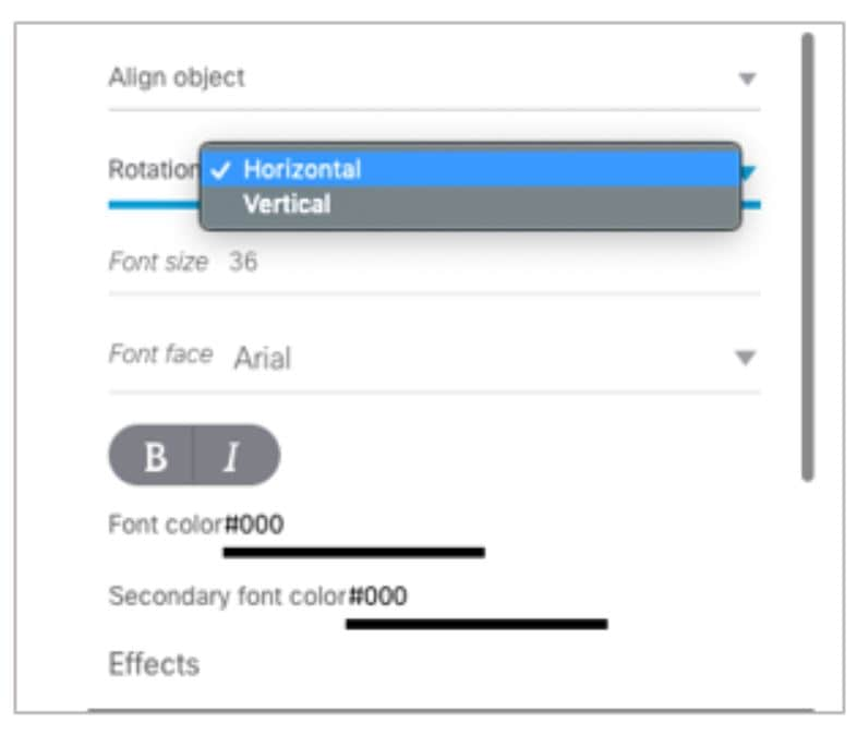
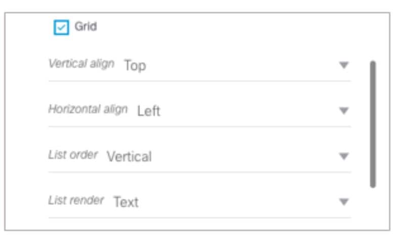
Figure 11 Widget Layer Parameters
How to Design the Layout of External Content for Display
This section includes the following tasks:
■Resizing and Rotating Components
■Working with Large Data Sources
Accessing the Widgets Tool
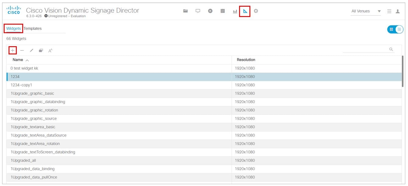
1. Log into Cisco Vision Director as an Administrator.
2. Click Designer > Widgets. Or, click Widgets from the Asset Library left panel.
Creating New Widgets
You can create a new widget when you first access the Widgets tool or you can create a new widget from within the tool.
To create a new widget from within the tool:
1. From the menu bar in the Widgets tool, click Add (Figure 12).
2. In the Name box, type a name for your new widget.
3. Specify the size of the widget.
The tool displays a box of the size that you created, with the dimensions that you specified (Figure 13).
Working with Images
Adding Standalone Images
Images can be added as a background to your layout in the Widgets tool and they also can be bound to a data field using the External Content configuration, such as to add a team logo to a score field that will appear in the widget.
To support the addition of a graphic bound to a particular external source data field, see Modifying the Output Format of a Statistic.
The Widgets tool uses the Graphic component to support the addition of images as a background or in other places on your canvas.
Before you can add an image to a widget, import the image file into Cisco Vision Director by going to Library > Import to select and open a file. In the Import Content dialog box, specify any options and click Upload.
1. Open or create the widget where you want to add an image.
2. In the component banner, select the Graphic component and drag and drop it onto your widget canvas (Figure 14).
Figure 14 Drag and Drop Graphic Component on Widget Canvas
3. To add an image, be sure that the graphic component where you want to add the image is selected.
4. In the Select Image dialog box, highlight the image that you want to add and click Select.
The image is added and scaled to the size of your graphic component box (Figure 15).
Figure 15 Image Added to Graphic Component
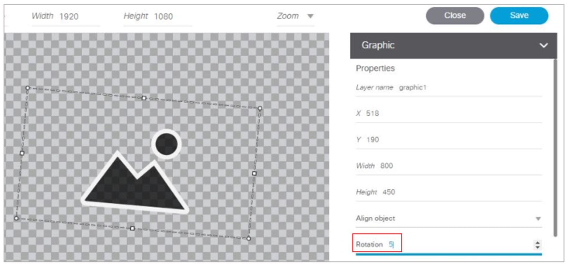
Resizing and Rotating Images
Images will automatically scale to the size of the graphic component box in the widget.
TIP : To find the size of your image file, use the List view for your images in Library. Select your image and look at the size in the Dimension field in the metadata box.
You can scale the graphic to its original size after you add it, or if you modify the image size in the widget, you can revert back to its original size using the “Use original image size” option, which is recommended.
Figure 16 shows the options available on the Properties panel for a graphic component and displays the different bounding box handles that can be used to modify the size of a component box.
Figure 16 Graphic Component Properties Panel and Bounding Box Handles
You can modify the size and position of an image in the following ways:
■Explicitly setting values on the Properties panel.
■Selecting the bounding box and using the handles to modify it.
■With the graphic component selected, select the “Use original image size” checkbox to revert the image to its original size when imported.
For more information, see Resizing and Rotating Components.
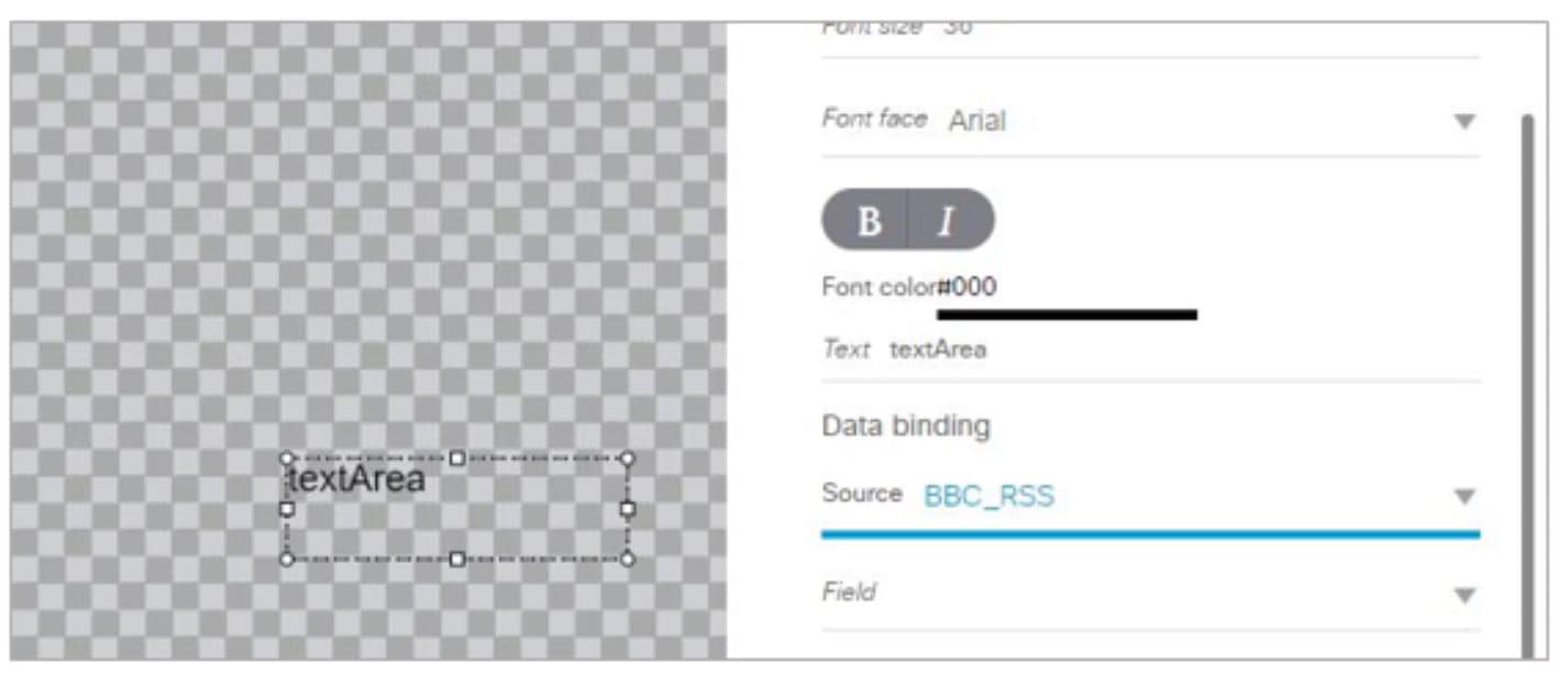
Adding Text Areas
A text area component is added to a widget in the same way as a graphic component, but with some different properties. A text area supports a character string, and font size and color selection.
The default font is Arial. You can specify other fonts for the widget if you have installed custom fonts for Cisco Vision Director using the Software Manager.
To add a text area to a widget:
1. Open or create the widget where you want to add the text area.
2. In the Widget banner, select the Text Area component and drag and drop it onto your widget canvas.
3. In the Properties panel, type the character string for the box, select the font size, and color (Figure 17).
Figure 17 Text Area Component Properties
4. Resize or position the text area as needed. For more details, see Resizing and Rotating Components.
Resizing and Rotating Components
You can resize and rotate both Text Area and Graphic components in the following ways:
■Change the component location:
–Select the component and manually drag it to the location that you want on the canvas.
–Specify the x/y horizontal and vertical values directly in the Properties panel.
–Select and drag a handle on the component’s bounding box to enlarge or reduce the component size. If using a handle on a side of the box, only that dimension is changed. If using a corner handle, both dimensions of the box are changed.
–Shift+Click on a corner handle to resize the box proportionally.
–Specify the width and height values directly in the Properties panel.
Figure 18 identifies the bounding box handles that you can use to resize components. To rotate a component, use the Properties panel.
Working with Large Data Sources
Cisco Vision Director truncates a data packet to 16 KB due to packet size limits on the DMP, so usable data plus overhead cannot exceed 16 KB under normal operation. The 16 KB limit is for all external data referenced in a script (possibly by multiple widgets).
If you are working with certain data sources larger than 16 KB and whose data does not need more immediate synchronization across large numbers of (100-200) media players (such as for menu board data), add the Data Pull component to your widget.
To disable multicast push of a data source in a widget and enable data pull for all fields:
1. Open or create the widget where your large data source is bound.
2. In the Widget banner, select the Data Pull component and drag and drop it onto your widget canvas.
3. In the Properties panel, do one of the following to specify the frequency with which you want to get the data source from Cisco Vision Director:
–Click the Pull Once checkbox to do a one-time data pull from the data source.
–In the Pull Interval (seconds) option, specify the number of seconds to wait before pulling data again from the data source.
The Data Pull component is not a presentation component and it will not appear on the display.
It does have dimensions and coordinates but they are not necessary to be applied unless you simply want to move or resize the component to simplify your view of the rest of the widget on the canvas.
Binding External Data to a Widget
The widget supports the binding of external data to a text area component so that you can display dynamic output fields, such as game periods, scores, and so on from an external source.
Note : If you add a text string to the component, it will be replaced by the real-time data from the output field that you specified in the Data Binding panel once the widget is published.
Before you can bind external data to a widget, you must have configured your external data source and mapped the output fields by going to Configuration > Data Integration > Field Mapping tab. For more information, see Overview of Data Integration in Cisco Vision Director.
To bind external data to a widget:
1. Open or create the widget where you want to add the text area.
2. In the Widget banner, select the Text Area component and drag and drop it onto your widget canvas.
3. In the Properties panel, select the font size and color. Optionally, specify a character string if you want to temporarily see some content in the component while the widget is open.
The font size and color will be applied to the bound data.
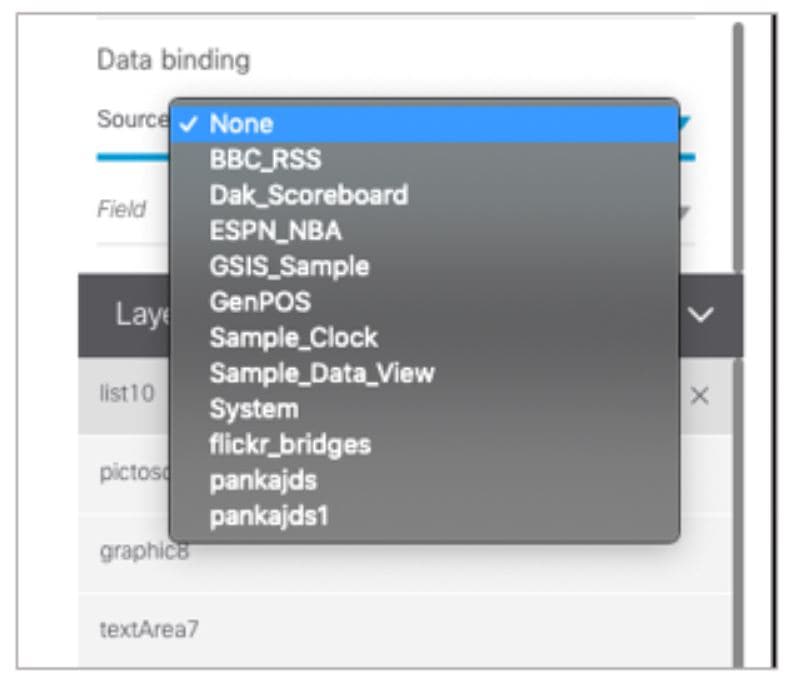
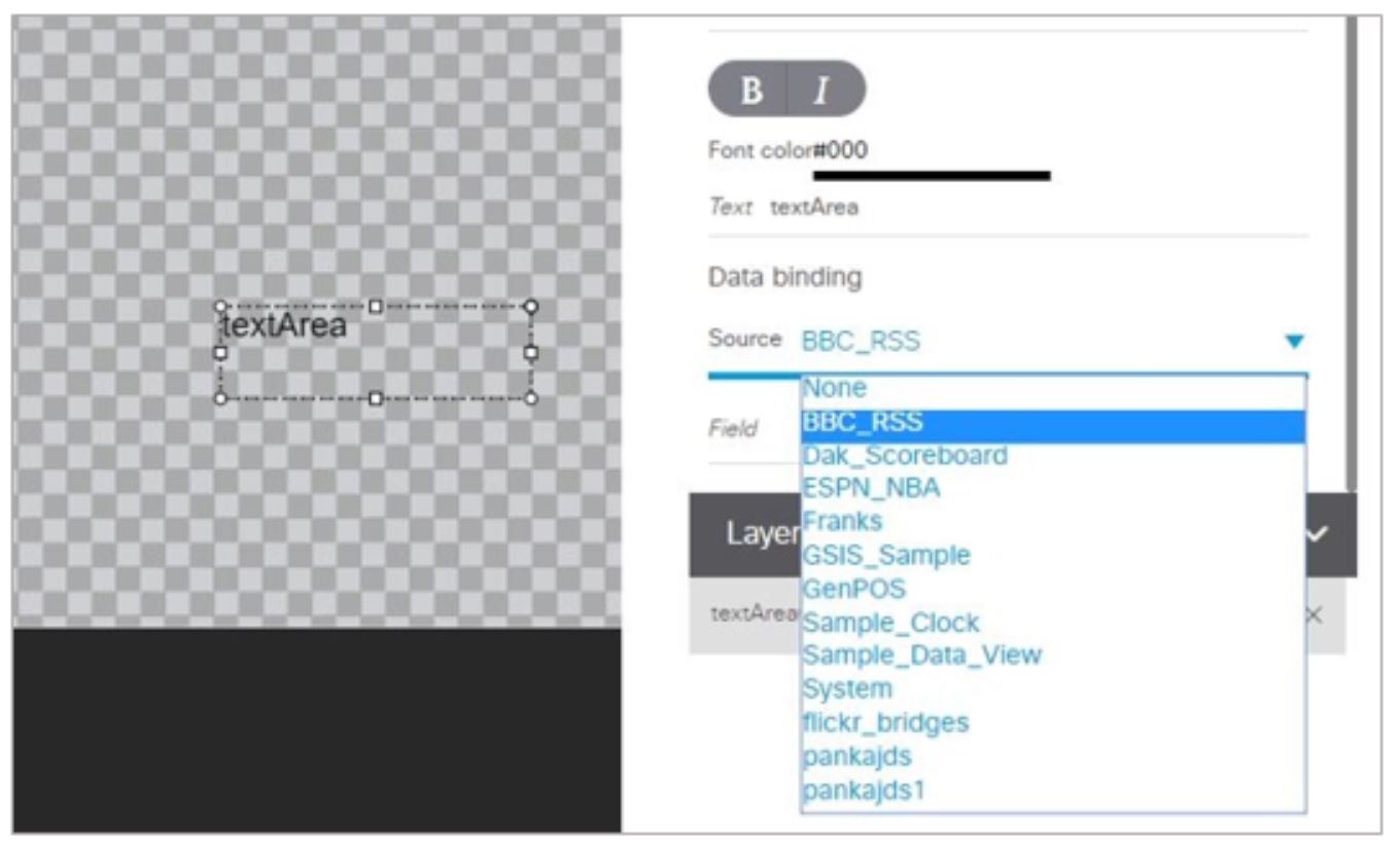
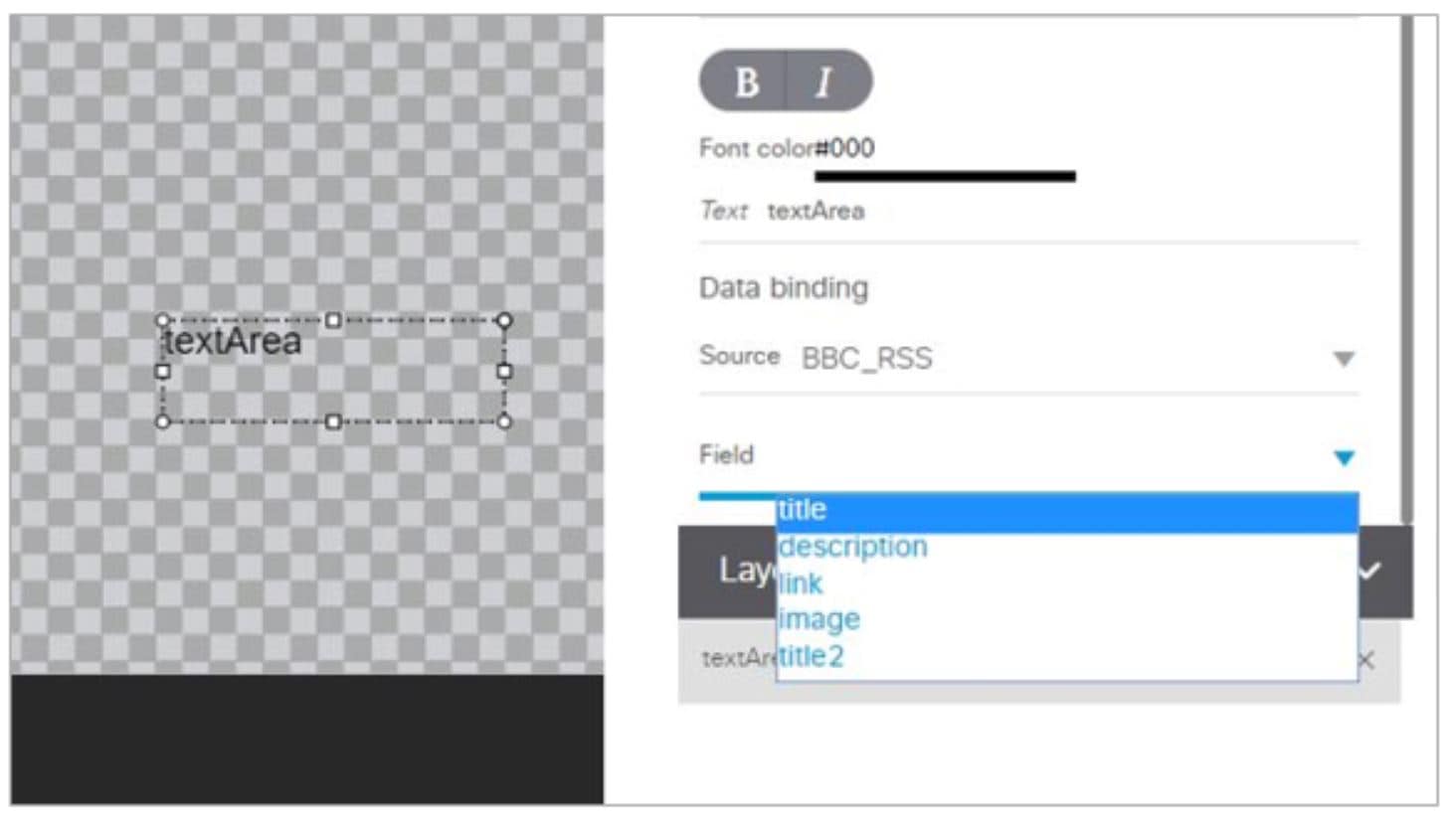
4. In the Properties panel, go to data binding section, click on Source and open the drop-down list (Figure 19).
Figure 19 Accessing the Data Source List
5. Click the drop-down list and select the data Source from which you want to bind data. Use the scroll bar to reveal all data sources as necessary (Figure 20).
Figure 20 Selecting the Data Source
6. Click the drop-down list and select the data output Field you want to display in the text area component (Figure 21).
Figure 21 Selecting the Data Field
Modifying Existing Widgets
This section includes the following tasks:
Changing the Size of a Widget
To change the size of a widget:
1. Open the widget whose size you want to change.
2. From the Edit menu, select Widget Dimension.
3. In the Change Widget Dimension dialog box, specify the new width and height values.
Deleting Widgets
1. From the Designer landing page, select Widgets tab.
2. Select the widget that you want to remove.
3. Click Remove icon (–) from the action bar. A confirmation dialog box displays.
Renaming Widgets
1. From the Designer landing page, select Widgets tab.
2. Select the widget that you want to rename.
3. Click Rename (AA). The widget name is changed to an editable box. A Rename pop-up displays.
Configuration Examples
This section includes the following topics:
■Basic Widget Configuration Example
■Menu Board Widget Using DMB Themes Configuration Example
■TextToScreen Widget with Merged Generic Data Sources Configuration Example
■Tabular Widget Using List Components for a Transit Schedule Configuration Example
■Custom Welcome Messages Configuration Example
Basic Widget Configuration Example
Note : This example demonstrates use of the Text Area and Graphic components with data binding. The figures are based on the original interface for the External Content Integration feature. Therefore, some of the figures do not reflect all of the latest available components in the interface.
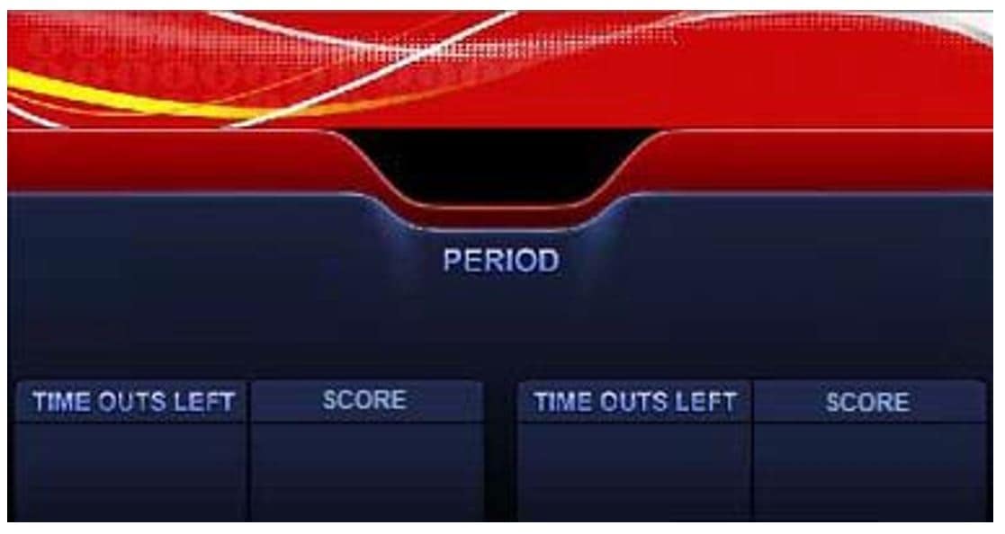
This section shows a basic widget configuration example to bind external data for an OES Ice Hockey Scoreboard data source. The example uses an image background (Figure 22) that creates static headings for Period, Time Outs, and Score, with companion text area components that will be created as layers on top of the background.
These text areas will be positioned beneath the background image headings and will have real-time data bound to them to appear in the widget once it is published.
Figure 22 Image Background for Scoreboard Widget
To create a widget and bind data to it:
1. From the Designer landing page, select Widgets tab.
2. Click the Add (+) icon in the action bar.
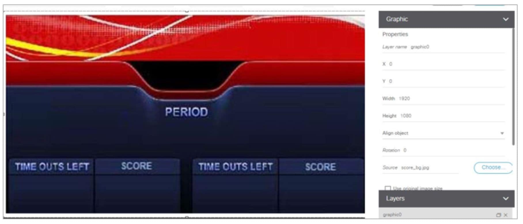
3. From the Widget banner, select the Graphic component and drag and drop it onto your widget canvas.
4. With the graphic component selected, go to the Properties panel.
5. Go to Source section and click Choose. A Select Image dialog box displays.
6. Click on the background image that you want to add and click Select. The image is added and scaled to the size of your graphic component box.
7. In the Properties tab, specify the following values (Figure 23):
Figure 23 Background Image Added to Graphic Component
8. Create two new text area components to add “HOME” and “GUEST” as the specified text string positioned as layers on top of the background graphic component (Figure 24).
Figure 24 Addition of Home and Guest Text Areas
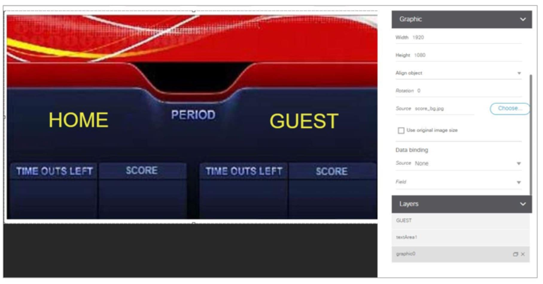
a. Drag and drop the Text Area component onto the background graphic.
b. In the Properties panel, specify the following values:
c. Select the handles on the text area box and expand its boundaries enough to reveal the text.
d. Select the text area component and drag it to the left side of the background graphic over the Time Outs Left and Score fields.
e. Repeat steps a–d using “GUEST” text and drag the component to the right side of the background graphic.
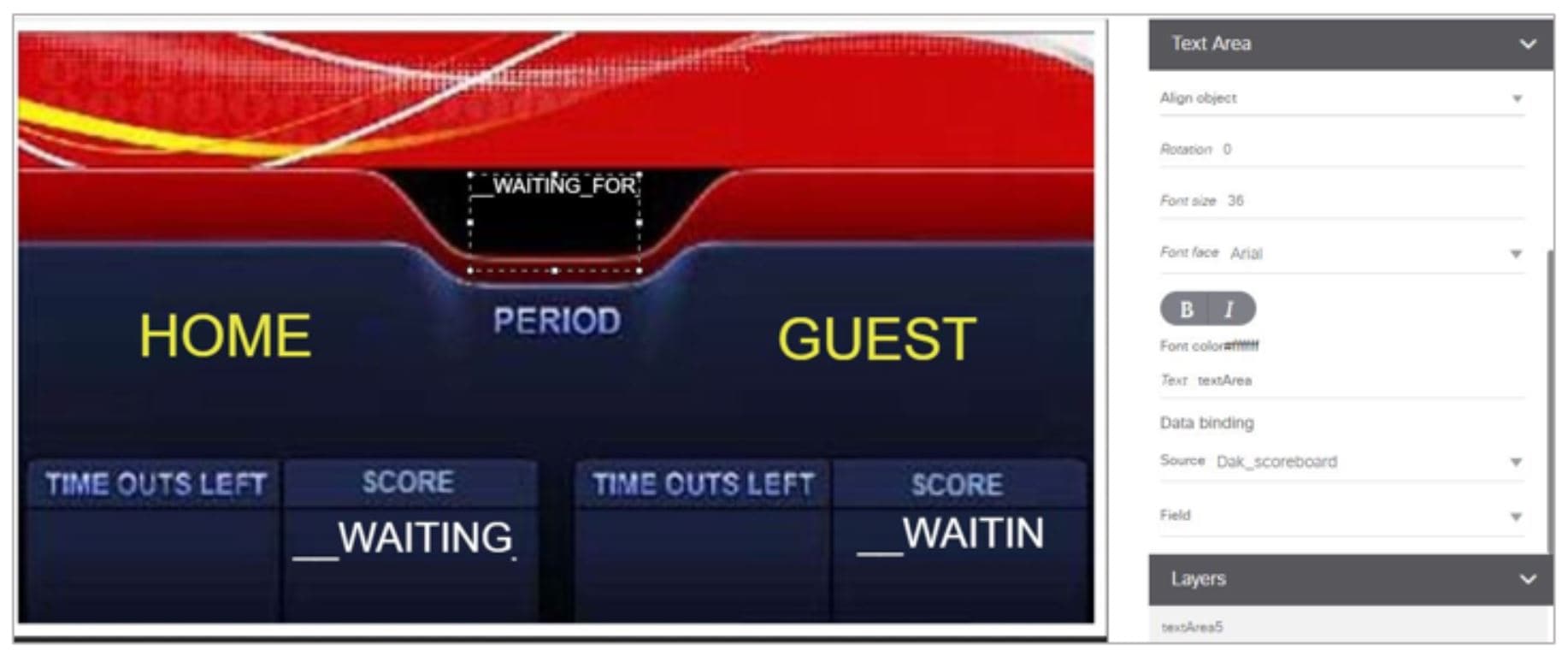
9. Add Text Area components to bind data for Period, Time Outs, and Score areas for both teams:
a. Drag and drop the Text Area component onto the background graphic.
b. (Optional) Zoom in as needed to see the component better.
c. Position and resize the component beneath the heading for which you are going to bind corresponding data.
d. (Optional) Add text to temporarily identify what data will be in the box, such as “period_data.”
e. In the Data Binding panel, select the OES: Ice Hockey, Scoreboard data source and the period data field (Figure 25).
Figure 25 Period Data Field Binding for OES Ice Hockey Scoreboard Source
f. Repeat steps a–e for all other data fields that you need to bind.
Menu Board Widget Using DMB Themes Configuration Example
This advanced example shows how to create a menu board widget by configuring a data source for a menu board that uses a menu theme that you have defined in the Cisco Vision Director Dynamic Menu Board (DMB) application. The benefit of using a DMB theme for your widget-based menu boards is that it allows you to more easily show categories of items on your menu.
To successfully configure a menu board widget you must be familiar with the content and format of your menu theme data to be mapped into the List components. If you are using a standard menu theme from DMB, see the “Appendix A: Default Menu Theme Reference” module of the Cisco Vision Director Dynamic Menu Board and Store Configuration Guide as a useful reference.
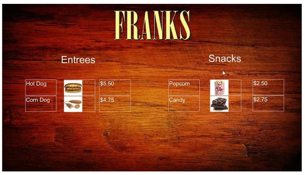
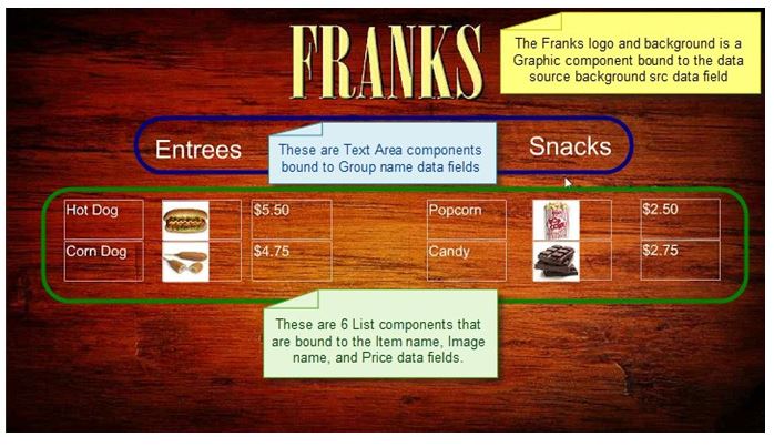
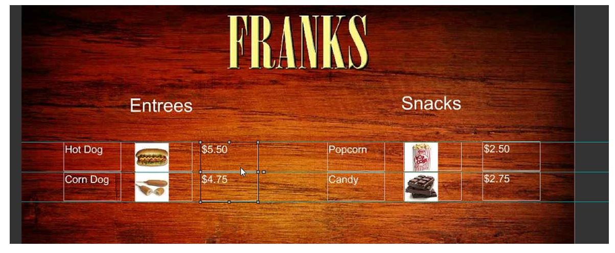
Figure 26 shows the menu board widget described in this configuration example.
Figure 26 Frank’s Menu Board Widget Example
This example highlights the following functionality in the Data Integration Feature:
■DMB menu theme data source configuration.
■Selection of output fields for the background image, column headings, menu items, and menu images.
■Indexing elements in the XML data using the XPath expression editor to select the fields that you want to include on your menu board.
Task List
■Create the Menu Theme in the DMB Application
■Create the Data Source for the Menu Theme Widget
■Select the Input Fields to be Mapped to the Menu Board Widget
■Define the Mapping Expressions
■Configure the Background Graphic Component for the Menu Board Widget
■Configure the List Components for Each Set of Mapped Data
Create the Menu Theme in the DMB Application
Before you can use a menu theme as a data source, you must create the theme in the DMB application, or use one of the default themes. For more information about creating menu themes, see the Cisco Vision Director Dynamic Menu Board and Store Configuration Guide.
In this example, the Franks default DMB menu theme is used as the data source for the menu widget. Figure 27 shows the layout details for the Franks theme.
Figure 27 Franks Layout—Default DMB Menu Theme

As a reference for the Data Integration configuration, you can view the XML data for your menu theme from the DMB application. Roll over the action icons to find the X for XML.
Figure 29 shows an excerpt of this information from that document for the Franks layout.
Create the Data Source for the Menu Theme Widget
The Theme Name for the data source must match the name of the theme that you are using in the DMB application. Figure 28 shows creation of the Menu Theme data source type using the Theme Name “Franks” for our example in the Dynamic Signage Director UI.
Figure 28 Menu Theme Data Source Configuration
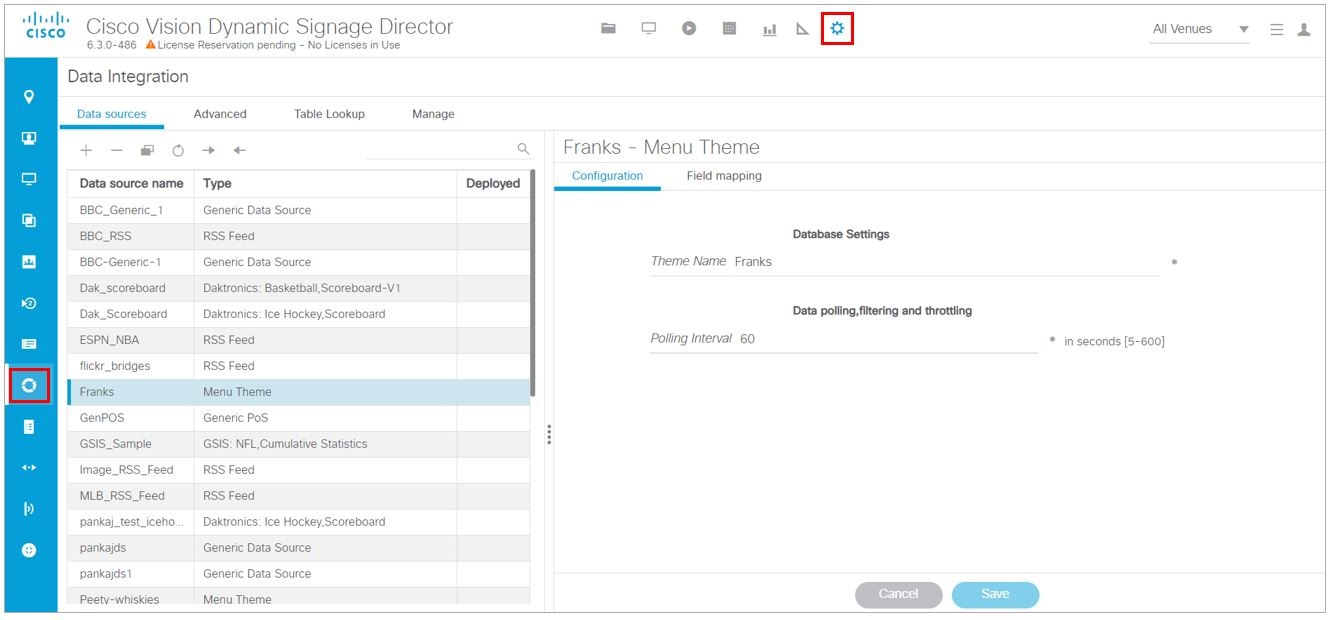
For more information about creating menu theme POS data sources, see Configuring the Connection to a Menu Theme POS Data Source.
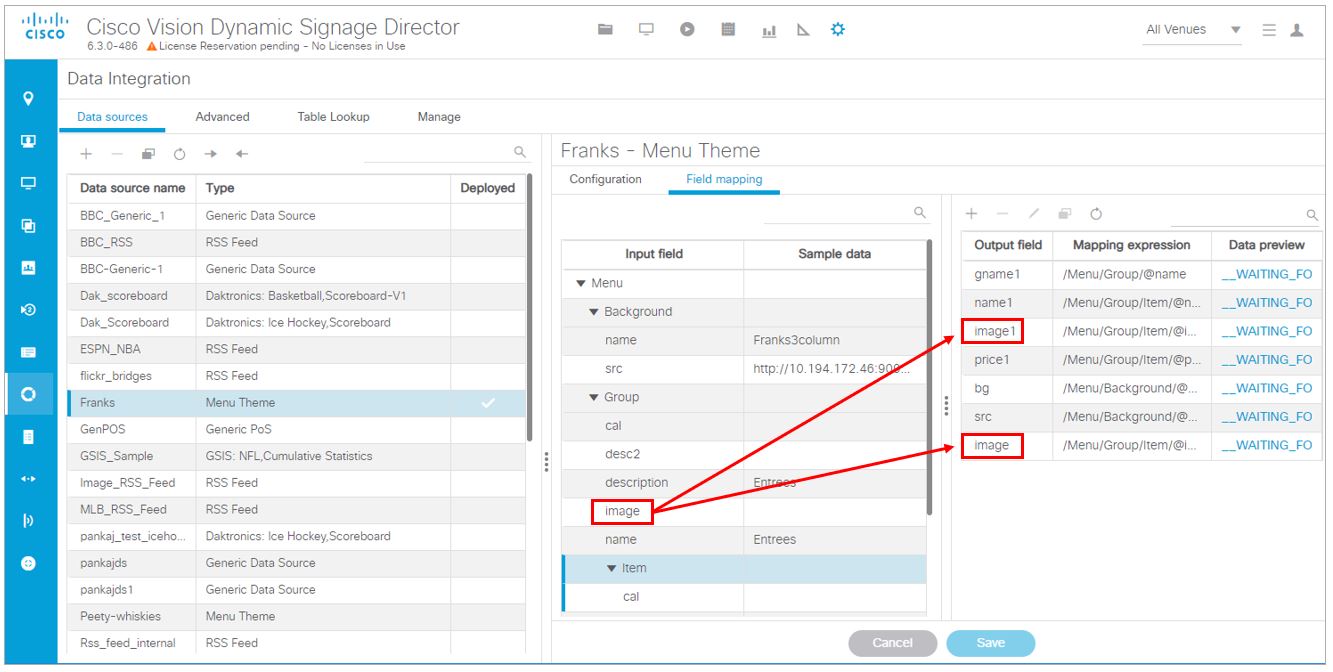
Select the Input Fields to be Mapped to the Menu Board Widget
To perform this task, you need to understand the content and format of the data that you want to display on your menu board and how the output XML is defined by the Data Integration feature.
In the Franks default menu theme, there are three columns and five headers defined (Figure 29). The five possible headers to be used in the menu board are: Entrees, Snacks, Beer, Beverages, and Souvenir.
Figure 29 Franks Layout—Columns and Headers
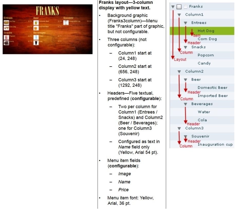
In the XML for POS menu theme data integration, a “Group” instance corresponds to unique column/header combinations for the theme. Therefore, in the Franks theme, there are five possible groups.
In our example shown in Figure 26, we will select two groups (Entrees and Snacks), along with two instances each of item names, images, and prices for each group.
Figure 30 shows an overview of the input fields that are selected for output in our example.
Note : You must drag certain input fields multiple times to create the number of instances that you need on the menu board. Then, index the expression to identify each instance.
Figure 30 Menu Theme Field Mapping Workflow
1. (Optional) To use the background associated with the menu theme for the menu board, do the following:
Note : If you want to use a different background than what is in the theme, you can skip this step and simply add a graphic component to the widget.
a. Under the Background list, locate the src field and drag it over to the Output field panel.
b. In the Add Output Field dialog box, type the name that you want to use or accept the default.
2. To add groups (categories) for the menu board, do the following:
a. Under the Group list, locate the name field and drag it over to the Output field panel.
b. In the Add Output Field dialog box, type a new name for the for the group, such as “gpname1” and click OK.
c. Repeat this step for as many groups as you want to add and give each a unique name.
3. To add items for each group, do the following:
a. Under the Item list, locate the name field and drag it over to the Output field panel.
b. In the Add Output Field dialog box, type a new name for the item, such as “itemname1” and click OK.
c. Repeat this step for as many items as you want to add and give each a unique name. In our example, one item field called “name1” was created.
4. To add images for each item, do the following:
a. Under the Item list, locate the image field and drag it over to the Output field panel.
b. In the Add Output Field dialog box, type a new name for the item, such as “image1” and click OK.
c. Repeat this step for as many images as you want to add and give each a unique name. In our example, one image field called “image1” and was created.
5. To add prices for each item, do the following:
a. Under the Item list, locate the price field and drag it over to the Output field panel.
b. In the Add Output Field dialog box, type a new name for the item, such as “price1” and click OK.
c. Repeat this step for as many images as you want to add and give each a unique name. In our example, one price field called “price1” was created.
Define the Mapping Expressions
When you add the group name field to the output field mapping, notice that the following default mapping expression is created:
Each field of that type that you add will have this same default expression, which means that only one group would be identified. Modify this default expression to index each group that you define and for each field that you have added.
Figure 31 highlights how the index [1] and [2] is added to each output field to identify each element as part of Group 1 or Group 2. Expressions indexed for Group [1] will be associated with the Entrees category, and those indexed for Group [2] will be associated with the Snacks category in this example.
Figure 31 Mapping Expression Example
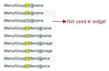
To define the mapping expression to index each group instance:
1. In the Output field panel, select the field.
2. Click the pencil (Edit) icon.
3. In the Change Output Field dialog box, go to the Expression option and type [1] or [2] after the Group label (before the slash) and click OK.
Enable the Data Source
To enable the data source configuration:
1. In the left pane, select the data source.
2. Click Deploy. A message box appears asking you to restart the application.
3. If you have completed all of the changes that you want to make for the data source, restart the application:
b. Select Restart Application.
TIP : The Play button is located on the bottom left of the Data Integration panel.
Create the Menu Board Widget
After you have deployed the POS data source, create a new widget for the menu board. For full-screen menu boards, 1920x1080 is the common size.
For details about how to create a widget, see Creating New Widgets.
Figure 32 shows the different component types that are used to bind the data fields from the menu theme data source in our example.
Figure 32 Menu Board Widget Components Overview
Configure the Background Graphic Component for the Menu Board Widget
To add a background for your menu board widget, configure a Graphic component as the first layer on your canvas. This graphic component can either be bound to the source background from your menu theme data source, or it can be selected from the Cisco Vision Director Asset Library.
Figure 33 shows where you can use the Content Name on the Properties panel to browse for an image to use as the background. If you want to use a separate image for your menu board background, then that image must be uploaded to the Cisco Vision Director Asset Library before it can be added to the graphic component.
Figure 33 Selecting an Image for the Background Graphic on the Properties Panel
Be sure to specify the size for the graphic component that reflects the size of your menu board. For more information about graphic component properties, see Standalone Graphic Component Properties.
For information about how to add an image, see Working with Images.
Figure 34 shows the alternative way to select a background graphic for a menu theme, by using the Data Binding configuration. In this example for setting the background, the bg data field that we mapped as an available output field in the data source is selected for Data Binding for the graphic component. When you bind the background from the menu theme data source, the image URL to the DMB image gallery is used.
Figure 34 Binding the Menu Theme Data Source Background
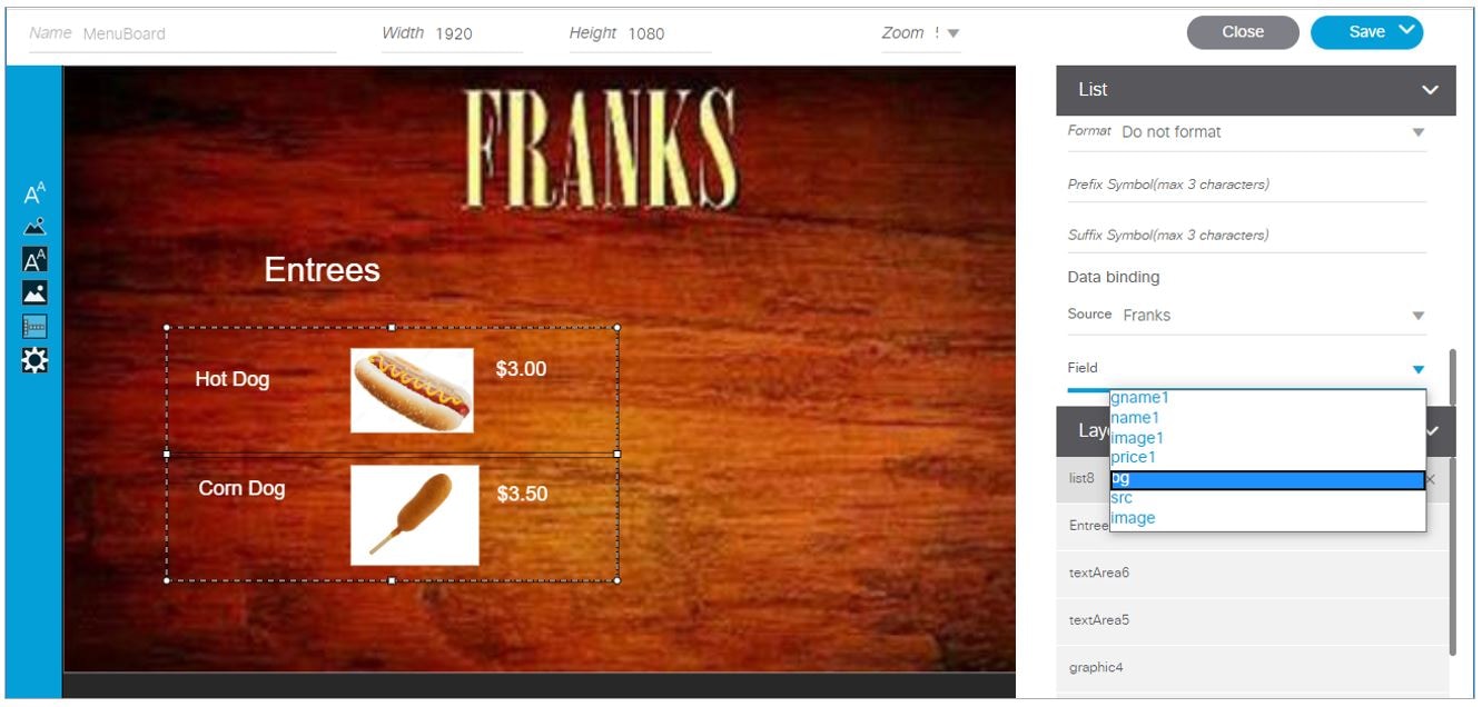
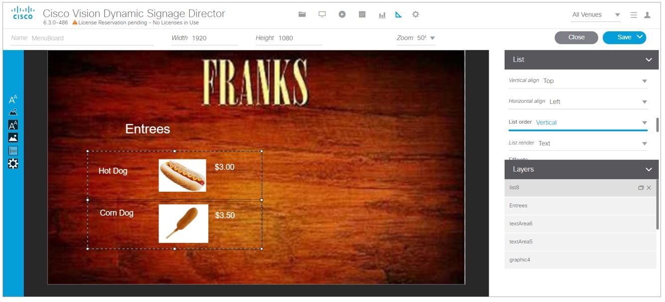
Configure the List Components for Each Set of Mapped Data
For each of the group headings (one) in the example, you need a List component for the item name, image, and price for a total of three lists (Figure 35).
Figure 35 List Components for the Franks Menu Theme Example
To configure the list components:
1. Drag and drop the List component onto the canvas.
2. From the Data Binding panel, select the Data Source and Data Field.
In our example, “Franks” would be the Data Source, with the following Data Fields selected for each list:
3. From the Properties panel, specify the settings for each list. Figure 35 shows an example of the properties set for the selected image list under the Entrees heading.
a. Set List Order to Vertical.
–Text—For name and price data fields.
c. (Optional) Click Grid. This allows you to see borders around the cells.
d. (Optional) Specify the location of the list and the cell dimensions.
TIP : For the first list, you can just use the component handles to resize the list, as you move list components on the canvas to align them (Figure 36). From there, you can use the Properties panel to set all of the other list components to those same dimensions.
Figure 36 List Component Grid Lines
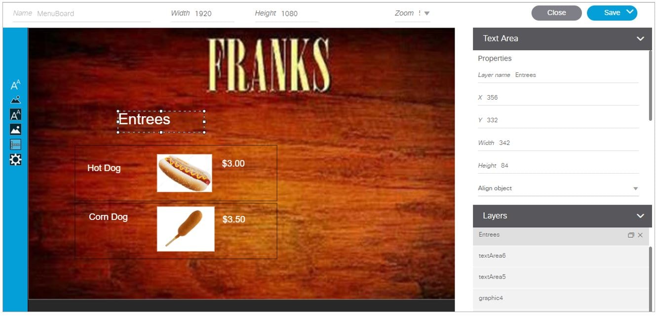
Configure the Text Area Components for the Group Headings
In our example, we configure two Text Area components to create the group headings: Entrees and Snacks.
To configure the text area components:
1. Drag and drop the Text Area component onto the canvas.
2. From the Data Binding panel, select the Data Source and Data Field.
In our example, “Franks” would be the Data Source, with the following Data Field selected for each list:
3. From the Properties panel, specify the settings for each Text Area.
Figure 37 shows an example of the properties set for Entrees group heading.
Figure 37 Text Area Properties
Add the Data Pull Component
As a best practice for menu board data, which can become sizable, you should add the Data Pull component to the menu board widget. Although you can see this component on your widget canvas, it does not appear on the published menu board.
For more information about how to add the data pull component, see Working with Large Data Sources.
TextToScreen Widget with Merged Generic Data Sources
Configuration Example
This advanced example shows how to create generic data sources from RSS feeds, filter the data, and combine the feeds into a new data source for layout in the Widgets tool. The example highlights the following functionality in the External Content Integration feature:
■Generic data source configuration of an RSS data feed.
■Provision of XML sample data.
■Selection of specific item ranges in a data feed using the XPath expression editor.
■Merging of data sources into a data view.
■Data view configuration as data source.
■Preview of received data in the data source.
■Use of a background graphic in the layout.
■Overlay of a TextToScreen component with data bound from merged data sources (a data view).
■Use of color properties in the TextToScreen component.
To create a TextToScreen widget with merged data sources:
1. Click Configuration > Data Integration.
For more information, see Accessing the Data Integration Interface.
2. Add a new Generic Data Source with the HTTP message type.
For more information, see Adding a New Data Source.
3. In the Configuration panel for the new Generic Data Source, type the URL to your RSS feed.
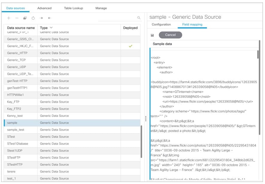
Figure 38 creates a new Generic Data Source named “sample - Generic Data Source” with the following HTTP URL “http://10.194.170.142/CiscoVision/mule/flows/sample/sample”. The rest of the configuration uses the default values.
Figure 38 HTTP Configuration for First Generic Data Source
5. Click the pencil Edit icon to open the Sample data box, paste the sample XML data from the feed, and save it.
For more information, see Providing Sample XML or JSON Data for Generic Data Sources.
Figure 39 shows a portion of the XML data pasted into the Sample data box.
Figure 39 Sample Data for First Generic Data Source
6. Expand the RSS input fields made available from the sample data and select a text-based input field to be used in the output display.
For more information, see Selecting Input Statistics and Mapping to Output Fields for Display.
7. Select the Expression mapping option and click OK.
The default XPath expression for the data field is added to the Mapping expression field. For an RSS title element, the default expression is “/rss/channel/title/text().”
8. Click the pencil Edit icon in the Output field icon bar to modify the XPath expression to filter the data provided by the feed.
For more information, see Modifying the Default XPath Expression.
Figure 40 shows a modification to the title data field to add the “item[position()>=2andposition()<5]” predicate to the default /rss/channel/title/text() expression:
/rss/channel/item[position()>=2andposition()<5]/title/text
In this example, the data will be filtered to pull the 2nd, 3rd, and 4th items in the title element of the feed.
Figure 40 Output Data Filter Using XPath Expression for First Generic Data Source
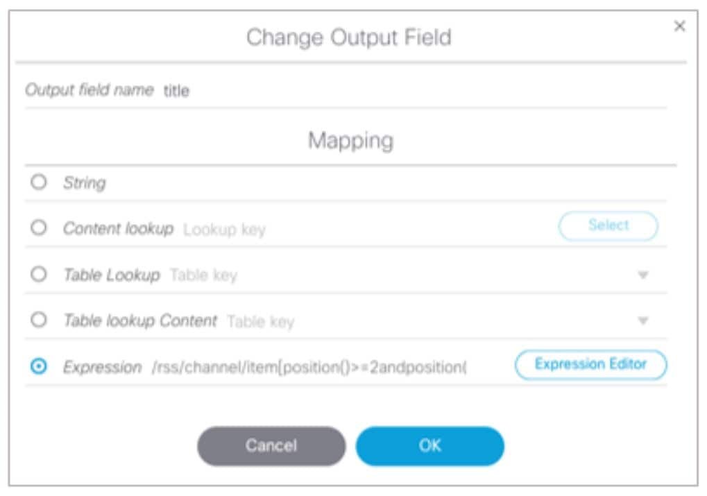
Figure 41shows selection of the “title” field for output display with the modified mapping expression and the 3 items available for data preview from the RSS feed.
Figure 41 Field Mapping for First Generic Data Source
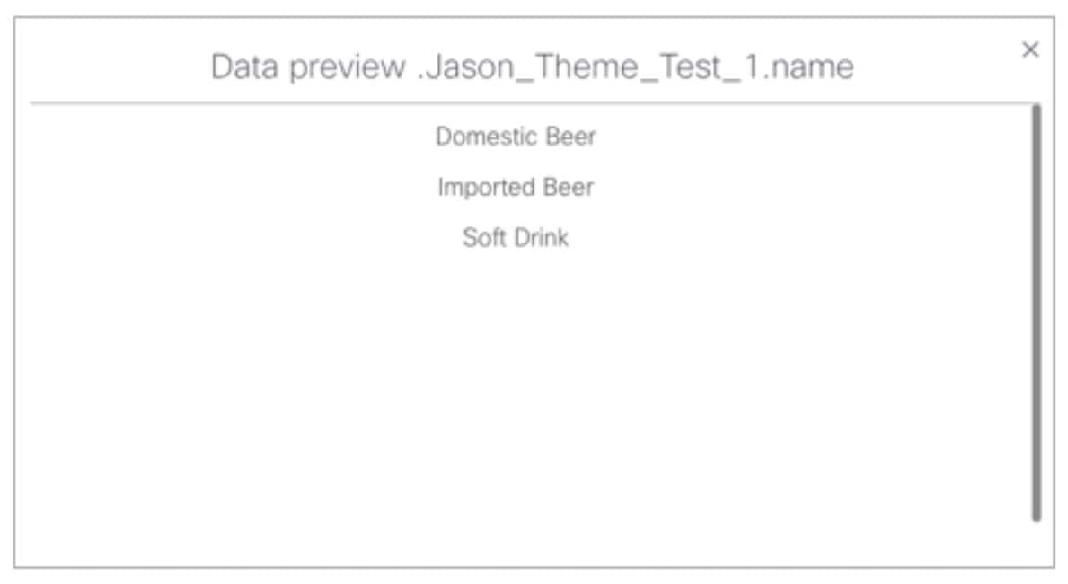
9. Click the link under Data preview to open the “Preview for” window, and verify the data from the RSS feed.
Based on the filter used in our example to pull 3 items from the title element, a link named “5 items” appears under Data preview. Figure 42 shows the preview of the five title items from the first generic data source RSS feed.
Figure 42 Data Preview for First Generic Data Source with Business Data
10. Repeat Step 2–9 for the second generic data source whose RSS feed content you want to combine with the first generic data source.
Figure 43 creates a second Generic Data Source named “sample” with the following HTTP URL “http://10.10.10.10.8888/StadiumVision/flows/dataview/data/My_Data_View”. The rest of the configuration uses the default values.
Figure 43 HTTP Configuration for Second Generic Data Source
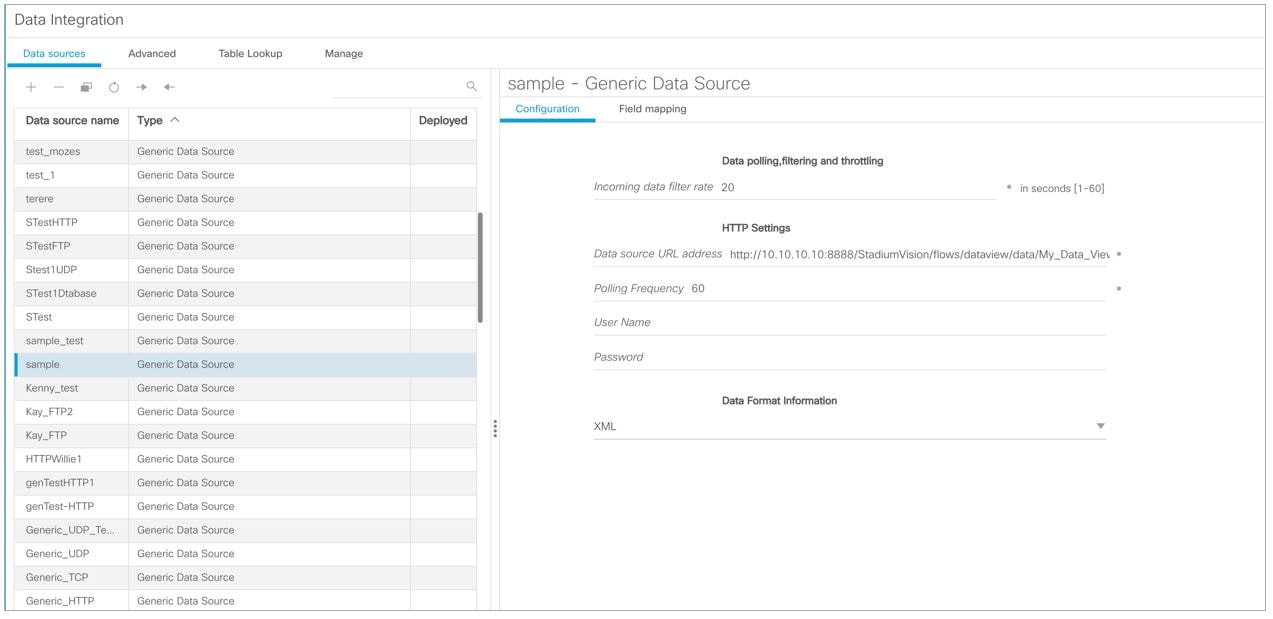
Figure 44 shows the corresponding XPath expression to filter the data to pull the 4th, 5th, and 6th items from the title element for the second generic data source.
Figure 44 Output Data Filter Using XPath Expression for Second Generic Data Source
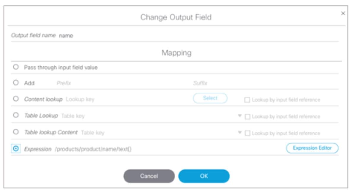
Figure 45 shows the preview of the 3 sports titles filtered from the second generic data source.
Figure 45 Data Preview for Second Generic Data Source with Sports Data
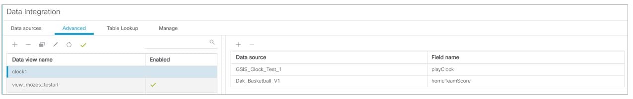
11. To combine content from multiple data sources, click Advanced to create a data view and add the data sources that you created.
For more information, see Working with Data Views.
Figure 46 shows creation of a1 data view named “clock1” with the “GSIS_Clock_Test1” data sources included.
Figure 46 Data View Creation with Two Generic Data Sources Added
12. Go to Field Mapping and provide the sample XML data for the combined data sources.
The following is an example of the sample XML used:
Note : The “entry” node is required in the sample data.
<channel>com.cisco.sv.databind</channel>
<hashcode>45adde4260b54cb41765345a21efd3dc</hashcode>
<name>Businessnews.title</name>
<entry index="0">Exclusive:Thermo Fisher weighs Life Tech takeover - sources</entry>
<entry index="1">Chesapeake CEO McClendon steps down after year of tumult</entry>
<entry index="0">Never-say-die Kings rally to haunt Canucks again</entry>
<entry index="1">49ers' Moss: "I'm the greatest receiver ever"</entry>
<entry index="2">MLB investigating doping report involving top players</entry>
After the XML sample data is saved, the data sources are combined.
Figure 47 highlights the new link to 20 items available for preview, which includes the 3 items from the business data source and 3 items from the sports data source.
Figure 47 Data View Field Mapping
13. Click the link in the Data preview column to verify the content for display.
Figure 48 shows the combined title items from both the business and sports feeds.
Figure 48 Data View Field Mapping, Update
For more information, see Accessing the Widgets Tool.
For more information, see Creating New Widgets.
16. Add a Graphic component to the canvas and adjust the size to accommodate the title fields from the RSS feeds.
For more information, see Working with Images.
17. Add a TextToScreen component to the canvas to overlay the Graphic component.
18. Bind the data view data source to the TextToScreen component.
Figure 49 shows binding of the “Generic_HK_JC_Feed” data source.
Figure 49 Data Binding from the Data Source Created from the Data View
19. In the Properties panel, set the options and choose the font colors.
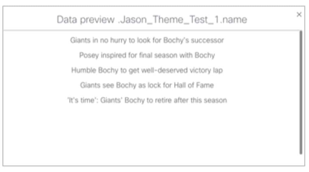
Figure 50 shows the properties used with black set for the first color. The bound data automatically appears in the widget.
Notice that the first message of the combined data that was displayed in the Data Integration preview in Figure 48 appears in the Widget.
Figure 50 TextToScreen Data Preview
Tabular Widget Using List Components for a
Transit Schedule Configuration Example
This advanced example shows how to create a generic data source for a transit schedule and map the data source fields to list components to create a schedule widget. To successfully configure a schedule widget you must be familiar with the content and format of your XML data to be mapped into the List components.
This example includes the following tasks:
■Create the Graphics for the Transit Schedule Widget
■Create the Data Source for the Transit Schedule Widget
■Provide the Sample XML Data for the Transit Schedule Widget
■Map the Data Source Input Fields and Modify the Default Expressions
Create the Graphics for the Transit Schedule Widget
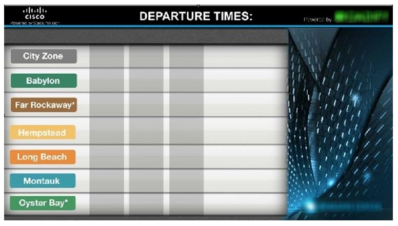
In this schedule example, the sample XML data is known to consist of seven routes and a background graphic was designed with those fixed route names as part of the graphic along with other creative elements for the schedule design (Figure 51). This background graphic is uploaded to the Asset Library in the Cisco Vision Director.
Figure 51 Schedule Widget Background Graphic Using Explicit Route Names
Also for this example, the sample XML data is known to provide the following status values:
Corresponding graphics were created and named “Good Service.png”, “Service Change.png”, and “Delay.png” so that an expression can be created to include status icons that correlate to the text value of the status fields in the XML data source.
Upload these graphics to the Cisco Vision Director Asset Library.
Create the Data Source for the Transit Schedule Widget
To create the data source for the schedule widget:
1. lick Configuration > Data Integration.
For more information, see Accessing the Data Integration Interface.
2. Add a new Generic Data Source with the HTTP message type.
For more information, see Adding a New Data Source.
3. In the Configuration panel for the new Generic Data Source, type the URL to your XML data source and configure any other required options.
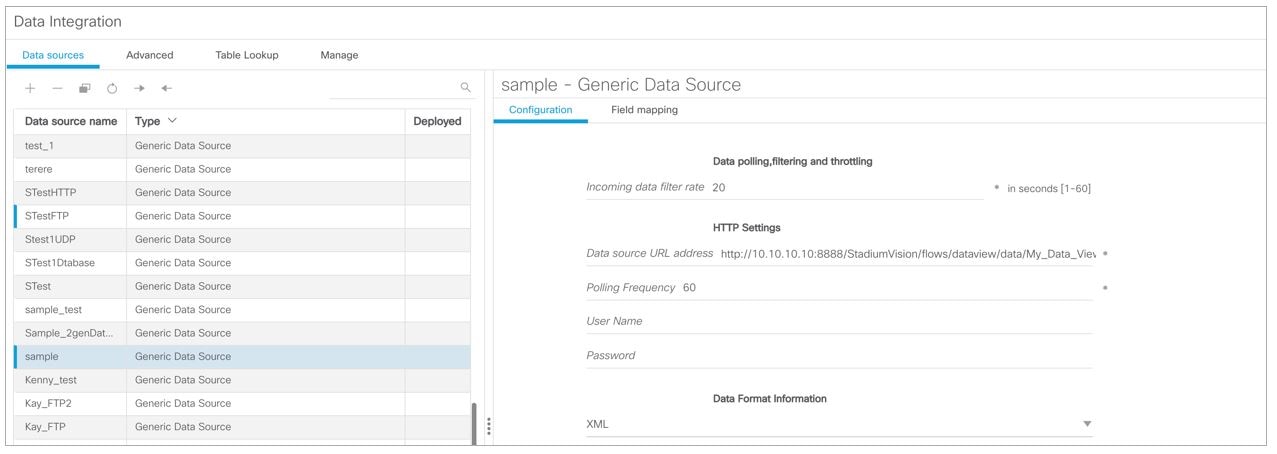
Figure 52 creates a new Generic Data Source named “STestFTP” with an HTTP URL for the data source along with a User Name and Password for authentication. The rest of the configuration uses the default values.
Figure 52 HTTP Configuration for First Generic Data Source
For more information, see Configuring the Connection to a Generic Data Source.
Provide the Sample XML Data for the Transit Schedule Widget
To provide the sample XML data for the transit schedule widget:
1. From the Data Integration screen, select the transit schedule data source and go to Field Mapping.
2. Provide the sample XML data for the data source and save it.
For more information, see Providing Sample XML or JSON Data for Generic Data Sources.
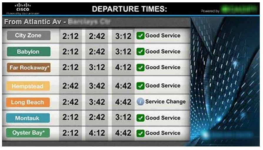
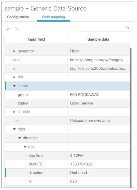
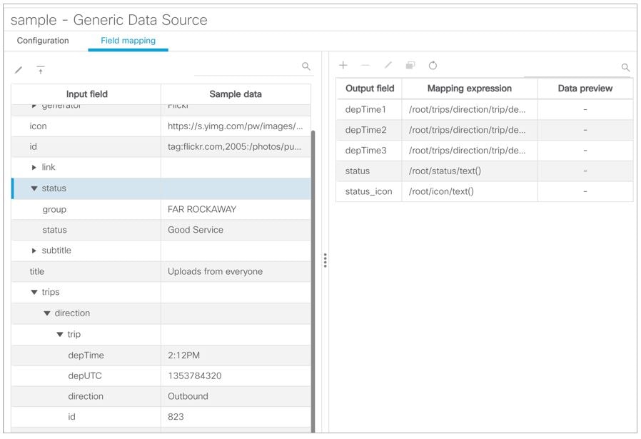
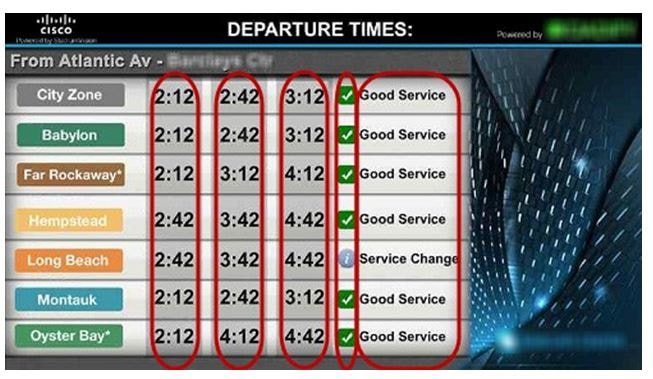
Figure 53 shows a snapshot of some of the sample XML data for the schedule widget data source. The “depTime” and “status” fields will be used in this widget example.
Figure 53 Sample XML Data for the Schedule Widget Data Source
Map the Data Source Input Fields and Modify the Default Expressions
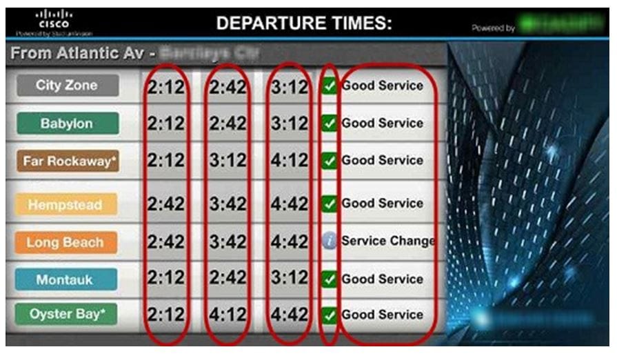
In this transit schedule widget example, five output fields will be created from the data source to display departure times and status in the widget as shown in Figure 54 and Figure 55.
Note : The status_icon output field will be created based on the value of the XML status field to look up a graphic that corresponds to that value from the Cisco Vision Director content library. For example, the status “Good Service” will have a suffix of “.png” added to create the value “Good Service.png” (a green checkmark graphic). This requires (as per the introduction to this example) that you have created a graphic of this name and uploaded it to the Content library in Cisco Vision Director.
To further understand the field mappings and their corresponding data expressions, consider the following XML data excerpt for the Far Rockaway route (Figure 54).
Figure 54 XML Route Data for Far Rockaway
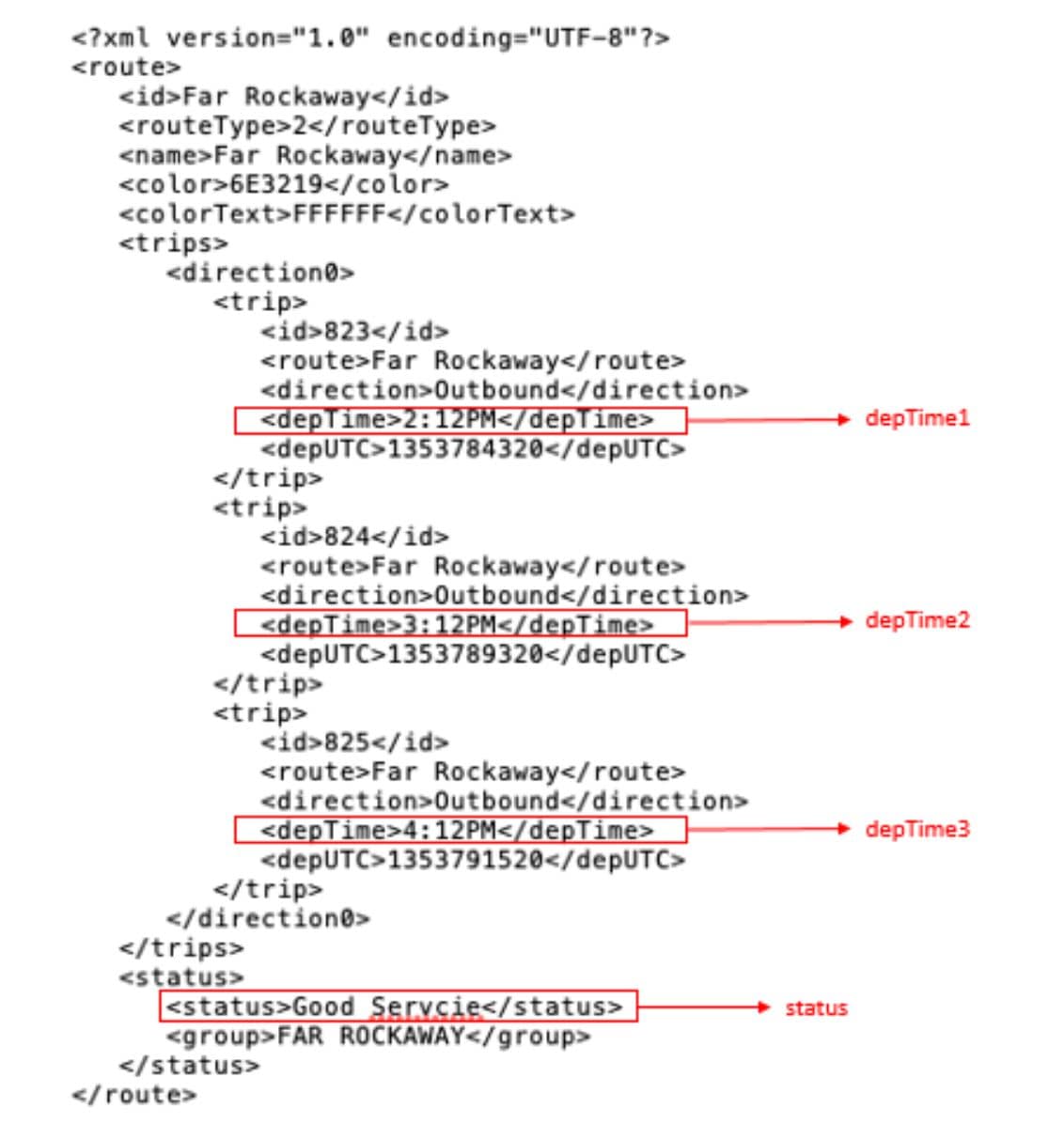
Figure 55 Output Data Fields for the Schedule Widget Data Source
These five output fields will be bound to five corresponding list components in the Widgets tool as shown in red in Figure 56.
Figure 56 Example of Schedule Widget Using List Components
To map the data source input fields and modify the default expressions:
1. Expand the data source input fields made available from the sample data and select the “depTime” input field to be used in the output display. Name this “depTime1.”
–For more information, see Selecting Input Statistics and Mapping to Output Fields for Display.
2. Select the Expression mapping option and click OK.
The default XPath expression for the “depTime” data field is added to the Mapping expression field: “/stops/stop/routes/route/trips/direction0/trip/depTime/text().”
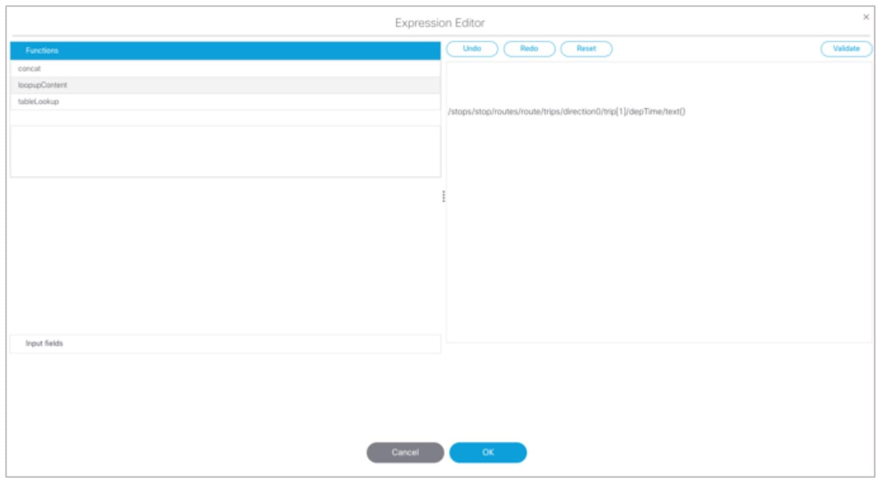
3. With the “depTime1” output field highlighted, click the pencil icon in the Output field icon bar to modify the XPath expression to filter the data provided by the feed.
4. In the Change Output Field dialog box, click Expression Editor. Add “[1]” to the “trip” element.
For more information, see Modifying the Default XPath Expression.
Figure 57 shows an example of the Expression Editor and corresponding string: “/stops/stop/routes/route/trips/direction0/trip[1]/depTime/text()”.
Figure 57 Expression Editor for the DepTime1 Output Field
5. Repeat this process to add two more output fields and name them “depTime2” and “depTime3” with corresponding “trip[2]” and “trip[3]” changes made to the default strings in the Expression Editor.
TIP: The [1], [2], and [3] syntax added to the trip element specifies that the first trip deptime value, second trip deptime value, and third trip deptime value are pulled from the XML data. In our sample data for the Far Rockaway route in Figure 54, you can see that these times will be “2:12,” “3:12,” and “4:12” as displayed in Figure 56.
6. In the Field Mapping panel, select the “status” Input field and drag it to the Output field box.
This field uses the expression “/stops/stop/routes/route/status/status/text().”
7. In the Field Mapping panel, select the “status” Output field and click the Copy icon.
8. Name the output field “status_icon” and click OK.
9. Complete the following steps to create an expression that will result in finding the icon that correlates to the status text field value. This field will be used in a list component to display icons beside a list component for the corresponding text status field as shown in Figure 56.
a. With the “status_icon” output field highlighted, click the Edit (pencil) icon in the Output field icon bar to modify the XPath expression to filter the data provided by the feed.
b. In the Change Output Field dialog box, click Expression Editor.
c. Drag the concat and lookupContent functions over to the expression and edit the string to match this example:
fn:lookupContent(fn:concat('',/stops/stop/routes/route/status/status/text(), '.png'))
This expression results in a string named “statusvalue.png” and the content for a graphic of that same name will be looked for in the Asset Library and displayed in the cell.
Create the Transit Schedule Widget
To create the transit schedule widget:
2. Create a new widget of size 1920x1080.
3. Drag the Graphic component onto the canvas and in the Properties panel.
4. In the Properties panel, go to Source section and click the Choose button. A Select Image dialog box displays.
5. Click on the background image that you want to add and click Choose. The image is added and scaled to the size of your graphic component box.
6. Drag the List component onto the canvas and modify the following Properties:
■Grid—Check this to ease the sizing of the component. Remember to turn it off again when formatting is complete.
Note : When you repeat this step for the “status_icon” output field, be sure to set the List Render property to Image.
7. (Optional) Under Effects, set the Background Color Condition if you want a certain background color to highlight any change in value for that cell, or two different colors for an increase and decrease in value.
a. Click the corresponding Color Picker to select a color from a palette or specify a specific hexadecimal number for a color.
b. In the Background color display duration (Seconds), specify the number of seconds that you want the cell background color change to remain on the display.
8. Click Data Binding and modify the following values:
–Select the name of the data source that you created for the widget.
–Select the name of the Data Field that you want to map to this component (depTime1).
9. Drag the component on top of the background graphic and resize it to match the size of the first column on the background graphic.
10. When complete, repeat this process by copying the first List component for the four remaining data sources:
–Bind each list to the corresponding output fields that you created (depTime2, depTime3, status_icon, and status).
–Drag the components and resize them to match the size of the columns on the background graphic.
–Once all List components are created and positioned properly, clear the Grid property checkbox.
TIP : If you do not see any preview data from your data source, be sure that you have enabled the data source configuration. For more information, see Enabling the Data Source Configuration.
Custom Welcome Messages Configuration Example
This example shows how to configure custom messages for different locations at a venue. Custom messages can be used for luxury suites when you want to welcome special guests to an event. Using the flexibility of the External Content Integration feature and the widgets tool, you can set up your venue to customize messages to accommodate different events, patrons, and multi-tenant/multi-use scenarios.
You can design your signage to be as simple as using a standard background graphic for all locations in the venue where the messaging is to appear, and only change the message or patron name—to a more flexible configuration where you change the background, icons, and messaging.
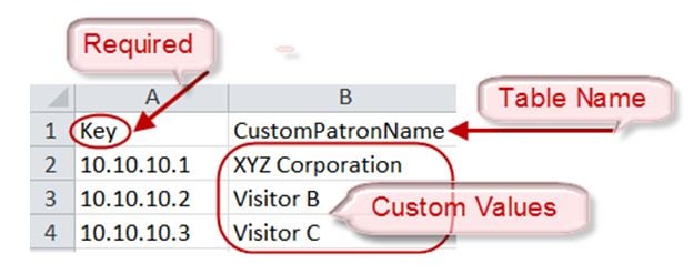
Table Key/Value Pairs
The way that you customize your content is by mapping tables of values to the media player IP addresses of the locations where the content is to appear. Each table consists only of a set of key/value pairs, where the “key” is the IP address of the media player. The value is either a text string or a filename for image content. You can have multiple tables of these key/value pairs if your message needs to map multiple values that will change by location.
You can manually create these tables, or import a set of values to map to that location. For initial configuration of a set of IP addresses using a common set of custom content for an event, it is simpler to import the values using a spreadsheet.
Figure 58 shows a simple example of a message that might be used in a suite welcoming patrons from “XYZ Corporation” to a game.
Figure 58 Welcome Message Example

This example highlights the following functionality in the Data Integration feature:
■System data source configuration.
■Mapping table items for output.
■Widget creation using the following components:
In this example we will use one of the simplest design scenarios to show how the different components work. Let’s consider the welcome message shown in Figure 58 implemented as a standard background with the message embedded and a custom patron name is displayed based on the location where the message is displayed (Figure 59). To customize this message, you could simply add suite patron names using the table lookup feature.
Figure 59 Patron Names Mapped from Table Lookup

Task List
■Design Message Content and Upload Graphics (required)
■Define Customized Content by Location (required)
■Add Tables for Data Integration (required)
■Configure the System Data Source (required)
■Enable the System Data Source (required)
■Create the Message Widget (required)
■Configure the Background Graphic Component for the Message (optional)
■Configure the Custom Text Component for the Message (required)
■Bind the System Data Source to the Text Component (required)
■Add the Data Pull Component and Bind the System Data Source (required)
■Save the Widget (required)
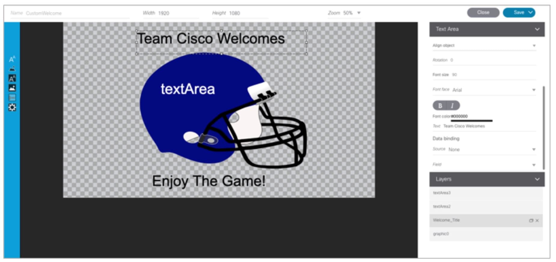
Design Message Content and Upload Graphics
Design your message(s) and determine the parts of the layout that will be customized per location. The parts of the message that will be customized will be what you specify in the table data.
1. Go to Library > Upload Assets and add the image(s) to the asset library. In our example, the basic image in Figure 60 is imported to the content library.
Figure 60 Standard Background with Message Included

Define Customized Content by Location
Identify the locations in your venue where custom messages will be displayed, and obtain the IP addresses of the digital media players in those locations.
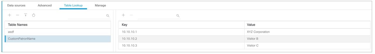
In this example, let’s consider that we are adding custom welcome messages to three locations in the venue for the following three visitors (patrons) to the suite locations:
■10.10.10.1—This media player is located in a suite location that should display a message using the standard background to welcome a patron named “XYZ Corporation.”
■10.10.10.2—This media player is located in a suite location that should display a message using the standard background to welcome a patron named “Visitor B.”
■10.10.10.3—This media player is located in a suite location that should display a message using the standard background to welcome a patron named “Visitor C.
So, we have the following mapping of patron names (Table 11) to IP addresses in our example:
Add Tables for Data Integration
There are two ways to add tables for data integration:
■Adding key/value pairs manually to a table that you create in the Table Lookup panel.
■Importing data from a spreadsheet to auto-populate the table(s).
With either method, the table named “CustomPatronName” is created as shown in Figure 61.
Figure 61 Table Lookup Example
Add Tables Manually
1. Go to Configuration > Data Integration > Table Lookup.
2. To add a new table, click the + icon in the left panel.
3. In the Table Name dialog box, type a name and click Create.
In our example, the table name is CustomPatronName.
4. To add the key/value pairs that you mapped for your custom content, click the + icon in the right panel.
5. In the Add Key Value dialog box, do the following:
a. In the Key box, type the IP address.
b. In the Value box, type the custom value to be mapped to that IP address location.
6. Repeat Step 4 and Step 5 until you have added all of your table entries.
Add Tables by Importing a TSV File
You can create your table data in a spreadsheet application and import it to Cisco Vision Director. The import method has the following advantages:
■It allows you to quickly populate table data when you have a large number of key/value pairs.
■With a single import, you can create multiple tables of key/value pairs. For example, if you plan to have both a custom message and a custom logo, you can use separate columns to map both custom values to an IP address. Cisco Vision Director creates a new table for each column of values that you define.
Caution : If you upload a file that uses a table name of an existing table already imported to Cisco Vision Director, then that table data is replaced. Moreover, if you wanted to change the values used in the same.TSV file for use in an existing widget, then you must re-bind your data source in the widget. To avoid this requirement, you can manually edit the table data.
Figure 62 TSV File Example for Table Key/Value Pairs
Note : If your design uses custom logos, or other custom text fields, you can add multiple tables to your.TSV file by simply adding the table name in the next available top cell and the values corresponding to the IP addresses in that column.
To add tables by importing a TSV file:
1. In a spreadsheet application, do the following (Figure 62):
b. In the second cell (B1), type the name of your table. In our example, this is “CustomPatronName.”
c. In each row below, type a set of key (IP address) and value pairs.
The custom value can be a text string, or it can be a file name that corresponds to an image uploaded to the content library.
Note : If you are using Microsoft Excel and type a text string that has a comma in it, then Excel adds quotation marks around your text string (such as “your, text”) and imports the quoted string into Cisco Vision Director. You need to either avoid use of a comma, edit your.TSV file in a text editor, or modify table entries within the Cisco Vision Director Table Lookup UI.
d. Save the file in.TSV format.
2. Go to Configuration > Data Integration > Table Lookup.
3. Click the Upload icon in the left panel.
4. Navigate to the location of your.TSV file and click Open. The table data from your file is automatically populated.
Note : If you have defined multiple columns of custom values to map to the IP addresses, then multiple tables of IP address key/value pairs are created. Each cell in row 1 (with the exception of A1) defines a new table name.
Configure the System Data Source
To configure the system data source:
1. Go to Configuration > Data Integration > Data Sources.
2. Select the System data source.
3. In the System - Data Flow panel, click Field Mapping.
4. In the Input field, expand the System field.
The REQUESTOR_IP input field displays.
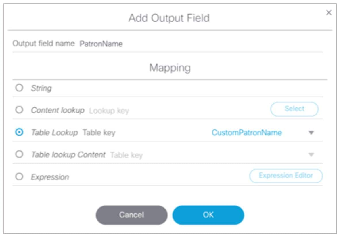
5. Select the REQUESTOR_IP input field and drag and drop it to the Output field panel.
6. In the Add Output Field dialog box, do the following:
■To do a table lookup for a text string (as in our example of “XYZ Corporation”):
–—In the Output field name, replace the REQUESTOR_IP field with a meaningful name for your custom text. In our example, it is “PatronName.”
–—Select Table Lookup, select the table name in the dropdown box, and mark the Lookup by input field reference option (Figure 63).
Figure 63 Add Output Field with Table Lookup by Input Field Reference
■To do a table lookup for an image in the content library:
Select Table Lookup Content and mark the Lookup by input field reference option.
7. (Optional) Repeat Step 5 and Step 6 for every table of key/value pairs that you need to map.
This means that for every custom area you have designed in your welcome message, you should have a corresponding REQUESTOR_IP output field.
Enable the System Data Source
For more information about enabling the System data source, see Enable the Data Source.
Create the Message Widget
From Library, click Widgets and create a new widget. For more information, see Creating New Widgets.
Configure the Background Graphic Component for the Message
For our example, you need to add a graphic component to the widget canvas and configure the filename of your background image that has been uploaded to the content library. For more information, see Working with Images.
Configure the Custom Text Component for the Message
Our example defines a custom text string for patron names, so you need to configure a text component in your message for the text string in the table data and configure attributes for it (Figure 64).
Figure 64 Configuring the Text Component
Bind the System Data Source to the Text Component
Once you add the text component to the widget, in addition to configuring the attributes for the text string display, you need to bind the component to the System data source. Figure 65 shows binding of the System data source and selection of the PatronName data field from our example.
Figure 65 Binding the System Data Source and PatronName Data Field
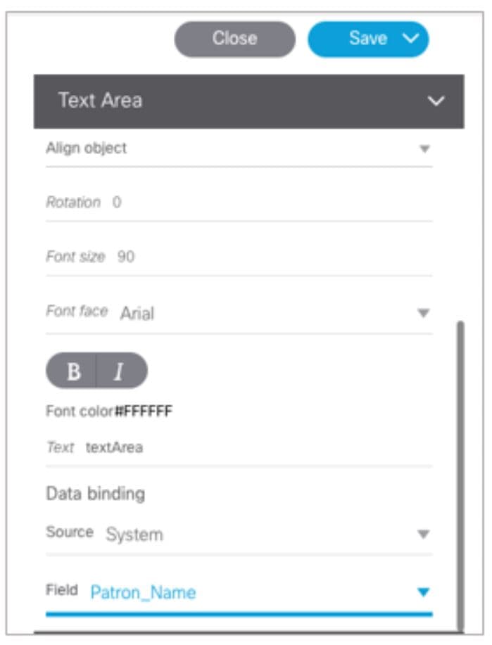
When you bind the system data source, the system is able to read the IP address of the media players and using your Table Lookup configuration, reference the table data that corresponds to that IP address for this component.
Add the Data Pull Component and Bind the System Data Source
After you have completed designing your widget, you must add the Data Pull component and bind it to the System data source as shown in Figure 66. All System data source fields are automatically selected.
Figure 66 Add the Data Pull Component and Bind the System Data Source
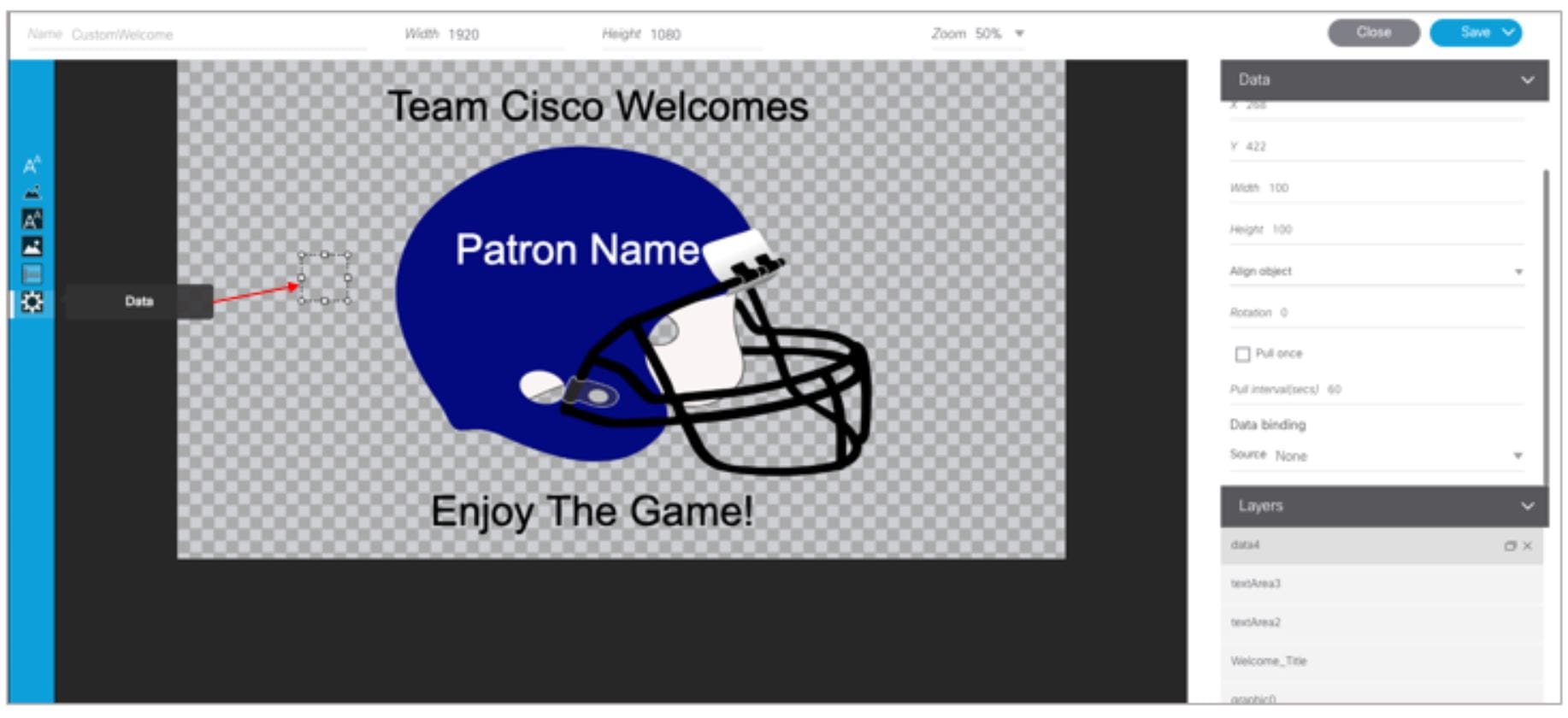
Note : While the system is loading data, or waiting for calls from the IP addresses of the media players that you specified, you might see the “_WAITING_FOR_DATA” message.
Save the Widget
When all of your component additions are complete, save the widget.
What to Do Next
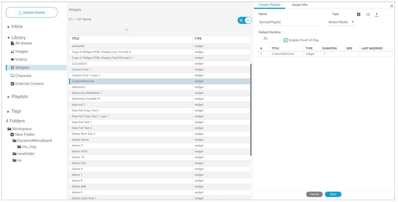
To publish a widget for display:
1. Create a playlist from Library > Widget for the widget that you created (Figure 67). Widgets are categorized in the “By Type” folder under the “widget” type.
Figure 67 Designing the Layout of Widget Content
 Feedback