- Preface
- Chapter 1 - Cautions and Advisories
- Chapter 2 - Cisco Spectrum Expert Introduction
- Chapter 3 - Cisco Spectrum Expert Overview
- Chapter 4 - Cisco Spectrum Expert Setup
- Chapter 5 - Cisco Spectrum Expert Software Overview
- Chapter 6 - Cisco Spectrum Expert Software Active Devices
- Chapter 7 - Working with Spectrum Tabs, Plots, and Charts
- Chapte 8 - Spectrum Plots
- Chapter 9 - Spectrum Charts
- Chapter 10 - Devices View
- Chapter 11 - Channel Summary
- Chapter 12 - Device Finder
- Chapter 13 - Cisco Spectrum Expert Software Local Settings
- Chapter 14 - Cisco Spectrum Expert and Network Operations
- Chapter 15 - Notices, Third Party, and Public Software Statements for Cisco�s Spectrum Expert
- Index
Spectrum Charts
The Cisco Spectrum Expert Spectrum Charts use bar, line, and pie charts to provide broad summary information about activity in the RF spectrum. Like the spectrum plots, the spectrum charts are based on data from the SAgE chip embedded in the Sensor card. This chapter describes the kinds of information displayed in each graph.
Using Spectrum View Charts
For a discussion of creating charts, pausing/resuming the display, and saving chart configurations, see "Spectrum Tabs, Plots, and Charts Overview."

Note ![]() Spectrum Plots are discussed in "Using Spectrum View Plots."
Spectrum Plots are discussed in "Using Spectrum View Plots."
Chart Content
Spectrum View offers seven different types of charts. We list all charts here, and provide more detailed discussion in the following pages.
•![]() Active Devices
Active Devices
•![]() Devices vs. Channels
Devices vs. Channels
•![]() Devices vs. Time
Devices vs. Time
•![]() Channel Utilization
Channel Utilization
•![]() Channel Utilization vs. Time
Channel Utilization vs. Time
•![]() Interference Power
Interference Power
•![]() SNR
SNR
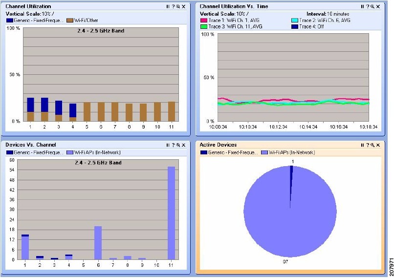
Active Devices
A pie chart which indicates—via different sized "slices" of the pie—what percentage of your RF activity is coming from different kinds of RF sources. You select which channel/band to monitor.
Devices vs. Channels
A bar chart displays the number of devices detected on different channels. You can select which frequency bands or channels will be monitored.
Devices vs. Time
A line chart displays the number of devices detected at different times. You can select the time interval of interest (ranging from ten minutes up to 24 hours), the channel or band to monitor, and the types of devices which will be tracked on the plot.
Channel Utilization
Channel Utilization vs. Time
A line chart displays the RF duty cycle as a function of time. You can select the time interval of interest (ranging from ten minutes up to 24 hours), and the channel or band to monitor.
For longer time intervals, you can also select how data is aggregated - that is, you can track the average duty cycle, the maximum duty cycle, or the minimum duty cycle. See Figure 9-1 for more information.
Figure 9-1 Spectrum Charts
Interference Power
A bar chart that shows the power for each selected channel is shown in Figure 9-2. The height of the bar shows the maximum power of all interference signals. Each bar consists of several lines representing the signal strength of a specific device type. The receive signal strength of the strongest In-Network Wi-Fi access point on each channel is shown by a + (plus) sign. The Wi-Fi noise floor is represented by a horizontal line across the grid background.
Figure 9-2 Interference Power Chart for Wi-Fi
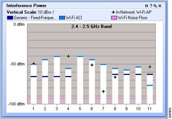
The X-axis shows the channels, and the Y-axis shows the signal strength (from -100 dBm to 0 dBm). The height of the bar indicates the cumulative power (in dBm) for all devices in this category that affect a given channel.
To view channel and power information:
•![]() Place the mouse to hover over a stacked bar to view pop-up information about the channel, maximum power, and the signal strength of each interfering device. Or, place the mouse to hover over a + sign to view pop-up information about the channel and the signal strength of the strongest In-Network Wi-Fi access point.
Place the mouse to hover over a stacked bar to view pop-up information about the channel, maximum power, and the signal strength of each interfering device. Or, place the mouse to hover over a + sign to view pop-up information about the channel and the signal strength of the strongest In-Network Wi-Fi access point.
•![]() Right-click either a stacked bar or + sign to view the same pop-up menu available on the Devices vs. Channel chart.
Right-click either a stacked bar or + sign to view the same pop-up menu available on the Devices vs. Channel chart.
SNR (Signal To Noise Ratio)
A color coded bar chart that displays the SNR for each channel having access points. SNR is the ratio of a given transmitted signal to the background noise on the channel.
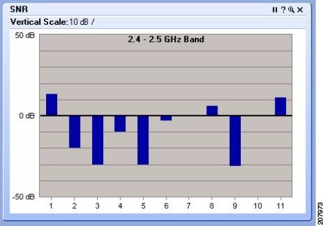
The X-axis shows the channels and the Y-axis shows the SNR power level (from -50 dB to 50 dB). The height of the bar above or depth of the bar below the 0 dB line indicates the SNR (in dB) for a given channel.
Note ![]() SNR charts are only supported if you are connected using local sensor card and have a local Wi-Fi card enabled. This chart is not available if you are connected through an AP.
SNR charts are only supported if you are connected using local sensor card and have a local Wi-Fi card enabled. This chart is not available if you are connected through an AP.
Bar Indicators
On the Channel Utilization, Devices vs. Channel, and Interference Power charts, the colored bars indicate the power level for each channel. Each interfering device is represented by a different color. A legend showing the devices and their associated colors is located at the top of the screen. Consequently, each colored section of the graphed bars map to the device legend.
The height of the bar shows the maximum power of all interference signals. Each color segment shows the contribution of a specific device type to the maximum power.
Navigate to Other Views
The bars and graphs on certain charts allow you to obtain additional information on a particular channel. You can navigate from Spectrum View to Devices or Channel Summary View. On the following plots/charts: Channel Utilization, Devices vs. Channel, Real Time FFT, FFT Duty Cycle, Swept Spectrogram, and Power vs. Frequency, right-click on a channel bar (or anywhere in the workspace of the plot) to display the pop-up menu. Select Show Devices Affecting <channel ID> to display the active devices in Devices View. Select Show Channel <channel ID> to display related data on this channel (highlighted in blue) in Channel Summary View. The Real Time FFT can also display the integrated channel power for each RF channel.
Chart Controls
The chart Control Panel lets you fine-tune the data presented by the charts.
Concerning band and channel selections, first note the following:
•![]() You can change the bands available here—that is, the bands shown on the Channel menus—by changing the Monitored Bands settings (Tools > Settings > Monitored Bands). See "Band and Channel Settings" for more information.
You can change the bands available here—that is, the bands shown on the Channel menus—by changing the Monitored Bands settings (Tools > Settings > Monitored Bands). See "Band and Channel Settings" for more information.
•![]() You can change the channels available here by changing your Channel Settings
You can change the channels available here by changing your Channel Settings
(Tools > Settings > Channel Settings). See "Band and Channel Settings" for more information.
Note ![]() Cisco Spectrum Expert Software will only make available, for selection here, those channels which you have selected under Channel Settings, provided those channels also fall within the bands you have selected under Monitored Bands. (In other words, the available channels are determined by the intersection of your Channel Settings and Monitored Bands.)
Cisco Spectrum Expert Software will only make available, for selection here, those channels which you have selected under Channel Settings, provided those channels also fall within the bands you have selected under Monitored Bands. (In other words, the available channels are determined by the intersection of your Channel Settings and Monitored Bands.)
Channel or Band Selection For Channel-Based Charts
Charts which use the RF channel as the independent variable (on the X-axis) include the Channel Utilization chart and the Devices Vs. Channel chart. These charts enable you to select exactly which channels will be displayed on the chart.
•![]()
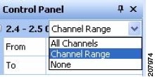
All Channels—All channels in the band will be charted.
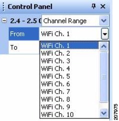
•![]() Channel Range—If you select this option, you then select a From channel (the lower end of a range) and a To channel (the upper end of the range) using the drop-down list boxes.
Channel Range—If you select this option, you then select a From channel (the lower end of a range) and a To channel (the upper end of the range) using the drop-down list boxes.
•![]() None—None of the channels in the band are charted.
None—None of the channels in the band are charted.
Note ![]() You may need to click on the [+] tree control buttons to expand visible options for each band displayed on the Control Panel.
You may need to click on the [+] tree control buttons to expand visible options for each band displayed on the Control Panel.
The Active Devices plot, which is a pie chart, has no X-axis. The pie chart simply shows the distribution of different device types in a selected band or channel. The single, simple Channel drop-down list box lets you select which channel or band is reported on by the chart.
Selection Options for Time-Based Charts
The Devices vs. Time and Channel Utilization vs. Time charts both use time as the independent (X-axis) variable. The two plots have similar, but slightly different controls.
For Devices vs. Time, you can select:
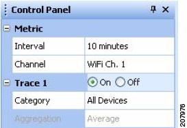
•![]() Interval—The total time interval for the X-axis. For example, if you select 8 hours, the chart will indicate the numbers of devices seen over the time period extending from "now" back to "now minutes 8 hours."
Interval—The total time interval for the X-axis. For example, if you select 8 hours, the chart will indicate the numbers of devices seen over the time period extending from "now" back to "now minutes 8 hours."
•![]() Channel—Use the Channel list-box to select which channel or band to monitor.
Channel—Use the Channel list-box to select which channel or band to monitor.
•![]() Trace—The chart can show usages for up to four different types of devices at one time. For each of the four traces (represented as different colors on the chart), you have the following options:
Trace—The chart can show usages for up to four different types of devices at one time. For each of the four traces (represented as different colors on the chart), you have the following options:
•![]() On / Off—Indicates if the trace is in use at all.
On / Off—Indicates if the trace is in use at all.
•![]() Category—Indicates the type of device to be tracked by the trace. Options will vary depending on your edition of Cisco Spectrum Expert Software, but may include 802.11 devices, microwave ovens, cordless phones, and so on.
Category—Indicates the type of device to be tracked by the trace. Options will vary depending on your edition of Cisco Spectrum Expert Software, but may include 802.11 devices, microwave ovens, cordless phones, and so on.
•![]() Aggregation—For time intervals of 8 hours or 24 hours, each "point" on the plot actually spans a significant period of time in its own right. You can select whether, for each point on the plot, you are seeing the Average number of devices active in that time interval; the Maximum number of devices seen in that time interval; or the Minimum number of devices seen in the time interval.
Aggregation—For time intervals of 8 hours or 24 hours, each "point" on the plot actually spans a significant period of time in its own right. You can select whether, for each point on the plot, you are seeing the Average number of devices active in that time interval; the Maximum number of devices seen in that time interval; or the Minimum number of devices seen in the time interval.
For shorter total time intervals (4 hours or less), this option is not available. For these shorter time-frames, each point on the plot represents a short enough period of time that there is no reason to distinguish between the minimum/maximum/average number of devices. The average value is shown automatically.
For Channel Utilization vs. Time, you can select:
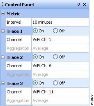
•![]() Interval—The total time interval for the X-axis. For example, if you select 8 hours, the chart will display the numbers of devices seen over the time period extending from "now" back to "now minutes 8 hours."
Interval—The total time interval for the X-axis. For example, if you select 8 hours, the chart will display the numbers of devices seen over the time period extending from "now" back to "now minutes 8 hours."
•![]() Trace—Here, each trace, rather than corresponding to a device type, corresponds to a band/channel, and/or to a different type of data aggregation. The chart can show up to four different traces at a time. For each of the four traces (represented as different colors on the chart), you have the following options:
Trace—Here, each trace, rather than corresponding to a device type, corresponds to a band/channel, and/or to a different type of data aggregation. The chart can show up to four different traces at a time. For each of the four traces (represented as different colors on the chart), you have the following options:
•![]() On / Off—Indicates if the trace is in use at all.
On / Off—Indicates if the trace is in use at all.
•![]() Channel—Uses the Channel list-box to select which channel or band to monitor.
Channel—Uses the Channel list-box to select which channel or band to monitor.
•![]() Aggregation—For time intervals of 8 hours or 24 hours, each "point" on the plot spans a significant period of time. You can select whether, for each point on the plot, you are seeing the Average duty cycle in that time interval; the Maximum duty cycle; or the Minimum duty cycle.
Aggregation—For time intervals of 8 hours or 24 hours, each "point" on the plot spans a significant period of time. You can select whether, for each point on the plot, you are seeing the Average duty cycle in that time interval; the Maximum duty cycle; or the Minimum duty cycle.
For shorter total time intervals (4 hours or less), this option is not available. For these shorter time-frames, each point on the plot represents a short enough period of time that there is no reason to distinguish between the minimum/maximum/average duty cycle. The average value is shown automatically.
 Feedback