Cisco Prime Network Registrar 10.1 DHCP User Guide
Bias-Free Language
The documentation set for this product strives to use bias-free language. For the purposes of this documentation set, bias-free is defined as language that does not imply discrimination based on age, disability, gender, racial identity, ethnic identity, sexual orientation, socioeconomic status, and intersectionality. Exceptions may be present in the documentation due to language that is hardcoded in the user interfaces of the product software, language used based on RFP documentation, or language that is used by a referenced third-party product. Learn more about how Cisco is using Inclusive Language.
The Cisco Prime
Network Registrar server status dashboard in the web user interface (web UI)
presents a graphical view of the system status, using graphs, charts, and
tables, to help in tracking and diagnosis. These dashboard elements are
designed to convey system information in an organized and consolidated way, and
include:
Significant
protocol server and other metrics
Alarms and alerts
Database
inventories
Server health
trends
The dashboard is best
used in a troubleshooting desk context, where the system displaying the
dashboard is dedicated for that purpose and might be distinct from the systems
running the protocol servers. The dashboard system should point its browser to
the system running the protocol servers.
You should interpret
dashboard indicators in terms of deviations from your expected normal usage
pattern. If you notice unusual spikes or drops in activity, there could be
communication failures or power outages on the network that you need to
investigate.
Opening the
Dashboard
The Dashboard feature is available on the regional cluster also. It provides System Metrics chart by default. It allows you
to display the server specific (DHCP, DNS, and CDNS) charts for various clusters. This can be configured in the Chart Selections
page.
To open the dashboard
in the web UI, from the
Operate menu,
choose
Dashboard.
Display
Types
Provided you have
DHCP and DNS privileges through administrator roles assigned to you, the preset
display of the dashboard consists of the following tables (See the table below
for an example):
System
Metrics—See the
"System Metrics"
section in
Cisco Prime Network Registrar 10.1 Administration Guide.
DNS General
Indicators—See the
"DNS General
Indicators" section in
Cisco Prime Network Registrar 10.1 Authoritative and Caching DNS User Guide.
Tip
These are just the preset selections. See Selecting Dashboard Elements to Include for other dashboard elements you can select. The dashboard retains your selections from session to session.
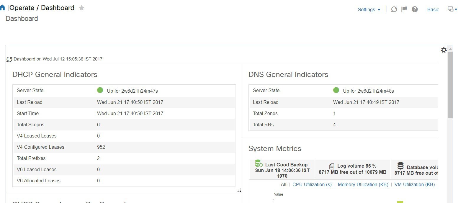
Figure 1. Preset Dashboard Elements
Each dashboard
element initially appears as a table or a specific panel chart, depending on
the element:
Note the green
indicator in the Server State description in the above image. This indicates
that the server sourcing the information is functioning normally. A yellow
indicator indicates that server operation is less than optimum. A red indicator
indicates that the server is down. These indicators are the same as for the
server health on the Manage Servers page in the regular web UI.
Graphic Indicators
for Levels of Alert
Graphed lines and
stacked areas in the charts follow a standard color and visual coding so that
you can immediately determine key diagnostic indicators at a glance. The charts
use the following color and textural indicators:
Highalertsorwarnings—Lines or areas in red, with a hatched
texture.
Allotherindicators—Lines or areas in various other colors
distinguish the data elements. The charts do not use green or yellow.
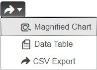
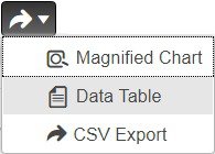
Magnifying and
Converting Charts
You can magnify a chart in a separate window by clicking the Chart Link icon at the bottom
of the panel chart and then by clicking the Magnified Chart option (see the
image below). In magnified chart view, you can choose an alternative chart type from
the one that comes up initially (see Other Chart Types).
Figure 2. Magnifying Charts
Note
Automatic refresh is turned off for magnified charts. To get the most recent data, click the Refresh icon next to the word Dashboard at the top left of the page.
To convert a chart to a table, see the Displaying Charts as Tables section. You cannot convert tables to a graphic chart format.
Legends
Each chart includes
a color-coded legend by default.
Tables
Dashboard elements
rendered as tables have data displayed in rows and columns. The following
dashboard elements are preset to consist of (or include) tables:
DHCP DNS Updates
DHCP Address Current Utilization
DHCP General Indicators
DNS General Indicators
Caching DNS General Indicators
Note
If you view a table
in Expert mode, additional data might appear.
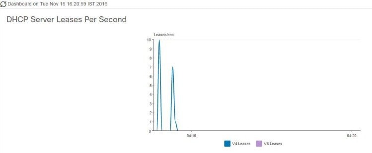
Line Charts
Dashboard elements
rendered as line charts can include one or more lines plotted against the x and
y axes. The three types of line charts are described in the following table.
Lines plotted
against the difference between two sequential raw data.
DNS Inbound Zone Transfers
DNS Outbound Zone Transfers
Rate line
chart
Lines plotted
against the difference between two sequential raw data divided by the sample
time between them.
DHCP Server Request Activity (see the image below)
DHCP Server Response Activity
DHCP Response Latency
DNS Query Responses
DNS Forwarding Errors
Tip
To get the raw data for a chart that shows delta or rate data, enter Expert mode, go to the required chart, click the Chart Link icon at the bottom of the panel chart, and then click Data Table . The Raw Data table is below the Chart Data table.
Figure 3. Line Chart Example
Area Charts
Dashboard elements
rendered as area charts have multiple related metrics plotted as trend charts,
but stacked one on top of the other, so that the highest point represents a
cumulative value. The values are independently shaded in contrasting colors.
(See the image below for an example of the DHCP Server Request Activity chart
shown in
Line Chart Example
rendered as an area chart.)
Figure 4. Area Chart Example
They are stacked in
the order listed in the legend, the left-most legend item at the bottom of the
stack and the right-most legend item at the top of the stack. The dashboard
elements that are pre-set to area chart are:
DHCP Buffer Capacity
DHCP Failover Status
DHCP Response Latency
DHCP Server Leases Per Second
DHCP Server Request Activity
DHCP Server Response Activity
DNS Inbound Zone Transfers
DNS Network Errors
DNS Outbound Zone Transfers
DNS Queries Per Second
DNS Related Server Errors
Other Chart
Types
The other chart types
available for you to choose are:
Line—One of the line charts described in Line Charts.
Column—Displays vertical bars going across the chart horizontally, with the values axis being displayed on the left side of the
chart.
Scatter—A scatter plot is a type of plot or mathematical diagram using Cartesian coordinates to display values for typically two
variables for a set of data.
Tip
Each chart type
shows the data in distinct ways and in different interpretations. You can
decide which type best suits your needs.
Getting Help for the
Dashboard Elements
You can open a help
window for each dashboard element by clicking the help icon on the table/chart
window.
Customizing the Display
To customize the dashboard display, you can:
Refresh the data and set an automatic refresh interval.
Expand a chart and render it in a different format.
Convert a graphic chart to a table.
Download data to comma-separated value (CSV) output.
Display or hide chart legends.
Configure server chart types.
Reset to default display
Each chart supports:
Resizing
Drag and drop to new cell position
Minimizing
Closing
Each chart has a help icon with a description of the chart and a detailed help if you click the link (more...) at the bottom
of the description.
Note
The changes made to the dashboard/chart will persist only if you click Save in the Dashboard window.
Refreshing Displays
Refresh each display so that it picks up the most recent polling by clicking the Refresh icon.
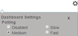
Setting the Polling Interval
You can set how often to poll for data. Click the Dashboard Settings icon in the
upper-right corner of the dashboard display. There are four options to set the
polling interval of the cached data, which polls the protocol servers for updates
(See the image below).
Figure 5. Setting the Chart Polling Interval
You can set the cached data polling (hence, automatic refresh) interval to:
Disabled—Does not poll, therefore does not automatically refresh the data.
Slow—Refreshes the data every 30 seconds.
Medium—Refreshes the data every 20 seconds.
Fast (the preset value)—Refreshes the data every 10 seconds.
Displaying Charts as Tables
Use the Chart Link icon at the bottom of the panel chart to view the chart link options (see the image below). You can choose to display a graphic
chart as a table by clicking the Data Table option.
Figure 6. Specifying Chart Conversion to Table Format
Exporting to CSV Format
You can dump the chart data to a comma-separated value (CSV) file (such as a spreadsheet). In the Chart Link controls at the
bottom of the panel charts (see the above image), click the CSVExport option. A Save As window appears, where you can specify the name and location of the CSV file.
Selecting Dashboard
Elements to Include
You can decide how
many dashboard elements you want to display on the page. At times, you might
want to focus on one server activity only, such as for the DHCP server, and
exclude all other metrics for the other servers. In this way, the dashboard
becomes less crowded, the elements are larger and more readable. At other
times, you might want an overview of all server activities, with a resulting
smaller element display.
You can select the
dashboard elements to display from the main Dashboard page by clicking the
Dashboard Settings icon and then clicking
ChartSelections in the Dashboard Settings dialog.
Clicking the link opens the Chart Selection page (see
Selecting Dashboard Elements).
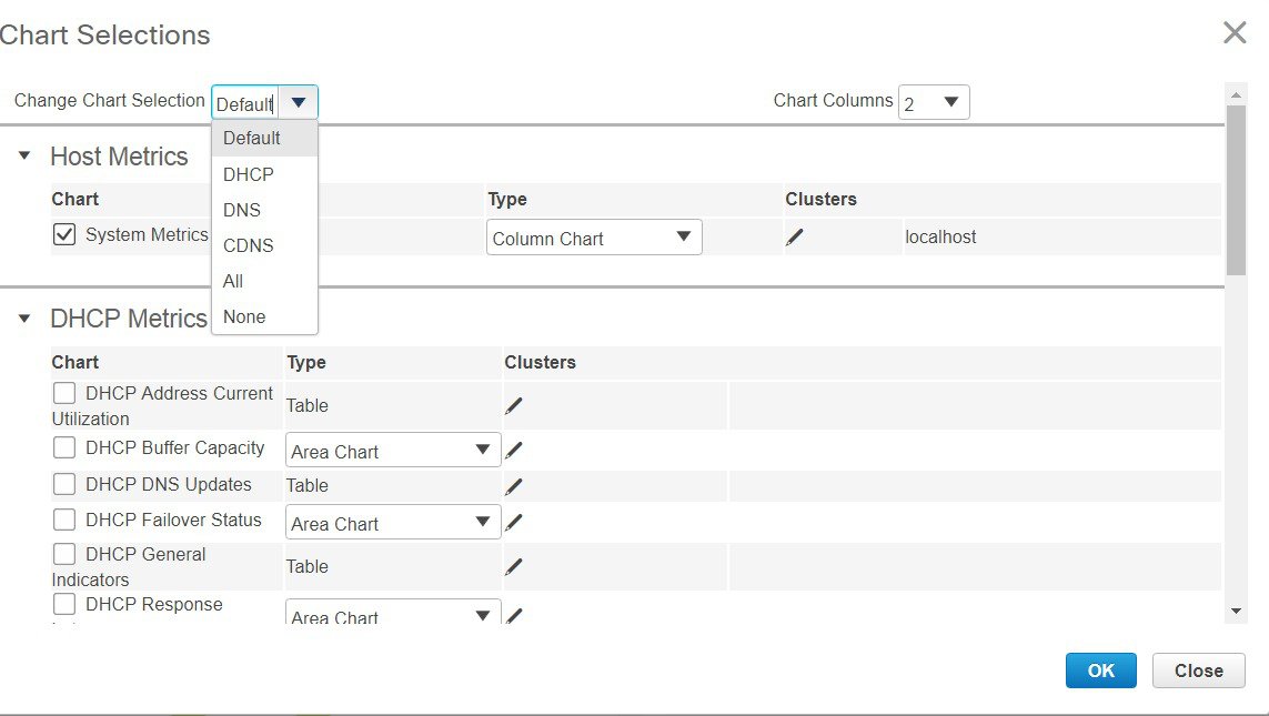
Configuring Server
Chart Types
You can set the
default chart types on the main dashboard view. You can customize the server
charts in the dashboard to display only the specific chart types as default.
To set up default
chart type, check the check box corresponding to the Metrics chart that you
want to display and choose a chart type from the
Type drop-down
list. The default chart types are consistent and shared across different user
sessions (see the image below).
Note
You can see either
the CDNS or DNS Metrics in the
Dashboard
Settings >
Chart Selection
page based on the service configured on the server.
Tip
The order in which
the dashboard elements appear in the Chart Selection list does not necessarily
determine the order in which the elements will appear on the page. An algorithm
that considers the available space determines the order and size in a grid
layout. The layout might be different each time you submit the dashboard
element selections. To change selections, check the check box next to the
dashboard element that you want to display.
Figure 7. Selecting Dashboard Elements
The above image displays the Charts Selection table in the regional web UI. The Clusters column is available only in regional dashboard and it displays the list of local clusters configured. You can add the local
cluster by clicking the Edit icon and then by selecting the local cluster name from the Local Cluster List dialog box.
To change selections,
check the check box next to the dashboard element that you want to display.
Specific group controls are available in the ChangeChartSelection drop-down list, at the top of the page (see the image above). To:
Uncheck all check boxes, choose None.
Revert to the preset selections, choose Default. The preset dashboard elements for administrator roles supporting DHCP and DNS are:
Host Metrics: System Metrics
DHCP Metrics: General Indicators
DNS Metrics: General Indicators
Select the DHCP metrics only, choose DHCP (see the "DHCP Metrics" section in Cisco Prime Network Registrar 10.1 DHCP User Guide).
Select the DNS metrics only, choose DNS (see the "Authoritative DNS Metrics" section in Cisco Prime Network Registrar 10.1 Authoritative and Caching DNS User Guide).
Select the DNS metrics only, choose CDNS(see the "Caching DNS Metrics" section in Cisco Prime Network Registrar 10.1 Authoritative and Caching DNS User Guide)
Select all the dashboard elements, choose All.
Click OK at the bottom of the page to save your choices, or Cancel to cancel the changes.
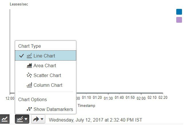
You can change the chart type by clicking the Chart Type icon at the bottom of the panel chart and then by selecting the required chart type (see the image below). The different
types of chart available are: Line Chart, Column Chart, Area Chart, and Scatter Chart.
Figure 8. Selecting the Chart Type
DHCP Metrics
These DHCP metric
elements are available in the dashboard:
The DHCP Address Current Utilization dashboard element, rendered as table, shows the DHCPv4 and DHCPv6 address utilization
(how many assigned addresses exist) for a particular address aggregation, which can be a scope, link, prefix, network, or
network plus selection tag. The table is available if you choose DHCPMetrics:DHCPAddressCurrentUtilization in the Chart Selections page.
The resulting table
shows:
Name—Aggregation name (or address).
InUse—Number of in-use addresses.
Total—Total number of addresses.
Utilization—Percentage of utilized addresses.
Mode(appears in Expert mode only)—Aggregation mode (scope, link, prefix, network, or selection-tags).
How to Interpret
the Data
The chart shows a table with four columns: the scope, link, or prefix name, its in-use and total addresses, and the percentage
of address utilization based on the previous two columns. The chart is available only if the DHCP server enhanced-sample-counters attribute is enabled.
If an SNMP trap configuration in scope mode applies, the Name column displays the scope name. Otherwise, it shows the network
IP address.
If traps are not enabled (or if the DHCP server default-free-address-config or v6-default-free-address-config attribute is not set), the network address is appended with an asterisk (*).
If a selection tag applies, its name is also appended. See the "Handling SNMP Notification Events" section in Cisco Prime Network Registrar 10.1 Administration Guide for details on SNMP traps.
If you do not define a default-free-address-config (or v6-default-free-address-config) attribute, Cisco Prime Network Registrar creates an internal, unlisted trap configuration named default-aggregation-addr-trap-config.
Because of this, do
not use the name default-aggregation-addr-trap-config for a trap configuration
you create.
Troubleshooting
Based on the Results
If the percentage
of utilized addresses is high, the addresses reached a saturation point. It
might be necessary to reassign addresses from a different scope.
DHCP Buffer
Capacity
The DHCP Buffer Capacity dashboard element, rendered as area chart, shows the number of allocated requests and responses,
and a line chart that plots the number of requests and responses in use. The element is available if you choose DHCPMetrics:DHCPBufferCapacity in the Chart Selections page.
The resulting table and chart plot:
RequestsinUse—Trend in the number of in-use request buffers.
ResponsesinUse—Trend in the number of in-use response
buffers.
How to Interpret
the Data
The DHCP Buffer
Capacity data shows the pattern in the use of DHCP request and response
buffers. If the buffers begin to increase in an abnormal pattern, there are
measures you can take without trying to compensate by increasing the number of
allocated buffers.
Troubleshooting
Based on the Results
If you see
increasing and consistent exceeding of the buffer threshold, find the reason
why the server is running slowly. Possible reasons include high degrees of
logging, slow DHCP extensions or LDAP servers, or overload, such as with chatty
clients or frequent rebooting of cable modem termination systems (CMTSs). You
might need to increase the buffer sizes.
DHCP DNS
Updates
The DHCP DNS Updates dashboard element, rendered as table, shows the related DNS server and its current state, and how many
pending DNS updates are occurring between it and the DHCP server. The table is available if you choose DHCPMetrics:DHCPDNSUpdates in the Chart Selections page.
The resulting table
shows:
Server—Related DNS server IP address
State—Related DNS server state
PendingUpdates—Total number of pending updates
How to Interpret
the Data
A high level of
pending updates to a specific DNS server indicates that the server is
unreachable or unavailable, or its address is wrong.
Troubleshooting
Based on the Results
Check into the
reachability of the associated DNS servers if the pending update rate spikes,
or ensure that the address of the associated server is correct.
DHCP Failover
Status
The DHCP Failover Status dashboard element rendered as two parallel trend charts that show the current and partner server
state and the binding updates and acknowledgments sent and received between the two failover partners. The charts are available
if you choose DHCPMetrics:DHCPFailoverStatus in the Chart Selections page.
Note
The failover
status is only for the first failover pair in the related servers list.
The display is a
table along with two rate line trend charts that shows the failover status for
the first failover pair for the related servers:
LocalState—Local DHCP server failover state along with
when it occurred.
PartnerState—Partner server failover state along with
when it occurred.
DHCPFailoverStatusUpdatesReceived—The first trend chart shows a comparison
of the number of binding updates received and binding acknowledgments sent.
DHCPFailoverStatusUpdatesSent—The second trend chart shows a comparison of
the number of binding updates sent and binding acknowledgments received.
How to Interpret
the Data
Along with some
state data, the display is split into two line trend charts that are inverses
of each other. Each chart compares the binding updates with the
acknowledgments. The top chart pairs the binding updates received with the
acknowledgments sent; the bottom chart pairs the binding updates sent with the
acknowledgments received.
Troubleshooting
Based on the Results
If the Partner
State value is other than 10, check the configuration of the partner server.
The updates sent and received data should also be fairly level.
DHCP General
Indicators
The DHCP General Indicators dashboard element, rendered as table, shows the server state, reload data, and lease counts.
The table is available if you choose DHCPMetrics:DHCPGeneralIndicators in the Chart Selections page.
The resulting table
shows:
ServerState—Up or Down (based on whether statistics are
available) and its duration.
LastReload—Date and time of the last server reload.
StartTime—Date and time of the last server process
(Cisco Prime
Network Registrar server agent) startup.
TotalScopes—Total number of configured DHCPv4 scopes.
V4LeasedLeases—Number of active DHCPv4 leases, including
reservations.
V4ConfiguredLeases—Number of configured DHCPv4 leases,
including reservations and ranges.
TotalPrefixes—Number of configured DHCPv6 prefixes.
V6LeasedLeases—Number of active DHCPv6 leases, including
reservations and delegated prefixes (which each count as one lease).
V6AllocatedLeases—Number of allocated DHCPv6 leases,
including reservations and delegated prefixes (which each count as one lease).
How to Interpret
the Data
The table indicates
the server state, process start time (via the Cisco Prime
Network Registrar server agent), and reload data, and also
provides lease statistics. The top set of data compares the DHCPv4 leases
actually in effect with those configured; the bottom set of data does the same
for DHCPv6 leases.
Time of last reload
is important for determining if recent changes to the server configuration
occurred from a reload operation. It can also help pinpoint when server changes
were last applied, if other indicators show a marked, unexpected behavioral
change. Be sure to preserve log files since the last reload.
Troubleshooting
Based on the Results
A drop or increase
in leases might indicate a power or network outage, but it can also indicate a
normal variation depending on lease times and usage patterns. The number of
scopes or prefixes indicated might also require some evaluation and possible
reconfiguration. If the server state is Down, all the DHCP chart indicators
show a red status box, so no data will be available. In the case of a server
that is down, restart the server.
DHCP Renewal Data
The DHCP Renewal Data dashboard element, rendered as line chart, shows the expected load of renewals on the DHCP server. This
chart is available if you choose DHCP Metrics: DHCP Renewal Data in the Chart Selections page.
The resulting line chart displays:
Number of Clients—Number of clients renewing within specific time intervals.
DHCP Response
Latency
The DHCP Response Latency dashboard element, rendered as area chart, shows the trend in the response packet latency (the
time interval between the request packet and its ensuing response). The chart is available if you choose DHCPMetrics:DHCPResponseLatency in the Chart Selections page.
Tip
You must also set
the
collect-sample-counters DHCP server attribute for this data
to display, with the
enhanced-sample-counters attribute also set for further
granularity. These attribute values are preset. If you are concerned about
achieving maximum performance, unset these attributes. (See the "Displaying Statistics"
section in
Cisco Prime Network Registrar 10.1 Administration Guide.)
The resulting area chart plots response latencies at the intervals:
Less than 50 milliseconds
50 to 200 milliseconds
200 to 500 milliseconds
500 to 1000 milliseconds (note that if the enhanced-sample-counters attribute is not set, all values below 1 second appear in this grouping)
1 to 2 seconds
2 to 3 seconds
3 to 4 seconds
More than 4 seconds
How to Interpret
the Data
The chart shows the
trend in response packet latency as an indicator of how long it takes to
respond to incoming packets. The gradations in the latency periods are stacked.
Troubleshooting
Based on the Results
High response
packet latency is similar to high buffer usage for troubleshooting purposes.
Look for slow LDAP servers or DHCP extensions, high levels of logging, or disk
I/O bottlenecks.
DHCP Server Leases
Per Second Data
The DHCP Server Leases Per Second dashboard element, rendered as area chart, shows the number of leases per second for the
DHCP server. This chart is available if you choose DHCPMetrics:DHCPServerLeases Per Second in the Chart Selections page.
The resulting area chart displays:
V4Leases—Number of IPv4 leases per second.
V6Leases—Number of IPv6 leases per second.
DHCP Server Request
Activity
The DHCP Server Request Activity dashboard element, rendered as area chart, traces the totals in the change rate of incoming
DHCP packet activity. The chart is available if you choose DHCPMetrics: DHCPServerRequestActivity in the Chart Selections page.
The resulting area chart plots the following trends:
V4Discovers—Number of DHCPv4 discover packets.
V4Requests—Number of DHCPv4 request packets.
V4Other—Number of DHCPv4 release, decline, or
info-request packets.
V4LeaseQueries—Number of DHCPv4 lease query packets.
V6Solicits—Number of DHCPv6 solicit packets.
V6Requests/Renews/Rebinds—Number of DHCPv6 request,
renew, and rebind packets.
V6Other—Number of DHCPv6 release, decline, or
information-request packets.
V6LeaseQueries—Number of DHCPv6 lease query packets.
InvalidPackets—Combined number of invalid DHCPv4 and
DHCPv6 packets.
How to Interpret
the Data
The DHCP Server
Request Activity data shows the pattern of server traffic based on incoming
DHCP requests. The trend should be fairly consistent, with spikes in the number
of Invalid packets being a sign that there is some misconfigured data on the
network. Note that DHCPv4 and DHCPv6 invalid packet activity is grouped
together.
Troubleshooting
Based on the Results
Check your DHCP
server configurations if there is a sudden spike in activity, especially in the
number of invalid request packets. Set your server logging to report where the
activity is occurring. Spikes or drops in activity can indicate network or
power outages that are worth investigating. Spikes in activity can also
indicate a faulty client, malicious client activity, or a recovery after a
power failure or outage that results in pent-up requests.
DHCP Server Response
Activity
The DHCP Server Response Activity dashboard element, rendered as area chart, traces the totals in the change rate of outgoing
DHCP packet activity. The chart is available if you choose DHCPMetrics: DHCPServerResponseActivity in the Chart Selections page.
The resulting area chart plots the following trends:
V4Offers—Number of DHCPv4 offer packets.
V4Acks—Number of DHCPv4 acknowledgment packets.
V4OtherClient—Number of other outgoing DHCPv4 client
packets.
V4LeaseQueries—Number of outgoing DHCPv4 lease query
packets.
V6Advertises—Number of DHCPv6 advertise packets.
V6Replies—Number of DHCPv6 reply packets.
V6Reconfigures—Number of DHCPv6 reconfigure packets.
V6LeaseQueryReplies—Number of DHCPv6 lease query reply
packets.
TotalDropped—Combined number of dropped DHCPv4 and
DHCPv6 packets.
How to Interpret
the Data
The DHCP Server
Response Activity data shows the pattern of server traffic to answer DHCP
requests. The trend should be fairly consistent, with spikes in the number of
Total Dropped packets being a sign that there is some misconfigured data on the
network. Note that DHCPv4 and DHCPv6 dropped packet activity is grouped
together.
Troubleshooting
Based on the Results
Check your DHCP
server configurations if there is a sudden spike in activity, especially in the
number of total dropped response packets. The response activity should match
the request activity, except for the normal time shift, and the same
diagnostics apply.


 Feedback