-
null
Bias-Free Language
The documentation set for this product strives to use bias-free language. For the purposes of this documentation set, bias-free is defined as language that does not imply discrimination based on age, disability, gender, racial identity, ethnic identity, sexual orientation, socioeconomic status, and intersectionality. Exceptions may be present in the documentation due to language that is hardcoded in the user interfaces of the product software, language used based on RFP documentation, or language that is used by a referenced third-party product. Learn more about how Cisco is using Inclusive Language.
- Updated:
- January 13, 2014
Chapter: Monitoring Your Cisco WAAS Network
- Viewing System Information from the System Dashboard Window
- Viewing Device Information
- Customizing a Dashboard or Report
- WAAS Chart Descriptions
- TCP Optimization Charts
- Compression Summary
- Compression Summary Over Time
- Effective WAN Capacity
- Throughput Summary
- Traffic Summary
- Traffic Summary Over Time
- The Traffic Summary Over Time chart displays a graph depicting the amount of original or optimized traffic, depending on the selected tab. You can include pass-through traffic by checking the Pass-Through check box. You can customize the chart by choosing specific applications to include. The default is all traffic.Traffic Volume and Reduction
- Acceleration Charts
- Akamai Connected Cache Charts
- Connection Trend Charts
- AppNav Charts
- Platform Charts
- SMB Preposition Chart
- TCP Optimization Charts
- WAAS Table Descriptions
- Using Predefined Reports to Monitor WAAS
- Predefined Reports Available by WAAS Level
- Location-Level Reports
- TCP Summary Report
- HTTP Acceleration Report
- HTTPS Acceleration Report
- SSL Acceleration Report
- MAPI Acceleration Report
- SMB Acceleration Report
- ICA Acceleration Report
- Summary Report
- Topology Report
- Connection Trend Report
- Connections Statistics Report
- Resource Utilization Report
- Disks Report
- AppNav Report
- Exported Reports
- Managing Reports
- Configuring Flow Monitoring
Monitoring Your Cisco WAAS Network
This chapter describes the monitoring tools available in the Cisco WAAS Central Manager GUI that can help you monitor activity, configure flow monitoring, and customize reports.
For information on Cisco WAAS system logging and troubleshooting, see the “Troubleshooting Your Cisco WAAS Network” chapter and see the Cisco WAAS Troubleshooting Guide for Release 4.1.3 and Later on Cisco DocWiki.

Note![]() Throughout this chapter, the term Cisco WAAS device is used to refer collectively to the WAAS Central Manager and Cisco Wide Area Application Engines (WAEs) in your network. The term WAE refers to WAE and Wide Area Application Virtual Engine (WAVE) appliances, and Cisco Virtual WAAS (vWAAS) instances.
Throughout this chapter, the term Cisco WAAS device is used to refer collectively to the WAAS Central Manager and Cisco Wide Area Application Engines (WAEs) in your network. The term WAE refers to WAE and Wide Area Application Virtual Engine (WAVE) appliances, and Cisco Virtual WAAS (vWAAS) instances.
Viewing System Information from the System Dashboard Window
The Cisco WAAS Central Manager GUI allows you to view general and detailed information about your Cisco WAAS network from the System Dashboard window. This section describes the System Dashboard window and contains the following topic:
Note![]() For information on viewing the alarm panel and on viewing device alarms, see Cisco WAAS Central Manager Alarm Panel in Chapter 16, “Troubleshooting Your WAAS Network.”
For information on viewing the alarm panel and on viewing device alarms, see Cisco WAAS Central Manager Alarm Panel in Chapter 16, “Troubleshooting Your WAAS Network.”
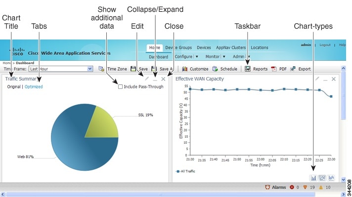
Figure 15-1 shows the System Dashboard window.
Figure 15-1 System Dashboard Window
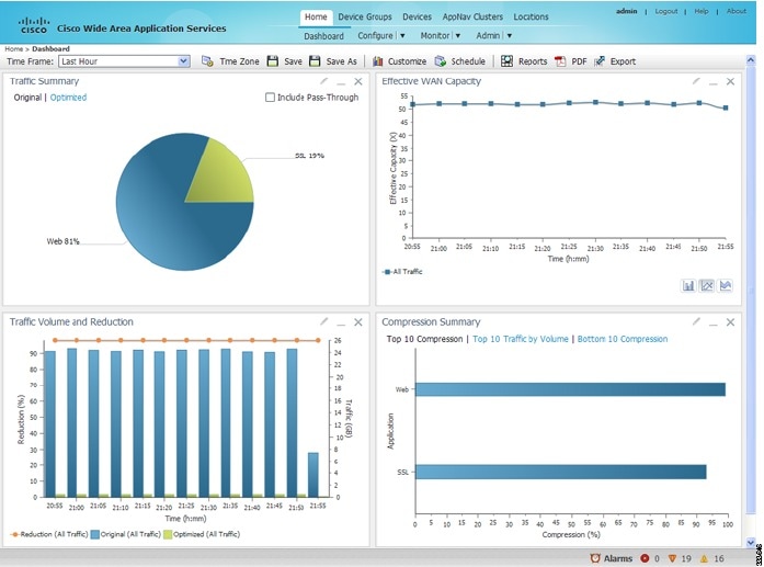
The information displayed in the charts in the System Dashboard window is based on a snapshot of your WAAS network that represents the state of your WAE devices at the end of every two polling periods. You can configure the interval between polls in the WAAS Central Manager GUI (Configure > Global > System Properties > System.monitoring.collectRate). The default polling rate is 300 seconds (5 minutes). Alarms are presented in real time and are independent of the polling rate.
Monitoring Graphs and Charts
The default System Dashboard window contains the following graphical displays about the application traffic processed by your WAAS system:
- Traffic Summary chart—Displays the applications with the highest percentage of traffic in the WAAS network for the last hour.
- Effective WAN Capacity graph—Displays the effective increased bandwidth capacity of the WAN link as a result of WAAS optimization, as a multiple of the actual bandwidth.
- The Traffic Summary Over Time chart displays a graph depicting the amount of original or optimized traffic, depending on the selected tab. You can include pass-through traffic by checking the Pass-Through check box. You can customize the chart by choosing specific applications to include. The default is all traffic.Traffic Volume and Reduction graph—Displays the original and optimized traffic volume and percentage of traffic reduction over the last hour.
- Compression Summary chart—Displays the ten applications with the highest percentage of traffic reduction for the WAAS network for the last hour. The percent calculation excludes pass-through traffic.
Numbers shown in charts and graphs are rounded to whole units (KB, MB, or GB), while those displayed in tables are rounded to three decimal places. Data values exported to CSV files are in bytes, and are therefore, not rounded.
You can customize the graphical displays and tables that are displayed on the system dashboard. For more information, see Customizing a Dashboard or Report. Individual charts are described in more detail in WAAS Chart Descriptions.
Much of the device, statistical, and alarm information that is presented in the system dashboard and associated graphs and charts is also available programmatically through the monitoring API. For more information, see Cisco Wide Area Application Services API Reference .
Note![]() You must synchronize the clock on each WAE device within 5 minutes of the primary and secondary WAAS Central Managers for statistics to be consistent and reliable. For information on using an NTP server to keep all your WAAS devices synchronized, see Configuring NTP Settings in the “Configuring Other System Settings” chapter. Additionally, if the network delay in the Central Manager receiving statistical updates from the WAEs is greater than 5 minutes, statistics aggregation may not operate as expected.
You must synchronize the clock on each WAE device within 5 minutes of the primary and secondary WAAS Central Managers for statistics to be consistent and reliable. For information on using an NTP server to keep all your WAAS devices synchronized, see Configuring NTP Settings in the “Configuring Other System Settings” chapter. Additionally, if the network delay in the Central Manager receiving statistical updates from the WAEs is greater than 5 minutes, statistics aggregation may not operate as expected.
Viewing Device Information
This section describes how to use the WAAS Central Manager device windows:
- Devices Window—Displays a list of and basic information for all WAAS devices.
- Device Dashboard Window—Displays detailed information about a specific device, such as the installed software version and whether the device is online or offline.
- Device Status Dashboard Window—Displays traffic information for all WAAS devices.
- Viewing and Unlocking Device Users —Displays the list of users, in table format, with information including username, number of login failures, and time of last login failure.
Devices Window
The Devices window lists all the WAAS devices that are registered with the WAAS Central Manager. To view this list, choose Devices > All Devices in the WAAS Central Manager GUI.
Figure 15-2 shows an example of the Devices window.
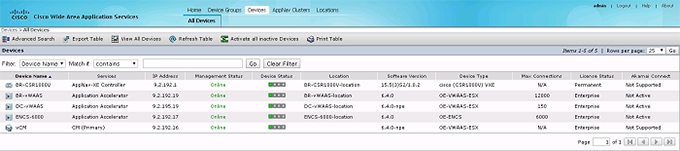
This window displays the following information about each device:
- Services enabled on the device. See Table 15-1 for a description of these services.
- IP address of the device.
- Management Status (Online, Offline, Pending, or Inactive). For more information about the status, see Device Alarms in the chapter “Troubleshooting Your WAAS Network.” A tool tip is displayed when you hover your cursor over the individual device Management status. It shows the timestamp for offline devices and the timestamp for the latest configuration for online devices.
- Device Status. The system status reporting mechanism uses four alarm lights to identify problems that have to be resolved. Each light represents a different alarm level as follows:
–![]() Green—No alarms (the system is in excellent health)
Green—No alarms (the system is in excellent health)
When you hover your mouse over the alarm light bar, a message provides further details about the number of alarms. Click the alarm light bar to troubleshoot the device. Location associated with the device. For more information about locations, see the “Using Device Groups and Device Locations” chapter. You can view reports that aggregate data from all the devices in a location. For more information, see Location-Level Reports.
- Software version installed and running on the device. For WAAS Express and AppNav-XE devices, both the Cisco IOS and the WAAS Express or AppNav-XE software versions are shown.
- Device Type. If you see a type such as WAAS Express and AppNav-XE devices, the router platform is displayed. For vWAAS devices, OE-VWAAS is displayed, and for Cisco WAAS for Cisco Integrated Services Routers (ISR) devices, ISR-WAAS is displayed. For ENCS devices, OE-ENCS is displayed.
- Max Connections- The maximum number of connections that can be handled by the device.
- License Type - Displays the type of license. The possible values are
- Smart License- shown only when smart licensing is enabled for the device.
- Perpetual type- regular
- License Status. Displays the installed licenses. See Table 15-2 for a description of the possible values.
- Akamai Connect - Displays the Akamai Connect license status for the device whether the license is supported, active or disabled for the device.
WAE devices that are at a later software version level than the WAAS Central Manager are displayed in red. Also, if the standby WAAS Central Manager has a different version level from the primary WAAS Central Manager, the standby WAAS Central Manager is displayed in red.
You can filter your view of the devices in the list by using the Filter and Match If fields above the list. Enter a filter string in the text field and click Go to apply the filter. The filter settings are shown below the list. Click Clear Filter to clear the filter and show all the devices. Filtering allows you to find devices that match the criteria that you set.
Note![]() After the devices has been registered to the WAAS Central Manager (WCM), a WCM DB VACUUM (runs between 1 AM – 2 AM) process takes more time (Min:2 min, Avg:7 min, Max:25min) due to the augmented load on computing resources.
After the devices has been registered to the WAAS Central Manager (WCM), a WCM DB VACUUM (runs between 1 AM – 2 AM) process takes more time (Min:2 min, Avg:7 min, Max:25min) due to the augmented load on computing resources.
- Few of the WAEs may go temporarily offline. They are online automatically once the VACUUM process is complete.
- Statistics Aggregation threads may take more than 5 minutes and the same would be indicated in the logs. As a result statistics samples, might be missing at network level.
- User, including the administrator will not be able to use (login) the WCM as the complete DB will be locked.
Device Dashboard Window
The Device Dashboard window provides detailed information about a WAAS device, including device model (such as WAVE-7541-K9 or OE-VWAAS-KVM), IP address, interception method, and device-specific charts. (See Figure 15-3.)
To access the Device Dashboard window, choose Devices > device-name.
Figure 15-3 Device Dashboard Window
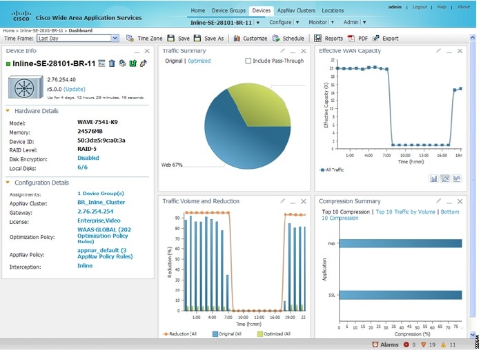
The Device Dashboard window for a WAAS Express or AppNav-XE device looks slightly different. It lacks some WAE-specific information and controls.
From the Device Dashboard window, you can perform the following tasks:
- View charts and graphs about the application traffic processed by the selected WAE device. (No charts or graphs are displayed if a WAAS Central Manager device is selected.)
- Customize the charts displayed in the window. For more information, see Customizing a Dashboard or Report. Individual charts are described in more detail in WAAS Chart Descriptions.
- View basic details, such as whether the device is online, the device’s IP address and hostname, the software version running on the device, and the amount of memory installed in the device, the license status, and so forth.
- View the device groups to which the device belongs. For more information about device groups, see Chapter3, “Using Device Groups and Device Locations” (Not available on AppNav-XE devices.)
- View the users that are defined on the device and unlock any locked-out users. For more information, see Viewing and Unlocking Device Users. (Not available on WAAS Express and AppNav-XE devices.)
- Click the Update link to update the software on the device. For more information, see the “Maintaining Your Cisco WAAS System” chapter. (Not available on WAAS Express and AppNav-XE devices.)
- Click the Telnet icon to establish a Telnet session into the device and issue CLI commands.
- Click the Delete Device icon to delete the device.
- Click the Full Update icon to reapply the device configuration from the Central Manager to the device. (Not available on WAAS Express and AppNav-XE devices.)
- Click the Reload icon to reboot the device. (Not available on WAAS Express and AppNav-XE devices.)
- Click the Restore Default Policies icon to restore the default predefined policies on the device. For more information, see Restoring Optimization Policies and Class Maps in the “Configuring Application Acceleration” chapter. (Not available on AppNav-XE devices.)
- Assign and unassign the device to device groups. For more information, see the “Using Device Groups and Device Locations” chapter. (Not available on AppNav-XE devices.)
- For a WAAS Express device, a WAAS Enabled Interfaces item shows the number of interfaces on which WAAS optimization is enabled. You can click the number to go to the Network Interfaces configuration window, which displays device interface details and allows you to enable or disable optimization on the available interfaces. For more details, see Enabling or Disabling Optimization on WAAS Express Interfaces in Chapter 6, “Configuring Network Settings.”
- For a WAAS Express device, you can view the DRE item to determine if the device supports data redundancy elimination (DRE) optimization, which is not supported on some WAAS Express device models. This item reads Supported or Unsupported.
- For a WAAS Express device, you can view the SSL item to determine if SSL acceleration is available. This item reads Available or Unavailable.
- For a vWAAS device, the No. of CPUs, Max TCP Connections, and Interception Method fields are shown. For more details, see Chapter 5, “Configuring Traffic Interception.”
- On an AppNav Controller, an AppNav Cluster item shows any defined AppNav Clusters. You can click a cluster name to go to that cluster’s home window. Also, an AppNav Policy item shows defined AppNav policies, if any. Click a policy name to go to the policy configuration window.
Device Status Dashboard Window
The Device Status Dashboard window, shown in Figure 15-4, lists all the WAAS devices that are registered with the WAAS Central Manager. To view this list, choose Home > Monitor> Network> Device Status in the WAAS Central Manager GUI.
Figure 15-4 Device Status Dashboard Window
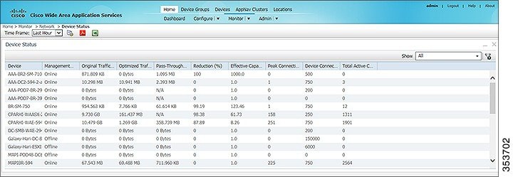
Table 15-3 displays information about each column in the Device Status Dashboard window:
Table 15-3 Column and Field Descriptions for the Device Status Dashboard Window
|
|
|
|---|---|
Choose one of the following time frame to display status for the device:
Note For more information on time frames, see Customizing a Dashboard or Report |
|
A status of Online, Offline, Pending, or Inactive. For more information on device management status and alarms related to device management status, see Device Alarms in Chapter 16, “Troubleshooting Your WAAS Network.” |
|
The amount of original traffic, in GB, passing through the device. |
|
The amount of optimized traffic, in GB, passing through the device. |
|
The percentage of traffic reduction for the time period specified in the Time Frame drop-down list. |
|
The effective bandwidth capacity of the device as a result of optimization. |
|
The total number of current active connections for the device. |
Device Status Report
You can choose to view the Device Status report as a pdf or a.csv file by selecting the respective icons on the dashboard. The Time Zone option enables you to customize the time zone for the report, based on your preference. For more information on setting time zones, see Customizing a Dashboard or Report.
You can filter your view of the devices in the list by using the Filter and Match If fields above the list. Enter a filter string in the text field and click the Go button to apply the filter. The filter settings are shown below the list. Click the Clear Filter button to clear the filter and show all devices. Filtering allows you to find devices in the list that match the criteria that you set.
Viewing and Unlocking Device Users
To view the users defined on a WAAS device, go to Devices > device-name, and then, from the device-name menu, choose Device Users. On a Central Manager device, choose CM Users).
The list of users is displayed in a table, which shows the username, number of login failures, maximum number of login failures allowed, and the time of the last failed login. To view the details of a user, click the View icon next to that username.
If a user is locked out because the user has reached the maximum number of failed login attempts, unlock the user by checking the check box next to the username and clicking Unlock below the table.
Detecting and Resolving Configuration Conflicts
Configuration conflicts between the device group and devices are difficult to identify at the device group level. Whenever configuration conflicts occur, they show up in the Force Device Group Detection page. The WAAS Central Manager provides an easy way to identify, view and resolve these configuration conflicts.
Note![]() Force Device Group detection is not applicable for Cisco routers.
Force Device Group detection is not applicable for Cisco routers.
To identify the configuration conflict pages,
Step 1![]() From the WAAS Central Manager navigate to Home > Admin > Force Device Group > View Pages to see the impacted Device Name, Device Group Name and Page Name. This lists all the device groups that have conflicts with the devices and on which page.
From the WAAS Central Manager navigate to Home > Admin > Force Device Group > View Pages to see the impacted Device Name, Device Group Name and Page Name. This lists all the device groups that have conflicts with the devices and on which page.
Step 2![]() Click on the page link to navigate to the corresponding page to correct the configuration conflict by selecting FDG as mentioned in Procedure for Forcing Device Group Settings.
Click on the page link to navigate to the corresponding page to correct the configuration conflict by selecting FDG as mentioned in Procedure for Forcing Device Group Settings.
Customizing a Dashboard or Report
You can customize the system and device dashboards and reports, if any, in the same way. For more information about creating custom reports, see Managing Reports.
This section contains the following topics:
The WAAS Central Manager Report Panel
An example of a report is shown in Figure 15-5.
Taskbar icons and controls across the top of the dashboard or report allow you to do the following:
–![]() Last Hour —Displays data for the past hour, in five-minute intervals (default). You can change the interval using the System.monitoring.collectRate configuration setting described in Modifying the Default System Properties in the “Configuring Other System Settings” chapter.
Last Hour —Displays data for the past hour, in five-minute intervals (default). You can change the interval using the System.monitoring.collectRate configuration setting described in Modifying the Default System Properties in the “Configuring Other System Settings” chapter.
–![]() Last Day —Displays data for the past day (in hourly intervals).
Last Day —Displays data for the past day (in hourly intervals).
–![]() Last Week —Displays data for the past week (in daily intervals).
Last Week —Displays data for the past week (in daily intervals).
–![]() Last Month —Displays data for the past month (in daily intervals).
Last Month —Displays data for the past month (in daily intervals).
–![]() Custom—Enter starting and ending dates in the From and To fields. Click the calendar icon to choose dates from a pop-up calendar.
Custom—Enter starting and ending dates in the From and To fields. Click the calendar icon to choose dates from a pop-up calendar.
The time frame setting is stored individually for each report and Central Manager user. Additionally, the System.monitoring.timeFrameSettings system property controls the system default time frame setting (see Modifying the Default System Properties in the “Configuring Other System Settings” chapter).
Note![]() If you create a chart with a custom date setting that spans more than two months prior to the current date, data for the most recent two months are plotted with daily data and data for all the earlier months are plotted with aggregated monthly data. The chart might appear to have a large drop in traffic for the most recent two months because the daily traffic totals are likely to be much smaller than the monthly traffic totals. However, this difference is normal.
If you create a chart with a custom date setting that spans more than two months prior to the current date, data for the most recent two months are plotted with daily data and data for all the earlier months are plotted with aggregated monthly data. The chart might appear to have a large drop in traffic for the most recent two months because the daily traffic totals are likely to be much smaller than the monthly traffic totals. However, this difference is normal.
–![]() UTC —Sets the time zone of the report to UTC.
UTC —Sets the time zone of the report to UTC.
–![]() CM Local Time —Sets the time zone of the report to the time zone of the WAAS Central Manager (default).
CM Local Time —Sets the time zone of the report to the time zone of the WAAS Central Manager (default).
When you change the time zone, the change applies globally to all reports. The time zone setting is stored individually for each Central Manager user.
- Save—Saves the dashboard or report with its current settings. The next time you view it, it is displayed with these settings.
- Save As—Saves the report with its current settings under a new name. A dialog box allows you to enter a report name and an optional description. You can enter only the following characters: numbers, letters, spaces, periods, hyphens, and underscores. The report will be available in the Monitor > Reports > Reports Central window.
- Customize—Allows you to add a chart or table to a dashboard or report. For information on adding a chart or table, see Adding a Chart or Table.
- Schedule—Allows you to schedule reports to be generated once, or periodically, such as hourly, daily, weekly, or monthly. When a scheduled report is generated, you can have a PDF copy of the report e-mailed to you automatically.
–![]() In the Date field, enter the schedule date in the format DD/MM/YYYY or click the calendar icon to display a calendar from which to choose the date.
In the Date field, enter the schedule date in the format DD/MM/YYYY or click the calendar icon to display a calendar from which to choose the date.
–![]() From the Hours drop-down list, choose the hours. The time represents the local time at the WAAS Central Manager.
From the Hours drop-down list, choose the hours. The time represents the local time at the WAAS Central Manager.
–![]() From the Minutes drop-down list, choose the minutes. The time represents the local time at the WAAS Central Manager.
From the Minutes drop-down list, choose the minutes. The time represents the local time at the WAAS Central Manager.
–![]() From the Frequency drop-down list, choose Once, Hourly, Daily, Weekly, or Monthly for the report frequency.
From the Frequency drop-down list, choose Once, Hourly, Daily, Weekly, or Monthly for the report frequency.
–![]() In the No. of Reports field, enter the number of times that a reoccurring report is to be generated. (After a report is generated a specified number of times, the report is no longer generated.)
In the No. of Reports field, enter the number of times that a reoccurring report is to be generated. (After a report is generated a specified number of times, the report is no longer generated.)
–![]() In the Email Id(s) field, enter the email addresses of the report recipients, separated by commas.
In the Email Id(s) field, enter the email addresses of the report recipients, separated by commas.
–![]() In the Email Subject field, enter the subject of the email message.
In the Email Subject field, enter the subject of the email message.
- Reports—Allows you to view the scheduled reports. For instructions about viewing scheduled reports, see Viewing or Deleting a Scheduled Report.
- PDF—Generates a PDF format of a report, including the charts and table data. If you want a custom logo in your PDF report, you can upload the logo by choosing Home Dashboard > Admin > Custom Logo, and clicking Upload. The custom logo is displayed in the PDF format of the report. Additionally, when you schedule a report, you can select Custom Logo for the logo to appear on the scheduled report. This option is available only when you have uploaded the custom logo.
- Export—Exports the chart and table statistical data to a CSV file. The statistical data shown in charts is rounded to whole units (KB, MB, or GB), while the exported data contains exact byte values.
Controls at the top of individual charts allow you to customize the chart as follows (not all controls are available in every chart):
- Chart title—Allows you to click and drag in order to move the chart to a different location in the report pane.
- Edit icon—Allows you to edit the chart settings, as described in Configuring Chart Settings.
- Collapse/Expand icon—Allows you to collapse or expand the chart. When a chart is collapsed, this icon changes to Expand, which restores the chart to its normal size.
- Close icon—Closes the chart.
- Tabs—Allows you to have a choice of multiple tab views that you can access by clicking the desired tab name. Note that not all charts have this feature.
- Check box to show additional data—Allows you to check the check box labeled with an optional data statistic to include the data in the chart. Note that not all charts have this feature.
Chart-type icons at the bottom of individual charts allow you to choose the chart type as follows: column chart, line chart, area chart, stacked line chart, stacked area chart. Note that not all charts have this feature.
Adding a Chart or Table
To add a chart or table to a dashboard or report, follow these steps:
Step 1![]() From the dashboard or report chart panel, click the Customize icon in the taskbar. The Customize window is displayed, as shown in Figure 15-6.
From the dashboard or report chart panel, click the Customize icon in the taskbar. The Customize window is displayed, as shown in Figure 15-6.

Step 2![]() Expand any of the chart categories by clicking on the small triangle next to the corresponding category.
Expand any of the chart categories by clicking on the small triangle next to the corresponding category.
Step 3![]() Check the check box next to each chart or table that you want to be displayed as a report. Individual charts are described in more detail in WAAS Chart Descriptions.
Check the check box next to each chart or table that you want to be displayed as a report. Individual charts are described in more detail in WAAS Chart Descriptions.
Charts that are currently included in the dashboard or report are marked with an asterisk (*). A report can contain a maximum of eight charts and tables (the Network Summary report can contain 12 charts and tables).
Note![]() At the WAAS Express device level, only charts for supported accelerators are available.
At the WAAS Express device level, only charts for supported accelerators are available.
Step 4![]() To preview a chart, click the chart’s title. The preview is displayed on the right of the pane.
To preview a chart, click the chart’s title. The preview is displayed on the right of the pane.
To delete a chart or table from a dashboard or report, click Close on the chart and save the report.
Configuring Chart Settings
To configure the data presented in a chart, follow these steps:
Step 1![]() Click the Edit icon in the upper right corner of a chart. The Settings window is displayed.
Click the Edit icon in the upper right corner of a chart. The Settings window is displayed.
Note![]() Not all settings are available for all chart types.
Not all settings are available for all chart types.
Step 2![]() (Optional) From the Traffic Direction drop-down list, choose one of the following options:
(Optional) From the Traffic Direction drop-down list, choose one of the following options:
Step 3![]() (Optional) From the Access Mode drop-down list, choose one of the following options:
(Optional) From the Access Mode drop-down list, choose one of the following options:
- Both—Displays statistics for both single-sided and double-sided optimization.
- With WAAS Peer—Display statistics for double-sided optimization.
- Without WAAS Peer—Displays statistics for single-sided optimization.
Use these options are to include or exclude single-sided optimization. The single-side statistics option is available only for the Traffic Summary, Effective WAN capacity, Traffic Volume and Reduction, Compression Summary, Traffic Summary over time, Compression Summary over time, Throughput Summary and Optimized Connections Over Time charts.
Step 4![]() (Optional) From the Select Series For drop-down list, choose one of the following:
(Optional) From the Select Series For drop-down list, choose one of the following:
Step 5![]() (Optional) In the Application or Classifier list, check the check box next to the applications or classifiers whose statistics you want to include in the chart data. To include all the applications, check the All Traffic check box. You can filter the list items by using the Quick Filter above the list. These lists are available only for some chart types.
(Optional) In the Application or Classifier list, check the check box next to the applications or classifiers whose statistics you want to include in the chart data. To include all the applications, check the All Traffic check box. You can filter the list items by using the Quick Filter above the list. These lists are available only for some chart types.
Step 6![]() (Optional) Some charts have other types of data series from which to choose. Check the check box next to each of the data series that you want to include in the chart data.
(Optional) Some charts have other types of data series from which to choose. Check the check box next to each of the data series that you want to include in the chart data.
Note![]() Data collection for applications and classifiers occurs at slightly different times in the Central Manager. Therefore, the statistics can be different when viewing the same time period for an application and a classifier that report similar data.
Data collection for applications and classifiers occurs at slightly different times in the Central Manager. Therefore, the statistics can be different when viewing the same time period for an application and a classifier that report similar data.
WAAS Chart Descriptions
This section describes the charts that you can choose to include in a dashboard or report. For tables that provide information on system, device, traffic and acceleration, see WAAS Table Descriptions,
The following chart categories are available:
- TCP Optimization Charts
- Acceleration Charts
- Akamai Connected Cache Charts
- Connection Trend Charts
- AppNav Charts
- Platform Charts
- SMB Preposition Chart
All charts are created using the Central Manager local time zone, unless the chart settings are customized to use a different time zone.
Note![]() At the device level for WAAS Express devices, only charts for supported accelerators are available. In all charts, pass-through traffic for WAAS Express devices is considered as zero.
At the device level for WAAS Express devices, only charts for supported accelerators are available. In all charts, pass-through traffic for WAAS Express devices is considered as zero.
TCP Optimization Charts
The following TCP optimization charts are available:
- Compression Summary
- Compression Summary Over Time
- Effective WAN Capacity
- Throughput Summary
- Traffic Summary
- Traffic Summary Over Time
- The Traffic Summary Over Time chart displays a graph depicting the amount of original or optimized traffic, depending on the selected tab. You can include pass-through traffic by checking the Pass-Through check box. You can customize the chart by choosing specific applications to include. The default is all traffic.Traffic Volume and Reduction
Compression Summary
The Compression Summary chart displays a bar chart depicting the percentage of traffic reduction (excluding pass-through traffic) for the top ten applications with the highest percentage of traffic reduction. Two additional tabs allow you to see the compression of the top ten applications by volume and the bottom ten applications with the lowest compression.
% Reduction Excluding Pass-Through = (Original Excluding Pass-Through – Optimized) / (Original Excluding Pass-Through)
Compression Summary Over Time
The Compression Summary Over Time chart displays a graph of the percentage of total traffic that was reduced by using the WAAS optimization techniques. This chart excludes pass-through traffic in the results. You can customize the chart by choosing specific applications to include. The default is all traffic.
% Reduction = (Original Excluding Pass-Through – Optimized) / (Original Excluding Pass-Through)
Effective WAN Capacity
The Effective WAN Capacity chart displays the effective increased bandwidth capacity of the WAN link as a result of WAAS optimization. You can choose which applications to include. The default is all traffic.
Effective WAN Capacity = 1 / (1-% Reduction Excluding Pass-Through)
% Reduction Excluding Pass-Through = (Original Excluding Pass-Through – Optimized) / (Original Excluding Pass-Through)
Throughput Summary
The Throughput Summary chart displays the amount of average and peak throughput for the LAN-to-WAN (outbound) or WAN-to-LAN (inbound) directions depending on the selected tab. The throughput units (KBps, MBps, or GBps) at the left side vary depending on the range. The Peak Throughput series is not applicable for Last Hour graphs. This chart is available only at the device and location levels. The chart, which is in PDF, displays a maximum of 10 series.
% Reduction Excluding Pass-Through = (Original Excluding Pass-Through – Optimized) / (Original Excluding Pass-Through)
Note![]() The WAN to LAN Throughput and the LAN to WAN Throughput charts for the Last Week and Last Month time periods do not display peak throughput data until after two days of data have accumulated. You may see 0 for peak throughput if it has been less than two days since a new WAAS software installation or upgrade.
The WAN to LAN Throughput and the LAN to WAN Throughput charts for the Last Week and Last Month time periods do not display peak throughput data until after two days of data have accumulated. You may see 0 for peak throughput if it has been less than two days since a new WAAS software installation or upgrade.
Traffic Summary
The Traffic Summary chart displays the top nine applications that have the highest percentage of traffic as seen by WAAS. Each section in the pie chart represents an application as a percentage of the total traffic on your network or device. Unclassified, unmonitored, and applications with less than 2 percent of the total traffic are grouped together into a tenth category named Other Traffic (shown only if it totals at least 0.1 percent of all traffic). You can choose to display Original traffic or Optimized traffic by clicking the tab, and you can include pass-through traffic by checking the Include Pass-Through check box.
(App Traffic/ Total Traffic) * 100
App Traffic is the Original traffic (Original Excluding Pass-Through) or Optimized traffic (Optimized Excluding Pass-Through) flowing for an application.
Traffic Summary Over Time
The Traffic Summary Over Time chart displays a graph depicting the amount of original or optimized traffic, depending on the selected tab. You can include pass-through traffic by checking the Pass-Through check box. You can customize the chart by choosing specific applications to include. The default is all traffic.Traffic Volume and Reduction
The Traffic Volume and Reduction chart compares the amount of original and optimized traffic in a bar chart and displays the percentage of traffic reduction as a line. Pass-through traffic is excluded. The traffic units (bytes, KB, MB, or GB) at the right side depend upon the range. The percentage of traffic reduction is shown at the left side of the chart. You can customize the chart by choosing specific applications to include. The default is all traffic.
% Reduction Excluding Pass-Through = (Original Excluding Pass-Through – Optimized) / (Original Excluding Pass-Through)
Acceleration Charts
HTTP Acceleration Charts
HTTP: Connection Details
The HTTP Connection Details chart displays the HTTP session connection statistics, showing the average number of active HTTP connections per device (at the device level, it shows the exact number for the last hour.) Click the Details tab to display the newly handled HTTP connections, optimized connections, dropped connections, and handed off connections over time.
HTTP: Effective WAN Capacity
The HTTP Effective WAN Capacity chart displays the effective bandwidth capacity of the WAN link as a result of HTTP acceleration, as a multiplier of its base capacity. The capacity data for all traffic and HTTP traffic is shown.
Note![]() If the chart has no data, monitoring may be disabled for the application definition that includes this type of traffic. Verify that monitoring is enabled for the web application.
If the chart has no data, monitoring may be disabled for the application definition that includes this type of traffic. Verify that monitoring is enabled for the web application.
HTTP: Estimated Time Savings
The HTTP Estimated Time Savings chart displays a graph of the estimated percentage of the response time saved by the HTTP accelerator due to SharePoint prefetch optimization and metadata caching.
HTTP: Optimization Count
The HTTP Optimization Count chart displays a graph of the number of different kinds of optimizations performed by the HTTP accelerator. These optimizations are displayed in different colors. The optimizations included in this chart are metadata caching and SharePoint prefetch.
HTTP: Optimization Techniques
The HTTP Optimization Techniques pie chart displays the different kinds of optimizations performed by the HTTP accelerator. The optimizations included in this chart are metadata caching, suppressed server compression, SharePoint prefetch, and DRE hinting.
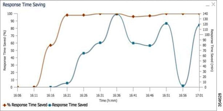
HTTP: Response Time Savings
The HTTP Response Time Savings chart displays a graph of the round-trip response time saved by the HTTP accelerator due to metadata caching and SharePoint prefetch optimizations. These optimizations are displayed in different colors. The time units (milliseconds, seconds, or minutes) at the left side depend on the range.
HTTPS Acceleration Charts
HTTPS: Connection Details
The HTTPS Connection Details chart displays the HTTPS session connection statistics, showing the average number of active HTTPS connections per device (at the device level, it shows the exact number for the last hour). Click the Details tab to display the newly handled HTTPS connections and optimized connections.
HTTPS: Effective WAN Capacity
The HTTPS Effective WAN Capacity chart displays the effective bandwidth capacity of the WAN link as a result of HTTP acceleration, as a multiplier of its base capacity. The capacity data for all traffic and SSL traffic (which includes HTTPS traffic) is shown.
Note![]() If the chart has no data, monitoring may be disabled for the application definition that includes this type of traffic. Make sure that monitoring is enabled for the SSL application.
If the chart has no data, monitoring may be disabled for the application definition that includes this type of traffic. Make sure that monitoring is enabled for the SSL application.
HTTPS: Estimated Time Savings
The HTTPS Estimated Time Savings chart displays the estimated percentage of response time saved by using metadata caching for HTTPS connections.
HTTPS: Optimization Count
The HTTPS Optimization Count chart displays a graph of the number of different kinds of metadata caching optimizations performed by the HTTPS accelerator. These optimizations are displayed in different colors.
HTTPS: Optimization Techniques
The HTTPS Optimization Techniques pie chart displays the different kinds of optimizations performed by the HTTPS accelerator. The optimizations included in this chart are metadata caching, suppressed server compression, and DRE hinting.
HTTPS: Response Time Savings
The HTTPS Response Time Savings chart displays a graph of the round-trip response time saved by the HTTPS accelerator due to metadata caching optimizations, which are displayed in different colors. The time units (milliseconds, seconds, or minutes) at the left side depend on the range.
Secure Sockets Layer (SSL) Acceleration Charts
SSL: Acceleration Bypass Reason
The Secure Sockets Layer (SSL) Acceleration Bypass Reason pie chart displays the reasons because of which SSL traffic is not accelerated: version mismatch, unknown, nonmatching domain, server name indication mismatch, cipher mismatch, revocation failure, certificate verification failure, other failure, and non-SSL traffic.
SSL: Connection Details
The SSL Connection Details chart displays the SSL session connection statistics, showing the average number of active SSL connections per device (at the device level, it shows the exact number for the last hour). Click the Details tab to display the newly handled SSL connections, optimized connections, handed-off connections, dropped connections, HTTPS connections, and Independent Computing Architecture (ICA) connections over SSL.
SSL: Effective WAN Capacity
The SSL Effective WAN Capacity chart displays the effective bandwidth capacity of the WAN link as a result of SSL acceleration, as a multiplier of its base capacity. The capacity data for all traffic and SSL traffic is shown.
All the charts above display the cumulative statistical data of single sided and dual sided ssl counters.
Note![]() If the chart has no data, monitoring may be disabled for the application definition that includes this type of traffic. Verify that monitoring is enabled for the SSL application.
If the chart has no data, monitoring may be disabled for the application definition that includes this type of traffic. Verify that monitoring is enabled for the SSL application.
Messaging Application Programming Interface (MAPI) Acceleration Charts
MAPI: Acceleration Bypass Reason
The Messaging Application Programming Interface (MAPI) Acceleration Bypass Reason pie chart displays the reasons because of which encrypted MAPI traffic is not accelerated: acceleration disabled, secret retriever disabled, unsupported cipher, unsupported authentication mechanism, misconfigured domain identity, failure in secret retrieval, general security failure, insufficient system resources, and recovery mode connections.
Click the Non-Encrypted tab to display the bypass reasons for unencrypted MAPI traffic: reservation failure (non-overload), reservation failure (overload), signed MAPI request, malformed RPC packet, handover request from peer, unsupported server version, user in denied list, unsupported client version, secured connections (encrypted), unsupported DCERPC protocol version, association group not tracked, and other.
MAPI: Average Response Time Saved
The MAPI Average Response Time Saved chart displays a graph of the estimated percentage of response time saved by the MAPI accelerator. The time units (microseconds, milliseconds, seconds, or minutes) at the left side depend upon the range.
MAPI: Connection Details
The MAPI Connection Details chart displays the MAPI session connection statistics, showing the average number of active MAPI connections per device (at the device level, it shows the exacat number for the last hour). Click the Details tab to display the newly handled MAPI connections, optimized connections, handed-off connections, and dropped connections. Click the Optimized Encrypted vs Non-Encrypted tab to display the new encrypted and unencrypted MAPI connections.
MAPI: Effective WAN Capacity
The MAPI Effective WAN Capacity chart displays the effective bandwidth capacity of the WAN link as a result of MAPI acceleration, as a multiplier of its base capacity. The capacity data for all traffic and MAPI traffic is shown.
Note![]() If the chart has no data, monitoring may be disabled for the application definition that includes this type of traffic. Verify that monitoring is enabled for the Email-and-Messaging application.
If the chart has no data, monitoring may be disabled for the application definition that includes this type of traffic. Verify that monitoring is enabled for the Email-and-Messaging application.
MAPI: Request Optimization
The MAPI Request Optimization chart displays the percentage of local and remote MAPI command responses. A local response is a response that is sent to the client from the local WAE. A remote response comes from the remote server. Click the Encrypted vs Non-Encrypted tab to display the percentage of local and remote responses for encrypted and unencrypted MAPI connections.
MAPI: Response Time Optimization
The MAPI Response Time Optimization chart compares the average time used for local and remote MAPI responses. The time units (microseconds, milliseconds, seconds, or minutes) at the left side depend upon the range. Click the Encrypted vs Non-Encrypted tab to display the average time used for local and remote responses for encrypted and unencrypted MAPI connections.
MAPI: Average Accelerated Client Sessions
The MAPI Average Accelerated Client Sessions pie chart displays the average number of encrypted sessions that are accelerated from different versions (2000, 2003, 2007, and 2010) of the Microsoft Outlook client. Click the Non-Encrypted tab to display the unencrypted session counts.
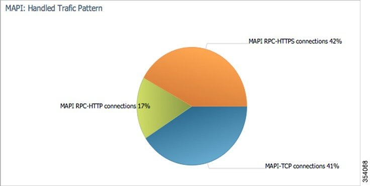
MAPI: Handled Traffic Pattern
For WAAS Versions 5.5.3 and later, MAPI Acceleration reports include the MAPI: Handled Traffic Pattern pie chart. This chart displays the percentage of three types of traffic:
- Total handled MAPI connections
- Total handled MAPI RPC-HTTP connections
- Total handled MAPI RPC-HTTPS connections
- Total handled MAPI over HTTP connections
Figure 15-7 Example of MAPI: Handled Traffic Pattern Chart
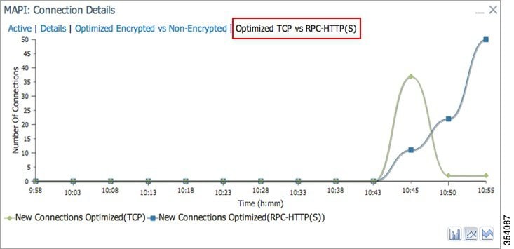
MAPI: Connection Details
The MAPI Connection Details chart displays MAPI session connection statistics, showing the average number of active MAPI connections per device (at the device level, it shows the exact number for the last hour). In addition to information on newly handled MAPI connections, optimized connections, handed-off connections, dropped connections, and optimized vs. non-encrypted MAPI connections, WAAS Version 5.5.3 and later also provides information on optimized TCP vs. RPC-HTTP(S) MAPI connections, as shown in Figure 15-8. WAAS Version 6.4.3 and later includes information on MAPI over HTTP connection in the following chart.
Figure 15-8 Example of MAPI: Connection Details Chart
Server Message Block (SMB) Acceleration Charts
SMB: Average Response Time Saved
The Server Message Block (SMB) Average Response Time Saved chart displays the average response time saved for SMB responses. The time units (milliseconds, seconds, or minutes) at the left side depend upon the range.
SMB: Client Average Throughput
The SMB Client Average Throughput chart displays the average client throughput for the SMB accelerator.
SMB: Connection Details
The SMB Connection Details chart displays the SMB session connection statistics, showing the average number of active SMB connections per device (at the device level, it shows the exact number for the last hour). Click the Details tab to display the newly handled SMB connections, optimized connections, handed-off connections, dropped connections, and signed connections.
SMB: Effective WAN Capacity
The SMB Effective WAN Capacity chart displays the effective bandwidth capacity of the WAN link as a result of SMB acceleration, as a multiplier of its base capacity. The capacity data for all traffic and SMB traffic is shown.
Note![]() If the chart has no data, monitoring may be disabled for the application definition that includes this type of traffic.
If the chart has no data, monitoring may be disabled for the application definition that includes this type of traffic.
SMB: Request Optimization
The SMB Request Optimization chart displays the percentage of SMB command responses that use the following optimizations: read ahead, metadata, write, and other.
SMB: Response Time Savings
The SMB Response Time Savings chart displays a graph of the round-trip response time saved by the SMB accelerator due to the following optimizations, which are displayed in different colors: read ahead, metadata, Microsoft Office, async write, named pipe, print, and other. The time units (milliseconds, seconds, or minutes) at the left side depend on the range.
SMB: Versions Detected
The SMB Versions Detected pie chart displays the number of SMB messages detected for each SMB version:
- SMB v1.0 optimized, SMB v1.0 unoptimized, SMB v1.0 signed.
- SMB v2.0 optimized, SMB v2.0 unoptimized, SMBv 2.0 signed optimized and SMB v2.0 signed unoptimized.
- SMB v2.1 optimized, SMB v2.1 unoptimized, SMB v2.1 signed optimized, SMB v2.1 signed unoptimized.
- SMB v3.0 optimized, and SMB v3.0 unoptimized, SMB v3.0 signed, SMBv3.0 Encryption L4 optimized, SMBv3.0 Encryption L7 optimized, SMBv3.0 Encryption unoptimized
- SMBv3.02 optimized, SMB v3.02 unoptimized and SMB v3.02 signed, SMBv3.02 Encryption L4 optimized, SMBv3.02 Encryption L7 optimized, SMBv3.02 Encryption unoptimized
- SMBv3.11 optimized, SMB v3.11 not optimized, SMB v3.11 signed sessions(L4 opt), SMB v3.11 signed sessions(L7 opt), SMBv3.11 Encrypted Sessions not optimized, SMBv3.11 Encrypted Sessions L4 optimized, SMBv3.11 Encrypted Sessions L7 optimized.
Independent Computing Architecture (ICA) Acceleration Charts
ICA: Client Versions
The Indepdendent Computing Architecture (ICA) Client Versions pie chart displays the number of ICA messages detected for each ICA version: online plugin 11.0, online plugin 11.2, online plugin 12.0, online plugin 12.1, Citrix Receiver 13.0, and other.
ICA: Connection Details
The ICA Connection Details chart displays the ICA session connection statistics, showing the average number of active ICA connections per device (at the device level, it shows the exact number for the last hour). Click the Details tab to display the newly handled ICA connections, optimized connections, handed-off connections, and dropped connections. Click the ICA vs ICA over SSL tab to display the the number of newly handled ICA connections and the number of newly handled ICA over SSL connections.
ICA: Effective WAN Capacity
The ICA Effective WAN Capacity chart displays the effective bandwidth capacity of the WAN link as a result of ICA acceleration, as a multiplier of its base capacity. The capacity data for all traffic and ICA traffic is shown.
Note![]() If the chart has no data, monitoring may be disabled for the application definition that includes this type of traffic. Verify that monitoring is enabled for the Citrix application.
If the chart has no data, monitoring may be disabled for the application definition that includes this type of traffic. Verify that monitoring is enabled for the Citrix application.
ICA: Unaccelerated Reasons
The ICA Unaccelerated Reasons chart displays the reasons that ICA traffic is bypassed: unrecognized protocol, unsupported client version, CGP session ID unknown, client on denied list, no resource, and other. Click the Dropped tab to display the reasons because of which ICA traffic is dropped: unsupported client version, I/O error, no resource, AO parsing error, maximum sessions reached, and other.
Akamai Connected Cache Charts
The WAAS Central Manager provides the following types of monitoring reports for Akamai Connected Cache:
To access the following types of charts, choose Monitor > Caching > Akamai Connect.
Note![]() Except for the Top Sites chart, you can view monitoring information at the device, network, location, or AppNav cluster levels.
Except for the Top Sites chart, you can view monitoring information at the device, network, location, or AppNav cluster levels.
Response Time Savings
The Response Time Savings chart displays the aggregated amount of time saved due to Akamai Connect caching, showing the response time saved as a percentage, and total response time saved, for cache hit transactions, in minutes.
Figure 15-9 Example of Response Time Savings Chart
The WAAS CM performs the following percentage calculations:
- Total response time saved
- Total adjusted download time
- Total response time without cache (total response time saved plus total adjusted download time)
Note![]() Output from the show statistics accelerator http CLI command also displays information on response time, including the fields Total Time Saved and Percentage of Connection Time Saved. For more information on CLI commands, see the Cisco Wide Area Application Services Command Reference Guide.
Output from the show statistics accelerator http CLI command also displays information on response time, including the fields Total Time Saved and Percentage of Connection Time Saved. For more information on CLI commands, see the Cisco Wide Area Application Services Command Reference Guide.
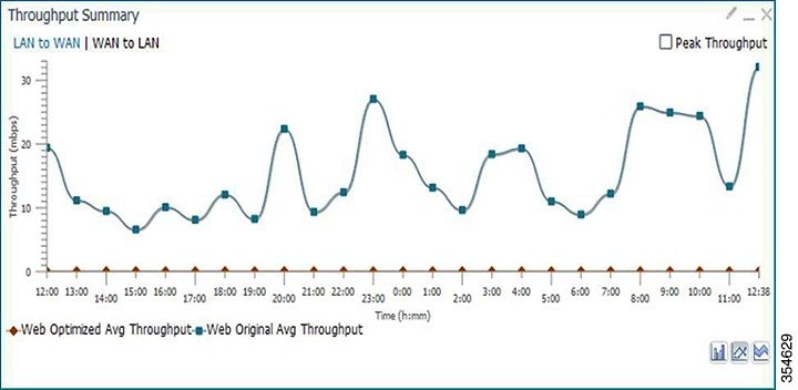
Throughput Summary
The Throughput Summary chart (Figure 15-10) displays information on web-optimized and original throughput. Depending in the tab you click for this chart, LAN-to-WAN (outbound) or WAN-to-LAN (inbound), throughput is displayed. The WAN-to-LAN report is the default report.
If you hover your mouse over a bar, the total optimized or average throughput, in KBps, for a given time range is displayed.
Figure 15-10 Example of Throughput Summary Chart
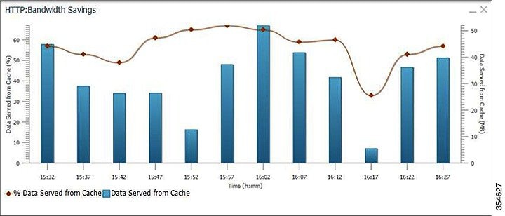
HTTP: Bandwidth Savings
The HTTP: Bandwidth Savings chart displays how much traffic, by percentage, is actually served by the Cache Engine (CE) that did not have to be fetched from the source.
When this information is combined with overall incoming traffic into the router from the WAN, it indicates how effective the cache is in boosting the WAN performance in terms of request-response latency. The combination of the incoming (WAN) traffic flow to the router, plus the WAN data offload incoming traffic provides a truer measure of the traffic flow the router’s clients (in aggregate) experience.
As shown in Figure 15-11:
- The bar graph is the absolute byte count for data served out of cache for the specified interval
- The line graph represents the percentage of total bytes requested that were served out of cache for the specified interval.
Figure 15-11 Example of HTTP Bandwidth Savings Chart
Top Sites
The Top Sites chart (Figure 15-12) displays the top sites being served by the Cache Engine (CE) in terms of hostname and traffic, in bar chart format. The Top Sites chart displays the following types of information:
- WAN Offload (Default report)—The top URLs by number of bytes served out of the cache, and as a result did not come over the WAN.
- Response Time Saving—The response time saved due to Akamai Connect caching. The time unit, (milliseconds, seconds, or minutes) at the bottom of the chart depend on the time range specified for the chart.
- Hit Count—The top URLs by number of cache hits.
- WAN Response—The top URLs by number of bytes served over the WAN.
Figure 15-12 Top Sites Chart Showing Response Time Savings by Site
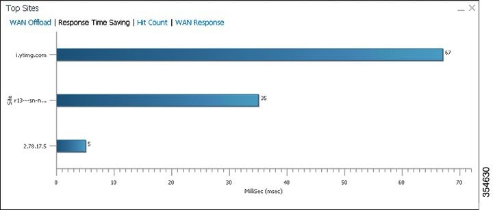
Note![]() Information in the Top Sites chart corresponds to the output for the show statistics accelerator http object-cache EXEC command. Top ten sites information is shown as top hosts information, in the Object cache top hosts ordered by: hit count, output section for 0 to 10 hosts. For more information on CLI commands, see the Cisco Wide Area Application Services Command Reference Guide.
Information in the Top Sites chart corresponds to the output for the show statistics accelerator http object-cache EXEC command. Top ten sites information is shown as top hosts information, in the Object cache top hosts ordered by: hit count, output section for 0 to 10 hosts. For more information on CLI commands, see the Cisco Wide Area Application Services Command Reference Guide.
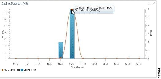
Cache Statistics (Hits)
The Cache Statistics (Hits) chart (Figure 15-13) displays information on cache hits or on data served from the cache, in bar chart format. For each type of Cache Statistics chart, you can specify a time frame of Last Hour, Last Day, Last Week, Last Month, or set a Custom one.
- The Cache Statistics Hits chart shows the percentage and the number of cache hits (in millions) over a specified time frame.
If you hover your mouse over a data point, the total percentage of cache hits for that data point is displayed.
If you hover your mouse over a bar, the number of hits, in millions, is displayed. - The Cache Statistics Data Served from Cache chart shows the percentage and the amount of data served from cache (in MB) over a specified time frame.
If you hover your mouse over a data point, the total percentage of cache hits for that data point is displayed.
If you hover your mouse over a bar, the total amount, in MB, of data served from the cache, is displayed.
Figure 15-13 Example of Cache Statistics Hits Chart Showing Detailed View of a Data Point
Connection Trend Charts
Optimized Connections Over Time
The Optimized Connections Over Time chart displays the number of optimized connections over the selected time period. You can show the number of MAPI-reserved connections by checking the MAPI Reserved Connections check box. You can view the peak optimized connection values for all the data points in the chart by checking the Peak Connections check box. If you have opted to view the peak connections, the chart shows a combination of Optimized Connections as stacked legends and Peak Connections as overlaid lines for selected application/classifiers. In WAAS-XE devices, the Optimized Connections Over Time chart has only the Peak Connections option. You can customize the chart by choosing specific applications to be included. The default is all traffic.
The peak connection value is available for the following:
- LAST HOUR—The maximum value (optimized, pass-through connections counters) among the12 data samples available for the last hour.
- LAST DAY—The maximum value (optimized, pass-through connection counters) among the 12 data samples for each hour. For example, if the optimized connection counter values are 10, 20, 30, 40, 50, 60, 70, 80, 90, 100, 110, and 120 for an hour, the peak optimized connection value would be 120.
This chart is available only when a specific WAAS device is selected and can be added only to the Connection Trend report.
Optimized vs Pass-Through Connections
The Optimized vs Pass-Through Connections chart displays the total number of optimized and pass-through connections on a device or on all devices in a location. You can show the device connection limit, which is the maximum number of connections a device can support, by checking the Device Connection Limit check box. This option is available only at the device level. At the Location level, by default, the chart displays only the top five devices series based on the maximum connection limit usage. You can select the devices of your choice from the chart Settings page. The chart in the PDF report displays a maximum of 10 series.
You can view the peak pass-through connection values for all the data points in the chart by checking the Peak Connections check box.
Note![]() This chart is available only when a specific WAAS device or location is selected, and can be added only to the Connection Trend report.
This chart is available only when a specific WAAS device or location is selected, and can be added only to the Connection Trend report.
Pass-Through Connections for a Device = Total Pass-Through Connections for all applications
Optimized Connections for a Device = Total Optimized Connections for all applications
Device Connections limit usage % = 100 * Average Optimized connections / Device connection Limit
Average Optimized connections = Sum of Optimized Connections / No. of samples
AppNav Charts
Total AppNav Traffic
The Total AppNav Traffic chart displays the total amount of distributed and pass-through traffic processed by the AppNav Cluster or ANC device. The units at the left side depend upon the range.
AppNav Policies
The AppNav Policies chart displays a graph of the amount of intercepted, distributed, or pass-through traffic processed by the AppNav Cluster (ANC) or ANC device for each policy rule, depending on which tab you select. The units at the left side depend upon the range.
From the Show Details For drop-down list, select a policy rule for viewing.
Top 10 AppNav Policies
The Top 10 AppNav Policies pie chart displays the amount of intercepted, distributed, or pass-through traffic processed by the AppNav Cluster or ANC device for the top nine policy rules with the most traffic, depending on which tab you select. Traffic for all other policy rules is grouped together into a tenth category named Other Traffic (shown only if it totals at least 0.1 percent of all traffic).
From the Show Details For drop-down list, select a policy rule for viewing.Top 10 WAAS Node Group Distribution
The Top 10 WAAS Node Group (WNG) Distribution pie chart displays the top nine WNGs to which traffic is distributed. Traffic for all other WNGs is grouped together into a tenth category named Other Traffic (shown only if it totals at least 0.1 percent of all traffic).
From the Show Details For drop-down list, select a WNG whose individual Cisco WAAS node details you want to view.
WAAS Node Group Distribution
The WAAS Node Group Distribution chart displays a graph of the amount of traffic distributed to each WNG. The units at the left side depend upon the range.
From the Show Details For drop-down list, select a WNG whose individual Cisco WAAS node details you want to view.
Pass-Through Reasons
The Pass-Through Reasons chart displays a graph of the amount of pass-through traffic for each of the pass-through reasons. The units at the left side depend upon the range.
From the Show Details For drop-down list, select a reason whose details you want to view.
Top 10 Pass-Through Reasons
The Top 10 Pass-Through Reasons pie chart displays the top nine reasons because of which traffic is passed through. Traffic for all other reasons is grouped together into a tenth category named Other Traffic (shown only if it totals at least 0.1 percent of all traffic).
From the Show Details For drop-down list, select a reason whose details you want to view.
Platform Charts
CPU Utilization
The CPU Utilization chart displays the percentage of CPU utilization for a device. This chart is available only when a specific WAAS device is selected. This chart can be added only to the Monitor > Reports > Reports Central > Resource Utilization report page.Disk Utilization
The Disk Utilization chart displays the percentage of disk utilization for a device. This chart is available only when a specific WAAS device is selected. This chart can be added only to the Monitor > Reports > Reports Central > Resource Utilization report page.
SMB Preposition Chart
The SMB Preposition chart represents the usage of SMB pre-positioning feature.
This chart is applicable at the device level. It is a combination chart that collects statistics for every 5 minutes from statistics infrastructure and plots the graph to represent the below information based on the statistics collected.
WAAS Table Descriptions
This section describes tables that provide information on system, device, traffic and acceleration, For information on charts that you can choose to include in a dashboard or report, see WAAS Chart Descriptions.
The following statistics details tables are available:
- Traffic Summary Table
- Network Application Traffic Details Table
- HTTP Acceleration Statistics Table
- HTTPS Acceleration Statistics Table
- ICA Acceleration Statistics Table
- MAPI Acceleration Statistics Table
- SMB Acceleration Statistics Table
- SSL Acceleration Statistics Table
You can sort the tables by clicking any column heading to sort the data in that column. A small triangle appears in the heading to indicate that a column is sorted. Click the triangle to reverse the sort order in the column.
For some values, different formulas are used at the system and device levels, and these formulas are noted in the table descriptions. The terms used in the tables are:
- Original Inbound—Traffic that is entering the WAAS device from the LAN (clients), and needs to be optimized before being sent out on the WAN to a peer WAAS device.
- Original Outbound—Traffic that is exiting the WAAS device to the LAN (clients) after being received on the WAN from a peer WAAS device.
- Optimized Inbound—Traffic that is entering the WAAS device from the WAN, and needs to be processed (deoptimized) before being sent out on the LAN to clients.
- Optimized Outbound—Traffic that is exiting the WAAS device to the WAN and a peer WAAS device after being optimized.
- Pass-Through—Traffic that is being passed through the WAAS device and is not optimized.
To get the statistics at the system, location, and device group levels, the Original Inbound, Original Outbound, Optimized Inbound, Optimized Outbound, Pass-through Client, and Pass-through Server bytes of all devices are added together. The Reduction % and Effective Capacity values are calculated using added values of all devices.
Traffic Summary Table
This table is called the Network Traffic Summary, Device Traffic Summary, or Location Traffic Summary, depending on the context, and it displays a summary of traffic.
At the system and location levels, each row in the table displays the total traffic information for each device that is registered to the corresponding Central Manager or is in a particular location. At the device level, each row in the table displays the total traffic information for each application defined on the device. The data is described in Table 15-4 .
|
|
|
|---|---|
Displays the device name. (Appears only at the system and location levels.) |
|
Displays the application name. (Appears only at the device level.) |
|
Reports the amount of original traffic, excluding pass-through traffic. |
|
Reports the amount of optimized traffic, excluding pass-through traffic. |
|
Reports the amount of pass-through traffic. (This value is not applicable for WAAS Express devices.) System: (Pass-through Client + Pass-through Server) / 2 Device/Device Group: Pass-through Client + Pass-through Server An asterisk (*) in the column heading indicates that a device whose data is included in this table is configured as a serial peer with another device and optimization is disabled between those two peer devices. The amount of pass-through traffic shown may be more than what is expected because the device passes through traffic coming from its peer. (For more information, see About Clustering Inline WAEs in the “Configuring Traffic Interception” chapter.)1 |
|
Reports the percentage of bytes saved, considering only optimized traffic. (Original Excl Pass-through – (Optimized)) * 100 / (Original Excl Pass-through) |
|
Reports the effective bandwidth capacity of the WAN link as a result of optimization, as a multiplier of its base capacity, considering only optimized traffic. |
Network Application Traffic Details Table
The Network Application Traffic Details table is available at the system level and displays the total traffic information for each application. The data is the same as described in Table 15-4 (except there is no Device column in this table).
HTTP Acceleration Statistics Table
The HTTP Acceleration Statistics table is available at the system and device levels and displays HTTP acceleration details. The data is described in Table 15-5 .
HTTPS Acceleration Statistics Table
The HTTPS Acceleration Statistics table is available at the system and device levels and displays HTTPS acceleration details. The data is described in Table 15-6 .
ICA Acceleration Statistics Table
The ICA Acceleration Statistics table is available at the system and device levels and displays ICA acceleration details. The data is described in Table 15-7 .
MAPI Acceleration Statistics Table
The MAPI Acceleration Statistics table is available at the system and device levels and displays MAPI acceleration details. The data is described in Table 15-8 .
SMB Acceleration Statistics Table
The SMB Acceleration Statistics table is available at the system and device levels and displays SMB acceleration details. The data is described in Table 15-9 .
SSL Acceleration Statistics Table
The SSL Acceleration Statistics table is available at the system and device levels and displays SSL acceleration details. The data is described in Table 15-10 .
Using Predefined Reports to Monitor WAAS
The WAAS Central Manager includes a number of predefined reports that you can use to monitor system operation. These reports are available from the Monitor menu. The reports consist of a combination of specific charts and graphs and a statistical table displayed in the lower part of the WAAS Central Manager window.
You can customize these predefined reports by editing them with the Manage Report function available in the Monitor menu, as described in Viewing and Editing a Report.
This section contains the following topics:
- Predefined Reports Available by WAAS Level
- Location-Level Reports
- TCP Summary Report
- HTTP Acceleration Report
- HTTPS Acceleration Report
- SSL Acceleration Report
- MAPI Acceleration Report
- SMB Acceleration Report
- Summary Report
- Summary Report
- Topology Report
- Connection Trend Report
- Connections Statistics Report
- Resource Utilization Report
- Disks Report
- AppNav Report
- Exported Reports
Predefined Reports Available by WAAS Level
This section contains the following tables:
- Table 15-11, “Predefined Reports Available at System, AppNav Cluster, Location, and Device Level”
- Table 15-12, “Predefined Reports Available at Specified Levels”
Table 15-11 shows the predefined reports available at the WAAS system level, the AppNav Cluster level, the location level, and the device level.
Table 15-11 Predefined Reports Available at System, AppNav Cluster, Location, and Device Level
|
|
|
|---|---|
Acceleration (not all reports available for WAAS Express device level) |
|
Table 15-12 shows the predefined reports available at specified WAAS levels.
Table 15-12 Predefined Reports Available at Specified Levels
|
|
|
|
|---|---|---|
AppNav Cluster level and Device level for AppNav Controller devices |
Note![]() In a WAAS network where there are 1000 or more WAEs, there may be a delay of up to 90 seconds to redisplay the table when you click a table column to sort a system-level report table. You may experience a similar delay when you click the Print icon in the taskbar before you see the report.
In a WAAS network where there are 1000 or more WAEs, there may be a delay of up to 90 seconds to redisplay the table when you click a table column to sort a system-level report table. You may experience a similar delay when you click the Print icon in the taskbar before you see the report.
Location-Level Reports
Location-level reports aggregate data from all the WAEs present in a particular location. For more information about locations, see Working with Device Locations in the “Using Device Groups and Device Locations” chapter.
To view a location-level report, follow these steps:
Step 1![]() From the WAAS Central Manager menu, choose Locations > location-name.
From the WAAS Central Manager menu, choose Locations > location-name.
Step 2![]() From the WAAS Central Manager menu, choose Monitor and choose the report from the Optimization or Acceleration categories.
From the WAAS Central Manager menu, choose Monitor and choose the report from the Optimization or Acceleration categories.
When scheduling any report, you can also select one or more locations; the report will include data from all the devices within the selected locations. For more information, see Scheduling a Report.
The maximum number of devices supported in a location-level report is 25 by default. This number is configurable up to 250 by the System.monitoring.maxDevicePerLocation system property. For more information, see Modifying the Default System Properties in the chapter “Configuring Other System Settings.”
TCP Summary Report
The Transmission Control Protocol (TCP) Summary report displays a summary of all traffic. The following charts and tables are included:
- Traffic Summary
- Effective WAN Capacity
- The Traffic Summary Over Time chart displays a graph depicting the amount of original or optimized traffic, depending on the selected tab. You can include pass-through traffic by checking the Pass-Through check box. You can customize the chart by choosing specific applications to include. The default is all traffic.Traffic Volume and Reduction
- Compression Summary
- Traffic Summary Over Time
- Compression Summary Over Time
- Throughput Summary (included only at the device and location levels)
- Traffic Summary Table
HTTP Acceleration Report
The HTTP Acceleration report displays the HTTP acceleration statistics. The following charts and tables are included:
- HTTP: Estimated Time Savings
- HTTP: Effective WAN Capacity
- HTTP: Connection Details
- HTTP: Response Time Savings
- HTTP: Optimization Count
- HTTP: Optimization Techniques
- HTTP Acceleration Statistics Table
The WAAS Central Manager provides monitoring information on the following types of caching: Basic, Standard, Advanced, Bypass, and Connected Cache. Except for the Top Sites chart, you can view monitoring information at the device, network, location, or AppNav cluster levels. The following charts are included:
HTTPS Acceleration Report
The HTTPS Acceleration report displays the HTTPS acceleration statistics. The following charts and tables are included:
SSL Acceleration Report
The SSL Acceleration report displays the SSL acceleration statistics. The following charts and tables are included:
MAPI Acceleration Report
The MAPI Acceleration report displays the MAPI acceleration statistics. The following charts and tables are included:
SMB Acceleration Report
The SMB Acceleration report displays the SMB acceleration statistics. The following charts and tables are included:
ICA Acceleration Report
The ICA Acceleration report displays the ICA acceleration statistics. The following charts and tables are included:
- ICA: Effective WAN Capacity
- ICA: Connection Details
- ICA: Client Versions
- ICA: Unaccelerated Reasons
- ICA Acceleration Statistics Table
Note![]() The ICA charts in WAAS Version 5.0 and later are different from those used in Version 4.5. If you are viewing the data from a Version 4.5 WAAS device, the charts appear empty due to the different data that the device is collecting. The ICA data for Version 4.5 WAAS devices is available in the system-level TCP Summary Report. For more information, see TCP Summary Report.
The ICA charts in WAAS Version 5.0 and later are different from those used in Version 4.5. If you are viewing the data from a Version 4.5 WAAS device, the charts appear empty due to the different data that the device is collecting. The ICA data for Version 4.5 WAAS devices is available in the system-level TCP Summary Report. For more information, see TCP Summary Report.
Summary Report
The Summary Report is a predefined report that can be used to monitor system operation. It is available at the system level. This report displays the following charts and tables by default:
- Traffic Summary
- Effective WAN Capacity
- Traffic Summary Over Time
- The Traffic Summary Over Time chart displays a graph depicting the amount of original or optimized traffic, depending on the selected tab. You can include pass-through traffic by checking the Pass-Through check box. You can customize the chart by choosing specific applications to include. The default is all traffic.Traffic Volume and Reduction
- Compression Summary
- Compression Summary Over Time
- HTTP: Estimated Time Savings
- HTTP: Effective WAN Capacity
- MAPI: Effective WAN Capacity
- SSL: Effective WAN Capacity
- MAPI: Average Response Time Saved
The Summary Report can be customized to display the charts that you require. Use the Customize taskbar icon to select the charts that you want to be displayed in this report. Only 12 charts can be displayed in the report.
Topology Report
The Topology report at the system level displays a topology map that shows a graphical representation of all the connections between the WAAS devices.
The topology map uses blue squares to show connections between devices. Use the legend to the right of the grid to associate the device name with the number that appears at the top of the grid. Use the drop-down lists at the top of the window to perform the following tasks:
- Display connections between your various locations instead of between devices.
- Sort the grid by the number of connections instead of by device name.
Click the View icon next to the WAE to view a list of peer devices for a specific WAE. The Peer List window appears, which is the same as the device level Topology report.
At the device level, the Topology report lists all the peer devices connected to a specific WAE so that you can see the relationship between devices in your WAAS network. The Peer List window displays information about each peer device involved in optimized connections with this WAE. To go to the system level Topology report, click the Topology icon in the taskbar.
If a peer device is not registered with the WAAS Central Manager, the message Unknown, this peer is not being managed by CM is displayed for the name and Unknown is displayed for the IP address.
Note![]() The WAAS Central Manager device does not have any peers because it does not participate with any WAEs to optimize traffic. For this reason, the topology feature is not available on the WAAS Central Manager device.
The WAAS Central Manager device does not have any peers because it does not participate with any WAEs to optimize traffic. For this reason, the topology feature is not available on the WAAS Central Manager device.
Connection Trend Report
The Connection Trend Report displays the connection trends of applications on a device. The following charts are included:
- Optimized Connections Over Time ((included only at the device level)
- Optimized vs Pass-Through Connections
Connections Statistics Report
The Connections Statistics report displays a Connections Statistics table for the device. The table displays all the TCP connections handled by the device and corresponds to the show statistics connection EXEC mode command in WAE and the show waas connection brief command in WAAS Express.
You can choose to display a subset of connections identified by IP address and port by entering values in the Source/Destination IP Address and Source/Destination Port fields above the table and clicking Submit. To see the Connection Start Time for the active connections in appropriate time zones, you can select the time zone from the available values of CM Local Time, Device Local Time and UTC from the Show Connection Start Time drop-down list.
Note![]() In case of a clock or timezone change in the WAE, the exact time for device timezone is reflected after the configuration synchronization cycles.
In case of a clock or timezone change in the WAE, the exact time for device timezone is reflected after the configuration synchronization cycles.
The Connection Statistics table displays the following information about each connection:
- Source IP address and port.
- Destination IP address and port.
- Peer ID—Hostname of the peer device.
- Applied Policy/Bypass Reason—Displays icons representing the applied optimization policies, including TFO, DRE, LZ, and an application accelerator, respectively. (Hover your mouse over the icon to see its meaning.) If the connection is not optimized, the bypass reason is shown.
- Connection Start Time—Date and time at which the connection was started.
- Open Duration—Number of hours, minutes, and seconds that the connection has been open.
- Total number of original bytes.
- Total number of optimized bytes.
- Percentage of compression.
- Class map name—If no class map exists for the connection, this column contains a dash. To create a class map for this connection, click the radio button at the left of the row and then click the Create Class-Map taskbar icon to display the Optimization Class-Map pane. For details on creating a class map and match conditions, see the “Configuring Application Acceleration” chapter.
Note![]() If the WAE is inheriting policies from a device group, the Create Class-Map button is dimmed, to prevent a user from unknowingly overriding device group policies. To create a class map, you must first override the device group policy page and then return to the Connection Statistics report.
If the WAE is inheriting policies from a device group, the Create Class-Map button is dimmed, to prevent a user from unknowingly overriding device group policies. To create a class map, you must first override the device group policy page and then return to the Connection Statistics report.
The data in the Connections Statistics table is retrieved from the device once when you view the table for the first time.
From the Connections Statistics table, you can perform the following tasks:
- Apply filter settings to display particular connections based on specific criteria, by choosing Quick Filter from the Show drop-list in the taskbar.
- Refresh the table by clicking the Refresh taskbar icon.
- Export the table to a spreadsheet by clicking the Export taskbar icon.
- View connection details by clicking the Details icon next to the connection entry.
The Connection Details window contains connection addresses, port information, policy information, and traffic statistics. It also displays graphs that plot real-time traffic statistics and are refreshed every two seconds.
Note![]() In the Connection Details window, if the value for Percentage Compression is negative, the Percentage Compression and Effective Capacity values do not appear.
In the Connection Details window, if the value for Percentage Compression is negative, the Percentage Compression and Effective Capacity values do not appear.
In some cases, the Central Manager is not able to fetch the Connections Statistics page details at the WAE device level. This happens when the WAE uses internal IP for management purpose with the Central Manager and external IP (NAT) for RPC or registration purpose with the WAAS Central Manager, and if the internal IP not reachable from the WAAS Central Manager.
Resource Utilization Report
The Resource Utilization report displays the following charts:
Disks Report
The Disks Report displays physical and logical disk information.
The report window displays the following information about each disk:
- Physical disk information, including the disk name, serial number, and disk size.
- Present status. The Present field will show either Yes if the disk is present or Not Applicable if the disk is administratively shut down.
- Operational status—NORMAL, REBUILD, BAD, UNKNOWN, or Online.
- Administrative status—ENABLED or DISABLED. When the Administrative Status field shows DISABLED, the Present field will show Not Applicable.
- Current and future disk encryption status.
- RAID level. For RAID-5 devices, the Disk Information window includes the RAID device name, RAID status, and RAID device size.
- Error information, if any errors are detected.
From this window, you can save all disk information details to an Excel spreadsheet by clicking the Export Table icon in the taskbar.
AppNav Report
The AppNav report displays AppNav flow distribution information. This report is available at the AppNav Cluster level, where it shows statistics for the whole AppNav Cluster, and at the device level for AppNav Controllers (ANCs), where it shows statistics for a single ANC.
The following charts and tables are included:
- Total AppNav Traffic
- AppNav Policies
- Top 10 AppNav Policies
- From the Show Details For drop-down list, select a policy rule for viewing.Top 10 WAAS Node Group Distribution
- WAAS Node Group Distribution
- Pass-Through Reasons
- Top 10 Pass-Through Reasons
At the AppNav Cluster level, the following additional controls appear in the taskbar:
- The Scope drop-down list allows you to choose to display data for the whole cluster or for an individual ANC.
- The AppNav Policy Rule drop-down list allows you to choose the AppNav policy for which data is displayed (shown for WAAS appliance AppNav clusters only.)
- The Context drop-down list allows you to choose the AppNav context (or all contexts) for which data is displayed (shown for AppNav-XE clusters only.)
Note![]() At the AppNav Cluster level, the charts may not show data if the configuration on all ANCs in the cluster does not match. To resolve this situation, choose AppNav Clusters > cluster-name from the Central Manager menu and click the taskbar icon named Force Settings on all Devices in a Group. After about 15 minutes, the AppNav charts will display data.
At the AppNav Cluster level, the charts may not show data if the configuration on all ANCs in the cluster does not match. To resolve this situation, choose AppNav Clusters > cluster-name from the Central Manager menu and click the taskbar icon named Force Settings on all Devices in a Group. After about 15 minutes, the AppNav charts will display data.
Exported Reports
Using the spreadsheet icon in the Central Manager taskbar, you can export chart values to a CSV file.
Table 15-13 provides descriptions of report column headings for exported reports. Because there are many report column headings, the table is divided into categories by types of traffic, in alphabetical order. For these heading descriptions, a time specification (for example, milliseconds) is not noted, as the time specification may change depending on the time period specified for the report (for example, hour or week).
- Akamai Connected Cache
- Akamai Connected Cache Top Sites
- Application, Time, and Time Saved
- Cache Control Header and Cache
- Connections: Active, Dropped, Incomplete, Pending
- Connections: Handled, Optimized, Prepositioned
- Connections: Idle, Reused, Timeout
- Connections: Handoffs, Pass Through, Piped Through
- DRE and LZ Compression
- Locally Served and Remotely Served
- Round Trip Time (RTT)
- Session
- Sharepoint
- Throughput
- Transactions
Table 15-13 Exported Report Column Headings
Managing Reports
The WAAS Central Manager allows you to edit any of the predefined reports and to create custom reports. Additionally, you can schedule reports to be generated periodically such as hourly, daily, weekly, or monthly. When a scheduled report is generated, a link to the report is e-mailed to notify the recipients.
This section contains the following topics:
- Creating a Custom Report
- Viewing and Editing a Report
- Scheduling a Report
- Viewing or Deleting a Scheduled Report
Creating a Custom Report
A report consists of up to eight charts and tables. The system and device dashboard displays are examples of predefined reports, along with the other reports available in the Monitor menu.
Reports can be created only at the system level, not at the device level.
To create a custom report, follow these steps:
Step 1![]() From the WAAS Central Manager menu, choose Monitor > Reports > Reports Central.
From the WAAS Central Manager menu, choose Monitor > Reports > Reports Central.
Step 2![]() Click the Create taskbar icon. The Create Report pane appears, as shown in Figure 15-14.
Click the Create taskbar icon. The Create Report pane appears, as shown in Figure 15-14.
Figure 15-14 Create Report Pane
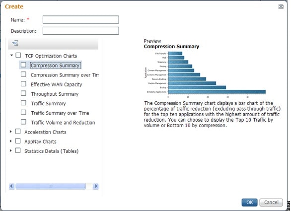
Step 3![]() In the Name field, enter a name for the report. The maximum is 64 characters. Only numerals, letters, spaces, periods, hyphens, and underscores are allowed.
In the Name field, enter a name for the report. The maximum is 64 characters. Only numerals, letters, spaces, periods, hyphens, and underscores are allowed.
Step 4![]() (Optional) In the Description field, enter a description of the report.
(Optional) In the Description field, enter a description of the report.
Step 5![]() In the list at the left side of the pane, check the check box next to each chart and table that you want to be displayed in the report. See WAAS Chart Descriptions for a description of the charts.
In the list at the left side of the pane, check the check box next to each chart and table that you want to be displayed in the report. See WAAS Chart Descriptions for a description of the charts.
Expand the categories by clicking the small triangle next to the category name. See a preview and description of a chart by clicking the chart name. Tables are listed in the last category, Statistics Details.
Step 7![]() (Optional) Customize any of the chart settings as follows:
(Optional) Customize any of the chart settings as follows:
a.![]() Display the report by clicking the report name in the Report Templates table.
Display the report by clicking the report name in the Report Templates table.
b.![]() You can customize report settings, such as the time frame and the time zone, as described in Customizing a Dashboard or Report.
You can customize report settings, such as the time frame and the time zone, as described in Customizing a Dashboard or Report.
c.![]() Click the Edit icon in the upper left of a chart to customize the chart settings. For more information, see Configuring Chart Settings.
Click the Edit icon in the upper left of a chart to customize the chart settings. For more information, see Configuring Chart Settings.
Repeat the steps for each chart you want to customize.
Another way in which you can create a report is to copy a similar report that already exists and modify it into a new report. To copy a report, follow these steps:
Step 1![]() From the WAAS Central Manager menu, choose Monitor > Reports > Reports Central.
From the WAAS Central Manager menu, choose Monitor > Reports > Reports Central.
Step 2![]() Check the box next to the report that you want to copy.
Check the box next to the report that you want to copy.
Step 3![]() Click the Copy taskbar icon. The copy report window appears.
Click the Copy taskbar icon. The copy report window appears.
Step 4![]() In the Name field, enter a name for the report.
In the Name field, enter a name for the report.
Step 5![]() (Optional) In the Description field, enter a description of the report.
(Optional) In the Description field, enter a description of the report.
The report is added to the Reports table.
Viewing and Editing a Report
To view or edit a report, follow these steps:
Step 1![]() From the WAAS Central Manager menu, choose Monitor > Reports > Reports Central.
From the WAAS Central Manager menu, choose Monitor > Reports > Reports Central.
Step 2![]() Click the name of the report that you want to view or edit.
Click the name of the report that you want to view or edit.
You can filter the list by choosing Quick Filter from the Show drop-down list and entering filter criteria.
Step 3![]() To change any of the charts or tables in the report, use the standard chart editing methods, as described in Customizing a Dashboard or Report.
To change any of the charts or tables in the report, use the standard chart editing methods, as described in Customizing a Dashboard or Report.
Step 4![]() Click Save to save the report, or click Save As to save the report under a different name.
Click Save to save the report, or click Save As to save the report under a different name.
To delete a report from the Reports table, check the check box next to the corresponding report and click the Delete taskbar icon.
Admin users can view, edit, and delete reports created by all users and can view and edit predefined reports. Nonadmin users can view, edit, and delete only reports created by themselves, and can view and edit predefined reports.
Scheduling a Report
You can schedule reports to be generated once or periodically, such as daily, weekly, or monthly. When a scheduled report is generated, a copy of the report can be emailed.
Note![]() You cannot delete a scheduled custom report after you have scheduled it and it is in pending status. You can delete a report only after it has been generated.
You cannot delete a scheduled custom report after you have scheduled it and it is in pending status. You can delete a report only after it has been generated.
To schedule a report, follow these steps:
Step 1![]() From the WAAS Central Manager menu, choose Monitor > Reports > Reports Central.
From the WAAS Central Manager menu, choose Monitor > Reports > Reports Central.
Step 2![]() Check the check box next to the report that you want to schedule.
Check the check box next to the report that you want to schedule.
Step 3![]() Click the Schedule icon in the taskbar. The scheduling window appears, as shown in Figure 15-15.
Click the Schedule icon in the taskbar. The scheduling window appears, as shown in Figure 15-15.
Figure 15-15 Scheduling a Report
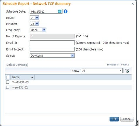
Step 4![]() In the Date field, enter the schedule date in the format DD/MM/YYYY, or click the calendar icon to display a calendar from which to choose the date.
In the Date field, enter the schedule date in the format DD/MM/YYYY, or click the calendar icon to display a calendar from which to choose the date.
Step 5![]() In the Hours drop-down list, choose the hours. The time represents the local time at the WAAS Central Manager.
In the Hours drop-down list, choose the hours. The time represents the local time at the WAAS Central Manager.
Step 6![]() In the Minutes drop-down list, choose the minutes. The time represents the local time at the WAAS Central Manager.
In the Minutes drop-down list, choose the minutes. The time represents the local time at the WAAS Central Manager.
Step 7![]() In the Frequency drop-down list, choose the report frequency (Once, Hourly, Daily, Weekly, or Monthly).
In the Frequency drop-down list, choose the report frequency (Once, Hourly, Daily, Weekly, or Monthly).
You can now schedule reports for multiple devices for Akamai Connect Reports. This is available only if you schedule a Monthly report.
–![]() Select the Aggregate box to receive an aggregate report of all devices called statistics.csv. These files are stored in the ftpconfig.properties file in the ftp server that needs to be configured before.
Select the Aggregate box to receive an aggregate report of all devices called statistics.csv. These files are stored in the ftpconfig.properties file in the ftp server that needs to be configured before.
–![]() Deselect the Aggregate box to receive individual reports for all devices. This report is called devicename_ddmmyyyy.csv.
Deselect the Aggregate box to receive individual reports for all devices. This report is called devicename_ddmmyyyy.csv.
Step 8![]() In the No. of Reports field, enter the number of times a reoccurring report is to be generated. You can schedule it to be generated for up to 1825 times. After being generated the specified number of times, the report is no longer generated.
In the No. of Reports field, enter the number of times a reoccurring report is to be generated. You can schedule it to be generated for up to 1825 times. After being generated the specified number of times, the report is no longer generated.
Step 9![]() Select the Email PDF or Email CSV check box to receive the report in the format of your choice.
Select the Email PDF or Email CSV check box to receive the report in the format of your choice.
Step 10![]() In the Email Id field (enabled only when the Email PDF or Email CSV check box is checked), enter the e-mail addresses of the report recipients, separated by commas.
In the Email Id field (enabled only when the Email PDF or Email CSV check box is checked), enter the e-mail addresses of the report recipients, separated by commas.
Step 11![]() In the Email Subject field, enter the subject of the email message.
In the Email Subject field, enter the subject of the email message.
Step 12![]() From the Select drop-down list, choose an option (Device(s), DeviceGroup, Cluster, or Location) to display a list of the chosen entities.
From the Select drop-down list, choose an option (Device(s), DeviceGroup, Cluster, or Location) to display a list of the chosen entities.
Step 13![]() In the Select entity area, choose the devices that are to be included in the statistics for the report. Check the check box next to each device, device group, cluster, or location that you want to include.
In the Select entity area, choose the devices that are to be included in the statistics for the report. Check the check box next to each device, device group, cluster, or location that you want to include.
To locate an entity in a long list, choose Quick Filter from the Show drop-down list and enter the complete or partial entity name in the field above the list. The search is case sensitive.
Step 15![]() Configure the e-mail server settings for e-mail notification when reports are generated. For more information, see Configuring the E-mail Notification Server in the “Configuring Other System Settings” chapter.
Configure the e-mail server settings for e-mail notification when reports are generated. For more information, see Configuring the E-mail Notification Server in the “Configuring Other System Settings” chapter.
Note![]() In a WAAS network where there are 1000 or more WAEs, a scheduled report might take up to 4 minutes to generate. And if you schedule more than one report at the same time, the reports will be generated with a delay of up to 20 minutes, depending on the number of reports and devices.
In a WAAS network where there are 1000 or more WAEs, a scheduled report might take up to 4 minutes to generate. And if you schedule more than one report at the same time, the reports will be generated with a delay of up to 20 minutes, depending on the number of reports and devices.
Viewing or Deleting a Scheduled Report
To view or delete a scheduled report, follow these steps:
Step 1![]() From the WAAS Central Manager menu, choose Monitor > Reports > Reports Central.
From the WAAS Central Manager menu, choose Monitor > Reports > Reports Central.
The lower part of the Reports window lists the completed and pending scheduled reports, depending on the tab you choose. (You can use the Show filter above the table to filter the reports that are displayed.)
Step 2![]() (Optional) To view a completed report instance in the Completed Reports tab, click the Completed link in the Status column.
(Optional) To view a completed report instance in the Completed Reports tab, click the Completed link in the Status column.
Note![]() For each completed instance of a scheduled report, the Frequency column shows Once and the Completed Time shows the date and time that the report was generated.
For each completed instance of a scheduled report, the Frequency column shows Once and the Completed Time shows the date and time that the report was generated.
Step 3![]() (Optional) If you want to view a list of pending reports, click the Pending Reports tab.
(Optional) If you want to view a list of pending reports, click the Pending Reports tab.
Step 4![]() (Optional) If you want to delete a report in either the Completed Reports or Pending Reports tabs, check the box next to one or more report instances that you want to delete and click the Delete taskbar icon.
(Optional) If you want to delete a report in either the Completed Reports or Pending Reports tabs, check the box next to one or more report instances that you want to delete and click the Delete taskbar icon.
WAAS stores the 10 most recently completed or failed report instances for each custom report. This number is configurable by the System.monitoring.maxReports system property. For details on changing this property, see Modifying the Default System Properties in the “Configuring Other System Settings” chapter.
Admin users can view reports scheduled by all users or the name of the report creator. Nonadmin users can view only reports scheduled by themselves.
Any changes to predefined report settings are stored separately for individual users. That is, if one user changes a predefined scheduled report, only that user sees the changes, and other users (including admin users) continue to see the report with default settings.
Reports scheduled by an external user are deleted if the maximum limit of days without a login passes and the user is deleted. For more information, see the cdm.remoteuser.deletionDaysLimit system configuration property in the “Configuring Other System Settings” chapter.
Note![]() You cannot delete a scheduled custom report after you have scheduled it and it is in pending status. You can delete a report only after it has been generated.
You cannot delete a scheduled custom report after you have scheduled it and it is in pending status. You can delete a report only after it has been generated.
Configuring Flow Monitoring
Flow-monitoring applications collect traffic data that is used for application trend studies, network planning, and vendor-deployment impact studies. This section describes how to configure the flow monitoring feature on the WAE, and includes the following topics:
- Configuring Flowing Monitoring with NetQoS
- Configuring Flow Monitoring with NetFlow v9
- Troubleshooting Flow Monitoring Information
Configuring Flowing Monitoring with NetQoS
About Flow Monitoring with NetQos
The NetQoS monitoring application can interoperate with the WAAS software to provide flow monitoring. To integrate this application with the WAAS software, configure the NetQoS FlowAgent module on the WAE devices. The NetQoS FlowAgent module on the WAE collects important metrics of packet flows, which are then sent across the network to the NetQoS SuperAgent. This monitoring agent analyzes the data and generates reports. For this feature to work, additional configuration is required on the NetQoS FlowAgent. (See the Example: Using NetQoS for Flow Monitoring.)
The monitoring agent comprises two modules: the console (or host) and the collector. The WAE initiates two types of connections to these two monitoring agent modules: a temporary connection to the console and a persistent connection to the collector.
Configuration Considerations for Flow Monitoring with NetQoS
Consider the following when you configure flow monitoring with NetQoS:
- Configure the console IP address on the WAE by entering the flow monitor tcpstat-v1 host configuration mode command in either the WAE CLI or through the Central Manager GUI. This temporary connection is referred to as the control connection.
- The control connection uses TCP port 7878. Its purpose is to obtain the IP address and port number of the collector to which the WAE is assigned.
- The WAE also pulls the configuration information regarding which servers are to be monitored over the control connection. After the WAE obtains the IP address and port number of the collector, the WAE opens a persistent connection to the collector. Collected summary data for the servers that are being monitored is sent over this persistent connection.
- You can place the console (or host) module and the collector module on a single device or on separate devices. These connections are independent of one another. Failure of one connection does not cause the failure of the other connection.
- You can view the state of these connections and various operation statistics display with the show statistics flow monitor tcpstat-v1 EXEC mode command. Connection errors and data transfer errors trigger alarms on the WAE and in the Central Manager GUI. For information on flow monitoring alarms, see Troubleshooting Flow Monitoring Information.
- To display debug information, use the debug flow monitor tcpstat-v1 EXEC mode command.
Procedure for Configuring Flow Monitoring with NetQos
To configure NetQoS flow monitoring on your WAEs using the Central Manager GUI, follow these steps:
Step 1![]() Create a new device group for configuring flow monitoring on multiple devices by choosing Device Groups > device-group-name > Create New Device Group.
Create a new device group for configuring flow monitoring on multiple devices by choosing Device Groups > device-group-name > Create New Device Group.
a.![]() When you create a device group, check the Automatically assign all newly activated devices to this group check box to enable this option.
When you create a device group, check the Automatically assign all newly activated devices to this group check box to enable this option.
b.![]() Add your existing WAE devices to this new device group.
Add your existing WAE devices to this new device group.
Step 2![]() In the Device Group listing window, click the Edit icon next to the name of the flow monitoring configuration device group that you want to configure.
In the Device Group listing window, click the Edit icon next to the name of the flow monitoring configuration device group that you want to configure.
Step 3![]() Choose Configure > Monitoring > Flow Monitor. The Flow Monitor Settings for Device Group window appears.
Choose Configure > Monitoring > Flow Monitor. The Flow Monitor Settings for Device Group window appears.
Step 4![]() In the Destination IP Address field, enter the IP address of the monitoring agent console.
In the Destination IP Address field, enter the IP address of the monitoring agent console.
This configuration allows the WAE to establish a temporary connection (a control connection) to the console for the purpose of obtaining the IP address of the collector device. You must configure the collector IP address information from the console device. (See the configuration documentation for the NetQoS flow monitoring application software.)
Step 5![]() Check the Enable Flow Monitor check box.
Check the Enable Flow Monitor check box.
Step 6![]() Click Submit to apply the settings to the devices in this device group.
Click Submit to apply the settings to the devices in this device group.
To configure NetQoS flow monitoring on the WAE using the CLI, follow these steps:
Step 1![]() Register the WAE with the IP address of the monitoring agent console.
Register the WAE with the IP address of the monitoring agent console.
This configuration allows the WAE to establish a temporary connection (a control connection) to the console (or host) for the purpose of obtaining the IP address of the collector device. You must configure the collector IP address information from the console device. (See the configuration documentation for the NetQoS flow monitoring application software.)
Step 2![]() Enable flow monitoring on the WAE appliance.
Enable flow monitoring on the WAE appliance.
Step 3![]() Check the configuration by using the show running-config EXEC command.
Check the configuration by using the show running-config EXEC command.
Example: Using NetQoS for Flow Monitoring
NetQoS integrates with the WAAS software by running the NetQoS FlowAgent on WAE devices. FlowAgent is a software module developed by NetQoS that resides on a WAE appliance. The FlowAgent collects metrics about the packet flows, which are then sent across the network to a NetQoS SuperAgent. The SuperAgent measures the round-trip times, server response times, and data transfer times, and then analyzes the data and generates reports.
Note![]() When you use flow monitoring with the NetQoS SuperAgent, the flow monitor on the WAE captures optimized traffic only.
When you use flow monitoring with the NetQoS SuperAgent, the flow monitor on the WAE captures optimized traffic only.
To configure flow monitoring with NetQoS, follow these steps:
Step 1![]() From the WAE CLI or Central Manager GUI, enter the SuperAgent Master Console IP address in the Destination IP Address field on your WAE appliances.
From the WAE CLI or Central Manager GUI, enter the SuperAgent Master Console IP address in the Destination IP Address field on your WAE appliances.
If you are configuring multiple WAAS devices through a device group, wait for the configuration to propagate to all the devices in the device list.
Step 2![]() From the NetQoS SuperAgent console, assign a WAE to a SuperAgent Aggregator (known as the collector in WAAS terminology) and configure the NetQoS networks, servers, and applications entities.
From the NetQoS SuperAgent console, assign a WAE to a SuperAgent Aggregator (known as the collector in WAAS terminology) and configure the NetQoS networks, servers, and applications entities.
Note![]() For information about using the NetQoS SuperAgent Master Console and configuring NetQoS SuperAgent entities, go to http://support.ca.com
For information about using the NetQoS SuperAgent Master Console and configuring NetQoS SuperAgent entities, go to http://support.ca.com
Configuring Flow Monitoring with NetFlow v9
About Flow Monitoring with NetFlow v9
NetFlow v9 is a template-based protocol developed by Cisco Systems to collect IP traffic information. The NetFlow v9 record format consists of a packet header followed by a template flowset of data flowset. A template flowset contains a description of the fields to be sent through in the data flowset. A data flowset is a collection of the data records containing flow information that is put into an export packet.
WAAS v5.3.1 and later provide the following features for Netflow v9:
- Unlike NetFlow v5, which used a fixed format, NetFlow v9 utilizes a template format. All WAAS optimization engines can use this template format to export data to collectors such as Cisco Prime and Solarwinds.
- The template format allows new features to be quickly added to NetFlow v9.
- Templates are verified every few minutes for changes, and sent out hourly to provide collectors with field information for data records.
- NetFlow v9 uses WAAS transaction log information and adds an exporter code to allow data to be sent to external devices.
- NetFlow v9 can be used on all WAAS optimization engines; it is not used with WAAS AppNav.
- By default, all WAAS class maps are monitored. If you would like to have specific class maps to not be monitored, see Disabling NetFlow v9 Monitoring.
Configuration Considerations for Flow Monitoring with NetFlow v9
To configure NetFlow v9 on your WAEs from the CLI, configure four monitoring areas:
- Flow Record—Contains the DNA-specific or WAAS-specific flow information or both that you want to send to the collector.
- Flow Exporter—Contains the destination details for the exported information, and the format for this information.
- Flow Monitor—Specifies which flow records are going to which flow exporter.
- Class Map—For WAAS v5.3.1 and above, monitors are enabled globally on all class map policies by default. If you do not want a particular device monitored, manually disable monitoring for that device.
Procedure for Configuring Flow Monitoring with NetFlow v9
To configure NetFlow v9 flow monitoring on the WAE using the CLI, follow these steps:
Step 1![]() Use the following command to create a flow record to configure which fields to collect as part of Netflow export:
Use the following command to create a flow record to configure which fields to collect as part of Netflow export:
Table 15-14 Collection Parameters
|
|
|
|
|
|
|
|
|
|
|
|
|
|
|
|
|
|
|
|
|
|
|
Step 2![]() Use the following command to create the flow exporter, which includes the destination IP address and port for the Netflow:
Use the following command to create the flow exporter, which includes the destination IP address and port for the Netflow:
Step 3![]() Use the following command to create the flow monitor and associate the flow record with the flow exporter:
Use the following command to create the flow monitor and associate the flow record with the flow exporter:
Disabling NetFlow v9 Monitoring
If flow monitoring is configured, it is enabled for all class-maps by default. Use the following command to disable monitoring for a particular class:
NetFlow v9 Exported Fields
In NetFlow v9, there are several fields that can be provided to the NetFlow collector. The following tables provide some examples of these fields:
Table 15-15 NetFlow v9 Exported Fields
NetFlow v9 Pass-Through Reasons
Pass-Through reasons are sent to the collector. Table 15-16 shows pass-through numbers and associated reasons.
Table 15-16 Pass-Through Number and Pass-Through Reason
|
|
|
Troubleshooting Flow Monitoring Information
Alarms for Flow Monitoring
Table 15-17 shows the four different alarms that may be raised when errors occur with flow monitoring.
Table 15-17 Alarms for Flow Monitoring
Commands Used to Troubleshoot Flow Monitoring
Table 15-18 shows the commands used to troubleshoot flow monitoring.
Table 15-18 Commands Used to Troubleshoot Flow Monitoring
|
|
|
|---|---|
| show flow record RecordName template |
|
 Feedback