Cisco WAE Design Archive 6.3 User and Administration Guide
Bias-Free Language
The documentation set for this product strives to use bias-free language. For the purposes of this documentation set, bias-free is defined as language that does not imply discrimination based on age, disability, gender, racial identity, ethnic identity, sexual orientation, socioeconomic status, and intersectionality. Exceptions may be present in the documentation due to language that is hardcoded in the user interfaces of the product software, language used based on RFP documentation, or language that is used by a referenced third-party product. Learn more about how Cisco is using Inclusive Language.
- Updated:
- November 5, 2015
Chapter: Using WAE Design Archive
Using WAE Design Archive
This chapter, which is organized as follows, assumes that the WAE Design Archive application has been set up and is already running and available via a web browser.
Reading the Home Page
The home page appears with two types of views: Map and incremental options for Network Statistics.
- Map—Displays snapshots of the network topology in a weathermap format.
- Network Statistics—Displays time-sequence plots in yearly, monthly, weekly, and daily increments.
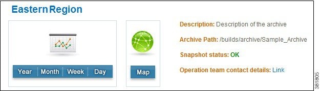
These views are available on a per-archive basis. Archives might be grouped together. If so, click on the group name to expand the list.

Note![]() To produce high-quality time-sequence plots, the application uses scalable vector graphics (SVG) format, which is built into most browsers with the exception of Internet Explorer. If you are using Internet Explorer, the first time you request a plot you are given instructions on how to download the browser plug-in for SVG.
To produce high-quality time-sequence plots, the application uses scalable vector graphics (SVG) format, which is built into most browsers with the exception of Internet Explorer. If you are using Internet Explorer, the first time you request a plot you are given instructions on how to download the browser plug-in for SVG.
View Weathermaps
WAE Design Archive dynamically displays weathermaps. For example, Figure 2-1 shows the display of a plan from a sample archive.
To access a weathermap, follow one of these steps.
- Select the Map option from the home page.
- From the Network Statistics page, click on Map in the top navigation area.
- From a time-sequence plot in the Network Statistics page, press and hold the SHIFT key while clicking any place within the plot.
Figure 2-1 Weathermap with Site Report
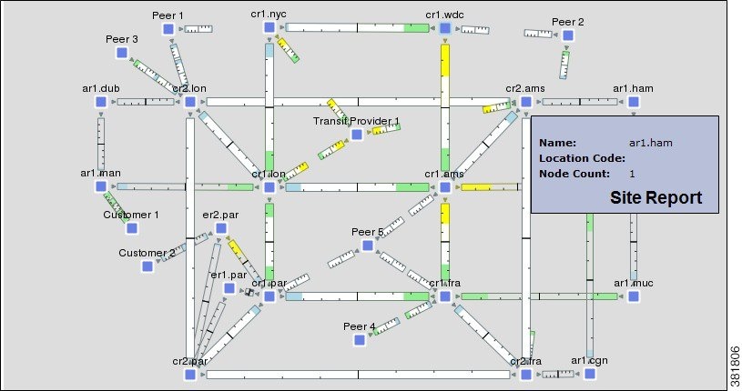
Weathermap Objects
The objects appearing in the weathermap represent the network topology. How they appear can differ depending on how the layout was set up to visualize the network.
- A node (router) appears as either a disk or a rectangle. Nodes can reside both inside and outside of sites.
- A site is a WAE Design construct to make visualization of networks easier to read. Sites appear as either a square (which is a peer or non-peer site), a circle (non-peer site), or cloud (peer site).
Unless a site is empty, there is a hierarchy of the sites and nodes that a site contains. A site can be both a parent and a child site. A site that contains another site is called a parent site. The contained nodes and sites are called children. Often the child nodes and sites are geographically co-located. For instance, a site might be a PoP where the routers reside.
–![]() In the weathermap, the parent site shows all egress inter-site interfaces of all nodes contained within it, no matter how deeply the nodes are nested. Similarly, this is true for each child site view within it.
In the weathermap, the parent site shows all egress inter-site interfaces of all nodes contained within it, no matter how deeply the nodes are nested. Similarly, this is true for each child site view within it.
–![]() To view a site report (Figure 2-1) listing the name, location code, and node count, double-click a site. A node count in a site report (tooltip) identifies the nodes directly within that site. That is, it does not count nodes for nested sites.
To view a site report (Figure 2-1) listing the name, location code, and node count, double-click a site. A node count in a site report (tooltip) identifies the nodes directly within that site. That is, it does not count nodes for nested sites.
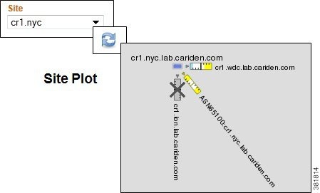
–![]() To view a site plot, select the desired site from the Site drop-down list in the control panel below the weathermap. Then click the Refresh icon. To return to the network plot, select Full Plot from the Site list and click Refresh.
To view a site plot, select the desired site from the Site drop-down list in the control panel below the weathermap. Then click the Refresh icon. To return to the network plot, select Full Plot from the Site list and click Refresh.
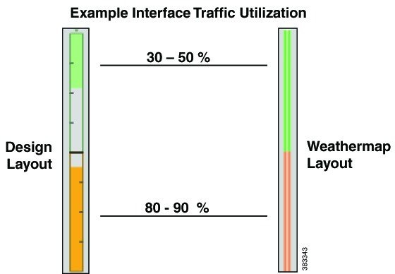
- Interface—Each pair of interfaces connects two different nodes. Their colors represent the outbound traffic utilization. This example shows interface utilization in two different layouts: Design and Weathermap.
Change Weathermap Parameters
The legend at the bottom of the weathermap shows its parameters (Figure 2-2). Below that is a control panel with drop-down lists that enable you to control these parameters and thus, affect the display of the weathermap ( Table 2-1 ). The adjustments apply only to the current browser session and are not saved for future use.
Figure 2-2 Map Legend and Control Panel
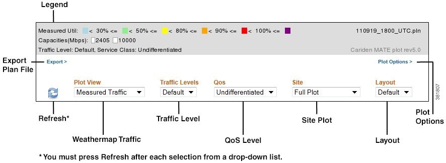
Note![]() All traffic is displayed in Mbps. In the weathermap, the traffic utilization colors represent outbound traffic.
All traffic is displayed in Mbps. In the weathermap, the traffic utilization colors represent outbound traffic.
|
|
|
|---|---|
Click to save the file to a location of your choice. You can then open this file either here or in the WAE Design GUI. This option is also available below the time-sequence plots. |
|
Enables you to modify visual attributes of the weathermap on a per-user basis. See the Set Plot Options section. |
|
Click to refresh the weathermap after making a selection from any of the drop-down lists. |
|
Displays a list of available traffic to display in the weathermap. The choices include non-failure states of measured traffic, simulated traffic, or LSP reservation traffic, as well as weathermaps based on simulated failures showing worst-case scenarios or failure impact. |
|
Displays a list of available traffic levels for viewing. For example, you might have a peak traffic level or a morning traffic level. The names vary according to how they are named in the plan file. |
|
Displays the type of traffic to view in the weathermap as differentiated by the QoS model.
|
|
Displays a list of sites available for viewing, as well as the entire weathermap (full plot). |
|
Displays a list of available weathermap layouts. Example layouts might include schematic layouts, geographic layouts, or separate layouts for different continents. |
Set Plot Options
You can modify the visual attributes of the circuits and plot via the Plot Options dialog box. Options are retained for future sessions. Note that although an administrator can set these options on a per-archive basis, you can override those settings using the Plot Options link that is located just below the weathermap. For detailed information about the effects of plot options, see the WAE Network Visualization Guide.
|
|
|
|---|---|
1. |
Select the Plot Options link just below the Legend in the Map page. |
- Circuit Width—The circuit width is based on its capacity (the higher the capacity, the wider the circuit). Using these options, you can set the minimum width and the capacity it represents, as well as how fast the width grows as the capacity grows.
- Interface Text—By default, there is no text on the interfaces. Using this option, you can display the percentage of interface filled with traffic, or the interface name, IP address, or IGP metric.
- Parallel Grouping—This option enables you to simplify the visual display by grouping circuits that are parallel in nature using any of the following methods. The worst or highest utilization displays for the grouping, thus enabling you to see congestion.
–![]() None—Each parallel circuit is displayed as a separate circuit (default).
None—Each parallel circuit is displayed as a separate circuit (default).
–![]() Node—Groups parallel circuits between two nodes.
Node—Groups parallel circuits between two nodes.
–![]() Metric—Groups parallel circuits between two nodes whose interfaces have the same IGP metric.
Metric—Groups parallel circuits between two nodes whose interfaces have the same IGP metric.
–![]() Site—Groups parallel circuits between two sites.
Site—Groups parallel circuits between two sites.
–![]() SRLG—Groups parallel circuits that belong to the same SRLG.
SRLG—Groups parallel circuits that belong to the same SRLG.
–![]() Group Name—Groups circuits belonging to a user-specified group.
Group Name—Groups circuits belonging to a user-specified group.
There is also an option to set the maximum display width for parallel circuits.
View Time-Sequence Plots
Step 1![]() Enter the URL path to the archive in the browser URL, which takes you to the home page.
Enter the URL path to the archive in the browser URL, which takes you to the home page.
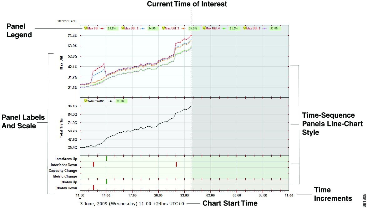
Step 2![]() Click on the time frame that you want to view: Year, Month, Week, or Day. Time-sequence plots for that time period appear (Figure 2-3).
Click on the time frame that you want to view: Year, Month, Week, or Day. Time-sequence plots for that time period appear (Figure 2-3).
The Y-axis shows the names of the time-sequence plots. The defaults are as follows.
The X-axis shows the time and is located at the bottom of the time-sequence plot. The default time is UTC.
Historic activity is shown on the left of the display, and predicted traffic (optional) is shown on the right with a gray background. Predicted data points are generated based on the previous day's network activity and the current network topology and configuration. For example, if there was a network failure, this portion of the plot might show how the network would respond against a repeat of the previous day's traffic loads. This tool is very useful for predicting and anticipating congestion problems that might occur in the event of a network failure or during planned equipment downtime for maintenance.
This is an interactive plot where you can mouse over to obtain additional information.
- To view an actual value (for instance, the Max Util), move the mouse over a specific data point. As you do, the Panel Legend displays the value associated with that data point.
- To view descriptive information, move the mouse over a specific data point. A tooltip (popup window) appears displaying information about that data point. For example, moving the cursor over a spike utilization point gives you the network interface associated with that spike. If you do not see a tooltip, then the application has not been configured to show one.
Figure 2-3 Network Statistics Page Showing Time-Sequence Plots
Navigation
You can easily navigate between different time scales from increments in minutes to years, as well as navigate between weathermaps and time-sequence plots.
Navigate Time Scales
On the top is a series of time-scale buttons for different time ranges. Whether in the Map or Network Statistics page, clicking on one of these takes you to the most recent time-sequence plot for that time increment.

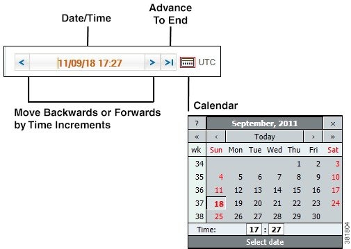
Navigate to Specific Dates and Times
In either the Map or Network Statistics page, to go to a snapshot of a specific date, use the date mechanisms in the top left ( Table 2-2 ).
Manage Settings
You can set application-wide parameters that affect the Map page, the Network Statistics page, or both, depending on the parameter. To change these settings, click the Settings link in the upper, left corner, and a Settings dialog box appears.
- Time Zone—Controls weather time zone is local or user-specified UTC time zone, which you can select from the drop-down list. To change the time zone to local, select Local. To change the time zone to another, select UTC and then select the desired zone from the drop-down list.
- Color—Controls the color depth of the weathermap to be either 8-bit or 32-bit. The 8-bit setting decreases the quality of the weathermap images, but increases the speed at which the image is transmitted, which can be helpful if you are viewing the archive remotely.
- Legend—Controls whether the legend at the bottom of weathermaps is displayed. The toolbar remains visible.
- Width—Smaller numbers reduce the size of the weathermap. Larger numbers increase the space on the left and right of the weathermap.
- Height—Smaller numbers reduce the size of the weathermap. Larger numbers increase the space above and below of the weathermap.
- Enable interactivity (SVG)—Controls the response to mouse clicks in the Network Statistics page. If this is disabled, mouse clicks are disabled and the image is downloaded to the browser in PNG format, instead of SVG. This non-interactive display of network status might be useful if copying or saving the image locally.
- Refresh rate—Refreshes the weathermap in minute increments.
 Feedback