- Preface
-
- Introduction to Dynamic Host Configuration
- Configuring Scopes and Networks
- Configuring Policies and Options
- Managing Leases
- Advanced DHCP Server Properties
- Configuring Client-Classes and Clients
- Using Expressions
- Managing DHCPv6 Addresses
- Configuring DHCP Failover
- Configuring DNS Update
- Using Extension Points
Cisco Prime Network Registrar 8.1 User Guide
Bias-Free Language
The documentation set for this product strives to use bias-free language. For the purposes of this documentation set, bias-free is defined as language that does not imply discrimination based on age, disability, gender, racial identity, ethnic identity, sexual orientation, socioeconomic status, and intersectionality. Exceptions may be present in the documentation due to language that is hardcoded in the user interfaces of the product software, language used based on RFP documentation, or language that is used by a referenced third-party product. Learn more about how Cisco is using Inclusive Language.
- Updated:
- December 25, 2011
Chapter: Server Status Dashboard
Server Status Dashboard
The Cisco Prime Network Registrar server status dashboard in the web user interface (web UI) presents a graphical view of the system status, using graphs, charts, and tables, to help in tracking and diagnosis. These dashboard elements are designed to convey system information in an organized and consolidated way, and include:
•![]() Significant protocol server and other metrics
Significant protocol server and other metrics
•![]() Alarms and alerts
Alarms and alerts
•![]() Database inventories
Database inventories
•![]() Server health trends
Server health trends
The dashboard is best used in a troubleshooting desk context, where the system displaying the dashboard is dedicated for that purpose and might be distinct from the systems running the protocol servers. The dashboard system should point its browser to the system running the protocol servers.
You should interpret dashboard indicators in terms of deviations from your expected normal usage pattern. If you notice unusual spikes or drops in activity, there could be communication failures or power outages on the network that you need to investigate.
Related Topics
Opening the Dashboard
Display Types
Customizing the Display
Selecting Dashboard Elements to Include
Host Metrics
DHCP Metrics
DNS Metrics
Caching DNS Metrics
Opening the Dashboard
Open the separate server status dashboard window by clicking the Dashboard icon ( ), which is between the Refresh (
 ) and Help (
 ) icons at the top right corner of the UI.
Display Types
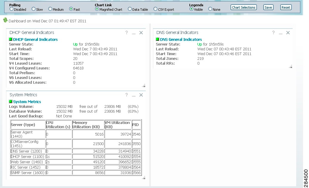
Provided you have DHCP and DNS privileges through administrator roles assigned to you, the preset display of the dashboard consists of the following tables (See Figure 3-1 for an example):
•![]() System Metrics—See the "System Metrics" section.
System Metrics—See the "System Metrics" section.
•![]() DHCP General Indicators—See the "DHCP General Indicators" section.
DHCP General Indicators—See the "DHCP General Indicators" section.
•![]() DNS General Indicators—See the "DNS General Indicators" section
DNS General Indicators—See the "DNS General Indicators" section

Tip ![]() These are just the preset selections. See the "Selecting Dashboard Elements to Include" section for other dashboard elements you can select. The dashboard retains your selections from session to session.
These are just the preset selections. See the "Selecting Dashboard Elements to Include" section for other dashboard elements you can select. The dashboard retains your selections from session to session.
Figure 3-1 Preset Dashboard Elements
Each dashboard element initially appears as a table or a specific chart type, depending on the element:
•![]() Table—See the "Tables" section.
Table—See the "Tables" section.
•![]() Line chart—See the "Line Charts" section.
Line chart—See the "Line Charts" section.
•![]() Stacked area chart—See the "Stacked Area Charts" section.
Stacked area chart—See the "Stacked Area Charts" section.
General Status Indicators
Note the green box next to each dashboard element name in Figure 3-1. This box indicates that the server sourcing the information is functioning normally. A yellow box indicates that server operation is less than optimum. A red box indicates that the server is down. These indicators are the same as for the server health on the Manage Servers page in the regular web UI.
Graphic Indicators for Levels of Alert
Graphed lines and stacked areas in the charts follow a standard color and visual coding so that you can immediately determine key diagnostic indicators at a glance. The charts use the following color and textural indicators:
•![]() High alerts or warnings—Lines or areas in red, with a hatched texture.
High alerts or warnings—Lines or areas in red, with a hatched texture.
•![]() All other indicators—Lines or areas in various other colors distinguish the data elements. The charts do not use green or yellow.
All other indicators—Lines or areas in various other colors distinguish the data elements. The charts do not use green or yellow.
Magnifying and Converting Charts
If Magnified Chart is the selected Chart Link (see Figure 3-5), you can magnify a chart in a separate window by clicking the chart. In magnified chart view, you can choose an alternative chart type from the one that comes up initially (see the "Other Chart Types" section).

Note ![]() Automatic refresh is turned off for magnified charts (see the "Setting the Polling Interval" section). To get the most recent data, click the Refresh icon next to the word Dashboard at the top left of the page.
Automatic refresh is turned off for magnified charts (see the "Setting the Polling Interval" section). To get the most recent data, click the Refresh icon next to the word Dashboard at the top left of the page.
To convert a chart to a table, see the "Displaying Charts as Tables" section. You cannot convert tables to a graphic chart format.
Legends
Each chart initially includes a color-coded legend. To turn off the legend display on the main dashboard page, see the "Displaying or Hiding Chart Legends" section. Removing the legend renders the graphic chart size relatively larger, which can be helpful if you have many charts displayed. You cannot remove legends in magnified views.
Tables
Dashboard elements rendered as tables have data displayed in rows and columns. The following dashboard elements are preset to consist of (or include) tables:
•![]() System Metrics
System Metrics
•![]() DHCP DNS Updates
DHCP DNS Updates
•![]() DHCP Address Current Utilization
DHCP Address Current Utilization
•![]() DHCP General Indicators
DHCP General Indicators
•![]() DNS General Indicators
DNS General Indicators
•![]() Caching DNS General Indicators
Caching DNS General Indicators
Note ![]() (See Figure 3-1 for examples.) If you view a table in Expert mode, additional data might appear.
(See Figure 3-1 for examples.) If you view a table in Expert mode, additional data might appear.
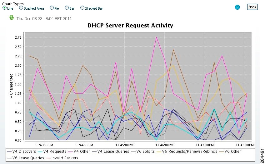
Line Charts
Dashboard elements rendered as line charts can include one or more lines plotted against the x and y axes. The three types of line charts are described in Table 3-1.
|
|
|
|
|---|---|---|
Raw data line chart |
Lines plotted against raw data. |
• • • • • |
Delta line chart |
Lines plotted against the difference between two sequential raw data. |
• • |
Rate line chart |
Lines plotted against the difference between two sequential raw data divided by the sample time between them. |
• • • • • |
Tip ![]() To get the raw data for a chart that shows delta or rate data, enter Expert mode, set the Chart Link to Data Table (see the "Displaying Charts as Tables" section), then click the chart. The Raw Data table is below the Chart Data table.
To get the raw data for a chart that shows delta or rate data, enter Expert mode, set the Chart Link to Data Table (see the "Displaying Charts as Tables" section), then click the chart. The Raw Data table is below the Chart Data table.
Figure 3-2 Line Chart Example
Stacked Area Charts
Dashboard elements rendered as stacked area charts have multiple related metrics plotted as trend charts, but stacked one on top of the other, so that the highest point represents a cumulative value. The values are independently shaded in contrasting colors. (See Figure 3-3 for an example of the DHCP Server Request Activity chart shown in Figure 3-2 rendered as a stacked area chart.)
Figure 3-3 Stacked Area Chart Example
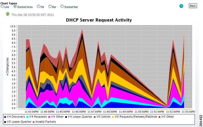
They are stacked in the order listed in the legend, the left-most legend item at the bottom of the stack and the right-most legend item at the top of the stack.
The dashboard elements that are pre-set to stacked area charts are:
•![]() DHCP Server Request Activity
DHCP Server Request Activity
•![]() DHCP Server Response Activity
DHCP Server Response Activity
•![]() DHCP Response Latency
DHCP Response Latency
•![]() DNS Outbound Zone Transfers
DNS Outbound Zone Transfers
•![]() DNS Inbound Zone Transfers
DNS Inbound Zone Transfers
Other Chart Types
The other chart types available for you to choose are:
•![]() Line—One of the line charts described in Table 3-1.
Line—One of the line charts described in Table 3-1.
•![]() Stacked Area—Charts described in the "Stacked Area Charts" section.
Stacked Area—Charts described in the "Stacked Area Charts" section.
•![]() Pie—Shows a single percentage pie chart of the data averaged over the time sampled.
Pie—Shows a single percentage pie chart of the data averaged over the time sampled.
•![]() Bar—Multiple related current value metrics plotted side by side as groups of bars that show the actual data sampled.
Bar—Multiple related current value metrics plotted side by side as groups of bars that show the actual data sampled.
•![]() Stacked Bar—Addition total of the actual samples. This chart shows more distinct data points than the stacked area chart.
Stacked Bar—Addition total of the actual samples. This chart shows more distinct data points than the stacked area chart.
Tip ![]() Each chart type shows the data in distinct ways and in different interpretations. You can decide which type best suits your needs.
Each chart type shows the data in distinct ways and in different interpretations. You can decide which type best suits your needs.
Getting Help for the Dashboard Elements
You can open a help window for each dashboard element by clicking the title of the element.
Customizing the Display
To customize the dashboard display, you can:
•![]() Refresh the data and set an automatic refresh interval.
Refresh the data and set an automatic refresh interval.
•![]() Expand a chart and render it in a different format.
Expand a chart and render it in a different format.
•![]() Convert a graphic chart to a table.
Convert a graphic chart to a table.
•![]() Download data to comma-separated value (CSV) output.
Download data to comma-separated value (CSV) output.
•![]() Display or hide chart legends.
Display or hide chart legends.
•![]() Configure server chart types.
Configure server chart types.
•![]() Reset to default display
Reset to default display
Each chart supports:
•![]() Resizing
Resizing
•![]() Drag and drop to new cell position
Drag and drop to new cell position
•![]() Minimizing
Minimizing
•![]() Closing
Closing
Each chart has a help icon with a description of the chart and a detailed help if you click the chart title.
Note ![]() The changes made to the dashboard/chart will persist only if you click Save in the Dashboard window.
The changes made to the dashboard/chart will persist only if you click Save in the Dashboard window.
Refreshing Displays
Refresh each display so that it picks up the most recent polling by clicking the Refresh icon.
Setting the Polling Interval
You can set how often to poll for data. In the upper-left corner of the dashboard display are the controls for the polling interval of the cached data, which polls the protocol servers for updates. (See Figure 3-4.)
Figure 3-4 Setting the Chart Polling Interval
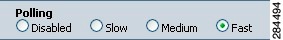
You can set the cached data polling (hence, automatic refresh) interval to:
•![]() Disabled—Does not poll, therefore does not automatically refresh the data.
Disabled—Does not poll, therefore does not automatically refresh the data.
•![]() Slow—Refreshes the data every 30 seconds.
Slow—Refreshes the data every 30 seconds.
•![]() Medium—Refreshes the data every 20 seconds.
Medium—Refreshes the data every 20 seconds.
•![]() Fast (the preset value)—Refreshes the data every 10 seconds.
Fast (the preset value)—Refreshes the data every 10 seconds.
Displaying Charts as Tables
You can choose to display a graphic chart as a table when you magnify the chart by clicking it (see the "Magnifying and Converting Charts" section). At the middle of the top of the dashboard display are the controls for the chart links (see Figure 3-5).
Figure 3-5 Specifying Chart Conversion to Table Format
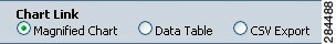
Click the Data Table radio button. When you click the chart itself, it opens as a table. The preset display format is Magnified Chart.
Exporting to CSV Format
You can dump the chart data to a comma-separated value (CSV) file (such as a spreadsheet) when you magnify the chart by clicking it. In the Chart Link controls at the top of the page (see Figure 3-5), click the CSV Export radio button, then click the chart. A Save As window appears, where you can specify the name and location of the CSV file.
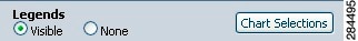
Displaying or Hiding Chart Legends
You can include or exclude the color-coded legends for charts on the main dashboard page. You might want to remove the legends as you become more familiar with the data and track it on a slightly larger chart display. In the upper-right of the dashboard display are the controls for the legend display (see Figure 3-6). The preset value is Visible.
Figure 3-6 Displaying or Hiding Chart Legends and Selecting Chart
Selecting Dashboard Elements to Include
You can decide how many dashboard elements you want to display on the page. At times, you might want to focus on one server activity only, such as for the DHCP server, and exclude all other metrics for the other servers. In this way, the dashboard becomes less crowded, the elements are larger and more readable. At other times, you might want an overview of all server activities, with a resulting smaller element display.
You can select the dashboard elements to display from the main Dashboard page by clicking Chart Selections in the upper right corner of the page (see Figure 3-6). Clicking the link opens the Chart Selection page (see Figure 3-7).
Configuring Server Chart Types
You can set the default chart types on the main dashboard view. You can customize the server charts in the dashboard to display only the specific chart types as default.
To set up default chart type, check the check box corresponding to the Metrics chart that you want to display and choose a chart type from the Chart Type drop-down list. The default chart types are consistent and shared across different user sessions (see Figure 3-7).
Note ![]() You can see either the CDNS or DNS Metrics in the Dashboard > Chart Selection page based on the service configured on the server.
You can see either the CDNS or DNS Metrics in the Dashboard > Chart Selection page based on the service configured on the server.
Tip ![]() The order in which the dashboard elements appear in the Chart Selection list does not necessarily determine the order in which the elements will appear on the page. An algorithm that considers the available space determines the order and size in a grid layout. The layout might be different each time you submit the dashboard element selections.
The order in which the dashboard elements appear in the Chart Selection list does not necessarily determine the order in which the elements will appear on the page. An algorithm that considers the available space determines the order and size in a grid layout. The layout might be different each time you submit the dashboard element selections.
Figure 3-7 Selecting Dashboard Elements
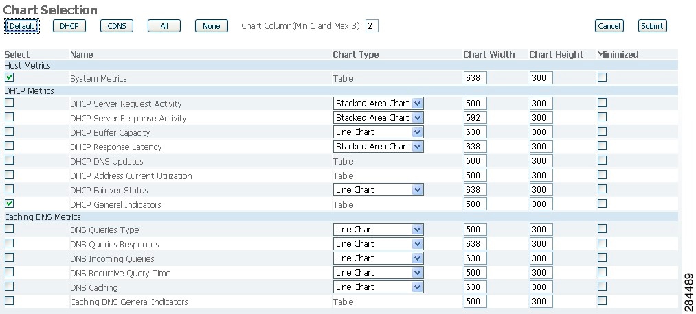
To change selections, check the check box next to the dashboard element that you want to display. Specific group controls are available in the upper-right corner of the page. To:
•![]() Uncheck all check boxes, click None.
Uncheck all check boxes, click None.
•![]() Revert to the preset selections, click Default. The preset dashboard elements for administrator roles supporting DHCP and DNS are:
Revert to the preset selections, click Default. The preset dashboard elements for administrator roles supporting DHCP and DNS are:
–![]() Host Metrics: System Metrics (see the "Host Metrics" section)
Host Metrics: System Metrics (see the "Host Metrics" section)
–![]() DHCP Metrics: General Indicators
DHCP Metrics: General Indicators
–![]() DNS Metrics: General Indicators
DNS Metrics: General Indicators
•![]() Choose the DHCP metrics only, click DHCP (see the "DHCP Metrics" section).
Choose the DHCP metrics only, click DHCP (see the "DHCP Metrics" section).
•![]() Choose the DNS metrics only, click DNS (see the "DNS Metrics" section).
Choose the DNS metrics only, click DNS (see the "DNS Metrics" section).
•![]() Choose the DNS metrics only, click CDNS (see the "Caching DNS Metrics" section)
Choose the DNS metrics only, click CDNS (see the "Caching DNS Metrics" section)
•![]() Choose all the dashboard elements, click All.
Choose all the dashboard elements, click All.
Click Submit at the top right of the page to submit your choices, or Cancel to cancel the changes.
Host Metrics
Host metrics comprise two charts:
•![]() System Metrics—See the "System Metrics" section.
System Metrics—See the "System Metrics" section.
•![]() JVM Memory Utilization (available in Expert mode only)—See the "JVM Memory Utilization" section.
JVM Memory Utilization (available in Expert mode only)—See the "JVM Memory Utilization" section.
System Metrics
The System Metrics dashboard element shows the free space on the disk volumes where the Cisco Prime Network Registrar logs and database directories are located, the date and time of the last server backup, and CPU and memory usage for the various servers. System metrics are available if you choose Host Metrics: System Metrics in the Chart Selection list.
The resulting table shows:
•![]() Logs Volume—Current free space out of the total space on the disk drive where the logs directory is located, with the equivalent percentage of free space.
Logs Volume—Current free space out of the total space on the disk drive where the logs directory is located, with the equivalent percentage of free space.
•![]() Database Volume—Current free space out of the total space on the disk drive where the data directory is located, with the equivalent percentage of free space.
Database Volume—Current free space out of the total space on the disk drive where the data directory is located, with the equivalent percentage of free space.
•![]() Last Good Backup—Date and time when the last successful shadow database backup occurred (or Not Done if it did not yet occur) since the server agent was last started.
Last Good Backup—Date and time when the last successful shadow database backup occurred (or Not Done if it did not yet occur) since the server agent was last started.
•![]() CPU Utilization (in seconds), Memory Utilization (in kilobytes), and (in Expert mode only) the VM Utilization (in kilobytes) and Process ID (PID) for the:
CPU Utilization (in seconds), Memory Utilization (in kilobytes), and (in Expert mode only) the VM Utilization (in kilobytes) and Process ID (PID) for the:
–![]() Cisco Prime Network Registrar server agent
Cisco Prime Network Registrar server agent
–![]() CCM server
CCM server
–![]() DNS server
DNS server
–![]() DHCP server
DHCP server
–![]() Web server
Web server
–![]() Router Interface Configuration (RIC) server
Router Interface Configuration (RIC) server
–![]() SNMP server
SNMP server
How to Interpret the Data
The System Metrics data shows how full your disk volumes are getting based on the available free space for the Cisco Prime Network Registrar logs and data volumes. It also shows if you had a last successful backup of the data files and when that occurred. Finally, it shows how much of the available CPU and memory the Cisco Prime Network Registrar servers are using. The difference in the memory and VM utilization values is:
•![]() Memory Utilization—Physical memory that a process uses, or roughly equivalent to the Resident Set Size (RSS) value in UNIX ps command output, or to the Task Manager Mem Usage value in Windows: the number of pages the process has in real memory minus administrative usage. This value includes only the pages that count toward text, data, or stack space, but not those demand-loaded in or swapped out.
Memory Utilization—Physical memory that a process uses, or roughly equivalent to the Resident Set Size (RSS) value in UNIX ps command output, or to the Task Manager Mem Usage value in Windows: the number of pages the process has in real memory minus administrative usage. This value includes only the pages that count toward text, data, or stack space, but not those demand-loaded in or swapped out.
•![]() VM Utilization—Virtual memory that a process uses, or roughly equivalent to the SZ value in UNIX ps command output, or to the Task Manager VM Size value in Windows: the in-memory pages plus the page files and demand-zero pages, but not usually the memory-mapped files. This value is useful in diagnosing how large a process is and if it continues to grow.
VM Utilization—Virtual memory that a process uses, or roughly equivalent to the SZ value in UNIX ps command output, or to the Task Manager VM Size value in Windows: the in-memory pages plus the page files and demand-zero pages, but not usually the memory-mapped files. This value is useful in diagnosing how large a process is and if it continues to grow.
Troubleshooting Based on the Results
If you notice the free disk space decreasing for the logs or data directory, you might want to consider increasing the disk capacity or look at the programs you are running concurrently with Cisco Prime Network Registrar.
JVM Memory Utilization
The Java Virtual Machine (JVM) Memory Utilization dashboard element is available only when you are in Expert mode. It is rendered as a line trend chart that traces the Unused Maximum, Free, and Used bytes of JVM memory. The chart is available if you choose Host Metrics: JVM Memory Utilization in the Chart Selection list when you are in Expert mode.
How to Interpret the Data
The JVM Memory Utilization data shows how much memory applies to running the dashboard in your browser. If you see the Used byte data spiking, dashboard elements might be using too much memory.
Troubleshooting Based on the Results
If you see spikes in Used memory data, check your browser settings or adjust the polling interval to poll for data less frequently.
DHCP Metrics
These DHCP metric elements are available in the dashboard:
•![]() DHCP Server Request Activity—See the "DHCP Server Request Activity" section.
DHCP Server Request Activity—See the "DHCP Server Request Activity" section.
•![]() DHCP Server Response Activity—See the "DHCP Server Response Activity" section.
DHCP Server Response Activity—See the "DHCP Server Response Activity" section.
•![]() DHCP Buffer Capacity—See the "DHCP Buffer Capacity" section.
DHCP Buffer Capacity—See the "DHCP Buffer Capacity" section.
•![]() DHCP Response Latency—See the "DHCP Response Latency" section.
DHCP Response Latency—See the "DHCP Response Latency" section.
•![]() DHCP DNS Updates—See the "DHCP DNS Updates" section.
DHCP DNS Updates—See the "DHCP DNS Updates" section.
•![]() DHCP Address Current Utilization—See the "DHCP Address Current Utilization" section.
DHCP Address Current Utilization—See the "DHCP Address Current Utilization" section.
•![]() DHCP Failover Status—See the "DHCP Failover Status" section.
DHCP Failover Status—See the "DHCP Failover Status" section.
•![]() DHCP General Indicators—See the "DHCP General Indicators" section.
DHCP General Indicators—See the "DHCP General Indicators" section.
DHCP Server Request Activity
The DHCP Server Request Activity dashboard element rendered as a stacked area chart traces the totals in the change rate of incoming DHCP packet activity. The chart is available if you choose DHCP Metrics: DHCP Server Request Activity in the Chart Selection list.
The resulting stacked area chart plots the following trends:
•![]() V4 Discovers—Number of DHCPv4 discover packets.
V4 Discovers—Number of DHCPv4 discover packets.
•![]() V4 Requests—Number of DHCPv4 request packets.
V4 Requests—Number of DHCPv4 request packets.
•![]() V4 Other—Number of DHCPv4 release, decline, or info-request packets.
V4 Other—Number of DHCPv4 release, decline, or info-request packets.
•![]() V4 Lease Queries—Number of DHCPv4 lease query packets.
V4 Lease Queries—Number of DHCPv4 lease query packets.
•![]() V6 Solicits—Number of DHCPv6 solicit packets.
V6 Solicits—Number of DHCPv6 solicit packets.
•![]() V6 Requests/Renews/Rebinds—Number of DHCPv6 request, renew, and rebind packets.
V6 Requests/Renews/Rebinds—Number of DHCPv6 request, renew, and rebind packets.
•![]() V6 Other—Number of DHCPv6 release, decline, or information-request packets.
V6 Other—Number of DHCPv6 release, decline, or information-request packets.
•![]() V6 Lease Queries—Number of DHCPv6 lease query packets.
V6 Lease Queries—Number of DHCPv6 lease query packets.
•![]() Invalid Packets—Combined number of invalid DHCPv4 and DHCPv6 packets.
Invalid Packets—Combined number of invalid DHCPv4 and DHCPv6 packets.
How to Interpret the Data
The DHCP Server Request Activity data shows the pattern of server traffic based on incoming DHCP requests. The trend should be fairly consistent, with spikes in the number of Invalid packets being a sign that there is some misconfigured data on the network. Note that DHCPv4 and DHCPv6 invalid packet activity is grouped together.
Troubleshooting Based on the Results
Check your DHCP server configurations if there is a sudden spike in activity, especially in the number of invalid request packets. Set your server logging to report where the activity is occurring. Spikes or drops in activity can indicate network or power outages that are worth investigating. Spikes in activity can also indicate a faulty client, malicious client activity, or a recovery after a power failure or outage that results in pent-up requests.
DHCP Server Response Activity
The DHCP Server Response Activity dashboard element rendered as a stacked area chart traces the totals in the change rate of outgoing DHCP packet activity. The chart is available if you choose DHCP Metrics: DHCP Server Response Activity in the Chart Selection list.
The resulting stacked area chart plots the following trends:
•![]() V4 Offers—Number of DHCPv4 offer packets.
V4 Offers—Number of DHCPv4 offer packets.
•![]() V4 Acks—Number of DHCPv4 acknowledgment packets.
V4 Acks—Number of DHCPv4 acknowledgment packets.
•![]() V4 Other Client—Number of other outgoing DHCPv4 client packets.
V4 Other Client—Number of other outgoing DHCPv4 client packets.
•![]() V4 Lease Queries—Number of outgoing DHCPv4 lease query packets.
V4 Lease Queries—Number of outgoing DHCPv4 lease query packets.
•![]() V6 Advertises—Number of DHCPv6 advertise packets.
V6 Advertises—Number of DHCPv6 advertise packets.
•![]() V6 Replies—Number of DHCPv6 reply packets.
V6 Replies—Number of DHCPv6 reply packets.
•![]() V6 Reconfigures—Number of DHCPv6 reconfigure packets.
V6 Reconfigures—Number of DHCPv6 reconfigure packets.
•![]() V6 Lease Query Replies—Number of DHCPv6 lease query reply packets.
V6 Lease Query Replies—Number of DHCPv6 lease query reply packets.
•![]() Total Dropped—Combined number of dropped DHCPv4 and DHCPv6 packets.
Total Dropped—Combined number of dropped DHCPv4 and DHCPv6 packets.
How to Interpret the Data
The DHCP Server Response Activity data shows the pattern of server traffic to answer DHCP requests. The trend should be fairly consistent, with spikes in the number of Total Dropped packets being a sign that there is some misconfigured data on the network. Note that DHCPv4 and DHCPv6 dropped packet activity is grouped together.
Troubleshooting Based on the Results
Check your DHCP server configurations if there is a sudden spike in activity, especially in the number of total dropped response packets. The response activity should match the request activity, except for the normal time shift, and the same diagnostics apply.
DHCP Buffer Capacity
The DHCP Buffer Capacity dashboard element rendered as a table shows the number of allocated requests and responses, and a line chart that plots the number of requests and responses in use. The element is available if you choose DHCP Metrics: DHCP Buffer Capacity in the Chart Selection list.
The resulting table and line chart plots:
•![]() Requests in Use—Trend in the number of in-use request buffers.
Requests in Use—Trend in the number of in-use request buffers.
•![]() Responses in Use—Trend in the number of in-use response buffers.
Responses in Use—Trend in the number of in-use response buffers.
How to Interpret the Data
The DHCP Buffer Capacity data shows the pattern in the use of DHCP request and response buffers. If the buffers begin to increase in an abnormal pattern, there are measures you can take without trying to compensate by increasing the number of allocated buffers.
Troubleshooting Based on the Results
If you see increasing and consistent exceeding of the buffer threshold, find the reason why the server is running slowly. Possible reasons include high degrees of logging, slow DHCP extensions or LDAP servers, or overload, such as with chatty clients or frequent rebooting of cable modem termination systems (CMTSs). You might need to increase the buffer sizes.
DHCP Response Latency
The DHCP Response Latency dashboard element rendered as a stacked area chart shows the trend in the response packet latency (the time interval between the request packet and its ensuing response). The chart is available if you choose DHCP Metrics: DHCP Response Latency in the Chart Selection list.
Tip ![]() You must also set the collect-sample-counters DHCP server attribute for this data to display, with the enhanced-sample-counters attribute also set for further granularity. These attribute values are preset. If you are concerned about achieving maximum performance, unset these attributes. (See the "Displaying Statistics" section.)
You must also set the collect-sample-counters DHCP server attribute for this data to display, with the enhanced-sample-counters attribute also set for further granularity. These attribute values are preset. If you are concerned about achieving maximum performance, unset these attributes. (See the "Displaying Statistics" section.)
The resulting stacked area chart plots response latencies at the intervals:
•![]() Less than 50 milliseconds
Less than 50 milliseconds
•![]() 50 to 200 milliseconds
50 to 200 milliseconds
•![]() 200 to 500 milliseconds
200 to 500 milliseconds
•![]() 500 to 1000 milliseconds (note that if the enhanced-sample-counters attribute is not set, all values below 1 second appear in this grouping)
500 to 1000 milliseconds (note that if the enhanced-sample-counters attribute is not set, all values below 1 second appear in this grouping)
•![]() 1 to 2 seconds
1 to 2 seconds
•![]() 2 to 3 seconds
2 to 3 seconds
•![]() 3 to 4 seconds
3 to 4 seconds
•![]() More than 4 seconds
More than 4 seconds
How to Interpret the Data
The chart shows the trend in response packet latency as an indicator of how long it takes to respond to incoming packets. The gradations in the latency periods are stacked.
Troubleshooting Based on the Results
High response packet latency is similar to high buffer usage for troubleshooting purposes. Look for slow LDAP servers or DHCP extensions, high levels of logging, or disk I/O bottlenecks.
DHCP DNS Updates
The DHCP DNS Updates dashboard element rendered as a table shows the related DNS server and its current state, and how many pending DNS updates are occurring between it and the DHCP server. The table is available if you choose DHCP Metrics: DHCP DNS Updates in the Chart Selection list.
The resulting table shows:
•![]() Server—Related DNS server IP address
Server—Related DNS server IP address
•![]() State—Related DNS server state
State—Related DNS server state
•![]() Pending Updates—Total number of pending updates
Pending Updates—Total number of pending updates
How to Interpret the Data
A high level of pending updates to a specific DNS server indicates that the server is unreachable or unavailable, or its address is wrong.
Troubleshooting Based on the Results
Check into the reachability of the associated DNS servers if the pending update rate spikes, or ensure that the address of the associated server is correct.
DHCP Address Current Utilization
The DHCP Address Current Utilization dashboard element rendered as a table shows the DHCPv4 address utilization (how many assigned addresses exist) for a particular address aggregation, which can be a scope, network, or network plus selection tag. The table is available if you choose DHCP Metrics: DHCP Address Current Utilization in the Chart Selection list.
The resulting table shows:
•![]() Name—Aggregation name (or address).
Name—Aggregation name (or address).
•![]() In Use—Number of in-use addresses.
In Use—Number of in-use addresses.
•![]() Total—Total number of addresses.
Total—Total number of addresses.
•![]() Utilization—Percentage of utilized addresses.
Utilization—Percentage of utilized addresses.
•![]() Mode (appears in Expert mode only)—Aggregation mode (scope, network, or selection-tags).
Mode (appears in Expert mode only)—Aggregation mode (scope, network, or selection-tags).
How to Interpret the Data
The chart shows a table with four columns: the scope name, its in-use and total addresses, and the percentage of address utilization based on the previous two columns. The chart is available only if the DHCP server enhanced-sample-counters attribute is enabled.
•![]() If an SNMP trap configuration in scope mode applies, the Name column displays the scope name. Otherwise, it shows the network IP address.
If an SNMP trap configuration in scope mode applies, the Name column displays the scope name. Otherwise, it shows the network IP address.
•![]() If traps are not enabled (or if the DHCP server default-free-address-config or v6-default-free-address-config attribute is not set), the network address is appended with an asterisk (*).
If traps are not enabled (or if the DHCP server default-free-address-config or v6-default-free-address-config attribute is not set), the network address is appended with an asterisk (*).
•![]() If a selection tag applies, its name is also appended. See the "Handling SNMP Notification Events" section for details on SNMP traps.
If a selection tag applies, its name is also appended. See the "Handling SNMP Notification Events" section for details on SNMP traps.
•![]() If you do not define a default-free-address-config (or v6-default-free-address-config) attribute, Cisco Prime Network Registrar creates an internal, unlisted trap configuration named default-aggregation-addr-trap-config.
If you do not define a default-free-address-config (or v6-default-free-address-config) attribute, Cisco Prime Network Registrar creates an internal, unlisted trap configuration named default-aggregation-addr-trap-config.
Because of this, do not use the name default-aggregation-addr-trap-config for a trap configuration you create.
Troubleshooting Based on the Results
If the percentage of utilized addresses is high, the addresses reached a saturation point. It might be necessary to reassign addresses from a different scope.
DHCP Failover Status
The DHCP Failover Status dashboard element rendered as two parallel trend charts that show the current and partner server state and the binding updates and acknowledgments sent and received between the two failover partners. The charts are available if you choose DHCP Metrics: DHCP Failover Status in the Chart Selection list.
Note ![]() The failover status is only for the first failover pair in the related servers list.
The failover status is only for the first failover pair in the related servers list.
The display is a table along with two rate line trend charts that shows the failover status for the first failover pair for the related servers:
•![]() Local State—Local DHCP server failover state along with when it occurred.
Local State—Local DHCP server failover state along with when it occurred.
•![]() Partner State—Partner server failover state along with when it occurred.
Partner State—Partner server failover state along with when it occurred.
•![]() DHCP Failover Status Updates Received—The first trend chart shows a comparison of the number of binding updates received and binding acknowledgments sent.
DHCP Failover Status Updates Received—The first trend chart shows a comparison of the number of binding updates received and binding acknowledgments sent.
•![]() DHCP Failover Status Updates Sent—The second trend chart shows a comparison of the number of binding updates sent and binding acknowledgments received.
DHCP Failover Status Updates Sent—The second trend chart shows a comparison of the number of binding updates sent and binding acknowledgments received.
How to Interpret the Data
Along with some state data, the display is split into two line trend charts that are inverses of each other. Each chart compares the binding updates with the acknowledgments. The top chart pairs the binding updates received with the acknowledgments sent; the bottom chart pairs the binding updates sent with the acknowledgments received.
Troubleshooting Based on the Results
If the Partner State value is other than 10, check the configuration of the partner server. The updates sent and received data should also be fairly level.
DHCP General Indicators
The DHCP General Indicators dashboard element rendered as a table shows the server state, reload data, and lease counts. The table is available if you choose DHCP Metrics: DHCP General Indicators in the Chart Selection list.
The resulting table shows:
•![]() Server State—Up or Down (based on whether statistics are available) and its duration.
Server State—Up or Down (based on whether statistics are available) and its duration.
•![]() Last Reload—Date and time of the last server reload.
Last Reload—Date and time of the last server reload.
•![]() Start Time—Date and time of the last server process (Cisco Prime Network Registrar server agent) startup.
Start Time—Date and time of the last server process (Cisco Prime Network Registrar server agent) startup.
•![]() Total Scopes—Total number of configured DHCPv4 scopes.
Total Scopes—Total number of configured DHCPv4 scopes.
•![]() V4 Leased Leases—Number of active DHCPv4 leases, including reservations.
V4 Leased Leases—Number of active DHCPv4 leases, including reservations.
•![]() V4 Configured Leases—Number of configured DHCPv4 leases, including reservations and ranges.
V4 Configured Leases—Number of configured DHCPv4 leases, including reservations and ranges.
•![]() Total Prefixes—Number of configured DHCPv6 prefixes.
Total Prefixes—Number of configured DHCPv6 prefixes.
•![]() V6 Leased Leases—Number of active DHCPv6 leases, including reservations and delegated prefixes (which each count as one lease).
V6 Leased Leases—Number of active DHCPv6 leases, including reservations and delegated prefixes (which each count as one lease).
•![]() V6 Allocated Leases—Number of allocated DHCPv6 leases, including reservations and delegated prefixes (which each count as one lease).
V6 Allocated Leases—Number of allocated DHCPv6 leases, including reservations and delegated prefixes (which each count as one lease).
How to Interpret the Data
The table indicates the server state, process start time (via the Cisco Prime Network Registrar server agent), and reload data, and also provides lease statistics. The top set of data compares the DHCPv4 leases actually in effect with those configured; the bottom set of data does the same for DHCPv6 leases.
Time of last reload is important for determining if recent changes to the server configuration occurred from a reload operation. It can also help pinpoint when server changes were last applied, if other indicators show a marked, unexpected behavioral change. Be sure to preserve log files since the last reload.
Troubleshooting Based on the Results
A drop or increase in leases might indicate a power or network outage, but it can also indicate a normal variation depending on lease times and usage patterns. The number of scopes or prefixes indicated might also require some evaluation and possible reconfiguration. If the server state is Down, all the DHCP chart indicators show a red status box, so no data will be available. In the case of a server that is down, restart the server.
DNS Metrics
These DNS metric elements are available in the dashboard:
•![]() DNS Outbound Zone Transfers—See the "DNS Outbound Zone Transfers" section.
DNS Outbound Zone Transfers—See the "DNS Outbound Zone Transfers" section.
•![]() DNS Inbound Zone Transfers—See the "DNS Inbound Zone Transfers" section.
DNS Inbound Zone Transfers—See the "DNS Inbound Zone Transfers" section.
•![]() DNS Network Errors—See the "DNS Network Errors" section.
DNS Network Errors—See the "DNS Network Errors" section.
•![]() DNS Related Servers Errors—See the "DNS Related Servers Errors" section.
DNS Related Servers Errors—See the "DNS Related Servers Errors" section.
•![]() DNS General Indicators—See the "DNS General Indicators" section.
DNS General Indicators—See the "DNS General Indicators" section.
DNS Outbound Zone Transfers
The DNS Outbound Zone Transfers dashboard element rendered as a stacked area chart tracks the rate of change in full and incremental outbound zone transfer responses, and any associated errors. The chart is available if you choose DNS Metrics: DNS Outbound Zone Transfers in the Chart Selection list.
The resulting stacked area chart plots the following trends:
•![]() Full Responses—Number of full outbound zone transfers (AXFRs out).
Full Responses—Number of full outbound zone transfers (AXFRs out).
•![]() Incremental Responses—Number of incremental outbound zone transfers (IXFRs out).
Incremental Responses—Number of incremental outbound zone transfers (IXFRs out).
•![]() Authorization Errors—Number of unauthorized (refused) zone transfer requests.
Authorization Errors—Number of unauthorized (refused) zone transfer requests.
•![]() Exceed Max Transfers Out—Number of failed outbound transfers that exceed the maximum limit.
Exceed Max Transfers Out—Number of failed outbound transfers that exceed the maximum limit.
•![]() Other Errors—Number of other outbound transfer errors that are not authorization errors.
Other Errors—Number of other outbound transfer errors that are not authorization errors.
How to Interpret the Data
This chart is useful in gauging if outbound zone transfers to a secondary DNS server are occurring as predicted and if there are any authorizations or failed transfer attempts in the process. The most significant indicator is the trend in the number of outbound zone transfers denied for lack of permission or for not being authorized for the zone.
Troubleshooting Based on the Results
Check the primary and secondary server configurations if there are errors or exceeded limits in the outbound zone transfers.
DNS Inbound Zone Transfers
The DNS Inbound Zone Transfers dashboard element rendered as a stacked area chart tracks the rate of change in full and incremental inbound zone transfer responses, and any associated errors. The chart is available if you choose DNS Metrics: DNS Inbound Zone Transfers in the Chart Selection list.
The resulting stacked area chart plots the following trends:
•![]() Full Responses—Number of full inbound zone transfers (AXFRs in).
Full Responses—Number of full inbound zone transfers (AXFRs in).
•![]() Incremental Responses—Number of incremental inbound zone transfers (IXFRs in).
Incremental Responses—Number of incremental inbound zone transfers (IXFRs in).
•![]() Authorization Errors—Number of refused responses (xfer-in-auth-errors).
Authorization Errors—Number of refused responses (xfer-in-auth-errors).
•![]() Failed Attempts—Number of failures other than refusals (xfer-failed-attempts).
Failed Attempts—Number of failures other than refusals (xfer-failed-attempts).
•![]() Exceed Max Transfers In—Number of times that the concurrent inbound transfers reach the maximum limit.
Exceed Max Transfers In—Number of times that the concurrent inbound transfers reach the maximum limit.
How to Interpret the Data
This chart is useful in gauging if inbound zone transfers to a secondary DNS server are occurring as predicted and if there are any authentication or failed transfer attempts in the process. The most significant indicator is the trend in the number of inbound zone transfers denied for lack of permission, for not being authorized for the zone, or for other reasons.
Troubleshooting Based on the Results
Check the primary and secondary server configurations if there are errors or exceeded limits in the inbound zone transfers.
DNS Network Errors
The DNS Network Errors dashboard element rendered as a line chart tracks the rate of change in DNS server network errors. The chart is available if you choose DNS Metrics: DNS Network Errors in the Chart Selection list.
The resulting line chart plots the following trends:
•![]() Query Error Packets/Query Responses—Ratio of query error packets over responses. Responses consist of:
Query Error Packets/Query Responses—Ratio of query error packets over responses. Responses consist of:
–![]() Authoritative
Authoritative
–![]() Authoritative no-such-name
Authoritative no-such-name
–![]() Authoritative no-such-data
Authoritative no-such-data
–![]() Nonauthoritative
Nonauthoritative
–![]() Nonauthoritative no-such-data
Nonauthoritative no-such-data
–![]() Requests refused
Requests refused
•![]() Non Error Dropped Packets/Query Responses—Ratio of nonerror dropped packets (queries dropped) over responses.
Non Error Dropped Packets/Query Responses—Ratio of nonerror dropped packets (queries dropped) over responses.
•![]() Update Errors/Updates—Ratio of DNS Update errors over total updates.
Update Errors/Updates—Ratio of DNS Update errors over total updates.
How to Interpret the Data
This chart indicates query and response errors as an indication of the health of the server.
Troubleshooting Based on the Results
Check the DNS server network configuration if errors are increasing.
DNS Related Servers Errors
The DNS Related Servers Errors dashboard element rendered as a line chart tracks the rate of change in DNS related server errors. The chart is available if you choose DNS Metrics: DNS Related Servers Errors in the Chart Selection list.
The resulting line chart plots the following trends:
•![]() Referral Timeouts/Referrals—Ratio of referral timeouts over referrals.
Referral Timeouts/Referrals—Ratio of referral timeouts over referrals.
•![]() Failed Responses/Total Incoming Zone Transfer Requests—Ratio of failed responses over incoming zone transfer requests.
Failed Responses/Total Incoming Zone Transfer Requests—Ratio of failed responses over incoming zone transfer requests.
•![]() TSIG Errors/TSIG Attempts—Ratio of transaction signature (TSIG) errors (bad times, keys, or signatures) over total TSIG attempts (successfully received packets).
TSIG Errors/TSIG Attempts—Ratio of transaction signature (TSIG) errors (bad times, keys, or signatures) over total TSIG attempts (successfully received packets).
How to Interpret the Data
This chart indicates the health of connections and data transfers with related DNS servers. All three chart lines can have diagnostic significance.
Troubleshooting Based on the Results
Check the configurations and connectivity of the related servers in HA DNS relationships if errors are increasing.
DNS General Indicators
The DNS General Indicators dashboard element rendered as a table shows the server state, its last and startup reload time, the number of zones per server, and the total resource record (RR) count. The table is available if you choose DNS Metrics: DNS General Indicators in the Chart Selection list.
The resulting table shows:
•![]() Server State—Up or Down (based on whether statistics are available), and how long the server has been in this state.
Server State—Up or Down (based on whether statistics are available), and how long the server has been in this state.
•![]() Last Reload—How long since the last server reload.
Last Reload—How long since the last server reload.
•![]() Start Time—Date and time of the last server process (Cisco Prime Network Registrar server agent) startup.
Start Time—Date and time of the last server process (Cisco Prime Network Registrar server agent) startup.
•![]() Total Zones—Number of configured zones.
Total Zones—Number of configured zones.
•![]() Total RRs—Number of resource records.
Total RRs—Number of resource records.
How to Interpret the Data
The data in this chart shows general server health and operational duration. The objective is to make decisions about the server, such as whether it might be time for another reload, perhaps warranted by the number of configured zones.
Troubleshooting Based on the Results
If the server state is Down, all the DNS chart indicators show a red status box, so no data will be available. In the case of a server that is down, restart the server. The number of zones indicated might also require some evaluation and possible reconfiguration.
Caching DNS Metrics
These Caching DNS metric elements are available in the dashboard:
•![]() DNS Queries Type—See the "DNS Queries Type" section.
DNS Queries Type—See the "DNS Queries Type" section.
•![]() DNS Queries Responses—See the "DNS Queries Responses" section.
DNS Queries Responses—See the "DNS Queries Responses" section.
•![]() DNS Incoming Queries—See the "DNS Incoming Queries" section.
DNS Incoming Queries—See the "DNS Incoming Queries" section.
•![]() DNS Recursive Query Time—See the "DNS Recursive Query Time" section.
DNS Recursive Query Time—See the "DNS Recursive Query Time" section.
•![]() DNS Caching—See the "DNS Caching" section.
DNS Caching—See the "DNS Caching" section.
•![]() Caching DNS General Indicators—See the "Caching DNS General Indicators" section.
Caching DNS General Indicators—See the "Caching DNS General Indicators" section.
DNS Queries Type
The DNS Queries Type dashboard element rendered as a line chart traces the number queries by type. The chart is available if you choose Caching DNS Metrics: DNS Queries Type in the Chart Selection list.
The resulting line chart plots the following trends:
•![]() A—Number of A queries received.
A—Number of A queries received.
•![]() AAAA—Number of AAAA queries received.
AAAA—Number of AAAA queries received.
•![]() CNAME—Number of CNAME queries received.
CNAME—Number of CNAME queries received.
How to Interpret the Data
This chart shows the number of incoming queries of type A, AAAA, and CNAME.
DNS Queries Responses
The CDNS Query Responses dashboard element rendered as line chart shows the number of responses with NOERROR, NODOMAIN, No Data, Other Errors, Secure, and Unsecure return codes. The display is available if you choose Caching DNS Metrics: DNS Queries Responses in the Chart Selection list.
The resulting line chart plots the following trends:
•![]() NOERROR—Number of answers from cache or recursion that result in rcode of NOERROR being returned to client.
NOERROR—Number of answers from cache or recursion that result in rcode of NOERROR being returned to client.
•![]() NXDOMAIN—Number of answers from cache or recursion that result in rcode of NXDOMAIN being returned to client.
NXDOMAIN—Number of answers from cache or recursion that result in rcode of NXDOMAIN being returned to client.
•![]() NODATA—Number of answers that result in pseudo rcode of NODATA being returned to client.
NODATA—Number of answers that result in pseudo rcode of NODATA being returned to client.
•![]() Other Errors—Other errors.
Other Errors—Other errors.
•![]() Secure—Number of answers that correctly validated.
Secure—Number of answers that correctly validated.
•![]() Unsecure—Number of answers that did not correctly validate.
Unsecure—Number of answers that did not correctly validate.
How to Interpret the Data
This chart shows the following:
•![]() The number of answers to queries, from cache or from recursion, that had the return code NXDOMAIN.
The number of answers to queries, from cache or from recursion, that had the return code NXDOMAIN.
•![]() The number of answers to queries that had the pseudo return code NODATA. This means the actual return code was NOERROR, but additionally, no data was carried in the answer (making what is called a NOERROR/NODATA answer). These queries are also included in the NOERROR number. Common for AAAA lookups when an A record exists, and no AAAA.
The number of answers to queries that had the pseudo return code NODATA. This means the actual return code was NOERROR, but additionally, no data was carried in the answer (making what is called a NOERROR/NODATA answer). These queries are also included in the NOERROR number. Common for AAAA lookups when an A record exists, and no AAAA.
•![]() Number of answers that were secure. The answer validated correctly. The AD bit might have been set in some of these answers, where the client signalled (with DO or AD bit in the query) that they were ready to accept the AD bit in the answer.
Number of answers that were secure. The answer validated correctly. The AD bit might have been set in some of these answers, where the client signalled (with DO or AD bit in the query) that they were ready to accept the AD bit in the answer.
•![]() Number of answers that did not correctly validate.
Number of answers that did not correctly validate.
In a normal scenario, NOERROR is the successful response code.
Troubleshooting Based on the Results
Check the CDNS server configuration if the errors are increasing.
DNS Incoming Queries
The CDNS Incoming queries by dashboard element rendered as a line chart traces the TCP, IPv6, DNSSSEC, EDNS and Total queries. The chart is available if you choose Caching DNS Metrics: DNS Incoming Queries in the Chart Selection list.
The resulting line chart plots the following trends:
•![]() TCP—Total number of queries received over TCP by the CDNS Server.
TCP—Total number of queries received over TCP by the CDNS Server.
•![]() IPv6—Total number of queries received over IPv6 by the CDNS Server.
IPv6—Total number of queries received over IPv6 by the CDNS Server.
•![]() EDNS—Number of queries with EDNS OPT RR present.
EDNS—Number of queries with EDNS OPT RR present.
•![]() DNSSec—Number of queries with EDNS OPT RR with DO (DNSSEC OK) bit set.
DNSSec—Number of queries with EDNS OPT RR with DO (DNSSEC OK) bit set.
•![]() Total—Total number of queries received by the CDNS Server.
Total—Total number of queries received by the CDNS Server.
How to Interpret the Data
This chart shows the number of queries that were made using TCP, IPv6, and DNSSEC towards the CDNS server, number of queries that had an EDNS OPT record present, and the total number of queries received.
DNS Recursive Query Time
The CDNS Queries by Type dashboard element rendered as a line chart traces the average time to complete a recursive query and the median time to complete a query. The table is available if you choose Caching DNS Metrics: DNS Recursive Query Time in the Chart Selection list.
The resulting line chart plots the following trends:
•![]() Average—The average time to complete a recursive query.
Average—The average time to complete a recursive query.
•![]() Median—The median time to complete a recursive query.
Median—The median time to complete a recursive query.
How to Interpret the Data
Average indicates the time the server took to answer queries that needed recursive processing. Note that the queries that were answered from the cache are not in this average.
Median time indicates the median of the time the server took to answer the queries that needed recursive processing. The median means that 50% of the user queries were answered in less than this time. Because of big outliers (usually queries to non responsive servers), the average can be bigger than the median.
Troubleshooting Based on the Results
Check the connectivity and configuration for the name servers as forwarders or exception lists for the increasing values of the average and median time.
DNS Caching
The DNS Caching dashboard element rendered as a line chart traces the cache hits and cache misses. The chart is available if you choose Caching DNS Metrics: DNS Caching in the Chart Selection list.
The resulting line chart plots the following trends:
•![]() Cache Hits—The total number of queries that were answered from cache.
Cache Hits—The total number of queries that were answered from cache.
•![]() Cache Misses—The total number of queries that were not found in the cache.
Cache Misses—The total number of queries that were not found in the cache.
How to Interpret the Data
This chart indicates the number of queries that were successfully answered using a cache lookup against the number of queries that needed recursive processing.
Troubleshooting Based on the Results
If the cache misses are increasing exponentially, check the CDNS logs for errors. Increasing rates of cache misses can indicate that not enough space is available in memory to store the cached queries for more efficient responses.
Caching DNS General Indicators
The Caching DNS General Indicators dashboard element shows the server state, its last and startup reload time, and the total resource record (RR) count. The table is available if you choose Caching DNS Metrics: Caching DNS General Indicators in the Chart Selection list.
The resulting line chart plots the following trends:
•![]() Server State—Up or Down (based on whether statistics are available), and how long the server has been in this state.
Server State—Up or Down (based on whether statistics are available), and how long the server has been in this state.
•![]() Last Reload—How long since the last server reload.
Last Reload—How long since the last server reload.
•![]() Start Time—Date and time of the last server process (Cisco Prime Network Registrar server agent) startup.
Start Time—Date and time of the last server process (Cisco Prime Network Registrar server agent) startup.
How to Interpret the Data
The data in this chart shows general server health and operational duration. The objective is to make decisions about the server, such as whether it might be time for another reload, perhaps warranted by the number of configured zones.
Troubleshooting Based on the Results
If the server state is Down, all the CDNS chart indicators show a red status box, so no data will be available. In the case of a server that is down, restart the server.
 Feedback