- Cisco StadiumVision Director External Content Integration Guide, Release 3.0
- Preface
- Overview of External Content Integration in Cisco StadiumVision Director
- Configuring External Content Integration in Cisco StadiumVision Director
- Configuring Optional and Advanced Tasks for External Content Integration
- Designing the Layout of External Content Using the Widgets Tool
- Troubleshooting External Content Integration in Cisco StadiumVision Director
Release 3.0: Cisco StadiumVision Director External Content Integration Guide
Bias-Free Language
The documentation set for this product strives to use bias-free language. For the purposes of this documentation set, bias-free is defined as language that does not imply discrimination based on age, disability, gender, racial identity, ethnic identity, sexual orientation, socioeconomic status, and intersectionality. Exceptions may be present in the documentation due to language that is hardcoded in the user interfaces of the product software, language used based on RFP documentation, or language that is used by a referenced third-party product. Learn more about how Cisco is using Inclusive Language.
- Updated:
- August 1, 2012
Chapter: Designing the Layout of External Content Using the Widgets Tool
- Prerequisites for Using the Widgets Tool
- Restrictions for Using the Widgets Tool
- Information About Using the Widgets Tool
- How to Design the Layout of External Content for Display
Designing the Layout of External Content Using the Widgets Tool
This module describes how to design the layout for display of the data that you have integrated and mapped for output in Cisco StadiumVision Director using the External Content Integration feature. This layout is required to create a content object referred to as a widget, that you can then publish with the standard features of Cisco StadiumVision Director using playlists and scripts for eventual display on TVs.
This module includes the following topics:
• Prerequisites for Using the Widgets Tool
•Restrictions for Using the Widgets Tool
•Information About Using the Widgets Tool
•How to Design the Layout of External Content for Display
•Basic Widget Configuration Example
Prerequisites for Using the Widgets Tool
Before you design the layout of external content, be sure that the following requirements are met:
•You have configured the external data sources and mapped the statistics to output fields in the External Content Integration feature.
•The data from the external source is being properly ingested by Cisco StadiumVision Director.
•You have added any graphics that you want to add to the layout by importing them into Cisco StadiumVision Director from Control Panel > Content > Import.
Restrictions for Using the Widgets Tool
Before you design the layout of external content using the Widgets tool, consider the following restrictions:
•The Widgets layout tool can only be used for data sources that have been integrated into Cisco StadiumVision Director using the External Content Integration feature.
•Cisco StadiumVision Director only supports widgets that are created internally using the Widgets tool.
•Up to16 different sessions can be supported in the Widgets tool on a single computer.
•The maximum graphic size supported is 1920x1080, which is also the maximum size of the area supported in the Widgets layout tool.

Note If you attempt to use a larger graphic in the Widgets tool, it might not be displayed.
•The Widgets tool has the following font restrictions:
–Only the Arial font type with the ASCII character set is supported.
Note While you might be able to see a supported localized language and create text components with non-ASCII characters in the Widgets tool, these text components might not be rendered as expected on the DMP.
–The maximum font size is limited to 128 due to a restriction by the DMP.
–Importing of fonts is not supported.
•You cannot view sample or real-time data as you create a widget.
•The following functions are not supported in the Widgets tool:
–Undo
–Deleting a group of multi-selected components
Information About Using the Widgets Tool
This section includes the following topics:
•User Interface Characteristics
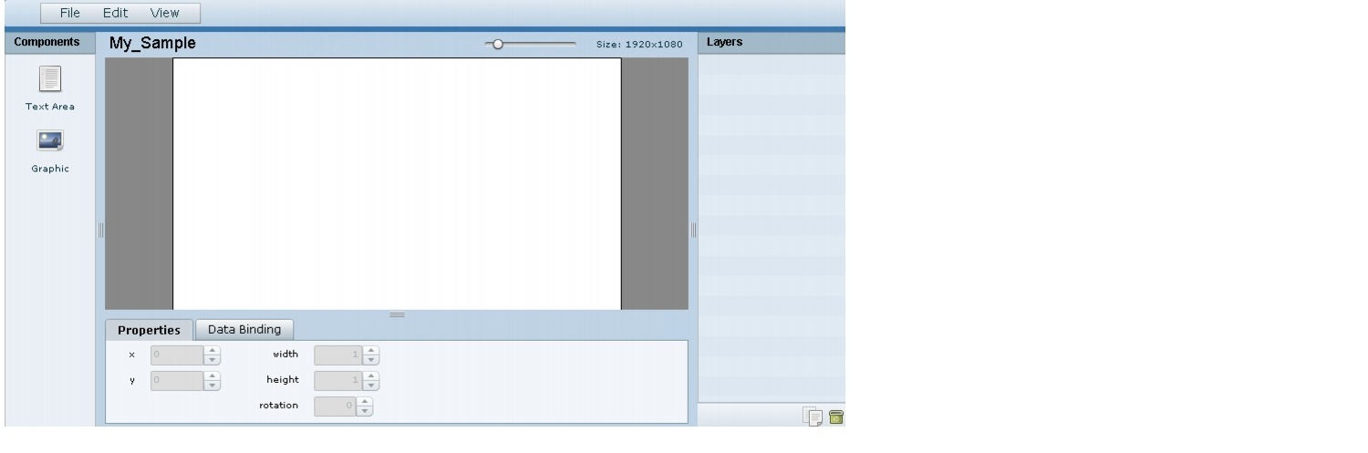
Components
The Widgets tool supports two different component types:
•Text Area
•Graphic
The Widgets tool uses the Graphic component to support the addition of images. Each time a graphic component is added to a widget, it is added in numerical order as a Layer on the canvas.
New components are added to the widget area simply by dragging the object type and dropping it onto the canvas or by double-clicking the component.
Layers
Similar to standard graphics editing applications, each time a Text Area or Graphic component is added to a widget, it is labeled in numerical order (by type) as a Layer on the canvas. Unless reordered, the first component added is at the bottom of the components added to the canvas, and the last component added is the topmost layer. In the user interface, the Layers box also lists the layers in stacking order with the topmost layer at the top of the list. In general, a background image should be at the bottom of the list.
You can reorder the layers by dragging and dropping them into a different order in the Layers box of the Widget tool.
The first graphic component added to the widget is identified as "graphic 1," and the first text area is labeled "text area 1." Components are numbered sequentially as they are added. Therefore, if you delete a component, that component number is not replaced.

Tip You can rename a component by double-clicking it.
Properties
The Properties panel allows you to set the characteristics of a component including explicitly setting its size, location, and rotation on the canvas. Depending on the component type, some additional options are provided:
•For Text Area components, you can specify the character string for the component, and select a font size and color.
Tip Remember that the Widgets tool displays a white background for ease of use, but if you are not using any background images, a black font will be invisible on the TV screen because the TV background is actually black.
•For Graphic components, you can import an image and also specify that it retain the dimensions of the original image.
Data Binding
After you have mapped the output fields for an external data source, you can bind that data to either type of component in a widget.
Note You cannot see any data in the widget component until you publish the widget and view it in an active script.
When you bind data to a text component, any text that you might have configured for that component will be replaced by the data when the widget is published.
User Interface Characteristics
Figure 1 shows the areas of the user interface for a new widget.
Figure 1 New Widget Interface
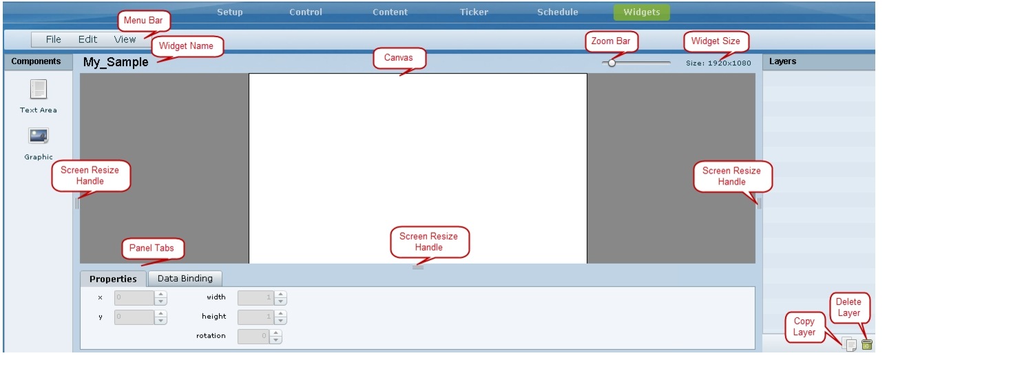
The Widgets tool interface supports some of the following functions and characteristics:
•Multi-selection of components using standard Control key sequences to move components as a group.
•Showing or hiding the bounding box of a component.
•"Zoom-to-fit" function by double-clicking the zoom knob.
•Change the widget dimensions by double-clicking the widget size in the upper right of the screen.
How to Design the Layout of External Content for Display
This section includes the following tasks:
•Showing the Component Bounding Box
•Resizing and Rotating Components
•Binding External Data to a Widget
Accessing the Widgets Tool
To access the Widgets tool, complete the following steps:
Step 1 Log into Cisco StadiumVision Director as an administrator.
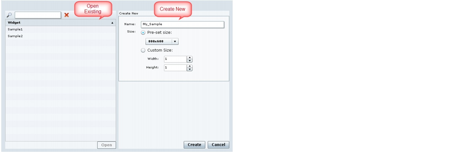
Step 2 From the main menu, click Control Panel > Widgets.
A dialog box opens for you to select an existing widget or create a new one (Figure 2).
Figure 2 Dialog Box to Open Existing or Create New Widgets
Creating New Widgets
You can create a new widget when you first access the Widgets tool, or you can create a new widget from within the tool.
To create a new widget from within the tool, complete the following steps:
Step 1 From the menu bar in the Widgets tool, click File > New.
The Create New dialog box is displayed (Figure 3).
Figure 3 Create New Dialog Box
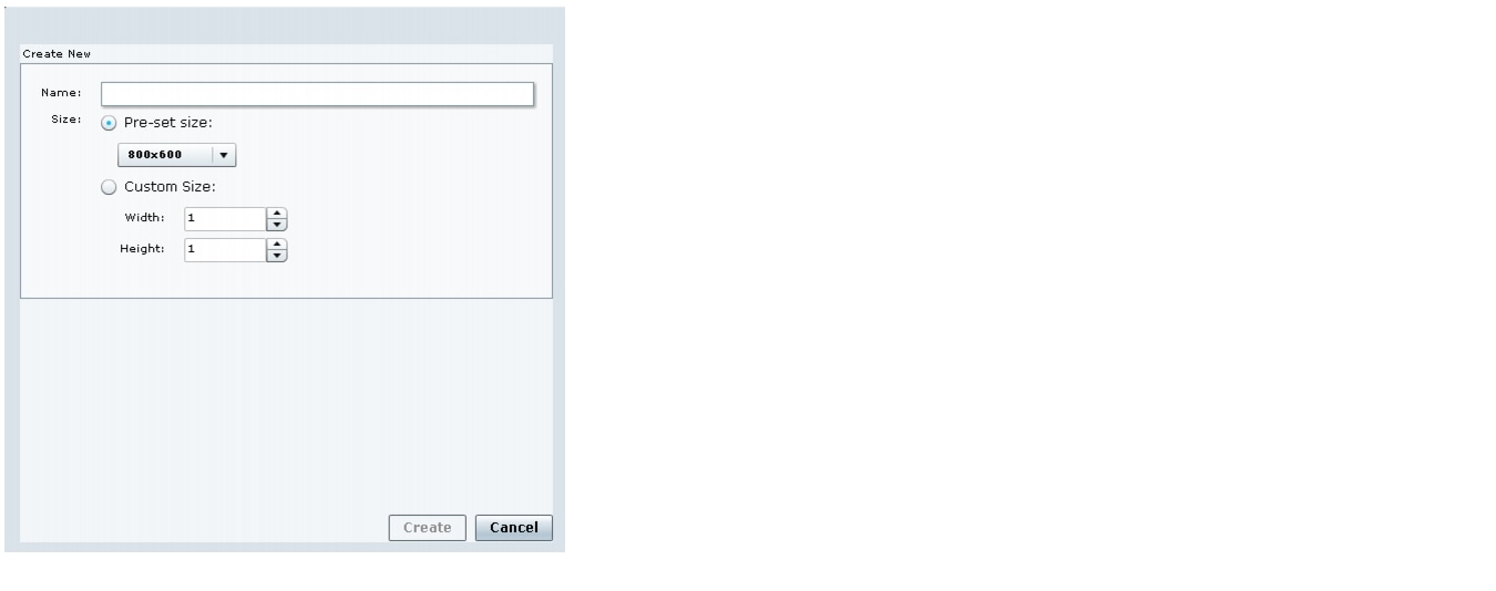
Step 2 In the Name box, type a name for your new widget.
Step 3 Do one of the following to specify the size of the widget:
•Click Pre-Set size and click the drop-down list to select a predefined dimension (WxH) for the canvas in pixels.
•Click Custom Size and specify a number (in pixels) for the width and height dimensions of the canvas.
Step 4 Click Create.
The tool displays a white box of the size that you created, with the dimensions that you specified displayed in the upper right corner.
Note The background canvas of the widget is actually transparent, but it is not shown with the graphics-standard checkerboard pattern to ease visibility of the components.
Step 5 Click File > Save.
Changes to the widget are saved.
Working with Images
This section includes the following topics:
Adding Images
Images can be added as a background to your layout in the Widgets tool, and they also can be bound to a data field using the External Content configuration, such as to add a team logo to a score field that will appear in the widget.
To support the addition of a graphic bound to a particular external source data field, see the "Modifying the Output Format of a Statistic" section.
The Widgets tool uses the Graphic component to support the addition of images as a background or in other places on your canvas.
Prerequisite
Before you can add an image to a widget, you must import the image file into Cisco StadiumVision Director by going to Control Panel > Content > Import to select and open a file. In the Import Content dialog box, specify any options and click Upload.
Procedure
To add an image to a widget, complete the following steps:
Step 1 Open or create the widget where you want to add an image.
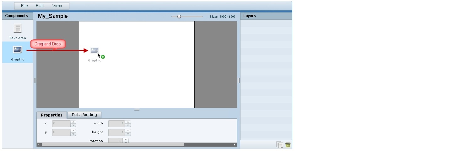
Step 2 In the Components box, select the Graphic component and drag and drop it onto your widget canvas (Figure 4).
Figure 4 Drag and Drop Graphic Component on Widget Canvas
Tip Double-click a component to automatically add it to the canvas.
Step 3 To add an image, be sure that the graphic component where you want to add the image is selected, and click Change.
Step 4 In the Select Image dialog box, highlight the image that you want to add and click Select.
The image is added and scaled to the size of your graphic component box (Figure 5).
Figure 5 Image Added to Graphic Component

Step 5 Click File > Save.
Changes to the widget are saved.
Resizing and Rotating Images
Images will automatically scale to the size of the graphic component box in the widget.
Tip To find the size of your image file, use the List view for your images in Control Panel > Content. Select your image and look at the size in the Dimension field in the "Other content metadata" box.
You can scale the graphic to its original size after you add it, or if you modify the image size in the widget, you can revert back to its original size using the "Use original image size" option, which is recommended.
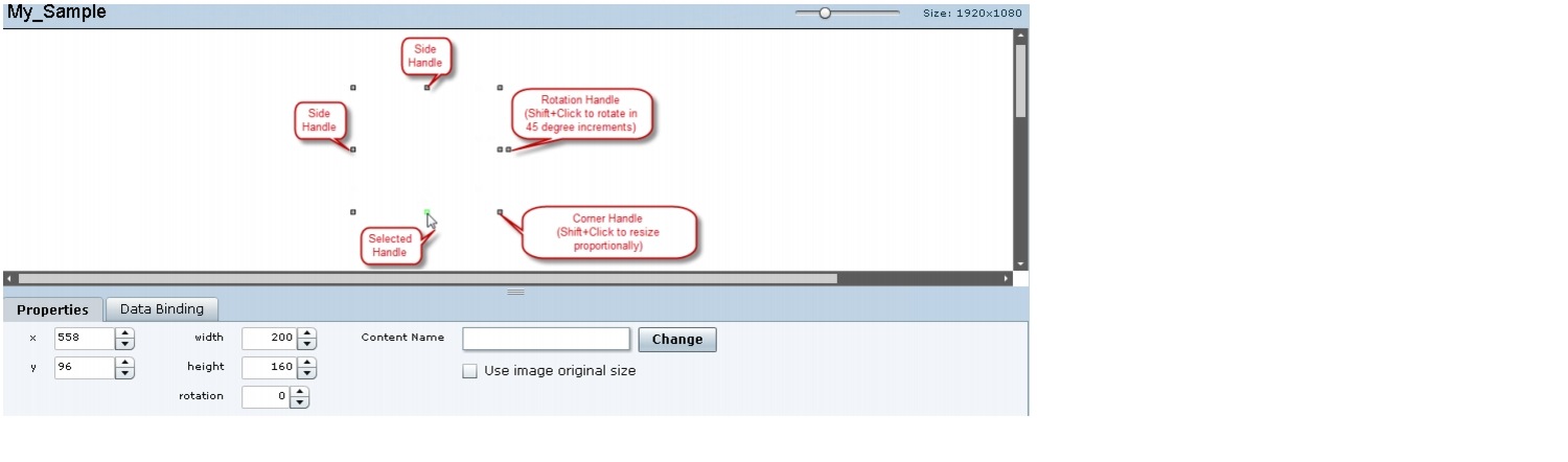
Figure 6 shows the options available on the Properties panel for a graphic component and displays the different bounding box handles that can be used to modify the size of a component box.
Figure 6 Graphic Component Properties Panel and Bounding Box Handles
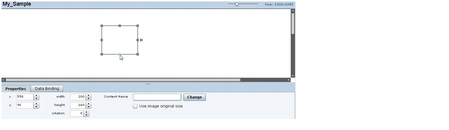
You can modify the size and position of an image in the following ways:
•Explicitly setting values on the Properties panel.
•Selecting the bounding box and using the handles to modify it.
•With the graphic component selected, select the "Use original image size" checkbox to revert the image to its original size when imported.
For more information, see the "Resizing and Rotating Components" section.
Adding Text Areas
A text area component is added to a widget in the same way as a graphic component, but with some different properties. A text area supports a character string, and font size and color selection.
Currently the only available font is Arial.
To add a text area to a widget, complete the following steps:
Step 1 Open or create the widget where you want to add the text area.
Step 2 In the Components box, select the Text Area component and drag and drop it onto your widget canvas.
Step 3 In the Properties panel, type the character string for the box, and select the font size and color.
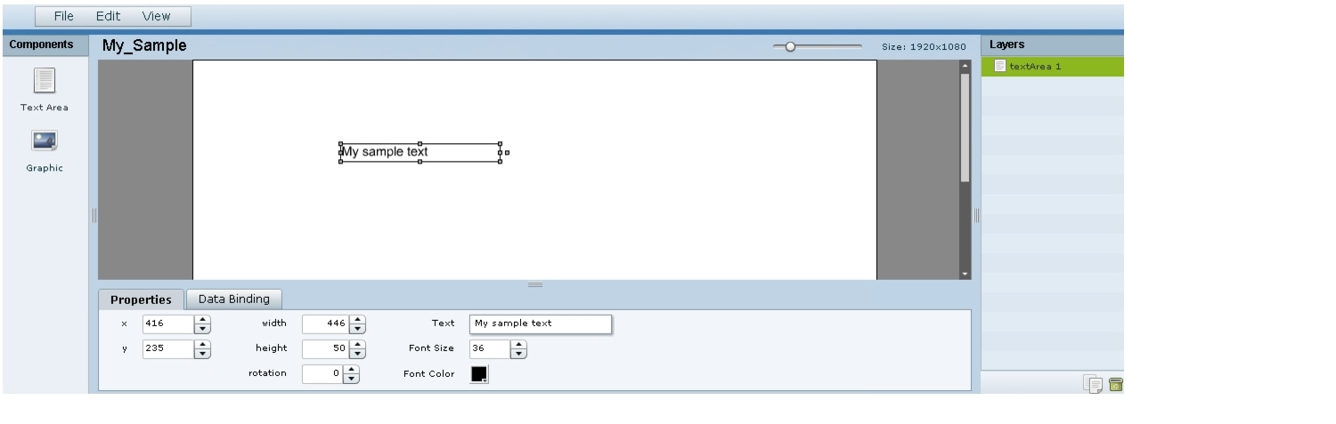
Figure 7 shows the options available on the Properties panel for a sample text area component.
Figure 7 Text Area Component Properties
Step 4 Resize or position the text area as needed. For more details, see the "Resizing and Rotating Components" section.
Step 5 Click File > Save.
Changes to the widget are saved.
Showing the Component Bounding Box
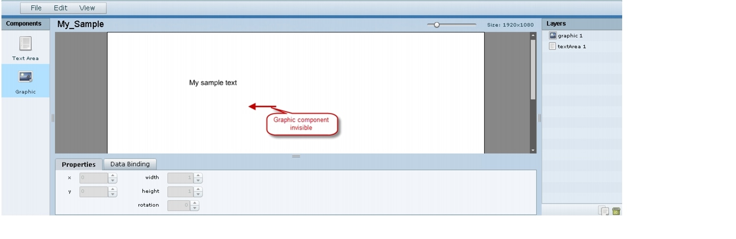
When you add a component onto the canvas, a temporary bounding box appears while the component is selected. If you move away from that component into another area of the canvas, you will not be able to see the boundaries of the component box.
Figure 8 shows an example of a text area and graphic component displaying the default setting without a visible boundary when the component is unselected. Notice that while the graphic component is selected the temporary bounding box is displayed in Figure 8, but when unselected it appears to disappear from the canvas (Figure 9).
Figure 8 Default Setting Without Bounding Box and Selected Component
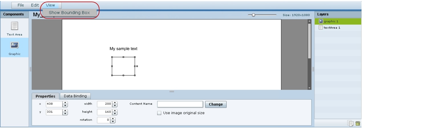
Figure 9 Default Setting Without Bounding Box or Selected Components
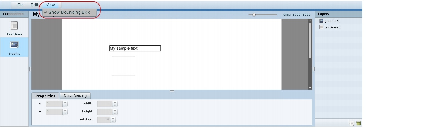
To display a boundary around all components in the widget, complete the following steps:
Step 1 From the menu bar, go to View.
Step 2 Click Show bounding box.
A checkmark appears beside the option when the bounding box is enabled for display, and all components will display a boundary around them.
Figure 10 shows an example of a text area and graphic component after the Show bounding box option is enabled.
Figure 10 Show Bounding Box Option Enabled
Step 3 Click File > Save.
Changes to the widget are saved.
Resizing and Rotating Components
You can resize and rotate both Text Area and Graphic components in the following ways:
•Change the component location:
–Select the component and manually drag it to the location that you want on the canvas.
–Specify the x/y horizontal and vertical values directly in the Properties panel.
•Change the component size:
–Select and drag a handle on the component's bounding box to enlarge or reduce the component size. If using a handle on a side of the box, only that dimension is changed. If using a corner handle, both dimensions of the box are changed.
–Shift+Click on a corner handle to resize the box proportionally.
–Specify the width and height values directly in the Properties panel.
•Change the component angle:
–Select the rotation handle and drag the box up or down to rotate it.
–Shift+Click on the rotation handle and drag the box up or down to change the angle in 45 degree increments.
–Specify the rotation value in degrees directly in the Properties panel.
Figure 11 identifies the bounding box handles that you can use to resize and rotate components.
Figure 11 Bounding Box Handles
Binding External Data to a Widget
The widget supports the binding of external data to a text area component so that you can display dynamic output fields, such as game periods, scores, and so on from an external source.
Note If you add a text string to the component, it will be replaced by the real-time data from the output field that you specified in the Data Binding panel once the widget is published.
Prerequisite
Before you can bind external data to a widget, you must have configured your external data source and mapped the output fields by going to Control Panel > Setup > External Content. For more information, see the "Configuring External Content Integration in Cisco StadiumVision Director".
Procedure
To bind external data to a widget, complete the following steps:
Step 1 Open or create the widget where you want to add the text area.
Step 2 In the Components box, select the Text Area component and drag and drop it onto your widget canvas.
Step 3 In the Properties panel, select the font size and color. Optionally, specify a character string if you want to temporarily see some content in the component while the widget is open.
The font size and color will be applied to the bound data.
Step 4 In the Data Binding panel, double-click in the first cell under the Data Source heading and open the drop-down list (Figure 12).
Figure 12 Accessing the Data Source List

Step 5 Click the drop-down list and select the data source from which you want to bind data. Use the scroll bar to reveal all data sources as necessary (Figure 13).
Figure 13 Selecting the Data Source

Step 6 Double-click inside the cell for the data field and select the drop-down list to select the data output field that you want to display in the text area component (Figure 14).
Figure 14 Selecting the Data Field

Step 7 Click File > Save.
Changes to the widget are saved.
Modifying Existing Widgets
This section includes the following tasks:
•Changing the Size of a Widget
Changing the Size of a Widget
To change the size of a widget, complete the following steps:
Step 1 Open the widget whose size you want to change.
Step 2 From the Edit menu, select Widget Dimension.
Step 3 In the Change Widget Dimension dialog box, specify the new width and height values.
Step 4 Click Change.
Deleting Widgets
To delete a widget, complete the following steps:
Step 1 From the File menu, select Manage Widgets.
Step 2 In the Manage Widget dialog box, select the widget that you want to remove.
Step 3 Click Delete.
Renaming Widgets
To rename a widget, complete the following steps:
Step 1 From the File menu, select Manage Widgets.
Step 2 In the Manage Widget dialog box, select the widget that you want to rename.
Step 3 Click Rename.
The widget name is changed to an editable box.
Step 4 Type a new name for the widget.
Step 5 Click Close.
Basic Widget Configuration Example
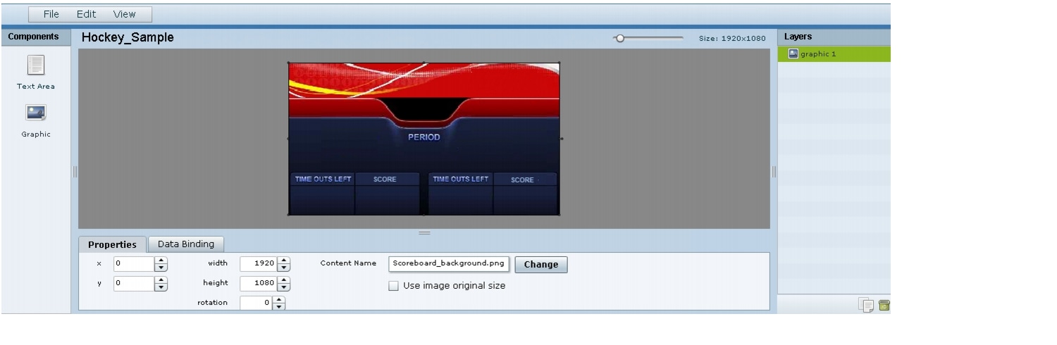
This section shows a basic widget configuration example to bind external data for an OES Ice Hockey Scoreboard data source. The example uses an image background (Figure 15) that creates static headings for Period, Time Outs, and Score, with companion text area components that will be created as layers on top of the background.
These text areas will be positioned beneath the background image headings and will have real-time data bound to them to appear in the widget once it is published.
Figure 15 Image Background for Scoreboard Widget

To create a widget and bind data to it, complete the following steps:
Step 1 Create a new widget with size 1920x1080.
Step 2 In the Components box, select the Graphic component and drag and drop it onto your widget canvas.
Step 3 With the graphic component selected, go to the Properties panel and click Change.
Step 4 In the Select Image dialog box, click on the background image that you want to add and click Select.
The image is added and scaled to the size of your graphic component box.
Step 5 In the Properties tab, specify the following values (Figure 16):
a. x and y—0
b. width —1920
c. height—1080
d. rotation—0
Figure 16 Background Image Added to Graphic Component
Step 6 Create two new text area components to add "HOME" and "GUEST" as the specified text string positioned as layers on top of the background graphic component (Figure 17).
Figure 17 Addition of Home and Guest Text Areas
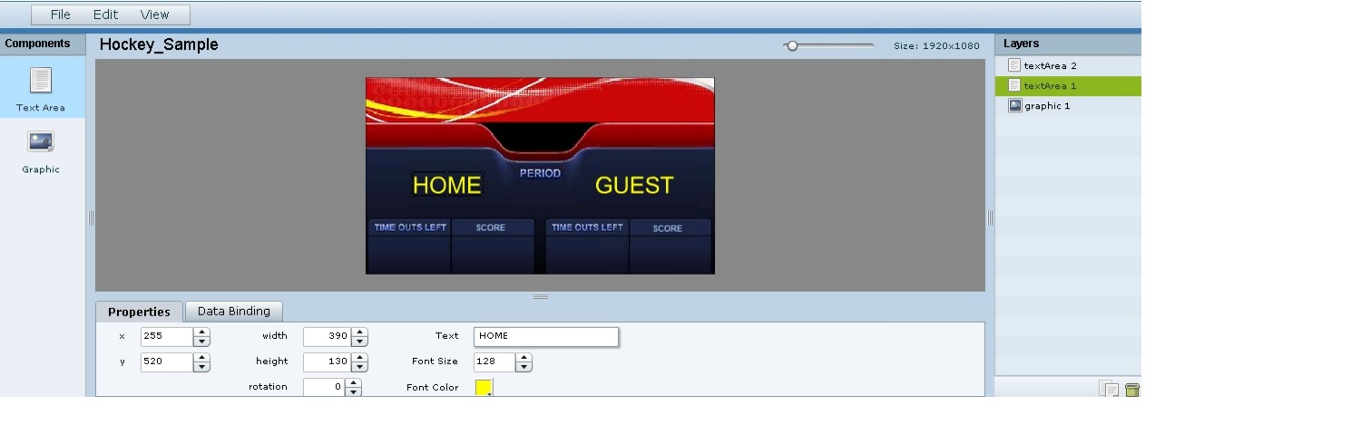
a. Drag and drop the Text Area component onto the background graphic.
b. In the Properties panel, specify the following values:
–Text box—Type "HOME"
–Font size—128
–Font color—Choose yellow
c. Select the handles on the text area box and expand its boundaries enough to reveal the text.
d. Select the text area component and drag it to the left side of the background graphic over the Time Outs Left and Score fields.
e. Repeat steps a-d using "GUEST" text and drag the component to the right side of the background graphic.
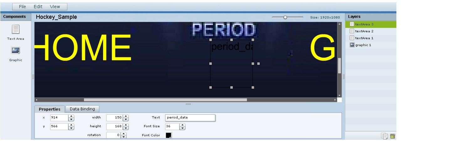
Step 7 Add Text Area components to bind data for Period, Time Outs, and Score areas for both teams:
a. Drag and drop the Text Area component onto the background graphic.
b. (Optional) Zoom in as needed to see the component better.
c. Position and resize the component beneath the heading for which you are going to bind corresponding data (Figure 18).
d. (Optional) Add text to temporarily identify what data will be in the box, such as "period_data."
Figure 18 Text Area Component to Bind Period Data
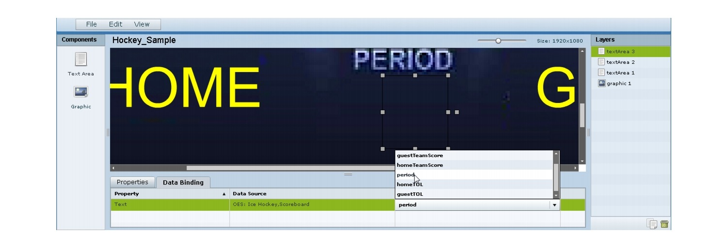
e. In the Data Binding panel, select the OES: Ice Hockey, Scoreboard data source and the period data field (Figure 19).
Figure 19 Period Data Field Binding for OES Ice Hockey Scoreboard Source
f. Repeat steps a-e for all other data fields that you need to bind.
Step 8 Click File > Save.
Changes to the widget are saved.
What to Do Next
After you have completed creating a widget, complete the following steps to publish it for display:
1. Create a playlist from the Control Panel for the widget that you created. Widgets are categorized in the "By Type" folder under the "widget" type.
2. Create an event script to run the playlist.
3. Schedule the script to display the content on a TV.
 Feedback