- Overview
- Understanding Objects, Properties, and Data
- Viewing Graphs
- Working with Tables and Filters
- Exploring Network Data
- Viewing Inventory
- Configuring and Running Reports
- Running Traffic Reports
- Running Health Reports
- Running Deviation Reports
- Running Ad Hoc Reports
- Managing Reports
- Using the Report Log
- Viewing Network Health and Weathermaps
Cisco WAE Live 6.4.1 User Guide
Bias-Free Language
The documentation set for this product strives to use bias-free language. For the purposes of this documentation set, bias-free is defined as language that does not imply discrimination based on age, disability, gender, racial identity, ethnic identity, sexual orientation, socioeconomic status, and intersectionality. Exceptions may be present in the documentation due to language that is hardcoded in the user interfaces of the product software, language used based on RFP documentation, or language that is used by a referenced third-party product. Learn more about how Cisco is using Inclusive Language.
- Updated:
- January 19, 2016
Chapter: Viewing Graphs
Viewing Graphs
You can view graphs in Explore and in the report outputs. Graphs show properties over time, enabling you to determine when significant events occur. For example, you can graph traffic to identify unexpected shifts, visualize growth trends, and determine whether traffic returns to normal levels after maintenance. Drops in traffic could indicate a routing problem.
Graph Icons
You can view graphs based on a single table entry or on all objects in a table depending on the icon you choose. The next table describes the difference between the two graph icons.
|
|
|
|---|---|

|
|

|
Graph all objects in a table, which is located above all the individual graph icons. |
These graph icons are available both through the Explore pages and as part of the output generated by most reports.
Figure 3-1 shows an example of a single Explore graph of an interface’s Traffic In and Traffic Out over the last week.
Figure 3-1 Example Single Graph of Interface Traffic In and Traffic Out Properties
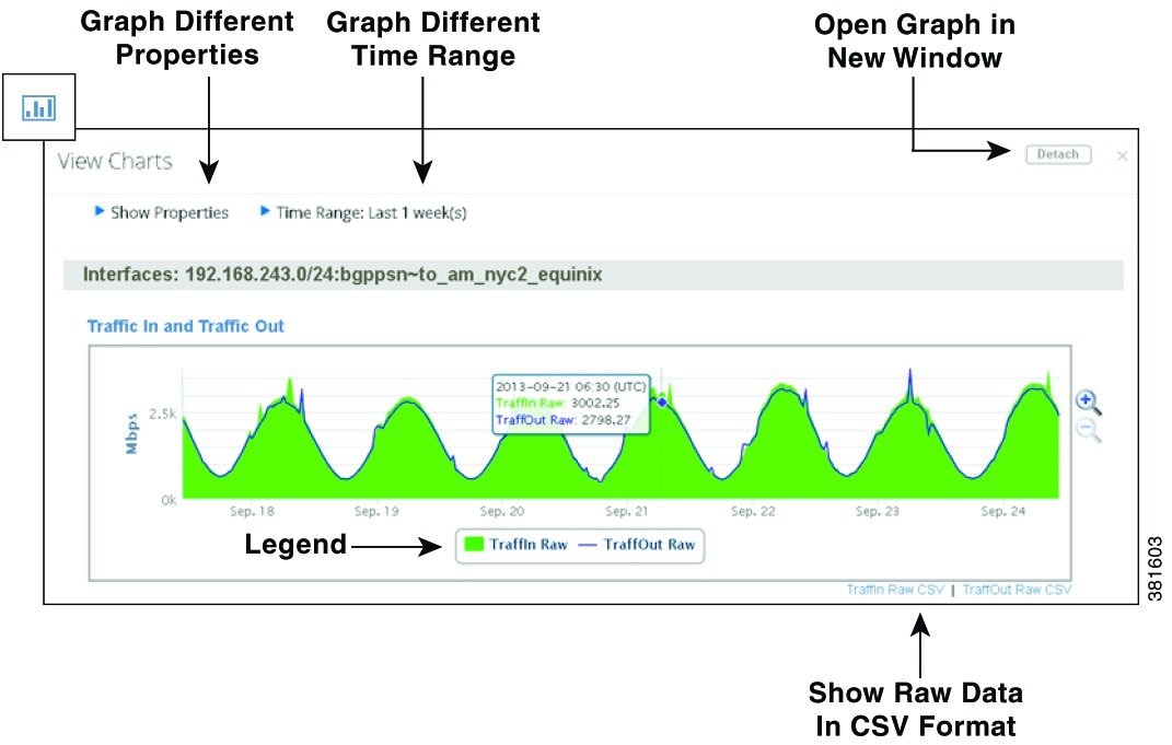
View Graph Options
In the View Charts page, you can choose from any of the following options to generate additional graph views:
- Show Properties —Select which properties to show in the graph.
- Time Range —Graph properties across a different time range. After changing the time range, you must click Redraw Graphs.
- Data Gap —A measurement of the time delta between two consecutive data points. This delta determines whether the difference between the two data points should be shown as a gap in the traffic. Enter the value in hours, minutes, and seconds.
Measurement gaps can occur when objects appear and withdraw from a network, when circuits become operational and non-operational, or when demands appear or disappear due to traffic fluctuations. While these are normal conditions, you might find the data easier to read if you adjust the Data Gap value.
Reports include an aggregate measure, for example, P95 over one day. When measurement gaps span the aggregation period, the graphs keep the aggregate at a constant rate using the last aggregate calculation. The result is a continuation of a graphed line when possibly there is no data due to network maintenance or failures. You can show these gaps by adjusting the Data Gap value.
- Graph Mode —When graphing multiple objects, change the graph mode. For more information, see Graphing Multiple Objects.
–![]() One property across multiple objects in either an overlay or a stacked manner.
One property across multiple objects in either an overlay or a stacked manner.
- Hide and show graphed properties —Click the property or graphed value (such as a trend) in the legend below the graph to toggle it on and off.
- CSV data —To list the graphed information in CSV format, click the CSV link below the graph. You can then use the browser tools to save or send the data, or you can cut and paste it to a file.
- Magnifying glass —Enlarge or decrease the size of the overall graph.
- Zoom —Zoom into a specific segment of the graph. Click and hold the cursor at the beginning of the range, and then drag it to the end point of the segment you need to enlarge. Zooming helps better read the reported data, such as when a deviation occurs.
Graphing Multiple Objects
You can graph all objects by clicking the Graph All icon at the top of the table. Thereafter, there are three available graph modes.
- Graphing by Individual Objects
- Graphing by Multiple Objects (Overlay by property and Stack by property)
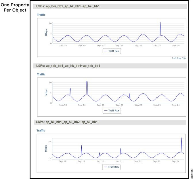
Graphing by Individual Objects
Individually graphing each property per object is useful when you want to see all of the data for an object in one place. For example, this mode makes it easy to compare inbound and outbound traffic for a particular interface. Figure 3-2 is an example where the Traffic property for three LSPs is graphed using the Individual Object graph mode.
Figure 3-2 Example of Graphing Individual Objects
Graphing by Multiple Objects
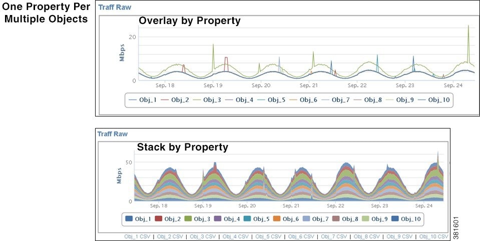
You can graph a single property for multiple objects either by overlaying them or by stacking them. Figure 3-3 shows an example of each using the same data (Traffic property, time frame, and LSPs) as was generated for Figure 3-2.
- Overlay by property —Overlay a single property for multiple objects in one graph. This is useful when you want to compare a single property across multiple objects. For example, if you want to compare inbound traffic data for all interfaces, overlay graphs make it easy to see which interfaces are carrying the most traffic.
- Stack by property —Stack a single property for multiple objects in one graph one on top of the other. The size of each colored area is per property and is proportional to the total, which is useful when comparing a single property across multiple objects over a given time. For example, you could use stacked graphs to compare how much CPU each node is utilizing at any given time.
Figure 3-3 Example of Overlay and Stack Graphs
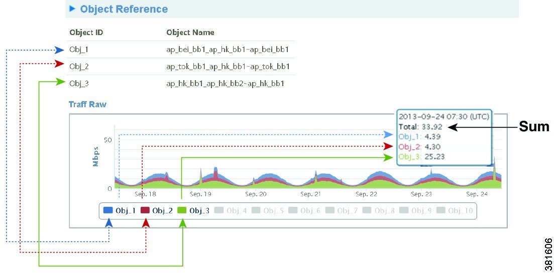
WAE Live assigns each object an object ID and graph color, and lists this association below each graph, thus identifying which data belongs to which object (Figure 3-4). As you move your cursor over the data points, the sum of the property values is listed along with the value of each object. To open or close the Object Reference section, click its arrow.
Figure 3-4 Reading Multi-Object Graphs
 Feedback