Cisco WAE Live 6.2 User Guide
Bias-Free Language
The documentation set for this product strives to use bias-free language. For the purposes of this documentation set, bias-free is defined as language that does not imply discrimination based on age, disability, gender, racial identity, ethnic identity, sexual orientation, socioeconomic status, and intersectionality. Exceptions may be present in the documentation due to language that is hardcoded in the user interfaces of the product software, language used based on RFP documentation, or language that is used by a referenced third-party product. Learn more about how Cisco is using Inclusive Language.
- Updated:
- September 30, 2015
Chapter: Health Reports
Health Reports
Access: WAE Live > Analytics, click New Report, and select Health Report Type
Access: WAE Live > Explore, select objects, and click Run Report
Health reports enable you to monitor and remedy network health by finding network objects that exhibit problematic behavior over time. For example, you can report on specific nodes that surpass 90% CPU utilization.
Each health report uniquely identifies ways in which an object might be considered unhealthy or in the case of LAGs, which LAGs are imbalanced. For instance, if you ran an interface health report on utilization over 80%, the resulting report would tell you the percentage of time each interface had over 80% utilization within the given time range, as well as the number of times the operating status changed. Another example is determining the number of times (Count) that a specific event occurs, such as LSP path changes.
Once the report is generated, you can then graph the properties over the report time range. These graphs allow you to drill down to the specific times at which the event occurred. These graphs could indicate when a specific threshold was violated or they could narrow the threshold violations to a single event.
To configure reports for a specific network, select it from the Network list (top left). If there is only one network configured, the word “default” appears.
Interface Health
An interface health report gives the percentage of time that incoming and outgoing traffic surpassed a user-defined threshold. Additionally, it identifies the number of times the operational status changed.
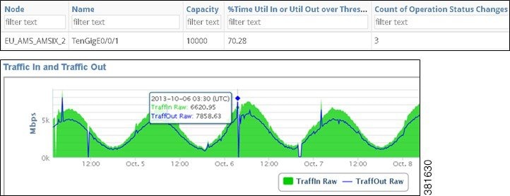
Example: Figure 9-1 shows an example health report output for an interface that was above an 80% utilization threshold 70.28% of the time, during which time there were 3 operating status changes. The graph visually shows that one of the peaks in utilization occurred on October 6. Moving the cursor over that point gives the exact date and utilization values.
Figure 9-1 Example Interface Health Report
Required Tabs
- See the Configuring Reports chapter.
- Util Threshold—Threshold interface traffic must surpass to be included in the report.
LAG Imbalance
A link aggregation group (LAG) is a group of physical interfaces that are bundled into a single logical interface. When traffic is not spread evenly across the members, congestion and dropped packets can occur even though the LAG itself is not congested.
A LAG Imbalance report enables you to determine which LAGs are imbalanced and at risk of dropping packets or incurring congestion. The basis for determining whether a LAG is included in the report is whether any of its members surpass a user-specified Util Out threshold. This helps you target potentially problematic LAGs, avoiding those that do not have sufficient traffic to give accurate results.
The LAG Imbalance report is based on two key parameters.
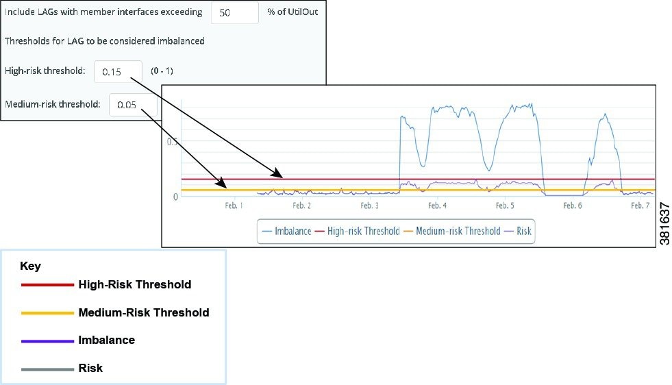
- Include LAGs with members exceeding __% —This value determines which LAGs are included in the report. If a LAG has any member that passes this Util Out threshold (at any time during the report period), then the LAG and all of its members are included in the report.
- High- and Medium-risk threshold—These values set the thresholds that WAE Live uses to determine whether a LAG is imbalanced or at risk. The value must be between 0 and 1.
LAG Imbalance and Risk
The LAG Imbalance/Risk graph shows the imbalance and risk compared to the high- and medium-risk thresholds, as well as whether and when the LAG passes these thresholds. The difference between risk and imbalance measurements is that risk calculations consider only positive differences, whereas imbalance calculations consider both negative and positive differences. For instance, Figure 9-2 shows that a LAG’s utilization was significantly imbalanced for several days, while it was only minimally at risk.
- Risk = Highest Util Out of Any Member - Average Util Out of All LAG Members
- Imbalance = Higher of these two values.
–![]() Average Util Out of All LAG Members - Lowest Util Out of Any Member
Average Util Out of All LAG Members - Lowest Util Out of Any Member
Example: This example LAG has four members.
- Util Out values are 0.10, 0.35, 0.55, and 0.40.
- Highest Util Out of Any Member = 0.55
- Lowest Util Out of Any Member = 0.10
- Average Util Out of All LAG Members = (0.10 + 0.35 + 0.55 + 0.40)/4 = 0.35
- Risk = 0.55 - 0.35 = 0.20
- Imbalance = 0.25 because it is the higher of the following two values.
Figure 9-2 Example LAG Imbalance and LAG Risk Graph
LAG Member Utilization
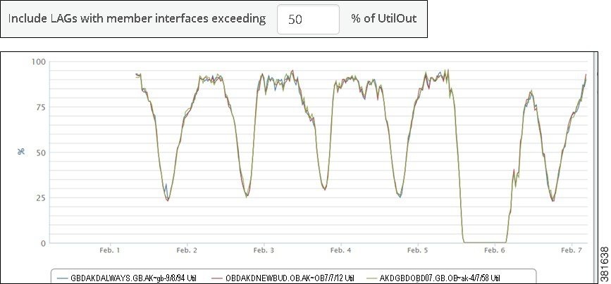
The Util Out graph shows the Util Out percentage of all of the LAG’s members over the report period (Figure 9-3). If you see that a LAG is imbalanced or at risk, this graph is helpful in determining which of the members is causing these effects.
Figure 9-3 Example LAG Member Util Out Graph
Additional Utilization, Imbalance, and Risk Data
In addition to these graphs, the report output includes the following utilization, imbalance, and risk values.
- Number of LAG members, which are viewable individually by clicking on the blue number in the LAG Members column.
- Peak member utilization
- Peak aggregated risk
- Peak aggregated imbalance
- Most recent aggregated risk
- Most recent aggregated imbalance
- Percentage of time the LAG was over the high-risk threshold
- Percentage of time the LAG was over the medium-risk threshold
Example
This example compares two scenarios to demonstrate how you could interpret the data.
While LAG A is imbalanced, it does not appear to be at high risk. Traffic coming into this LAG will likely not pose a problem since the data suggests that even if one member fails, the other nine members can handle the traffic.
LAG B is imbalanced and likely at high risk. One particular member is receiving much more traffic than the other members. If this happens when traffic is coming into LAG B and if that traffic is assigned to the member with 90% utilization, there might not be sufficient bandwidth left to handle the traffic, resulting in dropped packets.
Required Tabs
- See the Configuring Reports chapter.
- LAG Imbalance
–![]() Include LAGs with members exceeding __% —Specify the percentage of Util Out threshold used in determining which LAGs are included in the report. If any LAG member surpasses it, then the LAG is included in the report.
Include LAGs with members exceeding __% —Specify the percentage of Util Out threshold used in determining which LAGs are included in the report. If any LAG member surpasses it, then the LAG is included in the report.
–![]() High- and Medium-risk threshold—Specify the thresholds used to determine whether a LAG is imbalanced or at risk. The value must be between 0 and 1.
High- and Medium-risk threshold—Specify the thresholds used to determine whether a LAG is imbalanced or at risk. The value must be between 0 and 1.
LSP Health
An LSP health report identifies the percentage of time that the LSP traffic surpasses the user-specified threshold of setup bandwidth (set in the Setup BW Threshold tab). Additionally, it gives the following information.
- Last setup bandwidth
- Number of actual path changes
- Percentage of time the LSP was not on the shortest TE path
Required Tabs
- See the Configuring Reports chapter.
- Setup BW Threshold—Setup bandwidth threshold that LSPs must surpass to be included in the report.
Node Health
A node health report identifies the percentage of time that the CPU and memory surpass a threshold that you set in the CPU Threshold and Memory Threshold tabs, respectively.
Required Tabs
- See the Configuring Reports chapter.
- CPU Threshold—CPU threshold that nodes must surpass to be included in the report.
- Memory Threshold—Memory threshold that nodes must surpass to be included in the report.
Related Topics
- Objects, Properties, and Data
- Graphs
- Tables and Filters
- Explore
- Creating new reports
–![]() Reports
Reports
 Feedback