Cisco Tidal Enterprise Scheduler 6.2 User Guide
Bias-Free Language
The documentation set for this product strives to use bias-free language. For the purposes of this documentation set, bias-free is defined as language that does not imply discrimination based on age, disability, gender, racial identity, ethnic identity, sexual orientation, socioeconomic status, and intersectionality. Exceptions may be present in the documentation due to language that is hardcoded in the user interfaces of the product software, language used based on RFP documentation, or language that is used by a referenced third-party product. Learn more about how Cisco is using Inclusive Language.
- Updated:
- June 6, 2014
Chapter: Business Views
- Create Jobs/Job Groups in the View
- Add a Child Job to an Existing Group
- Create Dependencies in the View
- Create/Modify a Callout
- Hide/Show All Callouts
- Hide Individual Callouts
- Show Individual Callouts
- Create/Modify a Flag
- Create/Modify a Hyperlink
- Change the View Properties
- Delete Objects
- Deselecting Currently Selected Objects
- Find Jobs
Business Views
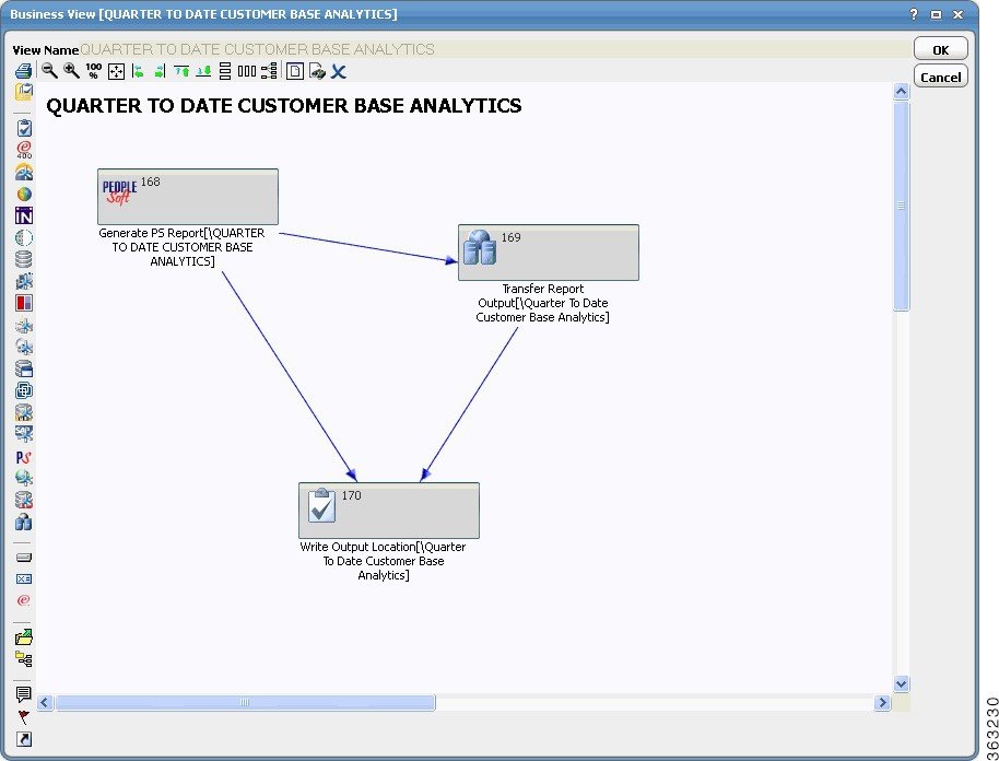
The Business Views pane is a subset of the Jobs pane. It provides an alternate method of defining jobs. The Business Views pane offers a graphical way to create and modify jobs and their dependencies by clicking function buttons and dragging-and-dropping object icons from a toolbar. Using the mouse cursor, you can create workflows, rearrange the sequence of jobs and link dependencies to jobs as required.
Business Views Pane Interface
From the Navigator pane, select Definitions > Jobs > Business Views to display the Business View window. The window is blank if you have not saved any Business Views.
If you have created and saved Business Views, they are listed in the window.
The Business View window contains the following columns of information about each listed View:
- Name – The name of the View.
- Owner – The user that owns (or created) the View.
- Public – Indicates if the View is available to other users.
- Groups – Indicates if the View depicts a job group and its children.
- Jobs – The number of jobs depicted in the Business View.
- Modified – The date and time that the View was last modified.
Views Preferences Dialog
While viewing the Business View window, select View > Preferences or right-click Business Views in the Navigator pane and select Preferences from the context menu to display the Business Views Preferences dialog.
General Tab
The General tab manages the recursive behavior of jobs in the Business Views screen.
This tab contains the following elements:
- Default View – Specifies that the selected Business View is the default View. This option assigns the properties of the default View to new Business Views.
- Add Children – Automatically includes the immediate child jobs of any existing job group that is added to a View.
- Add Children Recursively – Automatically adds successive generations of the children of all child job groups. If this option is selected, the Add Children option is automatically selected also.
- Add Predecessors – Automatically includes the immediate predecessor jobs of any existing job or job group that is added to a View.
- Add Predecessors Recursively – Automatically includes the immediate predecessors of a job and includes all other ancestors of those predecessors. If this option is selected, the Add Predecessors option is automatically selected also.
- Add Successors – Automatically includes the immediate successor jobs of any existing job or job group that is added to a Business View.
- Add Successors Recursively – Automatically includes the immediate successors of a job and includes all other descendants of those successors. If this option is selected, the Add Successors option is automatically selected also.
Columns Tab
The Columns tab specifies which columns are displayed in the Business Views window and in what order the columns are arranged.
Navigator Context Menu
When you right-click in the Navigator pane while Business Views is selected, the Navigator context menu displays.
This context menu contains the following options:
- Add Business View – Displays a new Business View screen.
- Preferences – Displays the Preferences dialog for the Business View window.
- Print – Displays a print preview screen of the information listed in the columns shown in the View window. From this screen, you can print a report of the information in the columns.
- Export – Saves the data in the current window as an ASCII text file. You can then use the file data in other applications.
- Refresh – Updates the data in the current window.
Business View Window Context Menu
You create, modify and delete Views from the context menu that displays by right-clicking the mouse from inside the Business View window or by clicking the Add Business View button on the toolbar of the Business View window.
This context menu contains the following options:
- Add View – Displays a new Business View screen.
- Modify View – Displays the selected View.
- Delete View – Deletes the selected View.
- Print – Displays a print preview screen of the information listed in the columns shown in the View window. From this screen, you can print a report of the information in the columns.
View Properties Dialog
The basic properties governing the appearance and operation of the View canvas are controlled from the View Properties dialog. The View Properties dialog displays when right-clicking on the Business View canvas and selecting the View Properties option in the context menu.
General Tab
The General tab controls the general properties of the Business View.
This tab contains the following elements:
- Owner – The user that owns (or created) the current View. If the owner is a workgroup, any member of the workgroup can work with this View.
- Zoom Scale – Select the zoom percentage of the View screen.
- Height – The total height (in pixels) of the View screen.
- Width – The total width (in pixels) of the View screen.
- Calculate Size to Fit – Configures the current View size to fit all graphical objects within the View.
- Show Captions – Selecting this option will display the full job name underneath the job bars.
- Public – Selecting this option makes the View available to all users of TES when viewing the Jobs pane. If this option is not selected, only the owner (whether an individual user or workgroup) can use the Business View.
Auto Arrange Tab
The Auto Arrange tab controls the behavior of the Automatic Arrangement feature applied to the Business View layout. Selected objects that are scattered randomly in the View are rearranged according to the properties specified on this tab.
The options in the Advanced Options section are used to configure the arrangement logic used in the most complicated Business View that contain many defined objects. Unless you thoroughly understand these options, it is recommended to use the defaults.
Depending upon the number and relationship of objects in a View, use of the advanced arrangement configuration options can slow down the display performance when using the Auto Arrange feature. The arrangement properties specified on this tab are applied to the selected objects in the View by clicking the Auto Arrange button .
This tab contains the following elements:
- Column Spacing – Specifies the horizontal distance (in pixels) between objects that are arranged in a column in the View.
- Direction Option – Specifies the directional orientation of the workflow displayed in the View. The linking arrows will point in the designated direction, e.g., the Up option flows from bottom to top.
Callouts Tab
The Callouts tab controls the default properties for the text callouts. Callouts are used to display additional information about an object.
This tab contains the following elements:
- Width – Specifies a default width (in pixels) for the callout. This width can be adjusted from the individual callout as necessary.
- Row Height – Specifies a default size (in pixels) for each line of text. This text size can be adjusted from the individual callout as necessary by dragging the green squares of the selected callout.
- Background Color – Clicking this button displays a Color dialog where the a background color for the callout can be selected from predefined colors or a new color can be created.
- Text Color – Clicking this button displays a Color dialog where a color for the callout text can be selected from predefined colors or a new color can be created.
- Font – Select the font to be used for the callout text from the list.
- Italic – Selecting this option displays the callout text in italic type.
- Underline – Selecting this option displays the callout text in underlined type.
- Bold – Selecting this option displays the callout text in bold type.
- Custom Text – Selecting this option displays any text that is typed in the box below.
- Job Runbook – Selecting this option displays any operator instructions that are entered on the Runbook tab of the job definition. If the Load URL option is selected on the Runbook tab after typing an URL for an internet or intranet site (or even a directory path on your system's network) then that Web page (or directory) displays. If you click the URL displayed in the caption, a separate window displays to show the Web page or directory contents of that URL.
- Job Notes – Selecting this option displays any notes about the job that are typed on the Notes tab of the job definition. If the Load URL option is selected on the Notes tab then the URL of the tab displays.
- Sample of Chosen Font – Displays the selected font as its appearance is currently configured.
- Hide All Callouts – Hides all callouts. You can also use the Hide All Callouts option from the context menu to hide the callouts.
To display a specific callout that is hidden:
a. Select the bar icon and right-click to display the context menu.
b. From the
Add/Edit Extras
submenu, select the
Callout
option to display the
Callout Properties
dialog.
Canvas Interface
The View’s Canvas functions are controlled from the icons that run in a toolbar along the top of the screen. The creation and linking of job and dependency objects is controlled from a column of icons that run down the left side of the Canvas.
Many of the toolbar options are available from a context menu.
Layout Toolbar
The buttons in the toolbar that runs along the top of the Canvas have the following functions:
- Align Left – Aligns selected objects by their left side boundary. All objects will align with the left side of the leftmost selected object. To align other objects with another designated object, click the anchor object (a green boundary box will surround the object) and while holding down the Ctrl key, select the other objects by either clicking them individually.
- Align Right – Aligns selected objects by their right side boundary. All objects will align with the right side of the rightmost selected object. Refer to the Align Left button section for details on aligning objects.
- Align Top – Aligns selected objects by their top boundary. All objects will align with the top of the highest selected object. Refer to the Align Left button section for details on aligning objects.
- Align Bottom – Aligns selected objects by their bottom boundary. All objects will align with the bottom of the lowest selected object. Refer to the Align Left button section for details on aligning objects.
- Equal Vertical Spacing – Spaces selected objects an equal distance apart in a column format.
- Equal Horizontal Spacing – Spaces selected objects an equal distance apart in a row format.
- Auto Arrange – Automatically arranges selected objects according to the properties configured on the Auto Arrange tab of the View Properties dialog.
Objects Toolbar
Along the left side of the View window are a column of buttons with various icons. Dragging-and-dropping these buttons onto the View canvas creates objects.
This toolbar contains the following buttons:
- Job Group – Clicking this button and dragging to the View canvas creates a job group bar. Double-click the job group bar to display a dialog to define the job group parameters.
- Job – Clicking this button and dragging to the View canvas creates a job bar. Double-click the job bar to display a dialog to define the job parameters.
- OS/400 Job – Clicking this button and dragging to the View canvas creates an OS/400 job bar. Double-click the OS/400 job bar to display a dialog to define the job parameters.
- Horizon Job – Clicking this button and dragging to the View canvas creates a Horizon job bar. Double-click the Horizon job bar to display a dialog to define the job parameters.
- BusinessObjects Job – Clicking this button and dragging to the View canvas creates a BusinessObjects job bar. Double-click the BusinessObjects job bar to display a dialog to define the job parameters.
- Informatica Job – Clicking this button and dragging to the View canvas creates a Informatica job bar. Double-click the Informatica job bar to display a dialog to define the job parameters.
- JD Edwards Job – Clicking this button and dragging to the View canvas creates a JDE job bar. Double-click the JDE job bar to display a dialog to define the job parameters.
- JDBC Job – Clicking this button and dragging to the View canvas creates a JDBC job bar. Double-click the JDBC job bar to display a dialog to define the job parameters.
- SSH Job – Clicking this button and dragging to the View canvas creates a SSH job bar. Double-click the SSH job bar to display a dialog to define the job parameters.
- Cognos Job – Clicking this button and dragging to the View canvas creates a Cognos job bar. Double-click the Cognos job bar to display a dialog to define the job parameters.
- JMS Job – Clicking this button and dragging to the View canvas creates a JMS job bar. Double-click the JMS job bar to display a dialog to define the job parameters.
- Remote Job Job – Clicking this button and dragging to the View canvas creates a Remote Job job bar. Double-click the Remote Job job bar to display a dialog to define the job parameters.
- Oracle Applications Job – Clicking this button and dragging to the View canvas creates an Oracle Applications job bar. Double-click the Oracle Applications job bar to display a dialog to define the job parameters.
- VMWare Job – Clicking this button and dragging to the View canvas creates an VMWare job bar. Double-click the VMWare job bar to display a dialog to define the job parameters.
- MSSql Adapter Job – Clicking this button and dragging to the View canvas creates a MSSql job bar. Double-click the MSSql job bar to display a dialog to define the job parameters.
- SAP Adapter Job – Clicking this button and dragging to the View canvas creates a SAP job bar. Double-click the SAP job bar to display a dialog to define the job parameters.
- PeopleSoft Adapter Job – Clicking this button and dragging to the View canvas creates a PeopleSoft job bar. Double-click the PeopleSoft job bar to display a dialog to define the job parameters.
- WebService Job – Clicking this button and dragging to the View canvas creates a WebService job bar. Double-click the WebService job bar to display a dialog to define the job parameters.
- Oracle Database Adapter Job – Clicking this button and dragging to the View canvas creates an Oracle Database job bar. Double-click the Oracle Database job bar to display a dialog to define the job parameters.
- FTP Job – Clicking this button and dragging to the View canvas creates a file dependency job bar. Double-click the FTP job bar to display a dialog to define the job parameters.
- File Dependency – Clicking this button and dragging to the View canvas creates a file dependency job bar.
- Variable Dependency – Clicking this button and dragging to the View canvas creates a variable dependency bar.
- z/OS Dependency – Clicking this button and dragging to the View canvas creates a z/OS dependency bar.
- Get Jobs – Clicking this button and double-clicking in the View window displays the Job Search dialog to enter search criteria to locate existing jobs to add to the View. (Refer to the “Views Preferences Dialog” section for information about recursive options for parent-child jobs.)
- Create View from Group – Select a group and then click this button to create a new View that displays only the selected job group and its children jobs with their respective dependencies. The selected group job bar receives a link icon to link to the new View and the parent group job bar in the new View also receives a link icon. By clicking the link icon , you can jump back and forth between the two Business Views. This option is only available if a job group bar is selected. (Refer to the “Views Preferences Dialog” section for more information about recursive options for parent-child jobs.)
- Callout – If a job or job group is selected when clicking this button, a text balloon that points to the selected job displays. By clicking anywhere on the text balloon you can move it around to reposition the callout text. The text balloon is bounded by little boxes.
The callout can be repositioned around an object by clicking it and dragging the callout to the desired location.
Double-clicking the callout displays the Callout Properties dialog.
The Callout Properties dialog largely duplicates the Callout tab of the View Properties dialog. The difference is that the Callout tab of the View Properties dialog sets the universal properties for all callouts while the Callout Properties dialog configures the properties for the individual callout that was selected. Refer to the Callouts Tab for more information on the options in this dialog.
Notice that there is an option to hide the callout text. The showing and hiding of an individual callout is controlled from either the Hidden option in this dialog or one of options in the Hide/Show submenu in the View context menu.
- Flag Job – If a job or job group is selected when clicking this button, the Flag Properties dialog displays. You can then assign a colored flag to the selected job as a marker.
You can designate a red, green, blue, yellow or black flag. If a flag is already assigned you can also delete it from this dialog. You can also type up to 4,000 characters of text about the flag to explain or describe it. These remarks are displayed by pausing the cursor on the flag.
- Create Hyperlink – Creates a Link bar icon and displays the Choose a View for Link dialog to create a link from the current View to another existing View. You click the link icon to display the linked View. To add the hyperlink to an existing job or dependency bar icon, select the bar icon and click this button (or use the Hyperlink option in the Add/Edit Extras submenu). To close the displayed dialog without creating a hyperlink, click Cancel .
Context Menu Options
Right-clicking the mouse anywhere on a View canvas displays a context menu of options. Many of these menu options replicate the functions of the various buttons on the toolbars along the Canvas edge. Some of the options are not available until a job or job group is selected. The options in the context menu are:
– Job
– This option displays a submenu of the following options:
Job
– This option displays a submenu of the following options:
Select from Existing Jobs – Displays the Job Search dialog to enter search criteria to locate a defined job.
Group – Creates a job group bar. Double-click the bar icon to define the parameters of the job group.
Job – Creates a job bar. Double-click the bar icon to define the parameters of the job.
–
Dependency
– Selecting this option displays a submenu of the following options:
File – Creates a file dependency bar. Click the dependency icon and drag the cursor to a job bar to associate the dependency to that job. Once the dependency is associated to a job, a dialog displays to define the parameters of the file dependency.
Variable – Creates a variable dependency bar. click the dependency icon and drag the cursor to a job bar to associate the dependency to that job. Once the dependency is associated to a job, a dialog displays to define the parameters of the variable dependency.
–
Link Node
– Displays the Link bar icon and the
Choose a View for Link
dialog to create a link from the current View to another existing View. Click the link icon to display the linked View. To add the hyperlink to an existing job or dependency bar icon, select the bar icon and use the
Hyperlink
option in the
Add/Edit Extras
submenu. To close the displayed dialog without creating a hyperlink, right-click in the list and select the
Delete
option.
–
View from Group
– Creates a separate View of a selected group bar and its children jobs. The selected group job bar receives a link icon to link to the new View and the parent group job bar in the new View also receives a link icon. By clicking the link icon , you can jump back and forth between the two Business Views. This option is only available if a job group bar is selected.
–
Callout
– Displays the
Callout Properties
dialog to add or modify the callout associated with a selected object.
–
Flag
– Displays the
Flag Properties
dialog for the object you selected.
–
Hyperlink
– Displays the
Choose a View for Link
dialog to add or change which defined View is linked.
- Edit – Displays the definition dialog for the selected object to modify its parameters.
- Delete – Deletes the selected object after you confirm that it should be deleted. If you wish to just remove the object from the View but not delete the actual job or dependency, select the Remove from View option.
- Copy – Copies the selected job or job group.
- Rename Alias – Changes the eight character name that appears inside the job object bar and updates the job alias in the job’s definition.
- Save – Saves any changes to the current View.
- Print – Displays a Print dialog to configure the printing parameters.
- Index – Displays a list of the objects in the View with their names and the appropriate icons. Double-click a listed item to display it (with a green selection box).
- Select All – Selects all objects in the current View.
- Show Missing – Displays a list of children or dependencies that exist but are not displayed in the current View. Children and/or dependencies may not be displayed in the View because they were deleted from a View (but not from the database), they were added to a job or group that co-exists in another View or they were created in the TES console instead of the View.
–
Children
– Displays a list of child jobs that belong to the groups in the current View but are missing from the View. You can add missing children by dragging-and-dropping any of the listed items into the current View.
–
Dependencies
– Displays a list of dependencies that are missing from the current View.
- Remove from View – Deletes the selected object from the View though the object remains in the database and can be seen in the Jobs window or on the Dependencies tab of the associated job definition.
- Hide/Show – Selecting this option displays a submenu of the following options:
–
Hide Selected Objects
– Grays out the selected objects so they are only faintly visible. The objects will not show in the
Job Activity
pane.
–
Hide All Callouts
– Hides all callouts to reveal more of the View canvas.
–
Show Selected
– Shows the hidden objects that were selected, restoring them to the normal bold lines instead of the grayed out format.
–
Show All
– Displays all jobs and dependency objects that have been hidden.
–
Show All Callouts
– Displays all callouts that have been hidden.
–
Show Unhidden Callouts
– Displays only those callouts that are not hidden individually.
–
Align
– Selecting this option displays a submenu of the following alignment options:
Left – Aligns selected objects by their left side boundary.
Right – Aligns selected objects by their right side boundary.
View Procedures
Create Jobs/Job Groups in the View
To create a job or job group in the View:
Step 1 From the Object toolbar, select the appropriate job/job group icon and drag it onto the Business Views Canvas.
Step 2 Double-click on the job/job group object to display its definition dialog and define its parameters.
Step 3 Save the definition dialog.
Add a Child Job to an Existing Group
If a defined job in the View does not already belong to a job group, it can be added to any defined job group in the View.
To add a child job to an existing group:
Step 1 From the Object toolbar, select the appropriate job icon or the
Get Job
icon and drag it onto the Business Views Canvas.
Step 2 From the canvas, double-click the job object to display its definition dialog.
Step 3 From the
Parent Group
list, select the job group you want the job assigned to.
Step 4 If defining a new job, define the remaining parameters.
Step 5 Save the definition dialog.
Create Dependencies in the View
To create a dependency in the View:
Step 1 From the Object toolbar, select the appropriate job icon and drag it onto the Business Views Canvas.
Step 2 Double-click on the job object to display its definition dialog and define its parameters.
Step 3 Save the definition dialog.
Step 4 From the Object toolbar, select the appropriate dependency icon and drag it onto the Business Views Canvas.

Note You cannot define a dependency until you have associated or linked it to an existing job object, so the object displays grayed out.
Step 5 Select the job object, then press CTRL+ALT simultaneously.
While continuing to press Ctrl + Alt simultaneously, click the dependency object.
A red arrow displays between the objects when they are linked successfully. Once linked, you can double-click the dependency to define it. Once defined, a green arrow displays between the objects.
Create/Modify a Callout
To create or modify a callout:
Step 1 Click an object to select it. (A green border will appear around the object.)
Step 2 Click the
Callout
button in the object toolbar to attach a caption to the object.
Step 3 Double-click the callout to display its
Callout Properties
dialog.
Step 4 Type the text you wish to appear in the callout and format it as needed.
Hide/Show All Callouts
Step 1 Right-click in the
Canvas
screen to display the context menu.
Step 2 Select the
Show/Hide
menu option.
- To hide all callouts, select the Hide All Callouts option.
- To show all callouts, select the Show All Callouts option.
Hide Individual Callouts
To hide an individual callout:
Step 1 Double-click a callout to display its
Callout Properties
dialog.
Step 2 Select the
Hidden
option.
Show Individual Callouts
To show an individual callout:
Step 1 Click an object to select it.
Step 2 On the object toolbar, click the
Callout
button to display the
Callout Properties
dialog for the object’s callout.
Step 3 Clear the
Hidden
option.
Create/Modify a Flag
Step 1 Click an object to select it.
Step 2 Click the
Flag Job
button in the object toolbar to display its
Flag Properties
dialog.
Step 3 Select a color for the flag and type any text you wish to appear when the mouse cursor pauses over the flag.
Create/Modify a Hyperlink
To create or modify a hyperlink:
Step 1 Click an object to select it.
Step 2 Click the
Create Hyperlink
button in the object toolbar to display the
Choose a View for Link
dialog.
Step 3 Link the selected object to a View by selecting a View from the list.
A link icon will be placed on the object that when clicked displays the specified View.
You can change the linked View at anytime by selecting the object, clicking the Create Hyperlink button and choosing a different View from the Choose a View for Link dialog.
Change the View Properties
To change a View’s properties:
Step 1 Display the
View Properties
dialog by selecting the
Properties
option in the Canvas context menu.
Step 2 Modify the parameters in the dialog as needed. Click the
Defaults
button to return to the original default values after changing the values.
Delete Objects
There are two degrees of object deletion. With one type of deletion, you may wish to just delete an object from the View Canvas yet leave the object still available in the database. With the other form of deletion, an object is not only removed from the View but is permanently removed from the database.
To delete an object from the View Canvas and the database, select the object and press the Delete button on your keyboard. A confirmation message displays.
Deselecting Currently Selected Objects
You can click on a empty spot of canvas to deselect all currently selected objects in the canvas. This is helpful if you want to recover or reset from previous selection mistakes during a job dependency or parent job relationship procedure.
Find Jobs
There are two different types of job searches available. All of the existing jobs that are defined in the database and just the jobs that are included in the current View, which can be difficult to find as the workflow in a View becomes more complicated and populated with objects.
- To find a particular object within the current View, right-click on the canvas and select Index from the context menu to display the Job Index dialog that lists the various objects contained in the current View. Double-click one of the listed objects to close the dialog and to display the selected object, highlighted in a green bounding box.
- To find an existing job (or job group) in the database that is not in the current View, click the Get Jobs button in the object toolbar to select it and double-click anywhere in the Canvas to display the Job Search dialog. Enter criteria in the various fields to find the desired job. For more information on the Job Search dialog, refer to “Job Search Dialog” section.
 Feedback